In this photoshoot I went to the beach near kiosk, because this was a beach I used to go to very often when I was younger, and even up until last Summer. I also go to kiosk quite often, so this setting and the activities presented here represent my identity very well. We also visited a shed that we used to go to in Summer, but it has a lot of damage now, so I took photos of the setting and us exploring.
Contact Sheet
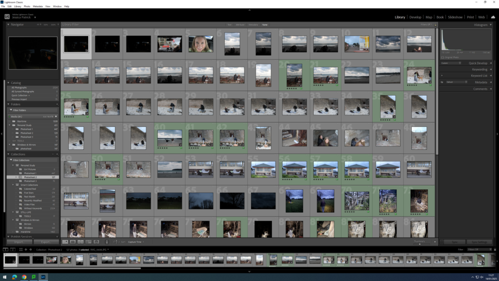
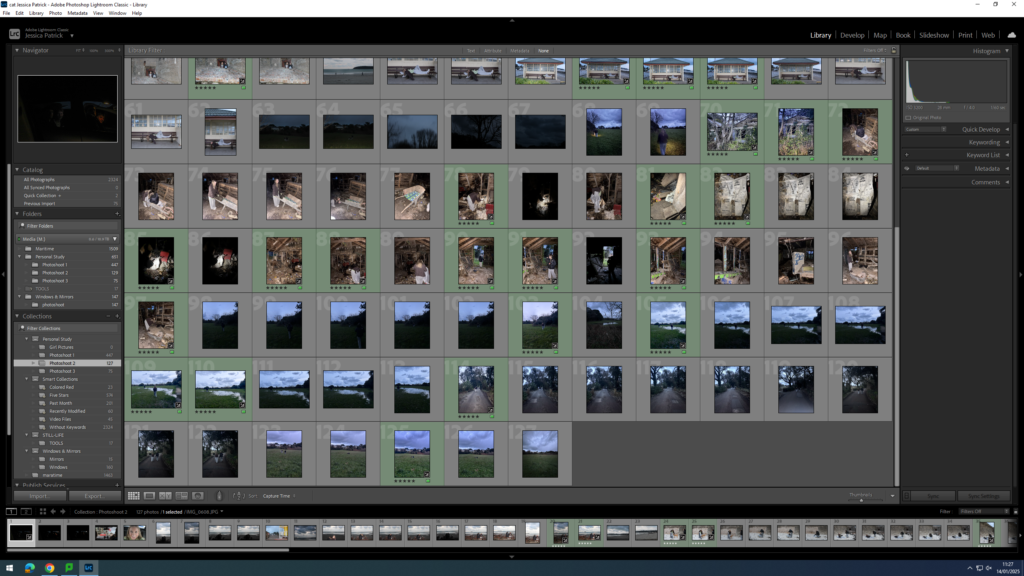
The images which are highlighted green are the photos that I have chosen to edit, because they represent my themes of youth and identity the best, and they have the best compositions and lighting.
Edits
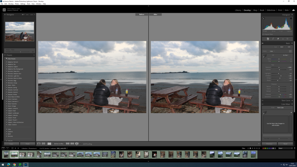
I edited this image by increasing the exposure, contrast, shadows, whites, vibrancy and saturation, while decreasing the highlights and blacks. I did this, so that the image would slightly brighter and more vibrant.
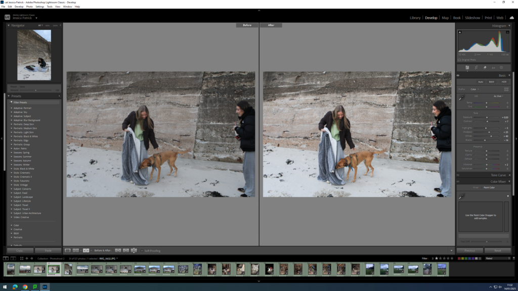
I edited this image by increasing the exposure, contrast, shadows, whites and vibrancy, while decreasing the highlights and blacks. I did this, so that the image would be slightly more exposed, as the lighting was not the best, as it had started to get darker.
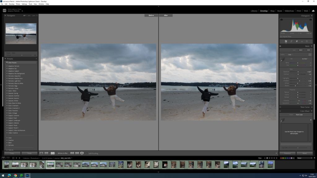
I edited this image by increasing the exposure, contrast, shadows, vibrancy and saturation, while decreasing the blacks. I did this, so that the image was slightly more exposed and slightly more vibrant.
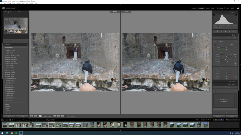
I edited this image by increasing the contrast, shadows, vibrancy and saturation, while decreasing the highlights and blacks. I did this, so that the image would be slightly less exposed, as I has used the flash, so the lighting was not the best. I also wanted it to be slightly more vibrant, so that the colour of the rocks would pop more.
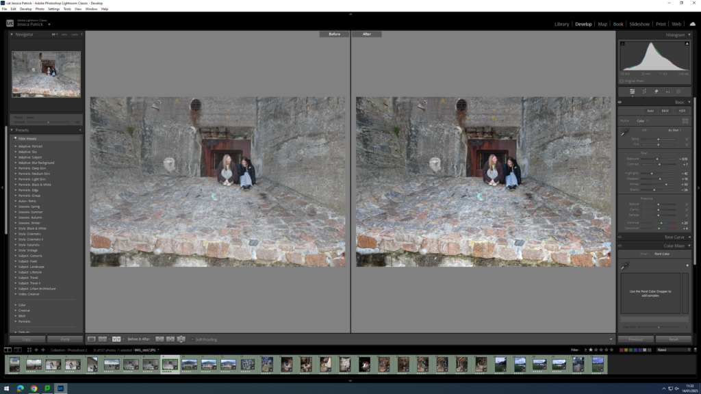
I edited this image by increasing the contrast, shadows, whites, vibrancy and saturation, while decreasing the highlights and blacks. I have done this, so that the image was less exposed, because the lighting was too harsh, due to me using the flash. I also wanted the colours of the rocks to be more vibrant.
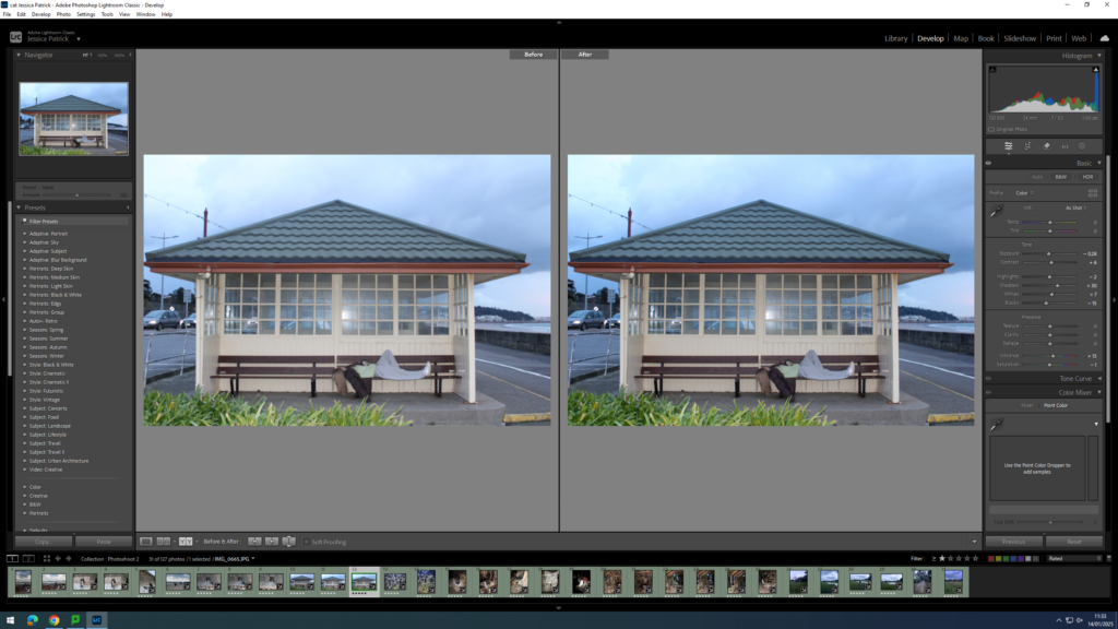
I edited this image by increasing the contrast, shadows, whites, and vibrancy, while decreasing the highlights, saturation and blacks. I did this, so that the image was less exposed, because of the harsh lighting due to the flash being used.
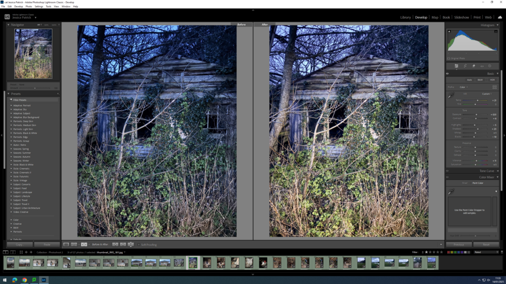
I edited this image by increasing the exposure, contrast, shadows, whites, vibrancy and saturation, while decreasing the highlights and blacks. I did this, because it was very dark, so I needed the image to be more exposed. I also added a yellow tint to the image, because there was a lot of blue tones throughout the image.
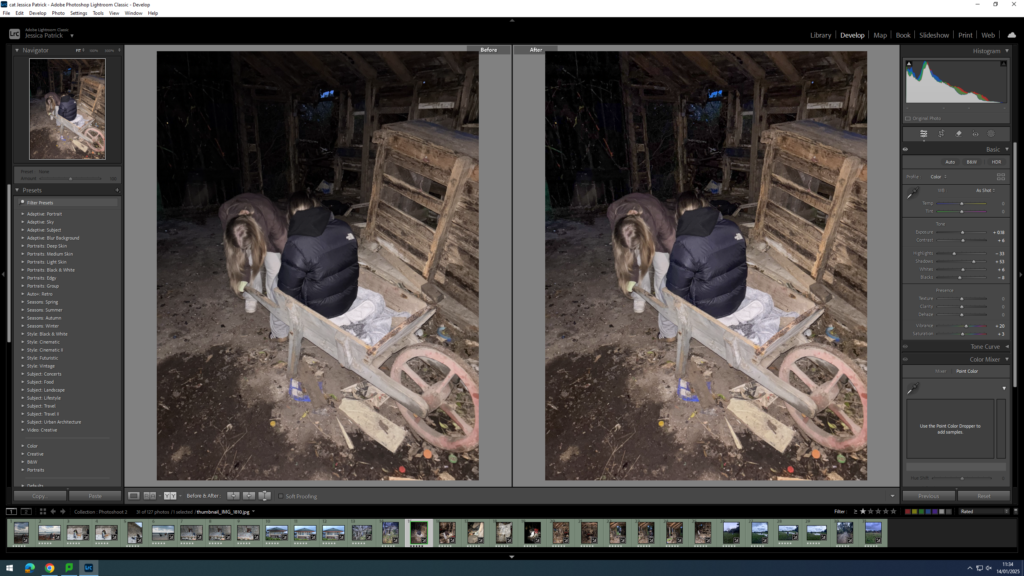
I edited this image by increasing the exposure, contrast, shadows, whites, vibrancy and saturation, while decreasing the highlights and blacks. I did this, so that the image was slightly more exposed.
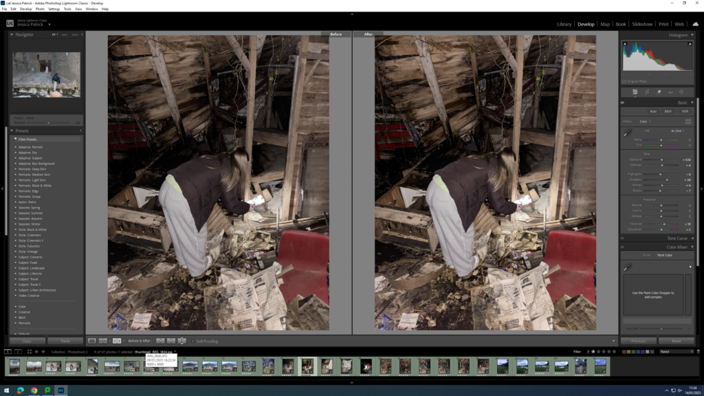
I edited this image by increasing the exposure, contrast, shadows, whites, vibrancy and saturation, while decreasing the highlights and blacks. I did this, so that the image was more exposed and more vibrant.
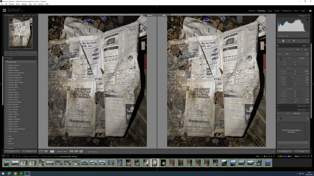
I edited this image by increasing the exposure, contrast, shadows, whites, vibrancy and saturation, while decreasing the highlights and blacks. I did this, so that the paper was less white and had more of a yellow tone, so that it would appear older.
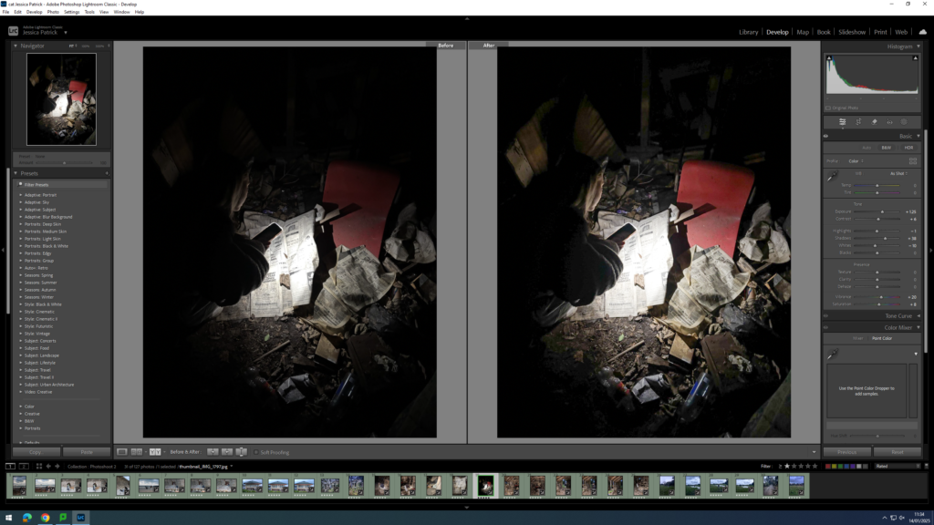
I edited this image by increasing the exposure, contrast, shadows, vibrancy and saturation, while decreasing the highlights and whites. I did this, so that the image was more exposed, so that the subjects flash was brighter and more could be seen.
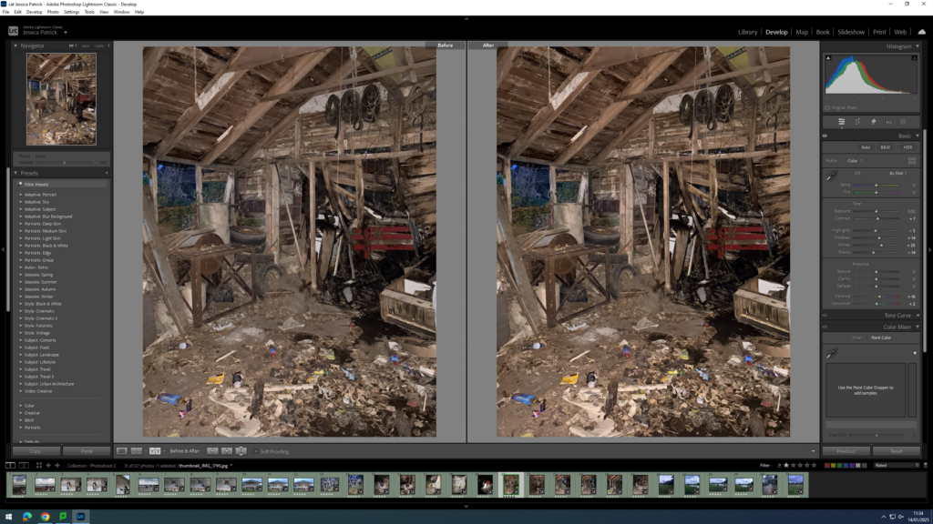
I edited this image by increasing the contrast, shadows, whites, vibrancy and saturation, while decreasing the highlights and blacks. I did this, so that the image was more vibrant and saturated.
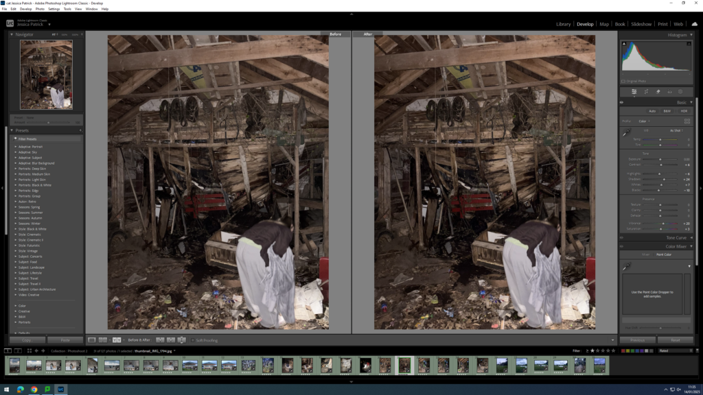
I edited this image by increasing the contrast, shadows, whites, vibrancy and saturation, while decreasing the highlights and blacks. I did this, so that it is more vibrant.
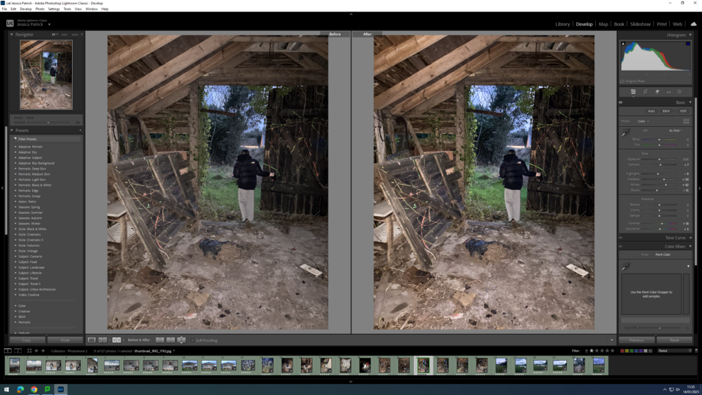
I edited this image by increasing the contrast, shadows, whites, vibrancy and saturation, while decreasing the highlights and blacks. I did this, so that the image was slightly brighter and the paint splatters were more vibrant.
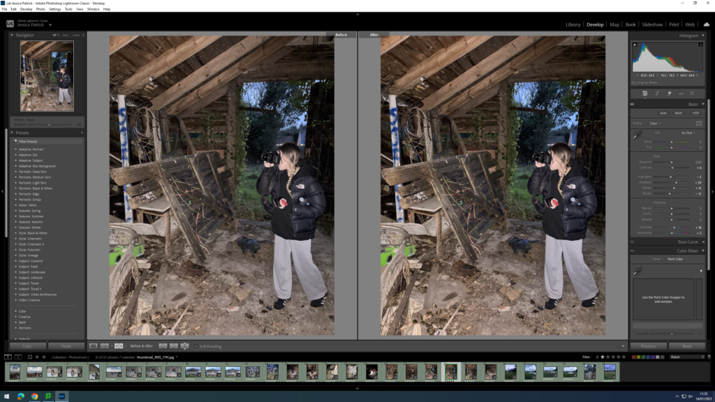
I edited this image by increasing the contrast, shadows, whites, vibrancy and saturation, while decreasing the highlights and blacks. I did this, so that the image had slightly warmer tones through it, rather than cool tones.
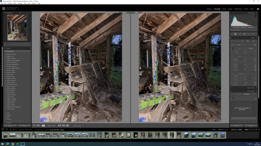
I edited this image by increasing the contrast, shadows, whites, vibrancy and saturation, while decreasing the highlights and blacks. I did this, so that the image was slightly brighter and the colours of the paint were more vibrant.
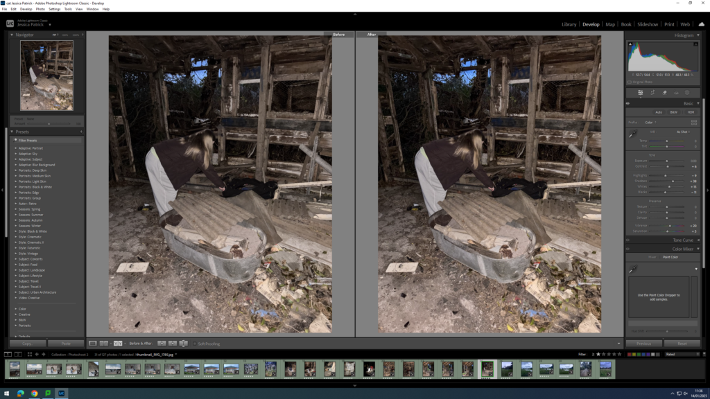
I edited this image by increasing the contrast, shadows, whites, vibrancy and saturation, while decreasing the highlights and blacks. I did this, so that the image was slightly brighter.
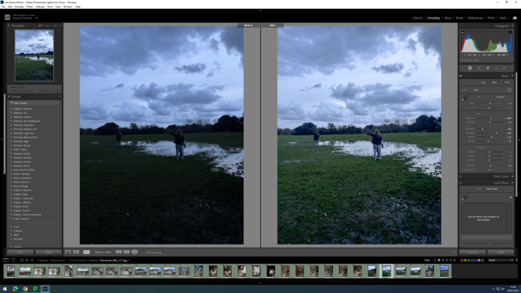
I edited this image by increasing the exposure, contrast, shadows, whites and vibrancy, while decreasing the highlights and blacks. I did this, so the image would be more exposed. I also added a yellow tint, because the image had lots of blue tones through it, so I wanted to cancel them out.
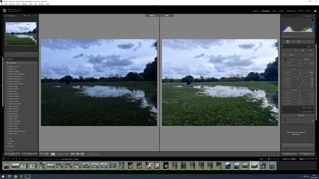
I edited this image by increasing the exposure, contrast, shadows, whites and vibrancy, while decreasing the saturation, highlights and blacks. I did this, so that the image was more exposed. I also added a yellow tint, because the image had lots of blue tones through it, so I wanted to cancel them out.
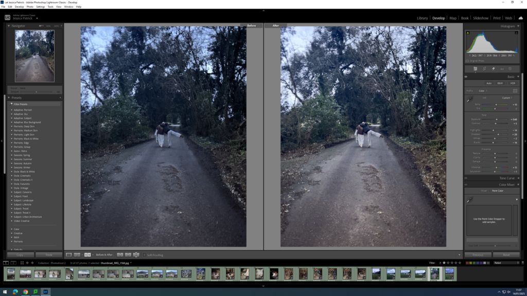
I edited this image by increasing the exposure, contrast, shadows and vibrancy, while decreasing the whites, saturation, highlights and blacks. I did this, so that so the image would be more exposed. I also added a yellow tint to this image, because there were lots of blue tone throughout it.
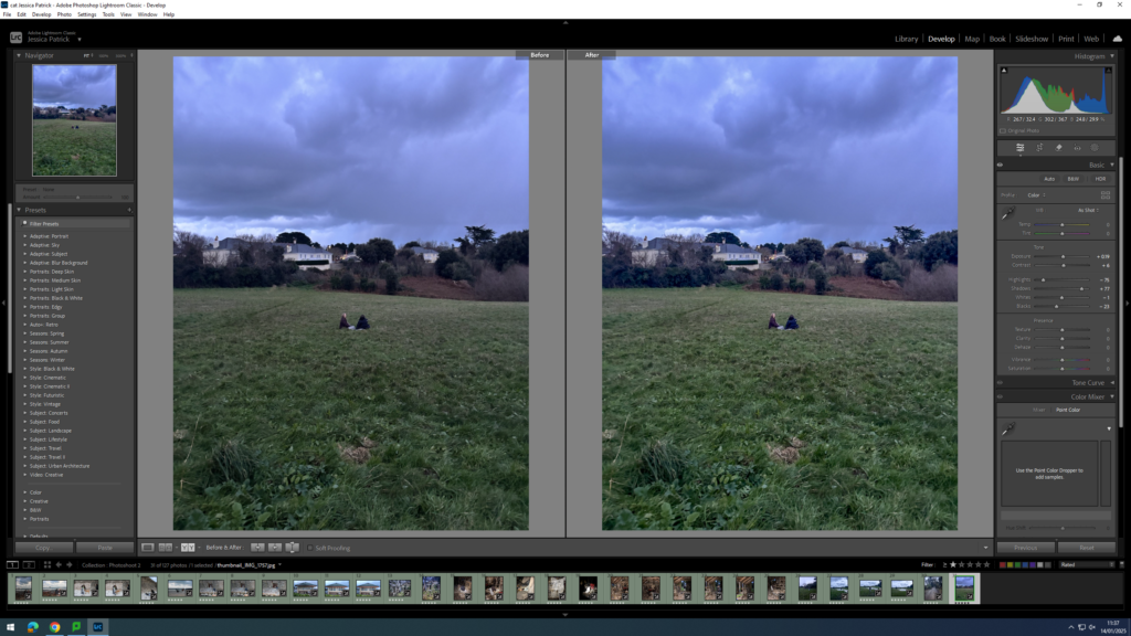
I edited this image by increasing the exposure, contrast, shadows and vibrancy, while decreasing the whites, saturation, highlights and blacks. I did this, so that the image was slightly more exposed. I also added a yellow tint to this image to cancel out the blue tones in it.
Photoshoot Conclusion
Overall, I think this photoshoot went well, because I was able to create and present different narratives of activities I used to do when I was younger. I was also able to experiment with shutter speed in this photoshoot, so I could create movement in my photos.
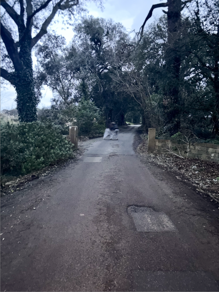
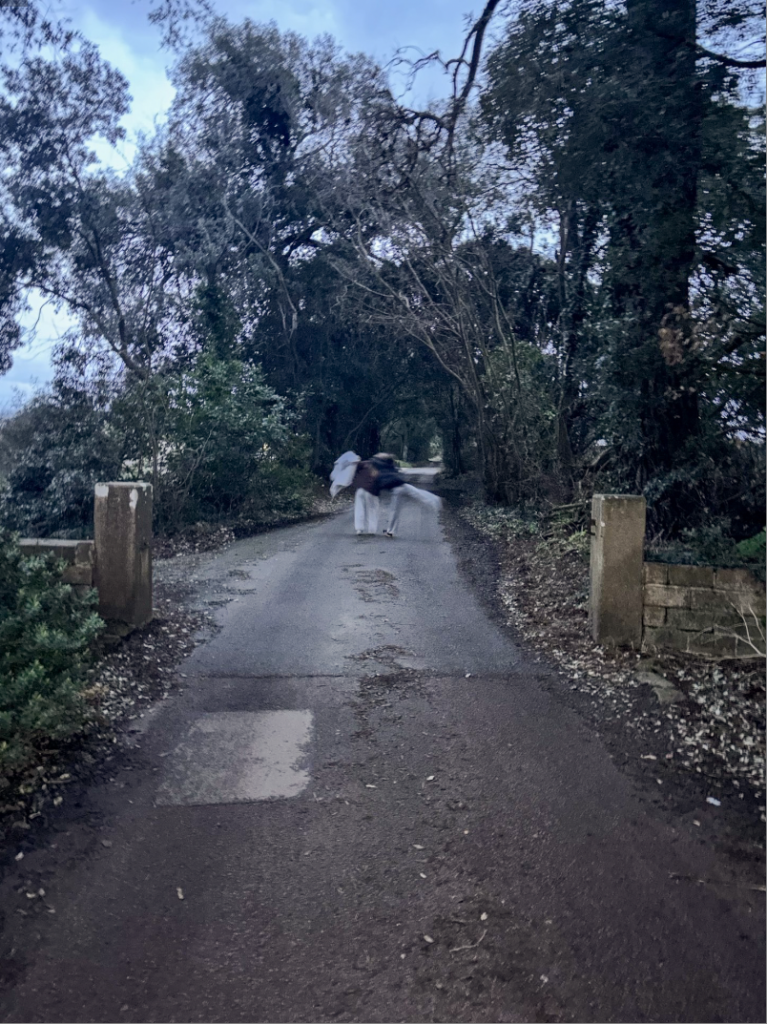
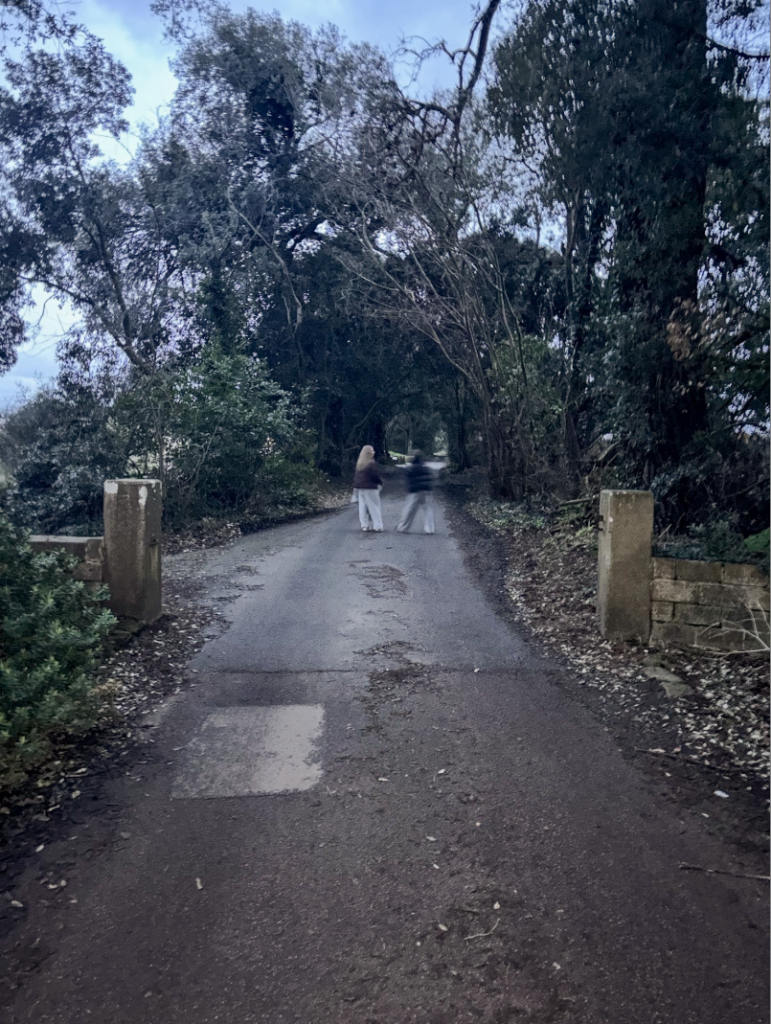
However, I thought the still image walking down the lane was more visually pleasing, but I am glad I experimented.
I was also able to get detail shots, which would be good to use in my photobook to break up my images a bit.
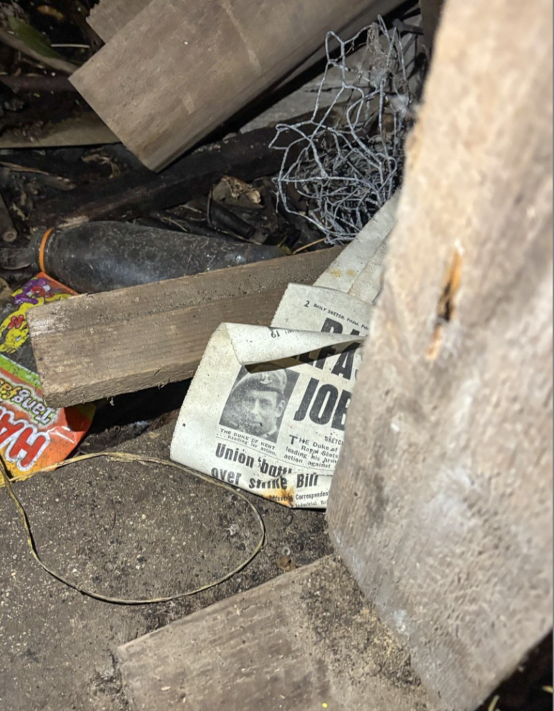
However, next photoshoot I would need to go out a bit earlier, as it started getting dark very early, meaning I had to use the flash, which didn’t create the best lighting for the images.
