Contact Sheet:
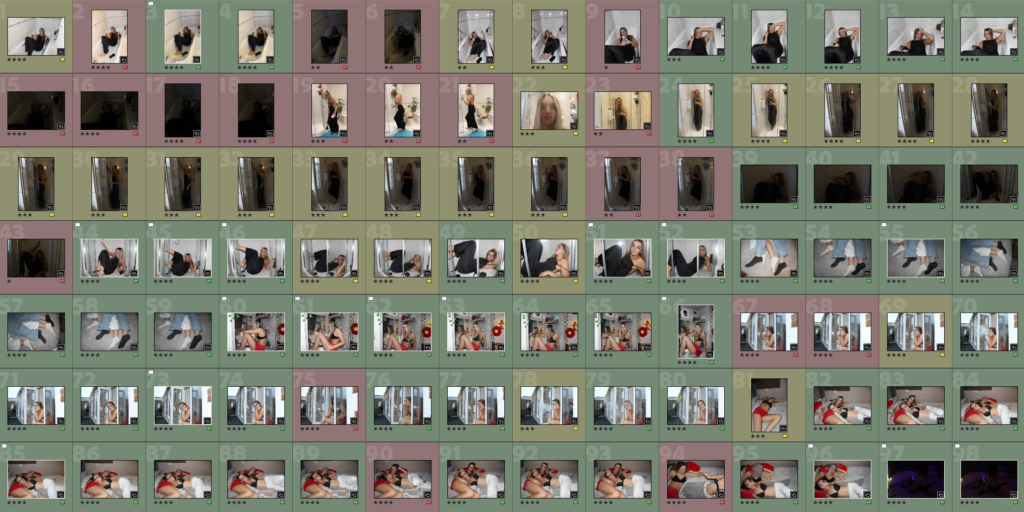
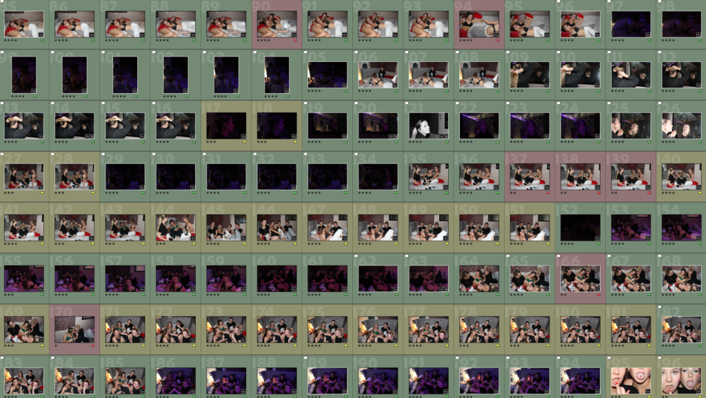

For my second personal study photoshoot, I chose to use 4 of my friends as models and recreated scenes inspired by Justine Kurland and Ramona Wang. The location of this shoot was in indoor and outdoor locations, meaning I was able to get a range of different images portraying different feminine ideas and perspectives. This differs from the first shoot I executed because it was only based on outdoor scenes, meaning I only had a limited amount of different backgrounds to include, which didn’t add any unique elements for me. Although this photoshoot incorporates factors from both my artist inspirations as they share focus on femininity, within this photoshoot I have portrayed similar aesthetics to Roberta Tocco specifically because she includes female models often displaying a close relationship with one another, for example physical touch, in her images. I have recreated these by photographing my friends including myself exhibiting these ideas, where we are often seen as being feminine by ‘comforting’ one another. I believe that the use of physical touch between females successfully links to my project and the overall themes, this is because stereotypically, women are seen as nurturing due to us having duties of having children, and this highlights the importance of having emotional connections with others. Other photos I captured such as portraits of one model individually can also link to youth and femininity due to the fact by having one female model in an image the viewer is able to make assumptions of why the image was taken, what I am trying to portray and identify what the main subject is. Contrastingly, I did photograph outside in a dark and empty car park, where we took the images of the girls out the car window and on the car bonnet. The reasoning behind this was to illustrate teenagers girls and their fantasy life, which again links to Tocco and her focus. These images show the feelings girls have towards growing up and becoming young adults who need to find their own identity. By photographing youthful and women-like factors, it allows me to begin telling my own story through my own personal experiences of being a young woman who is slowly steering away from childhood, and I feel that these images represent girlhood and youth effectively.
On Lightroom, I imported all 273 images from my shoot, and placed them in a new collection named “Personal Study photoshoot 2” so I could have future access to this photoshoot. I then flicked through all the images, and deleted the ones that had no potential and perhaps did not reflect my artists or display the themes I am focusing my project on. Next, I categorised all my images into one of three categories by colour coding; green, yellow or red. Which makes the editing process easier as I will only want to edit the green images, the ones that have the best lighting, camera focus, shutter speed and iso etc. During this, I also flagged the best images from the shoot, meaning I can differentiate them from the rest when I come to edit them, and therefore only focus on my best outcomes.
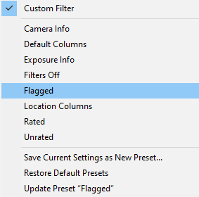
Furthermore, to begin my editing process I selected just my flagged images to edit so it separates them from the least successful outcomes. This made it easier for me, so I can identify which images I want to include from my shoot into my final book.
Editing:
The following images I have edited are my best selections from photoshoot 2, where I mainly took inspiration from Ramona Wang, yet I also included inspirations from Justine Kurland in the sense of careless teenage runaways.

For my first edit, this image has an overall mood of melancholy due to the models facial expressions. Therefore I wanted to exaggerate these feelings through decreasing the saturation of the image, which makes it appear colder to the viewer. By increasing the contrast too, I extenuated this to add more depth into the image and overall increase the intensity. However, despite it looking effective by itself, I don’t think this image will fit into the rest of my photobook as it is not the aesthetic I am aiming to show.
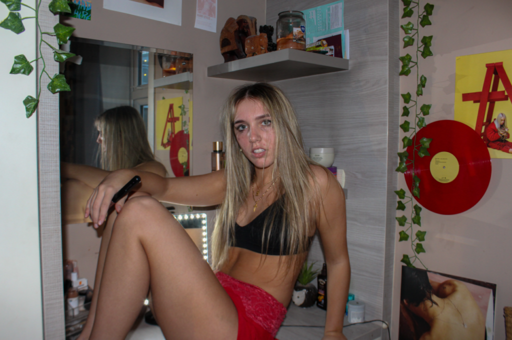
I edited this image again, this time keeping saturation within it as I feel it gives the image some life. Although the models facial expressions show sorrow and dejection, I believe that by adding more vibrancy it is able to lift the overall mood of the image, which will take the viewers attention away from just her face and allowing the viewer to appreciate the background. I decreased the highlights in this image because I didn’t want the LED lights on the mirror to be too distracting and blinding, yet they are still noticeable, which I wanted them to be as mirrors and lights can link to girlhood and youth through ideas of makeup.
Edit 2:
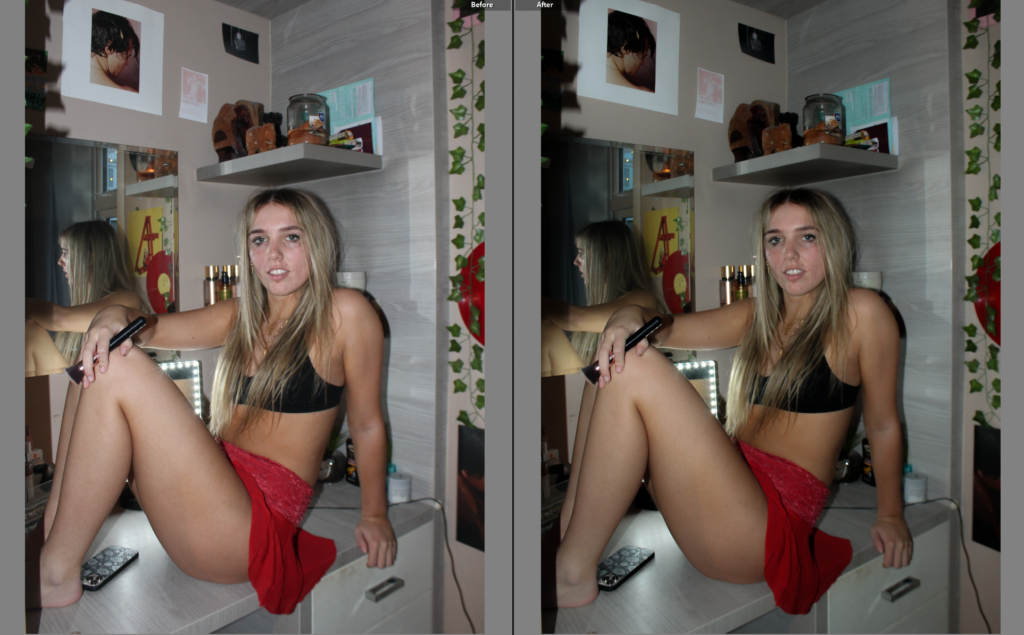
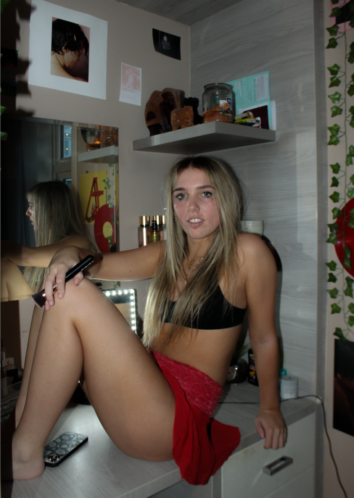
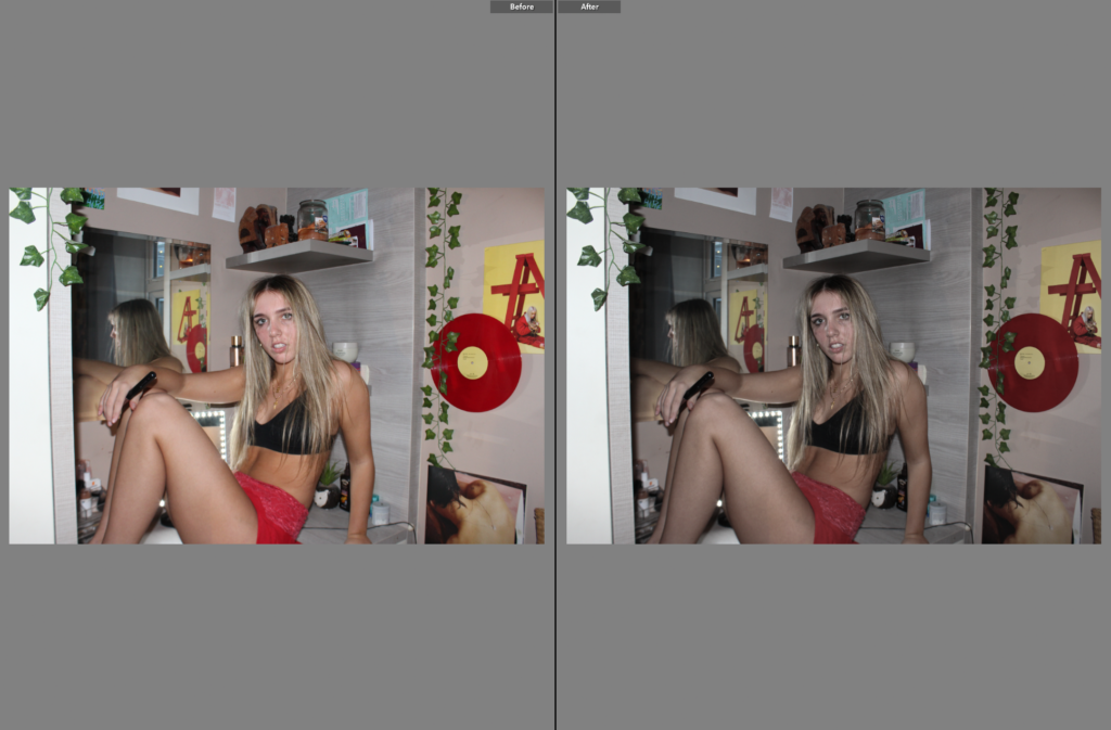
With my second edit I took a similar approach to the first, as it is the same model in the same location. However I feel this image has more potential due to it being a portrait, which immediately implies that the main subject is the model, rather than letting the viewers eye wonder through the image. I wanted to include her outfit into this image, specifically the skirt as I think it represents feminine qualities and stereotypically, red is a lustful colour that women wear. As these elements within the image are prominent, I decided to keep the editing minimal to prevent distractions and giving the overall outcome a fictional aesthetic. I increased the contrast to add exaggeration and make the image look magnified, and keeping the whites and highlights significantly low so it doesn’t look too luminous.
Edit 3:
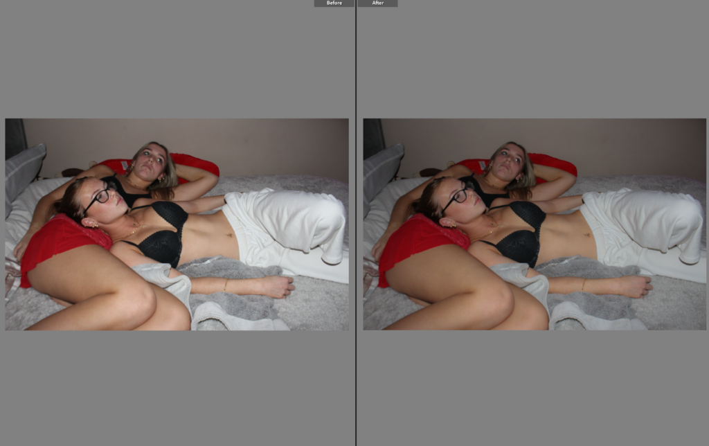
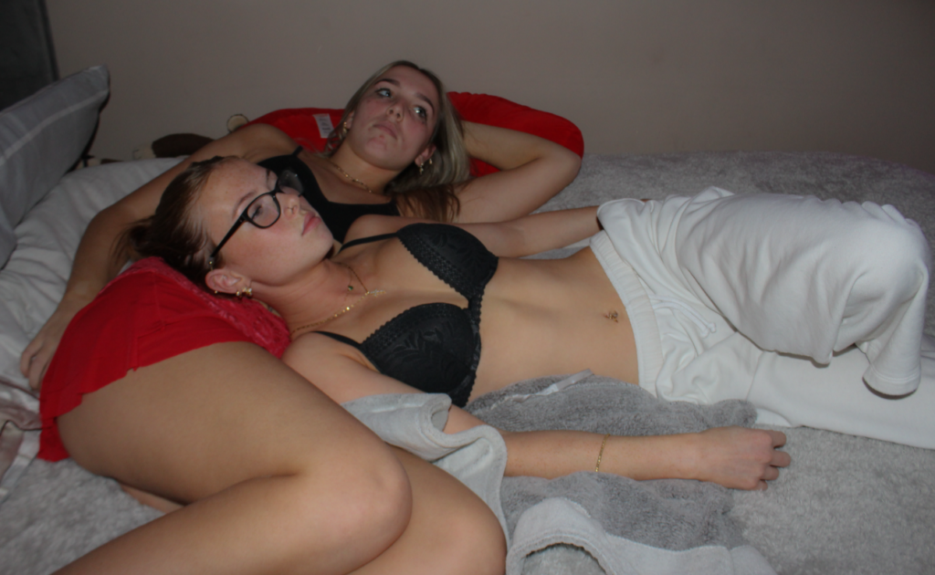
I decided to recreate some of Roberta Tocco’s approaches to editing this image, by keeping the image vigorous through decreasing the exposure which allows the colours and tones within the image stand out. I decreased the clarity in this photo, giving the image a more delicate and romantic mood. I think this works well as throughout my project I will be highlighting romance and delicacy in order to portray ideologies about femininity. Furthermore, I slightly increased the vibrance to accentuate the shades of red because I think they are an essential factor of the girlhood theme.
Edit 4:
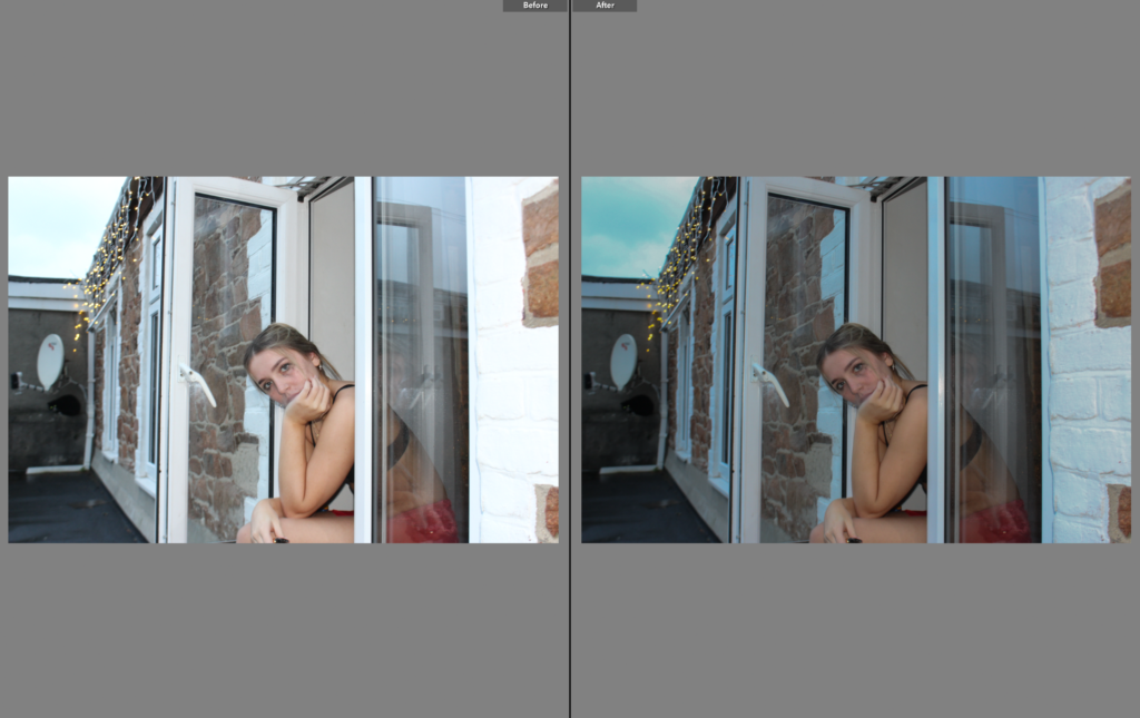
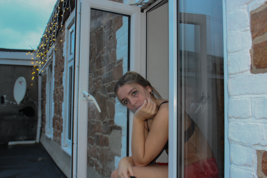
As this image was taken at dusk, it has slightly cooler natural lighting, which is definitely something I wanted to take advantage of because this was one of Tocco’s main components, as it gives the image a more simplistic overall look. To make this stand out, I decreased the exposure slightly so the section of sky in the background wasn’t too outstanding and so it could blend in naturally with the rest of the colours throughout the image. I did not increase the contrast in this image specifically because it allows the image to appear softer and perhaps more feminine, rather than harsh. Similar to the previous image I edited, I also decreased the texture and clarity to make the image look simplistic.
Edit 5:
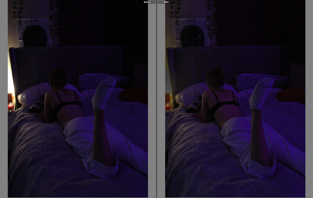
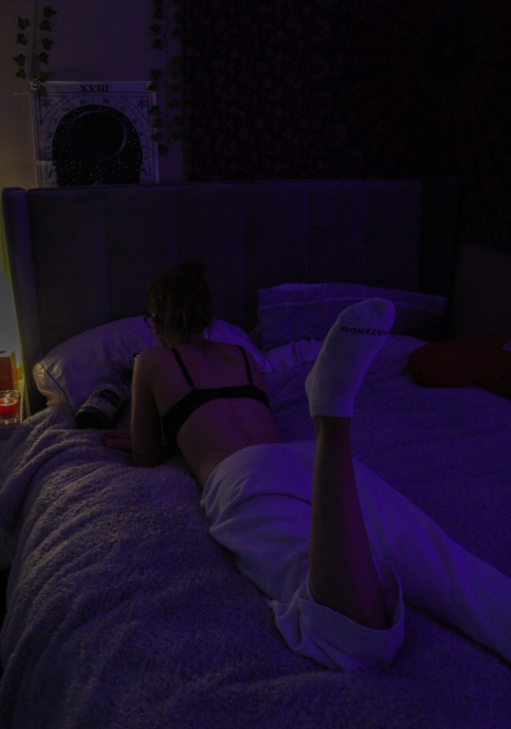
As my fifth photo had artificial and vibrant lighting, this contrasts from the rest of my images as it doesn’t execute the same realistic theme, so I wanted to make the image appear brighter so it could still be eye-catching. Therefore, I increased the exposure slightly so it wasn’t too dark, and kept the rest of the adjustments minimal to stop it from looking insincere. Again, I decreased the highlights and whites significantly because the candle on the left of the image was too bright and exposed, leaving the rest of the image looking bland. Yet, I kept the contrast neutral so the darker tones within the image were still visible.
Edit 6:
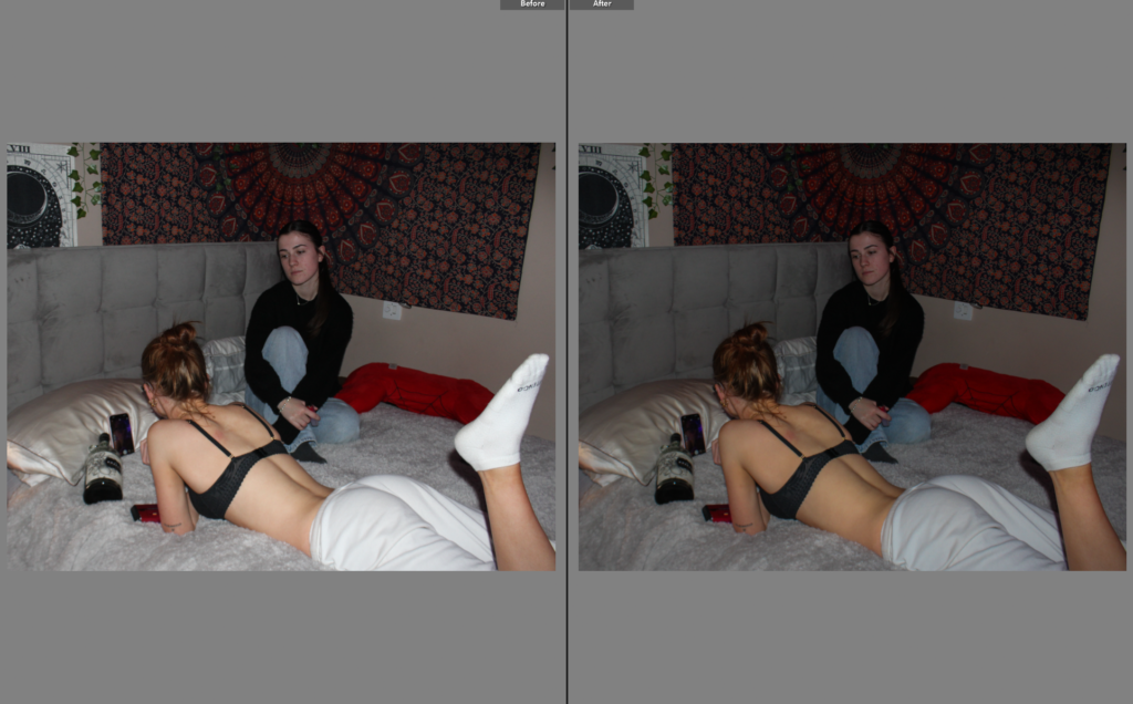
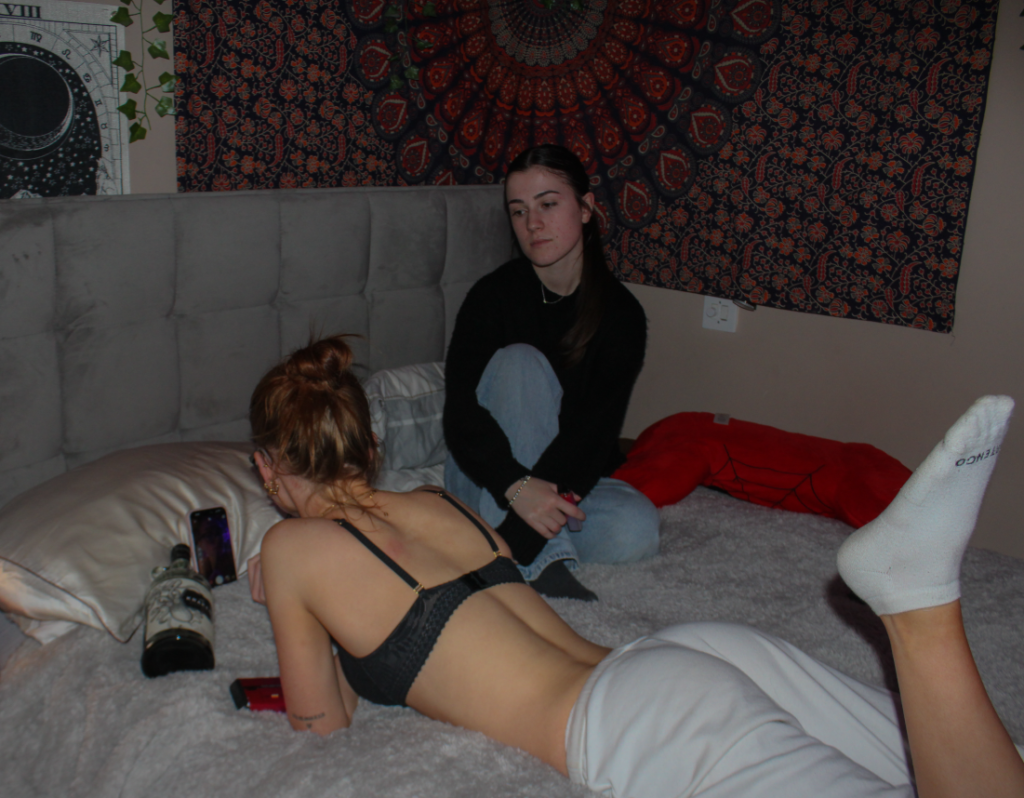
Firstly, I decreased the exposure slightly because I wanted the range of colours throughout this image to be seen as I think the different colours contrast each other, which makes the background more exciting. I kept this image in colour as I believe it adds a sense of realism as we see the world in colour and not black and white. Moreover, I am trying to portray a realistic idea within this image especially as I feel that my models facial expressions indicate jealousy. As jealousy is a common emotion felt by females growing up, I am able to draw the viewers attention to this which may be relatable. Therefore, there is very little editing in this image besides slightly increasing the contrast to add depth and emotion.
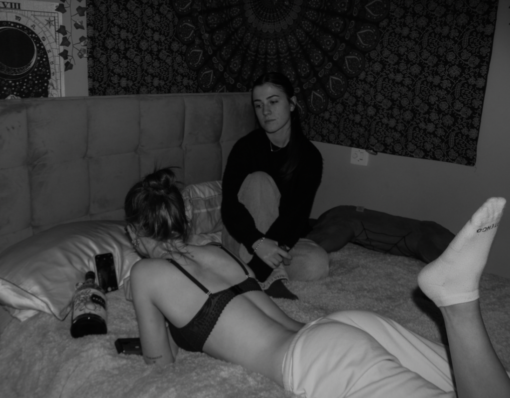
I also experimented with using a black and white filter on this photo, however I do not think it looks as effective as in colour. Despite black and white being stereotypically associated with sadness and realistic emotions, I feel that the image in black and white gives a surreal theme overall. Additionally, I believe it emphasises how the image is staged, which defeats the purpose of the themes I am portraying.
Edit 7:
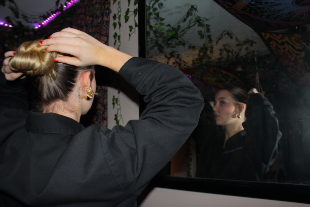
With this image, I decreased the temp to 0 because I wanted to give the image a cooler tone, where the colours within the image can contrast each other, as well as allow the main subject to stand out against the background. By increasing the contrast and decreasing the exposure, this allows the viewer to focus on the model as it exaggerates the use of the flash on the image. Overall, the main subject already stands out due to the shadowy background, I wanted it to stay this way so I ensured the viewers eye would wonder through the foreground first, and then through the background.
Edit 8:
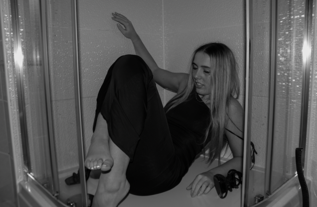
As this photo was taken in a unique location, I wanted to make it black and white to reflect girlhood and the struggles that come with growing up as a girl. Overall, the image has a melancholy mood to it, I wanted to accentuate this idea by decreasing the exposure so it is easier to notice the details in the image, and so it didn’t appear too blinding to the viewer. I also decreased the whites and increased the blacks to bring out the depth in the image and therefore add more of a depressing effect.
Edit 9:
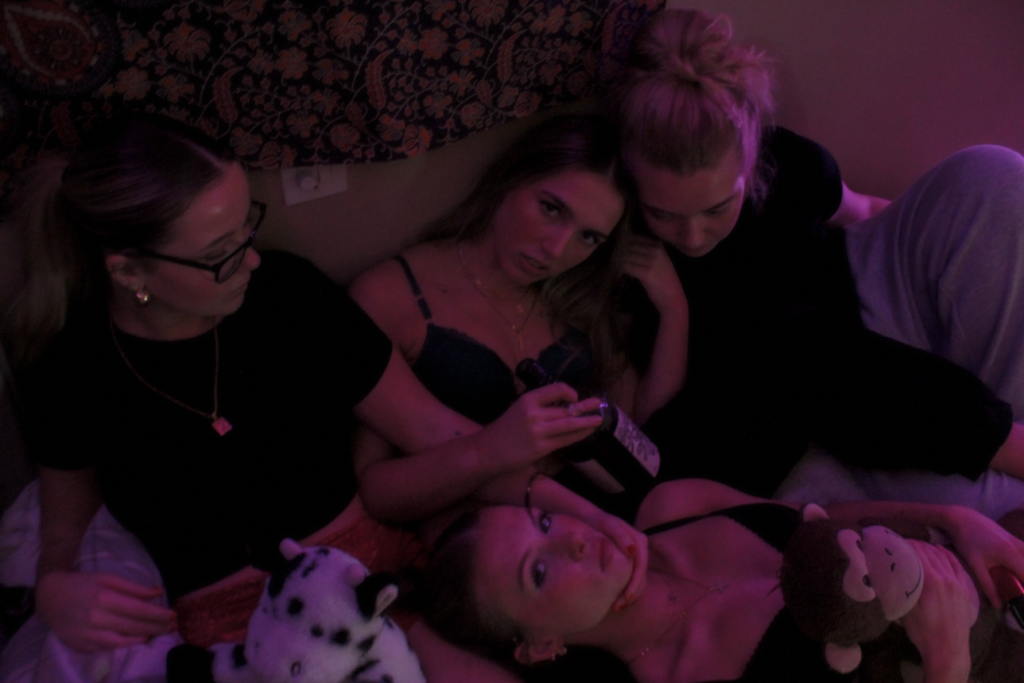
Due to this photo having multiple people in it and the frame is full, I did not want to edit excessively. I decreased the exposure to make is easier to see what’s in the image, as well as decreasing the contrast so it wasn’t too intense, as I think the models already carry the overall photo. Due to the lighting being typically darker already, this brought out many of the textures throughout forcing it to look grainy. Therefore, I slightly decreased the texture to minimise this, yet increased the whites significantly to add some vibrancy.
Edit 10:
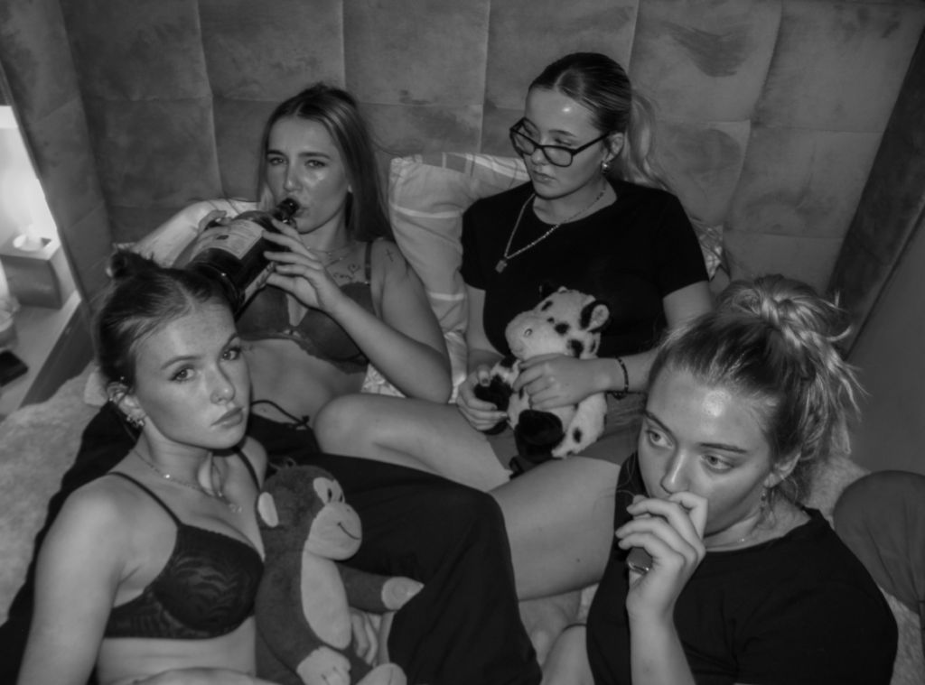
This image is similar to the previous one above so I changed it into black and white so the differences between them can be interpreted easier. However, I believe this image already has a staged approach and I think the black and white emphasises this. I decreased the highlights to -100 as it allows for the different tones to contrast effectively with each other, as well as not having too much light in the image. In addition, I slightly increased the contrast because it exaggerates the black and white effect, although I think it decreases the authenticity of the overall photo. I did not edit much more because I didn’t want to draw too much attention to the fact it is staged. Overall, I believe this image would look significantly better in colour to defeat this narrative.
Edit 11:
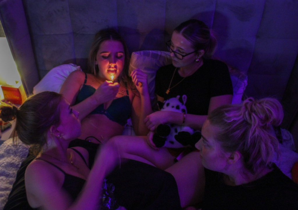
This edit is very minimal, as again it shares a similar aesthetic to the two previous outcomes. However, due to this one specifically having coloured lighting, it already stands out from the others. Meaning I had to decrease the highlights and the whites to keep an overall neutral lighting, and I wanted the fire from the lighter to be visible and vibrant. I increased the shadows to bring out the main subjects, which I think looks essential for the theme of my photoshoots. Lastly, I had to decrease the texture to add a smoother effect because the lighting is darker in this image compared to the others, meaning it was harder for the camera to capture accurate interpretations of the setting.
Edit 12:
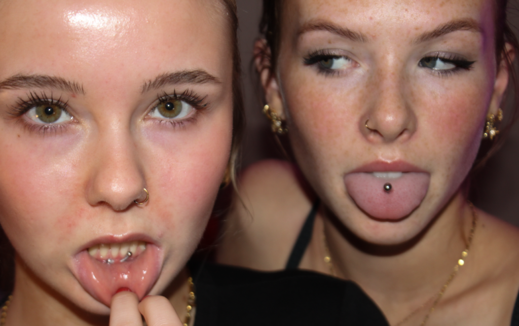
This image of two models is very close up and personal, so I kept the editing minimal so I can represent my theme of youth and identity well. This is because I believe I need to present my photoshoots as realistic, and staged as little as possible. I decreased the texture so the viewer can focus on the eyes and the jewellery on the models, as they are a very important factor of girlhood and representations of being a girl. I decreased the exposure so there was the right amount of luminosity in the image. I also decreased the temp to -100 as it gives an overall neutral tone, as before this edit the image was very cool-toned. Lastly, I slightly increased the contrast to exaggerate.
Edit 13:
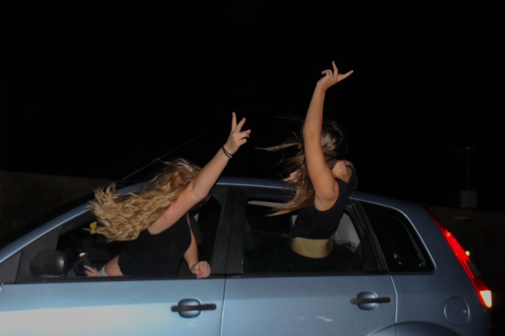
In this image, I figured that by matching the exposure and contrast so they can reflect each other, this would bring out the main subjects yet not bringing in too much lighting. I wanted the car to appear vibrant and colourful, as I feel this is a way of presenting girlhood and youth too. I increased the contrast to keep the dark background, I feel that this links effectively to Justine Kurland and the rebellious behaviour from the teenage runaways. I also decreased the highlights to prevent the camera flash from reflecting too much on the car.
Edit 14:
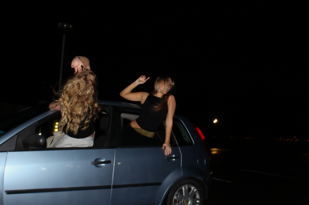
As this image is very similar to the previous, I kept the editing very minor to bring out the main subjects and so they can work well against the dark background.
Edit 15:
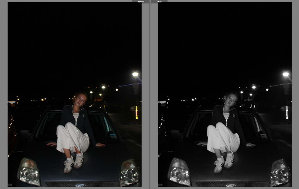
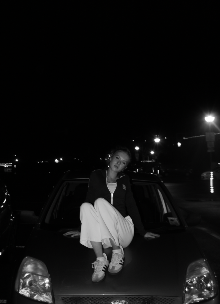
For my last edit, I changed it to black and white to create a drastic and tense effect. I thought this would compliment the overall artistic effect, which also works together with the dark background. I decreased the whites and highlights so they didn’t appear reflective, and by doing this it made it easier to focus on the models face, without too much brightness.
