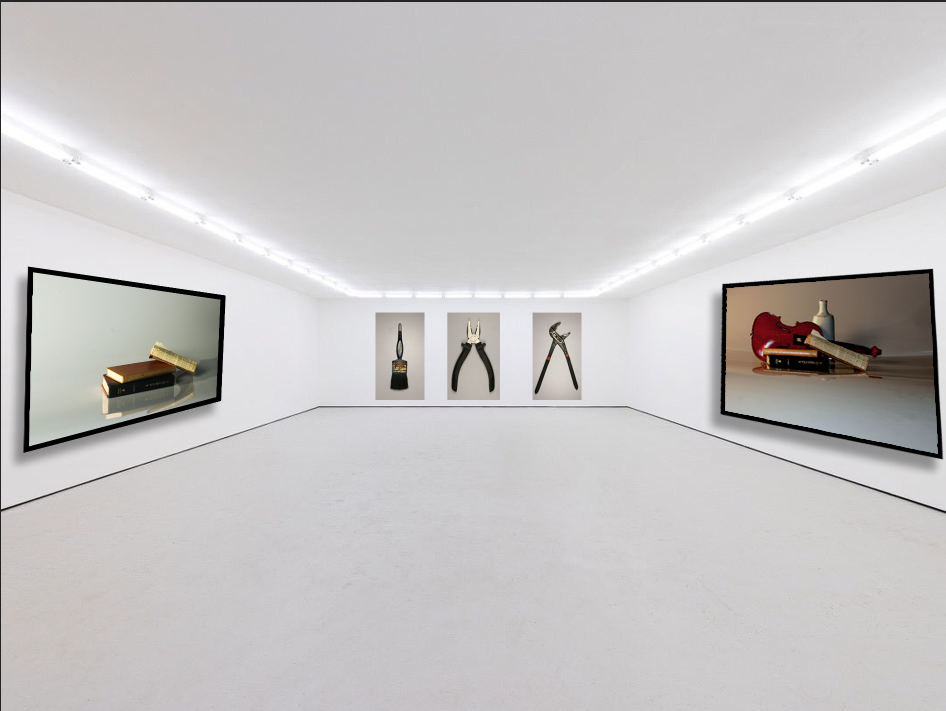
This is my virtual gallery where I have presented my favourite photos that I have taken. I chose this layout because it is very plain and lets you focus on the photos without having any distractions in the background. I have put in two of my favourite still life images on the side and my tools object photos at the back in a row for an organised gallery. The frames around the still life images are plain black to make the photos easily visible and make them stand out more. They are angled forwards and with shadows for a 3D look to make it look like they are in an actual gallery.
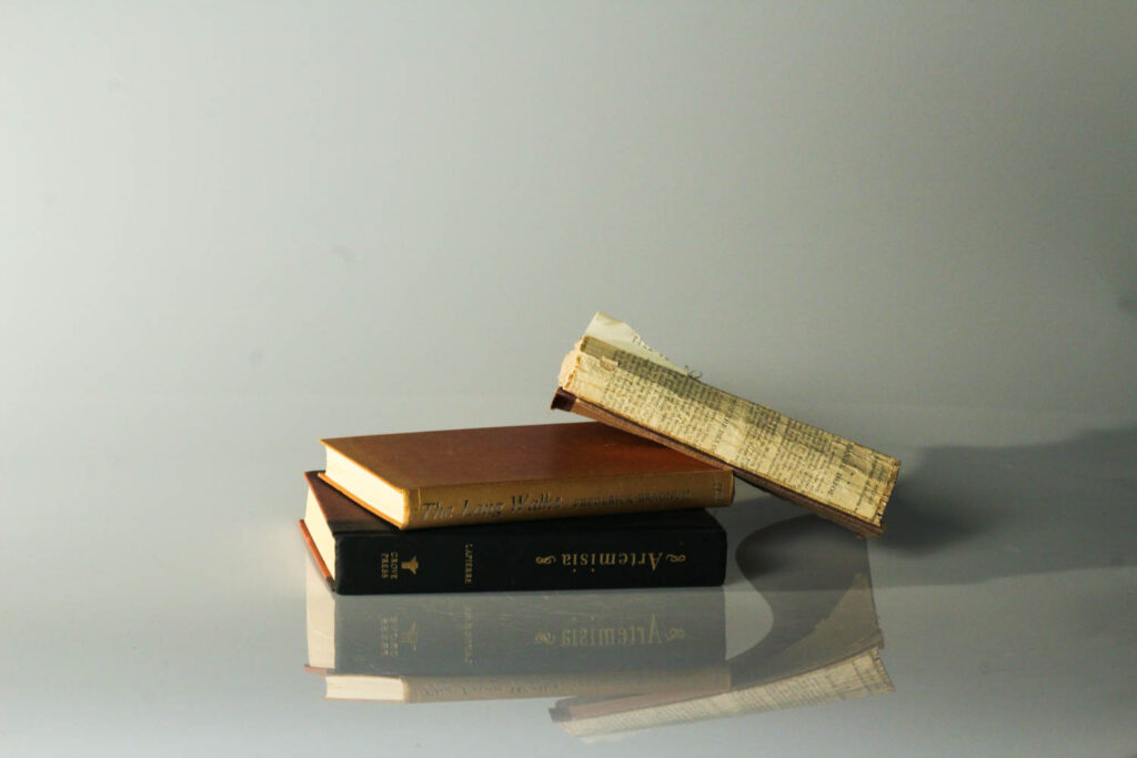
I chose this photo because I like the colder tones of this photo rather than the warmer tones of the violin picture opposite it. it is a nice comparison in still life and shows how there is both cold and warm tones in both photos that has similar vibes but different contrasts.
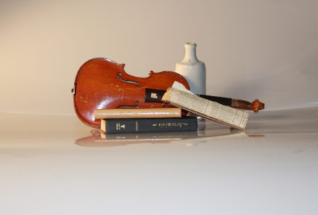
I used this photo because I really like the angle its shot at and it contrasts nicely with the other still like imagine in the gallery. the violin is a warm tone and it looked better than when it was originally dull and neutral.
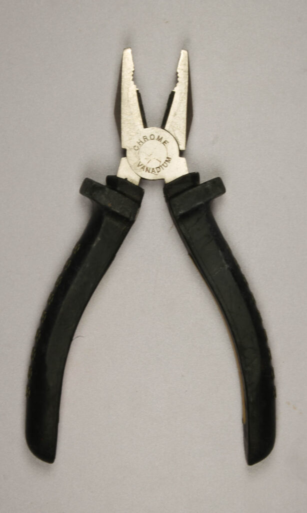
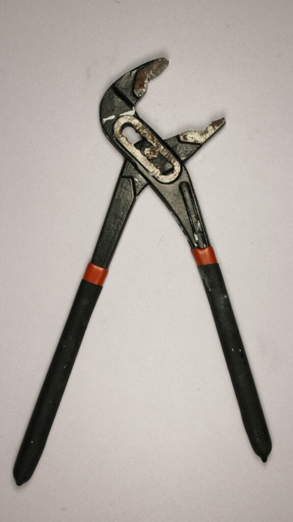
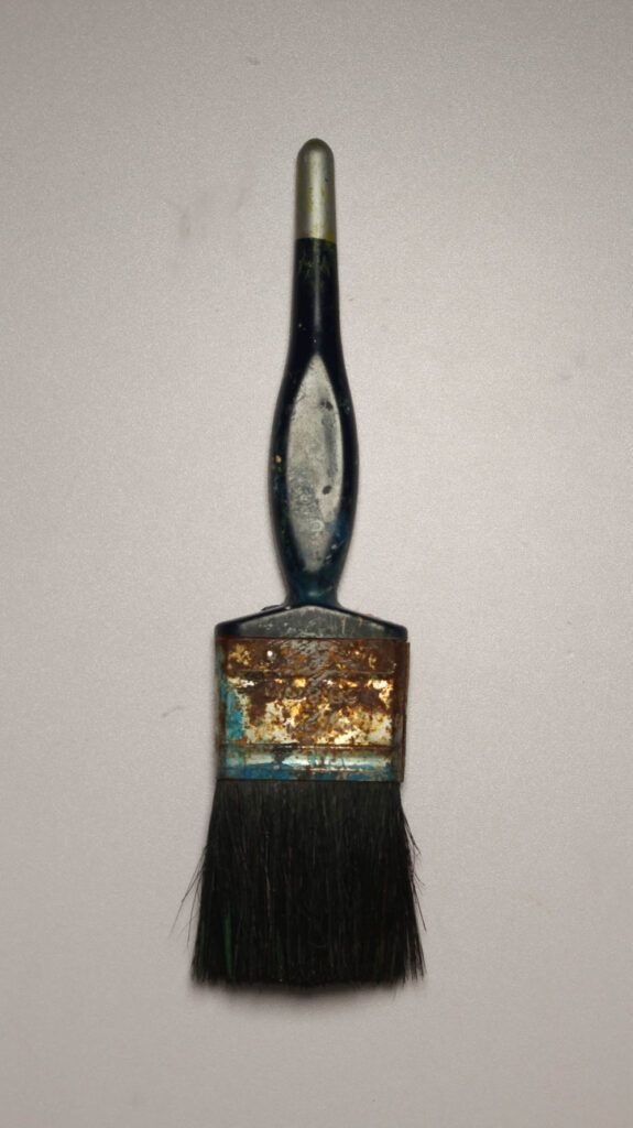
For these formalism photos I have presented at the back of my gallery because I think it looks organised and neat compared to if they were spread around on the walls. I chose these three photos as I think they are the best looking out of the tools photoshoot and I like how I have presented them in the gallery.
