Edgar Martins is a Portuguese photographer and author who resides in the UK, best known for his documentary work on conflict, war and testimony. However, many of Edgar Martins work also represents personal, internal conflicts within himself and stories told from his life through using staged fictional depictions.
Edgar Martins work is represented internationally at numerous renowned museums as well as many other collections such as:
- PS1 MoMA,
- MOPA,
- MACRO,
- MAAT,
- CIAJG,
- The Gallery of Photography Dublin,
- The National Media Museum,
Martins has also become the recipient of many awards such as:
- RCA Society Book Art Prize (2002),
- The Jerwood Photography Award (2003),
- The New York Photography Award (2008),
- The BES Photo Prize (2008),
- The IPA (Fine Art— Abstract category, 2010),
- The SONY World Photography Awards (2018),
Some of Edgar Martins work:

Martins work has a lot of abstract concepts within it, for example the first image that I have displayed shows two sides to the same photo, with the image on the left initially making the viewer believe that some sort of mirror is being held over a persons face, however when this shape is removed it reveals a man holding a chain into his mouth as if he is swallowing it. This consists of a lot of deception towards the viewer and tends to make them ‘think about the bigger picture’, really getting them to question it conceptually rather than just seeing the composition alone face on for what is within the frame. I really like this idea especially through the topic of ‘mirrors of the world’ because it portrays this subjectivity and storytelling nature, full of fictional components that transform an image into a visual piece of art.
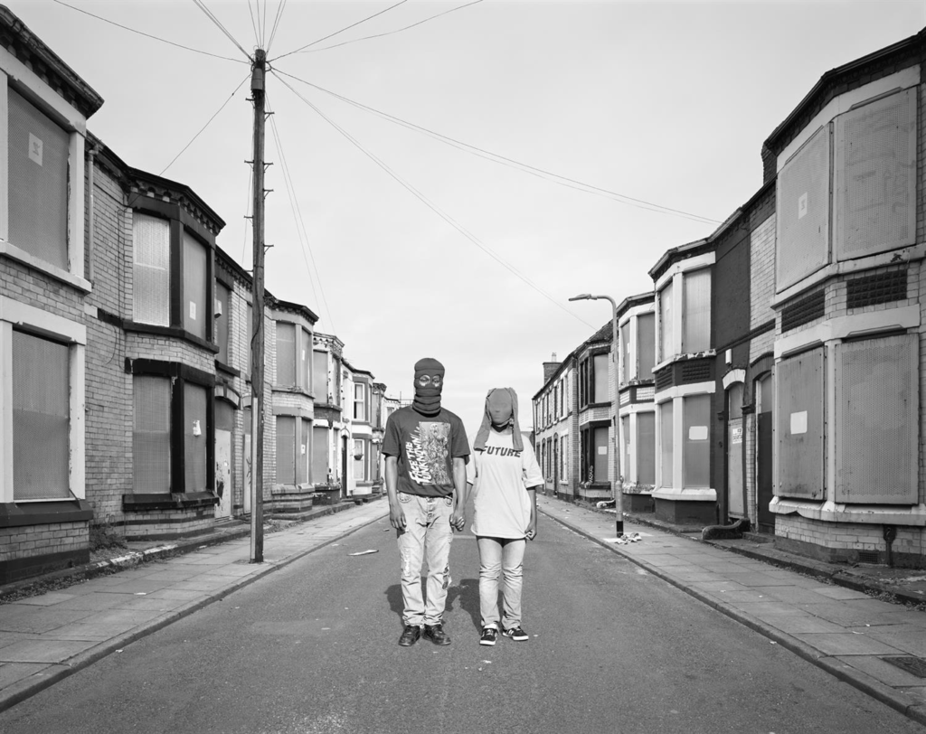
In this image, the first thing that draws my eye is the leading lines down the centre of the image leading to the two subjects in the centre. With their identities concealed, I think that this image makes the viewer question who they are and what their backstories are – the fact that they are holding hands connoting themes of community, relationships and togetherness. However, the desolate streets they are standing on looks off-putting and almost wrong, as if it shouldn’t be occurring in this way as it is so odd and uncanny. This weird composition is very obscure and intends to make the viewer feel uncomfortable so that they really acknowledge the personal reflection that is being shown here. Once again, the draining off of colour from the image makes it appear more sincere and serious as that level of vibrancy is gone, making the image speak for itself without any colour to try to evoke or support the emotion being portrayed. The boarded-up windows placed on each house gives the image a sense of danger and a need to be cautious because we don’t know what is being hidden here or what has occured in order for the past events to be covered up. The plainness of the image, for example the sky only having few electric lines spanned across or the one street light stemmed in the far background, ensures that the two people in the foreground are the focal point of the image and highlights to the viewer that there is a story here that needs to be heard as it is so unusual.
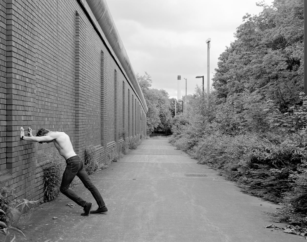
Similarly, the leading lines that oppose the practically blank sky makes the image appear uncanny and abnormal, leading off into a darkness concealed by trees to highlight that area of mystery and suspense. On the left is a elongated wall of purely bricks, opposing an entire block of vegetation. This gives a visual version of a binary opposite, man-made versus natural, bordered by a pathway. I think this works really well as this could be used as a concept for the way that humans are consistently wanting to use these harsh man-made techniques in order to develop society instead of sustainable sources. The subject leaning against the wall creating dynamic shapes with his leg, connotes emotions of anger and distress. Because he is turned away from the greenery that is appearing to reach out towards him, suggests that he may feel shame due to his conscious or unconscious contribution to polluting and ultimately destroying the world.
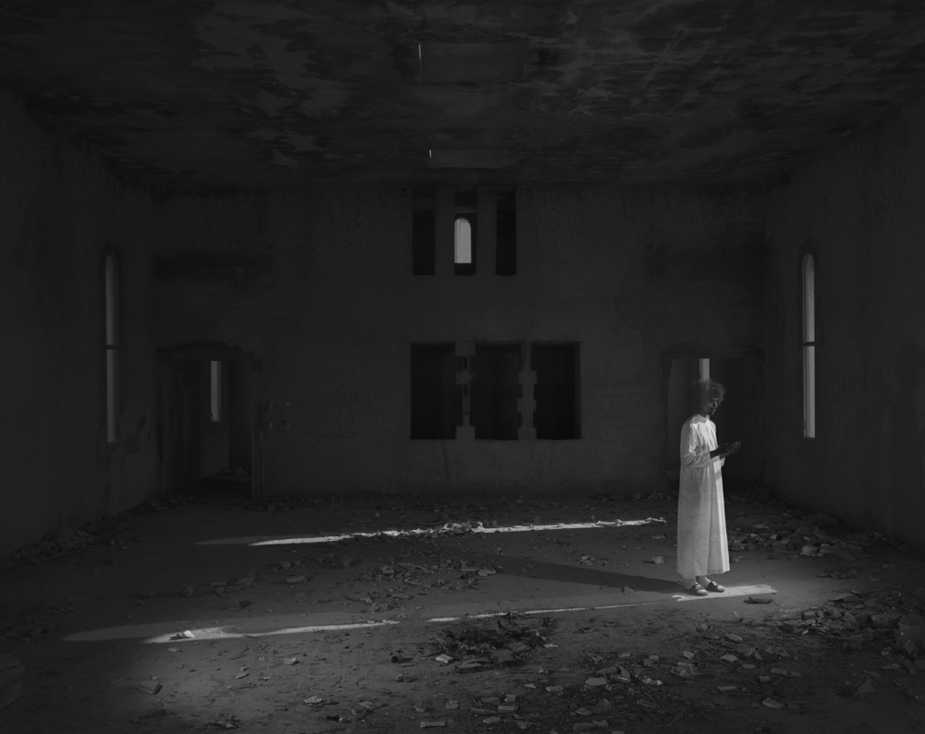
In this image, the figure looks almost translucent which suggests that this is the result of a double exposure edit on photoshop, for example. The emptiness of the room emphasises the dirt and decay that’s spread around the room, adding emotions of loneliness and isolation. The parallel lines placed in the centre of the room lead the viewers eyes to opposing ends of the room so that they focus on the entire image instead of just the brightened area. The exposure of the room is quite low, however its bright enough to ensure that the viewer can see the stains arranged on both the ceiling and the floor in-between the patterns of leaves. The ghostly aura this image inhabits stems from the project Anton’s Hand is Made of Guilt, tributing to his late friend Anton Hammerl. The way that he figure in the room is the only thing that is brightened gives them a sense of purity and cleanliness especially due to the gown that they are wearing. Aesthetica Magazine interviewed Martins on the backgrounding concepts behind this image:
“In 2011 my close friend, South-African photojournalist Anton Hammerl, travelled to Libya with three colleagues to cover the conflict between pro-regime and anti-Gaddafi forces. On 5 April 2011, a few days after arriving in the country, they were forcefully abducted by government backed militia on the front line, around the city of Brega. When Anton’s 3 colleagues were finally set free two months later, we discovered that he had been shot dead on the day of their capture and his body left in the desert. He’s mortal remains are missing to this day. Over the past 10 years Anton’s family and friends have lobbied the UK, Austrian, South African and Libyan governments, as well as the UN special rapporteur on extrajudicial, summary and arbitrary executions to launch an inquiry into his disappearance. Frustrated by the lack of progress, I decided to travel to Libya in 2019.“
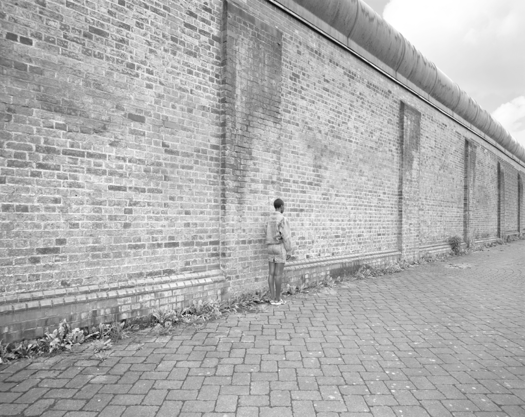
Because of the many similar tones in this image, the model almost goes undetected when the viewer initially looks at the image but as it is further inspected, the subject begins to appear. While the patterns are similar, the small contrasting differences add depth and dimension to the image making the composition visually appealing.
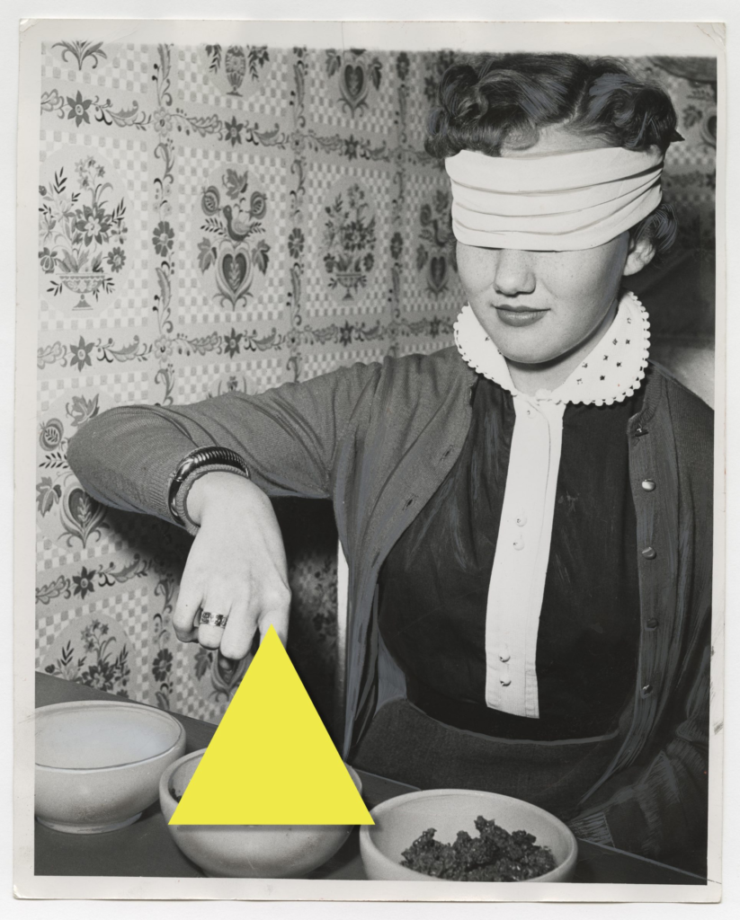
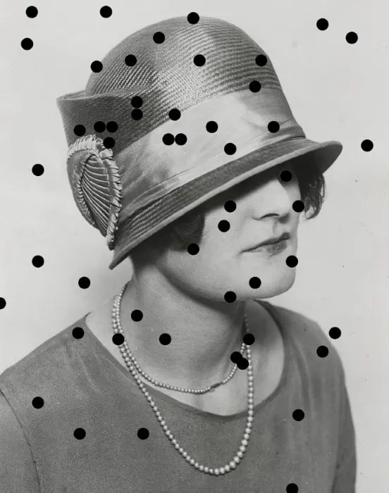
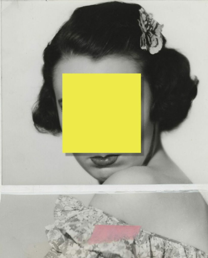
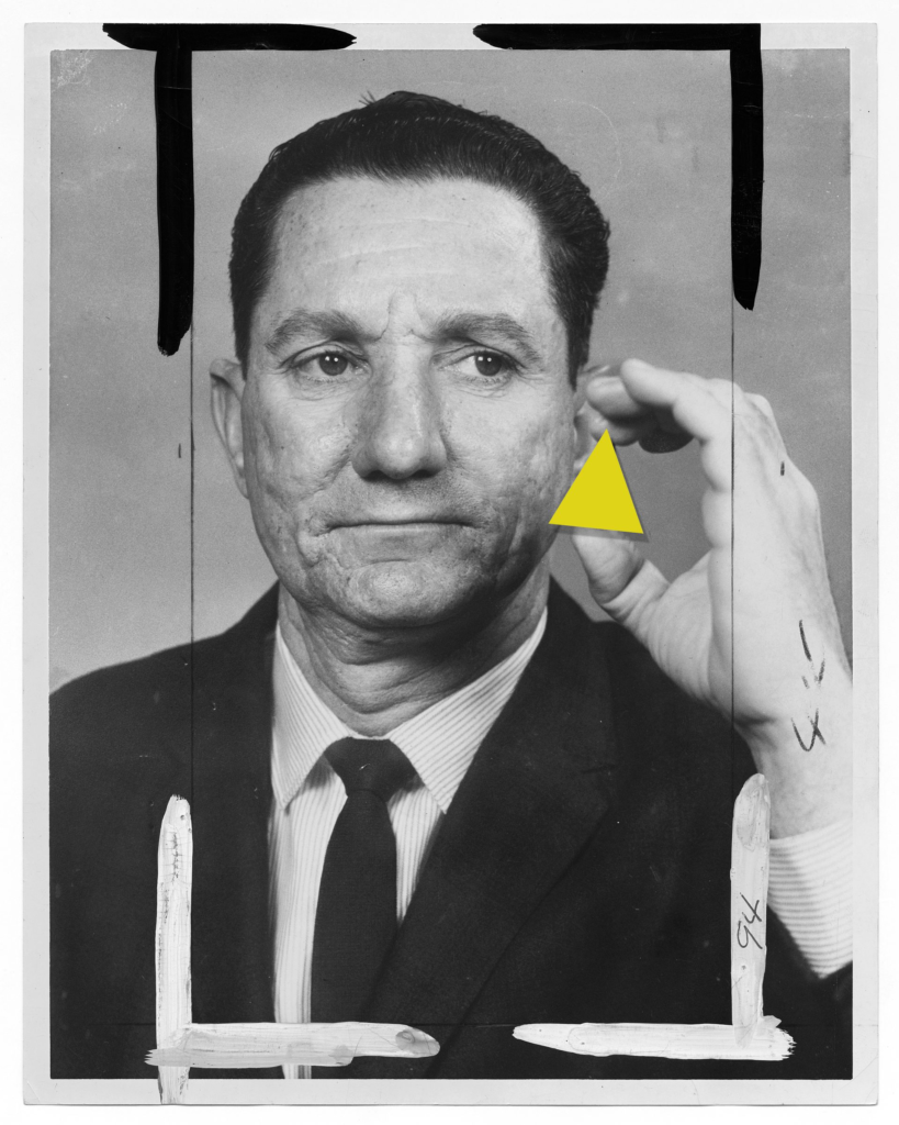
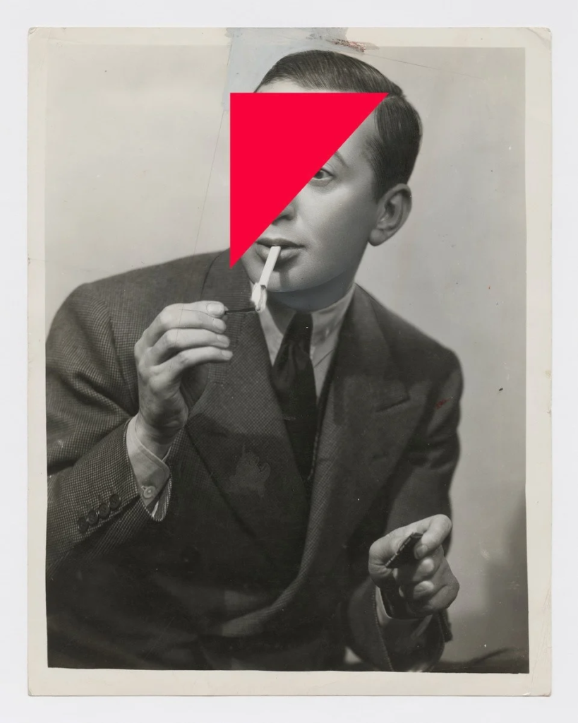
For my images reflecting ‘mirrors of the world’, I like the way that Edgar Martins uses the concealment of identity as well as graphic design because this turns the image into a question on who the person is in the image and what their backstory is. Some of his work is incredibly moving and documentary for activism purposes, such as war in poor countries, however some of his images are also taken in an interpretive way as his own reflection of the world which intrigues me.
Edgar Martins uses a lot of form in his work, for example the leading lines down a path or different kinds of shapes placed in sudden places which is something I would like to incorporate into my own photoshoot as this adds a sense of direction and structure into my work so that the composition settles positively. I would like to recreate the graphic design that Martins has used on his piece entitled “Disrupted Identity”. To do this, I will be getting models to dress up as different identities to resemble these old drama stills, then putting them in black and white with a warm tone to give the appearance of archived images. Then, I will be using Photoshop to create graphic shapes to place over certain parts of the models face in order to conceal their identity a little bit as I think this will be very effective due to the contrast in vibrancy – going from bold, neon colours to then layer over a monotone image. I think this idea of deception and mystery will be something that I can portray in my work in a bold and powerful way. As my final selection will only be 3 images, it is important that I guarantee each image is as striking as the other so that they can individually tell a story.

A great blog post linking Martin’s work with theory of mirrors/ windows. Look forward to see creative photographic responses