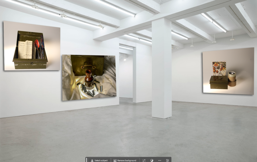
This was my final first practice gallery on Adobe Photoshop. To create my first artificial gallery, I found an image on images and imported it into Photoshop. I chose these particular images that I took to represent still life and transitioning into formalism. I think these all correlate in some way and have some sort of direct link to each other. The colours compliment each other well and I think this helps to escalate my gallery to look better and more presentable when the images I have taken all look similar but different.
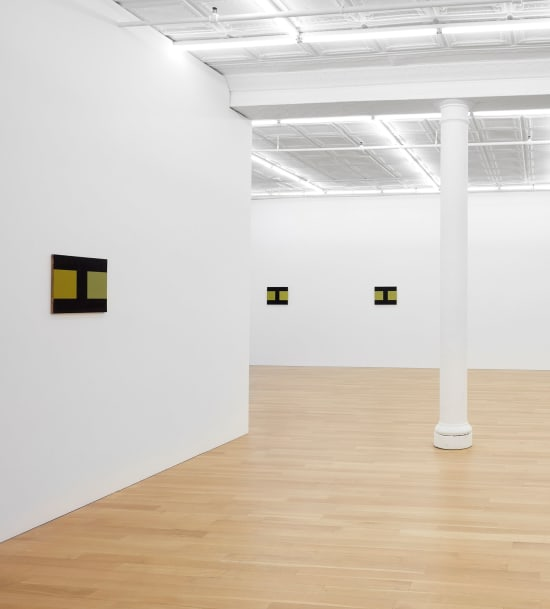
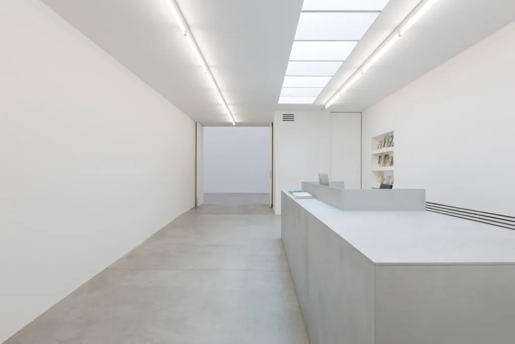
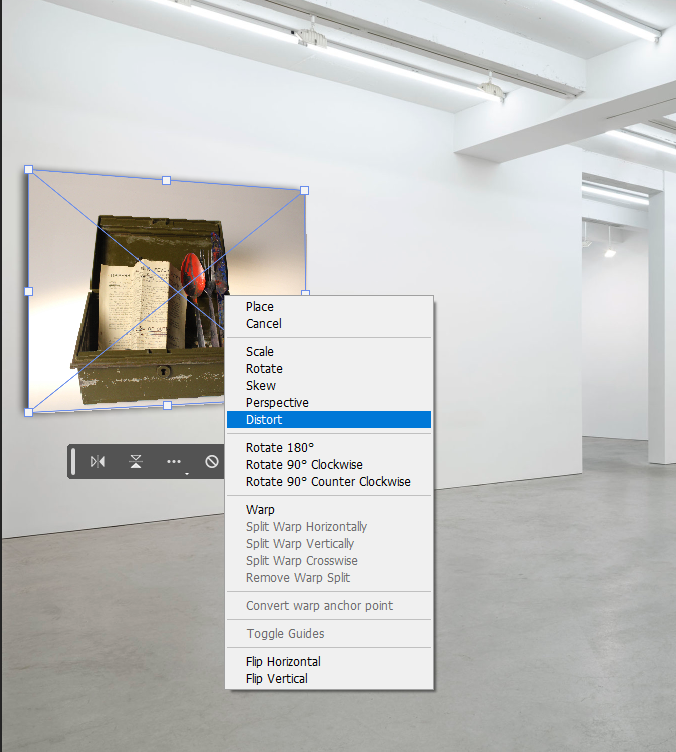
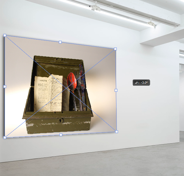
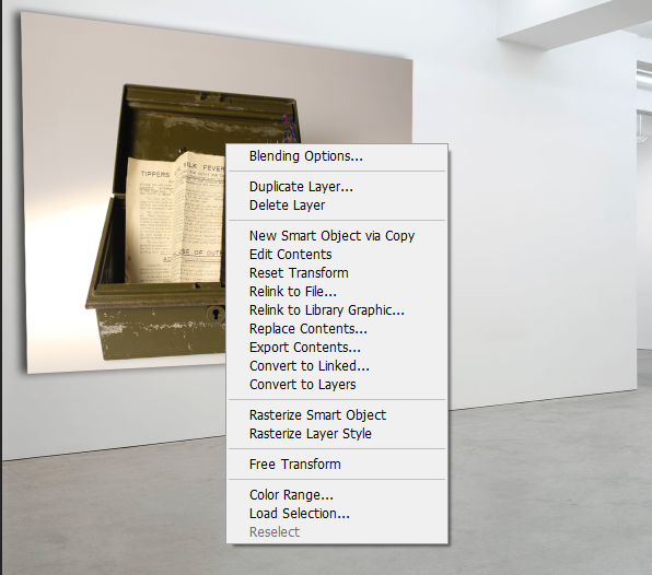
I then exported my own photos onto the image of the gallery, to put on top of the walls. I chose this image because I think it shows a clearly displayed and open space to place my photos. I also chose this image because I think it helps to challenge myself as the walls are slanted and give me an opportunity to test my new skills whilst editing images I have taken into a virtual gallery.
- After importing them I created a new layer and resized and distorted it to fit the walls. I did this in a particular way to fit the entirety of the wall then made them smaller in order to look presentable.
- I also changed the angle of how they sat on the walls. This helps them to look more realistic and straight. The straighter my images I took sit on the wall, the more realistic they look.
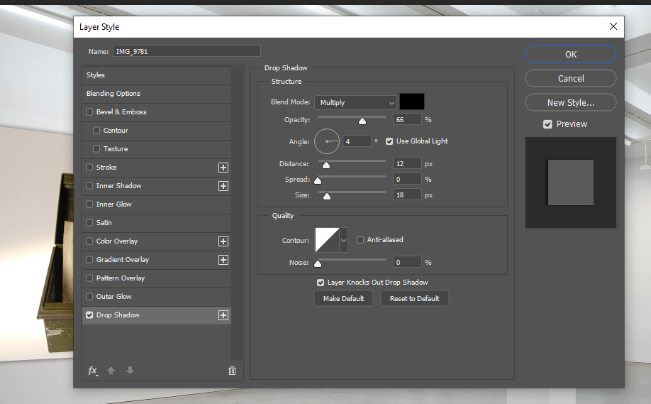
- I then pressed blending options after clicking the rectangular marquee tool. I then press drop shadow to control where the shadow is able to sit behind my image. This is to create a 3D effect.
I then moved onto Art steps and made another virtual gallery to display my still life photography. This website provided me with a more professional looking, but simpler approach to displaying my photographs.
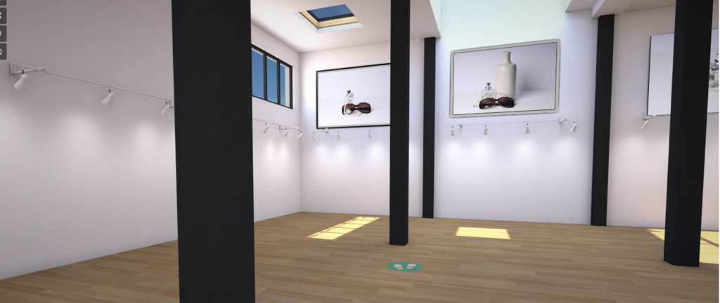
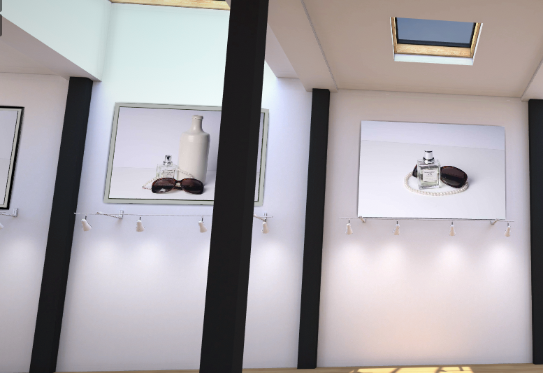
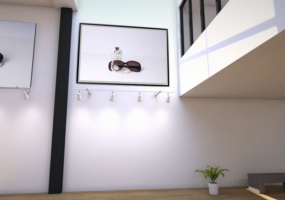
In my virtual gallery I made my photos look hung up on the wall. I also experimented with different borders of my photos. From a range of black white and grey backgrounds I was able to experiment which different colours complimented my photography and brought out their detail. I enjoyed using Artsteps so that I could properly evaluate my work in a digital gallery I could explore, this gave a more realistic approach instead of just a photo. I think I prefer using Artsteps as it gives me more time to focus on editing my photos without having to focus on the angle, distortion and shadowing on my artwork on the wall.
