Final outcome – Zine:

Cropping down the original image, which previously had a lot of space around it this creates a much larger focal point on the tone and detail of the statue, with a blurred background this makes the sailors silhouette stand out and for that reason, was why I found it perfect for the front cover.

With the line of boats, I found this images composition creative in its sporadic array of objects within the tight frame. With the railings and rooftops of the boats, this creates a visual ladder which pulls your eyes to the top of the image. The docking and actual ladder in the top left adds some contrast to fill the negative space.
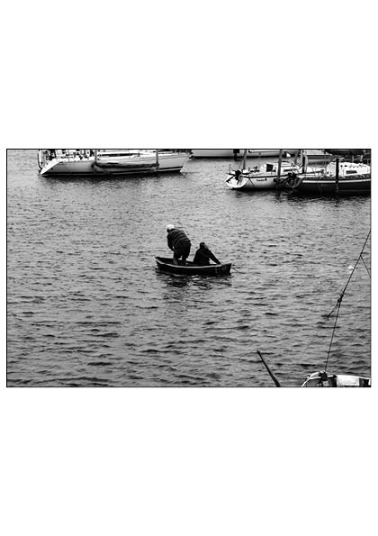
I found that this image came out really well in not only detail and composition but its ability to tell a story. Waiting for the decisive moment to snap the 2 sailors as they crossed straight through the middle of my lens, the other brighter boats around them contrasts well to their darkened silhouettes on the grey toned sea. With this candid shot, it creates a narrative to me that they are going about their daily lives living around the seaside.
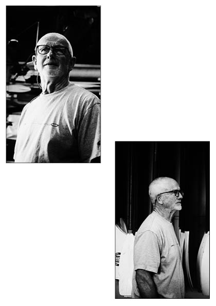

I think out of the 2 shoots, these are some of the best images I took and am very happy with their outcomes. With good use of natural light, short depth of focus and positioning these created an overall good Mise En Scene.
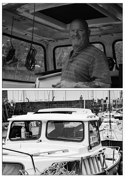
With these images, I feel like these contribute well to the aim of creating a story/narrative within this zine. Through both a candid and non-candid shot, they work well together to show a person how they would appear in a conversation VS in their day to day environment.
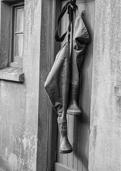
I like how with this photo, although not containing much about what’s in frame, it can make you construct your own idea about the person who is shown through their belongings. With the fisherman’s waders, to me it creates a rough idea of the types of jobs they may do around the harbour.


With these 2 paired together, they have an interesting composition, which to me comes from their relatability of the harbour theme. With Captain Brian Nibs, formerly being a harbour master, it is quite fitting for him to be placed alongside this image as it shows the harbour he’s become so associated with.
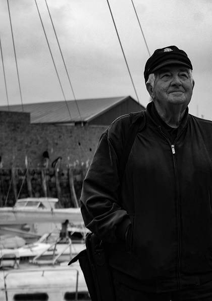

As a full page spread, this image continues on the narrative of the previous with showing Captain Brian Nibs in his maritime environment. With the title of this zine ‘Docked Lives’ this is a polysemous name I chose for the overall aims of the project. To create a narrative of peoples lives around the harbour, with boats oared up this meant they have ‘Docked Lives’, being a documentative style of photography, I played off the title to match this as ‘Docked’ can be interpreted as ‘documented’.


Through some good angles, I find the overall mise-en-scene of these images, matching well into the aesthetic, with the rules of thirds applied I find that these images are well positioned to make an interesting photograph.
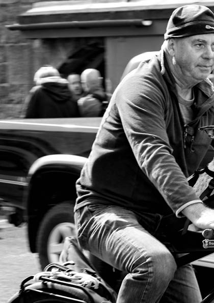

Like the images from the rowing club, I think this is another favourite of mine, With a captivating motion blur effect, this to me is a really detailed photograph which captures something outside the working element of the harbour and focuses on parts of its recreational usage too.
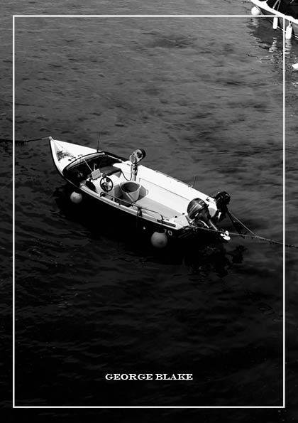
Finishing on this image, its dead centre positioning of the boat creates one final attention grab to levels of detail within the photo. with the shadow line crossing half the boat and water to the sun light waves on other side, this to me created a unique composition.
