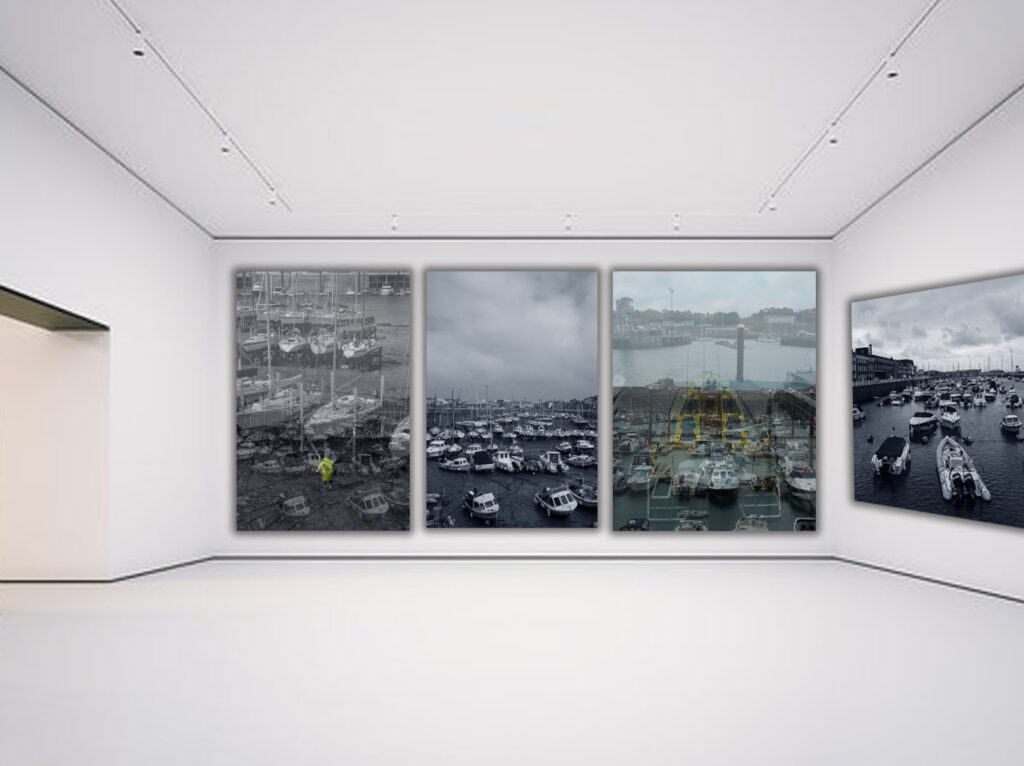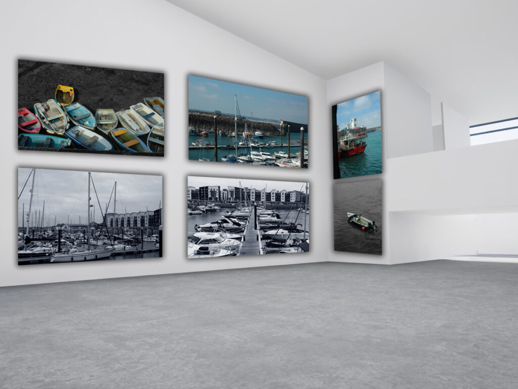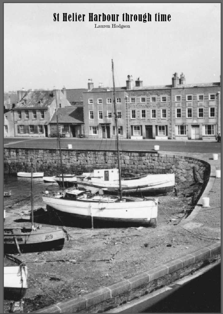
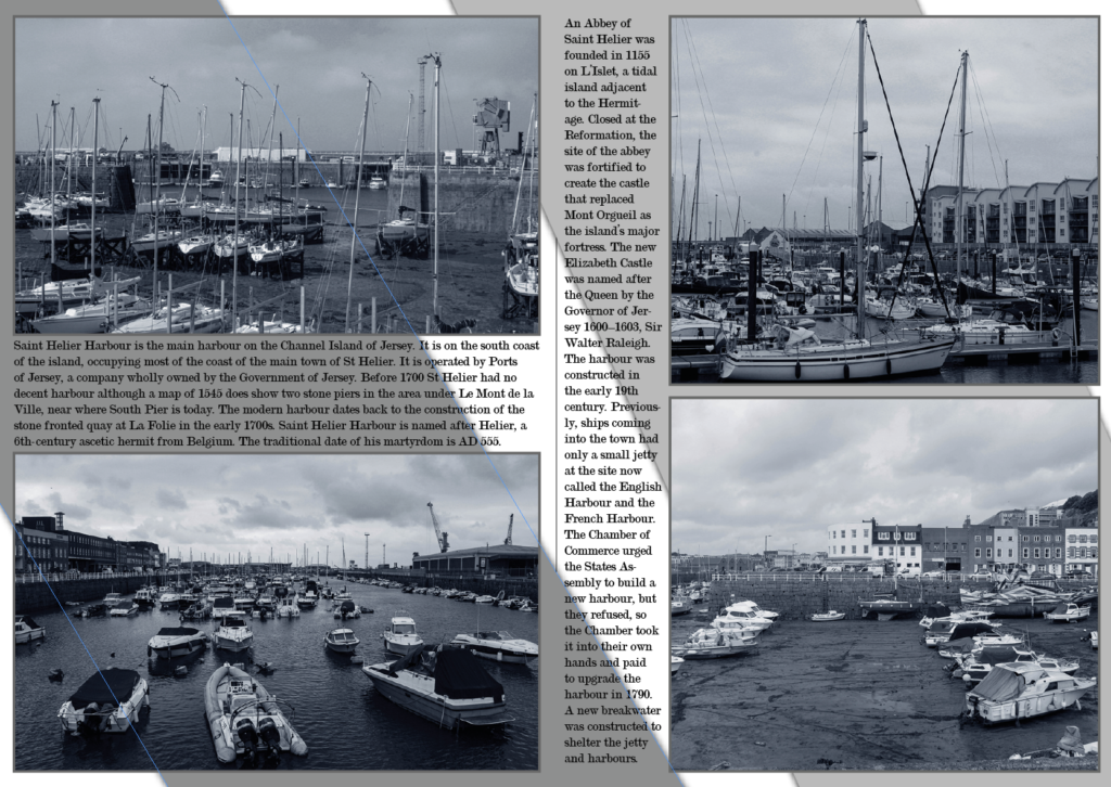
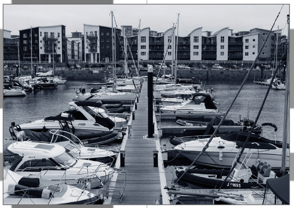
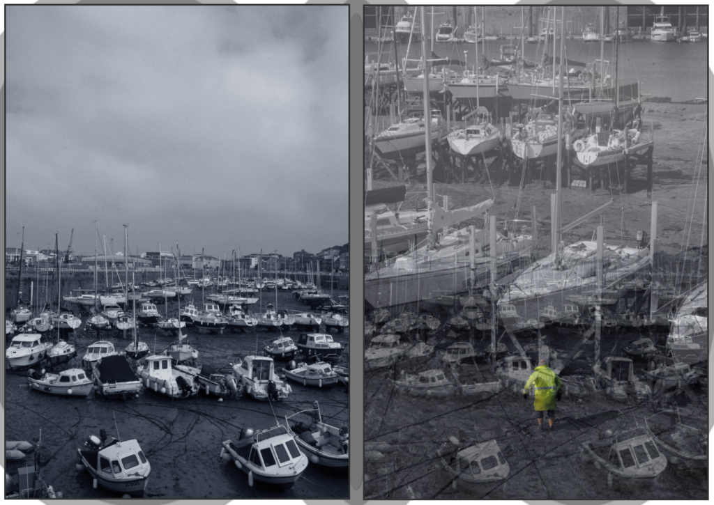
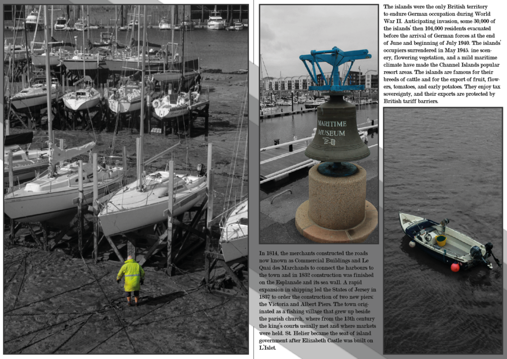
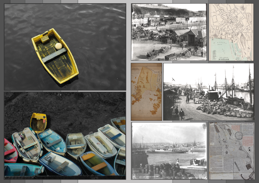
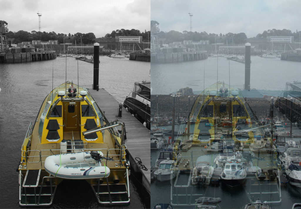
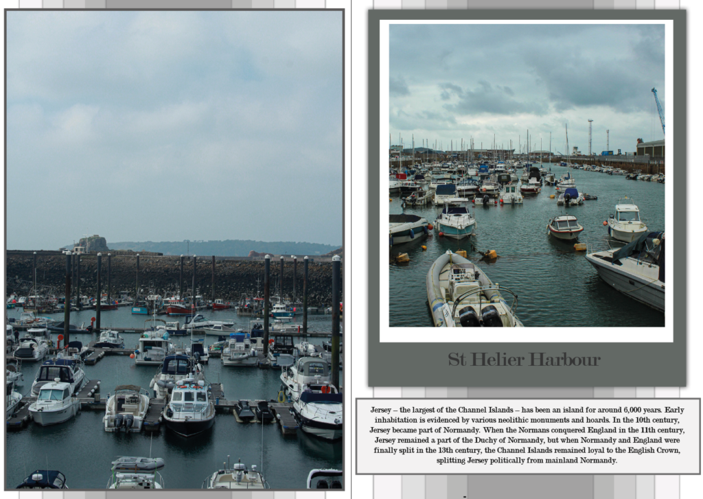
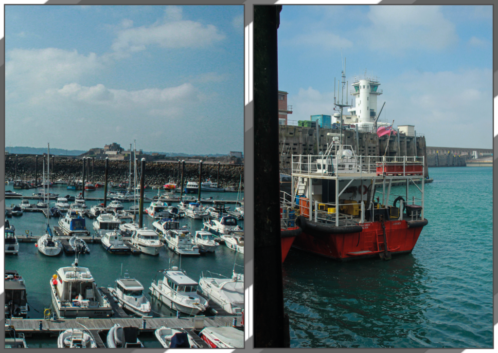
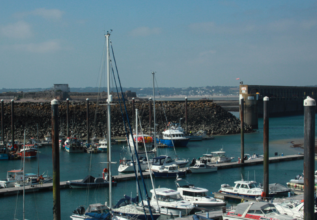

Overall, I like how my zine turned out. I thought the contrast between the only images pages and writing pages made it more enjoyable to look at and made it look more finished than if there were to have been blank spaces. I like how I conveyed the idea of the Harbour throughout time, going from only black and white images to ending up with fully coloured, vibrant pictures. Additionally, I found it interesting experimenting with different background designs and adding different shapes and layouts. I kept my writing font consistent throughout as to make it look seamless. However, one improvement I would make to my zine is by adding some images of people to it as my images are mainly just boats and wide angle shots. I think this would’ve been an interesting concept and created a better mixture of images in my zine instead of having them all look quite similar. Also, next time I would like to try and create a zine where there’s letter writing and different backgrounds so you can really focus on the images rather than the presentation.
Virtual gallery:
