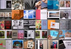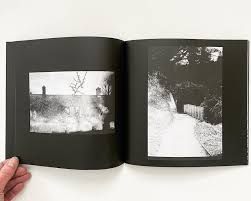
A photo zine, or a photography zine, is a small, self-published booklet or magazine that features photography. Zines are a tool used by photographers to tell a story in a visually capturing way to inform an audience about a specific topic or issue, to showcase and advertise a new idea or simply create a preview of an ongoing project.
To begin a zine, the photographer would decide on a range of photos that relate to each other. Zine’s generally will tell a kind of story or will at least have something in common.
Zines can be made on InDesign or can be handmade. For example, the settings I used for InDesign were: width: 148mm,
height: 210, pages: 16, orientation: portrait, columns: 2, column gutter: 5mm, margins: top, bottom, inside, outside: 10mm, bleed: top, bottom, inside, outside: 3mm. When you fold your sheets, your front cover and back cover should always be the first and last pages of your layout.

My Own zine:
My zine is going to be focussed on the photoshoot from St Helier Harbour which focusses on the new and the old harbour. I am planning to keep my zine all in colour and keep a brighter tone to the overall piece. I think I could make the old harbour photos black and white but I have decided to keep it all in colour so that all images have something in common.
Once you have considered the points made between the differences in narrative and story and thought about what story you want to tell about St Helier Harbour and the images that that you have made in response, consider the following:
STORY: What is your story?
My Zine doesn’t necessarily have a story, I more focussed on the layout. I made sure that the photos that I liked the most had their own page spread and I made a page like this as every other page.
