General layout:

Measurements:
Create new document
width: 148mm
height: 210
pages: 16
orientation: portrait
columns:2
column gutter: 5mm
margins: top, bottom, inside, outside: 10mm
bleed: top, bottom, inside, outside: 3mm
Paper plan:
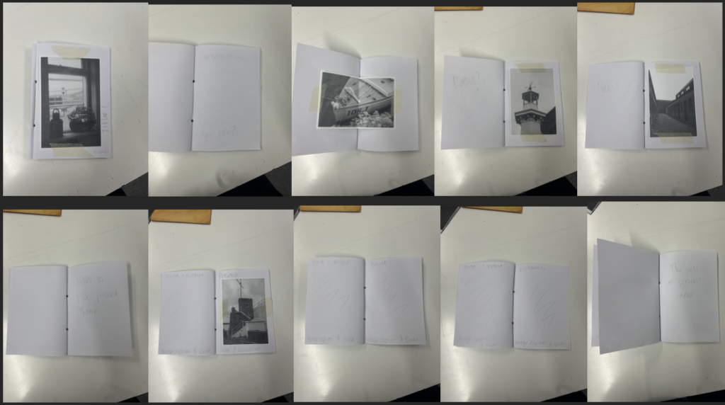

This was my first ever mock plan. I liked the Sequence of the photos however I didn’t really like the Layout of it and the fact that there was too much images to produce so this plan was rejected.
Indesign plan:
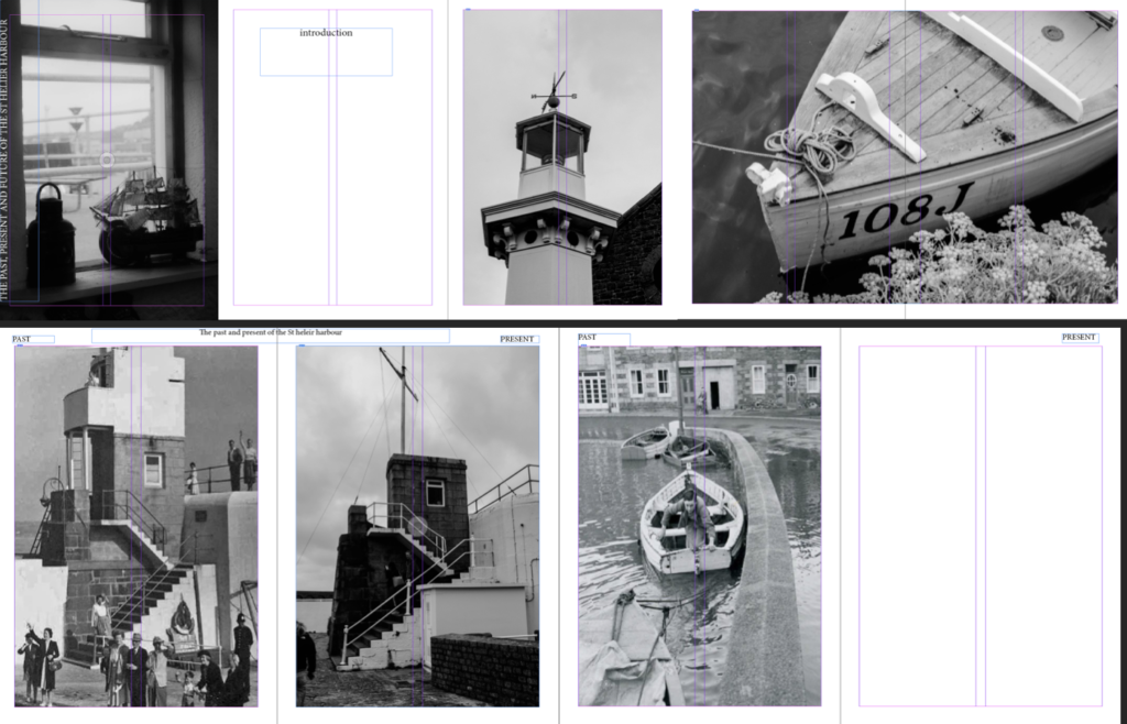
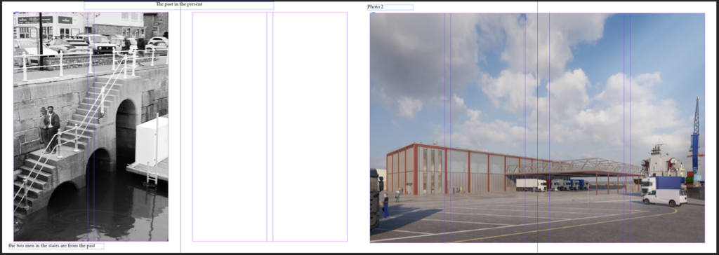
I liked the layout more and the features however the fonts and writing weren’t what I was looking for and there was too little images so I wanted to incorporate more images so this plan was rejected.
Actual Indesign plan:
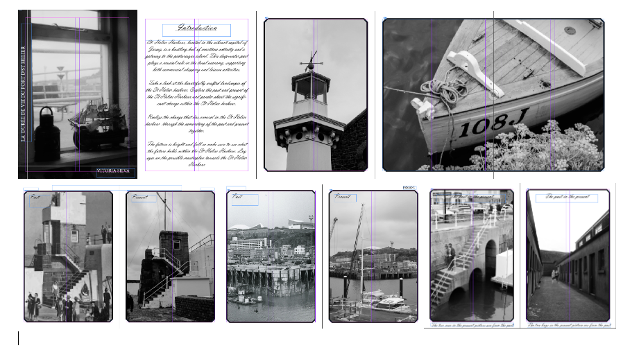
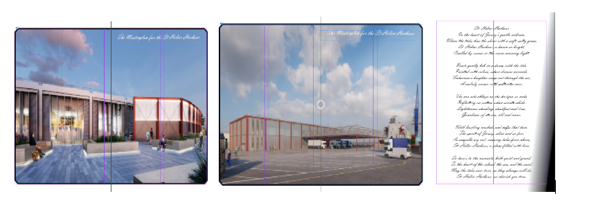
I loved everything about it, I liked the layout the sequence of images and most important the fonts and placement of the text. The design of the zine was also something that I was extremely proud of.
