Design and Layout
Layout
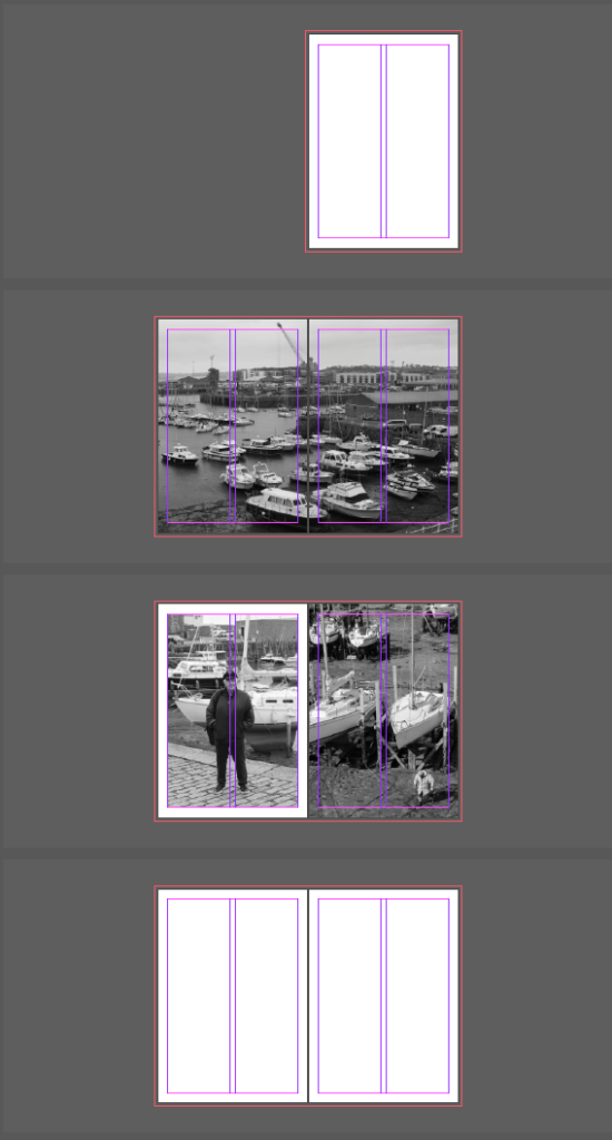
This is the how I made the Layout of my Zine:


Design
Controls:
Shift W to view
Ctrl D to insert image


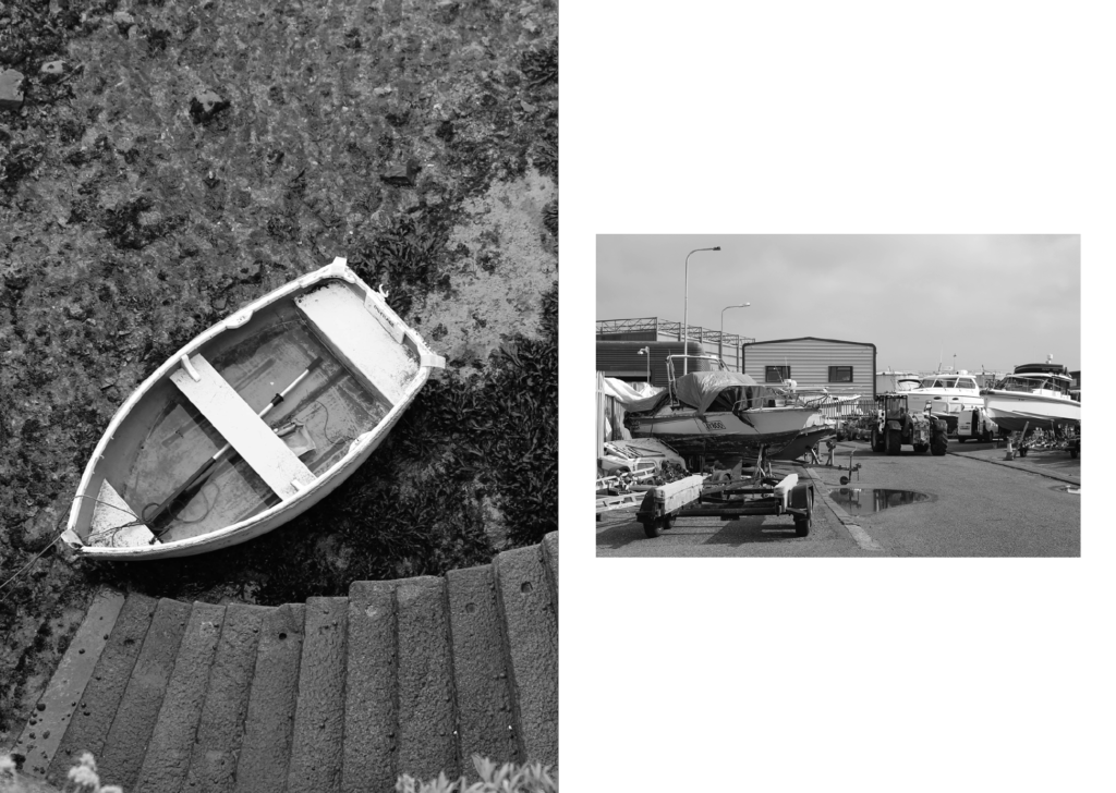
I am not very satisfied with this page as I don’t feel like it fits in with the rest of the zine or with the narrative I am trying to display (fishing industry), therefore, I am going to find an archive image that is similar to one that I have taken and display them together.
Use of Archive Images


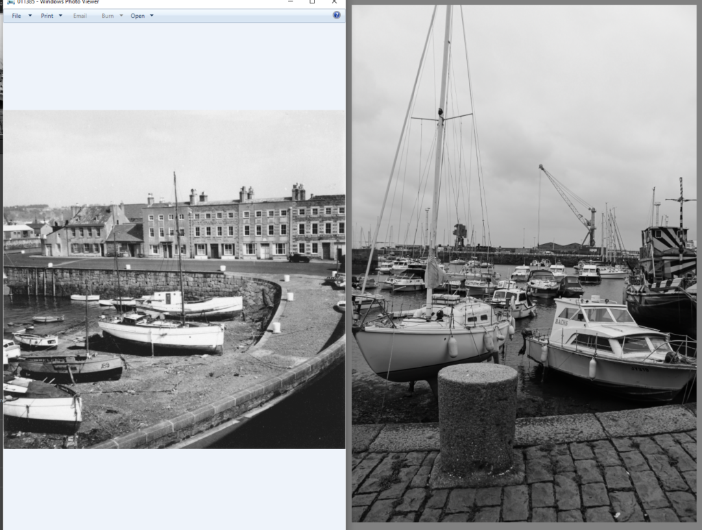
These are my two options of archive photos. I am going to go for the first option as it is more clear that they were taken at the same place and they still relate to the fishing industry, therefore, will fit in with the rest of the zine.


I re-edited this photo and lowered the clarity so that it would fit in better with the archive one.

I then rearranged the pages to what I thought was a more suitable layout:


I then added the title ‘St Helier Harbour’ to my front cover.

I then decided to put the subtitle ‘Fishing Industry’ below.

I then changed the layout of some of my pages to get a more efficient layout overall:


Final Layout
This is the final layout of my Zine:


