In terms of the layout I creating a 16 page photo zine/guide book which has displayed the photos around the St Helier Harbour. Each page captures an aspect of the harbour, offering viewers a virtual tour of its boats, fisheries, boardwalks, and shoreline scenery. By displaying these photos in a structured layout, the zine becomes more than just a collection of images—it’s a story that readers can explore and experience as if they’re walking through the harbour itself. In order to produce the display we present it through the app InDesign and add specific measurements and adjustments to see in a 2D format whereas to a 3D real life photo zine.
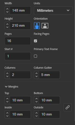
Using specific measurements is important when creating a photo zine as you need to make sure that the photo is of high quality for printing as well as having a consistence layout. Having the photographs in a layout that is easily readable and appealing to a viewer is key as visual representation is everything.
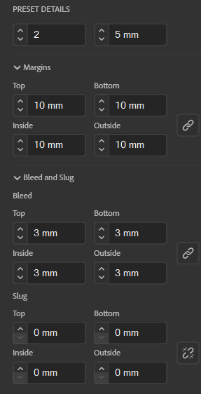
It’s important to set precise measurements. Using InDesign’s ruler guides and grids, I can create consistent margins, spacing, and alignment across each page. This precision is essential for a photo zine that is visually clean and professional, making each image stand out without feeling cluttered.
With InDesign’s flexibility, I can move images, text, and other elements freely to see how they work together visually. The layout can be adjusted to emphasize the most important parts of the harbour, focusing on details like close-up textures or wide views of the docks, allowing me to create visual flow that keeps the reader engaged.
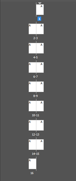
When working in InDesign..Typography plays a big role in setting the mood of the zine. InDesign’s font and type tools make it easy to try out different fonts, sizes, and styles until I find the ones that best reflect the harbour’s vibe, whether it is a bold typeface to introduce each small section or smaller, minimalist captions for the photos.The software offers many options for grids, guides, and master pages, which help maintain a cohesive look across all pages of the zine. These tools ensure that images and text are aligned and well-balanced, creating an organized flow that feels natural to readers.
InDesign supports high resolution images and allows for precise color control, I can ensure that each photo in the zine will look sharp as well as true to life. This quality is essential for a project like this, where capturing the details and textures of St Helier Harbour is key.
Below I have shown some examples of the tools being put into place and shifted around:
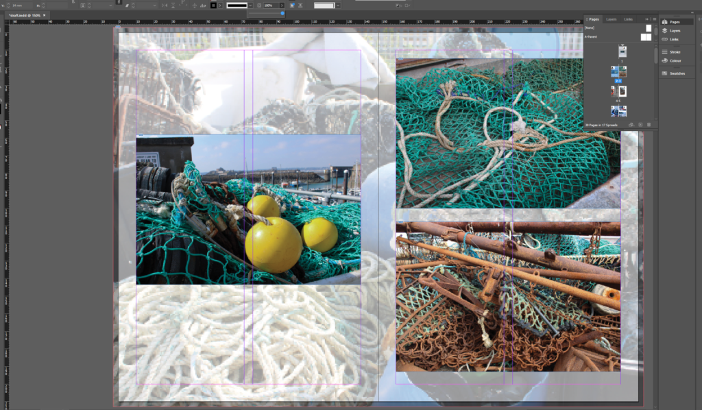
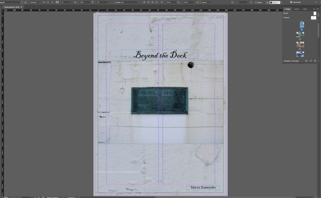
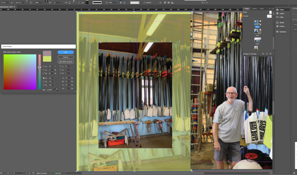
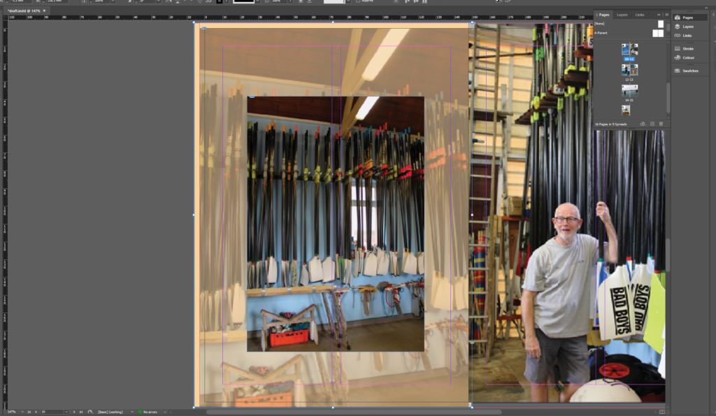
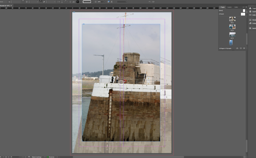
The final zine will have 16 pages with a mix of full-page images, collages, and paired text. Each page or spread has been planned to better the experience of moving through the harbour, and using the software InDesign, I can visualize how the final printed piece will look and feel, ensuring that the reader’s journey through Beyond the Dock is immersive and captivating.
