First, I opened a document using these measurements:

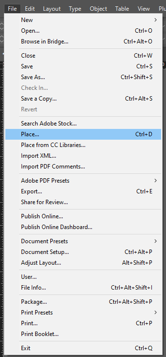
Then, I used the square boxing tool to create the sizing of the image I wanted.


After I selected the image, I could choose the appropriate fitting. I selected ‘Fit Frame Proportionally’ so that the image would size up into the box and be laid out properly. This way, my page wouldn’t look strange and would sit neatly.
The result:

Throughout my work, I could go into display mode so that the resolution would be good and I could see how my work would look physically:

To create my two zines, I added them to the same document by duplicating the spread. This made it easier to manage and also I could compare both of my zines to one another to make sure that they were different and contrasted well so I could represent the harbour from two different perspectives.

In this image, I am duplicating the spread to see which image should go on the left and which image should go on the right. This ensures I can make the page look the best as possible and that the two compositions match up properly.

Overview:


Experimentation:
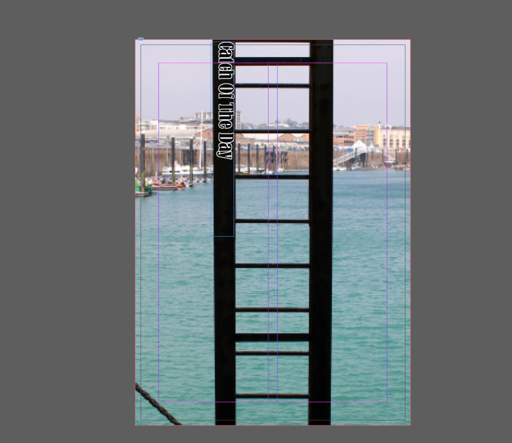
I experimented with different fonts, sized and text-designs, repositioning them into different angles to see which were best suited to my first page. I did this to ensure that my title was representative of what my zine’s story was about and the narrative I wanted to tell as well as where I actually placed the title so that this wouldn’t look strange on the image.


I ended up choosing this font for my title as it is bold and dark to match the silhouette of the ladder as this is a more modern image.


I chose this font for my second zine as I think that the black outline with the white lettering matches the colour palette of the image really well, and the way that the writing curves matches the structure in the image too.
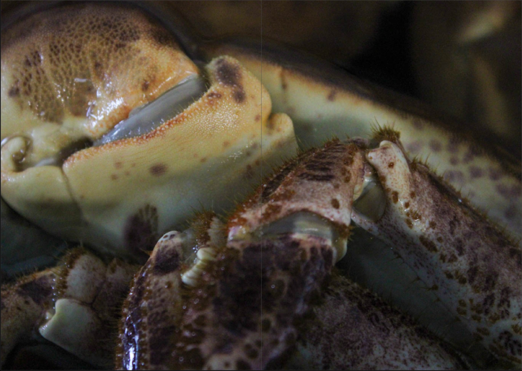
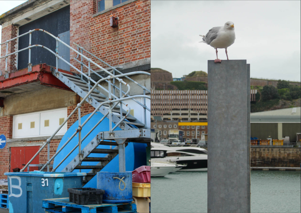
My Zines layout:
Zine 1:


Zine 2:


