Zines
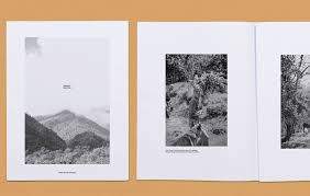
A photography zine is a small book almost of a collection of photos. They are designed to tell a story through photos and limited text, unlike like picture stories they don’t have text on every page and cannot be viewed as one page so much as a progression in story like a normal book. Each zine is completely personal to the creator/photographer some choosing bold, vibrant designs and others picking heavy white boarders around each photo. Some contain completely abstract photos others providing large overviews of the topic, most are a mixture of small detail shots and large overview photos. I personally liked the zines with detailed covers, with heavy texture or colour I found this draw me into the zine wondering what was inside rather than having an overly complex imagine that was easier to skip over. Following this, I found my favourite zines had a mixture of detail shots and larger scale photos, I found this explained the narrative the best.
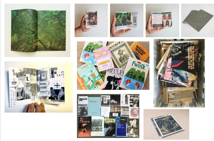
What is your story?
- 3 words
- land, sea, history
- A sentence
-A brief glance into Jersey’s maritime industries new and old.
- A paragraph
This zine will explore the old and current Jersey harbours, specifically the St Helier harbour we all know as ‘the harbour’ before venturing into the old French and English harbours. It will also show the narrative of the industries from fishing to sports like rowing.
What is Narrative?
Narrative is ‘a spoken or written account of connected events; a story.’ Or in photography terms, using photos to show a story to the viewer with minimal words. This can be done in many ways, in fact any photo tells and story so it can be done in a single photo or a small collection of photos like a picture story. However in this case I am creating a zine with the photos and knowledge I have gained researching and capturing the Jersey harbour’s over the past month.
How will I tell my narrative?
I will tell the story of the Jersey harbour through my photoshoot results, more specifically I will use a zine I design on Indesign. I have decided I will use negative space and backgrounds to add context as well as keep the zine interesting. By adding background images I will use photos that add context but aren’t enough for a page by themselves. Having done research I know I found the most interesting zines were the ones with a mixture of colour, texture and subjects, meaning in my zine I will use black and white as well as bold colour to my advantage emphasising detail with tonal black and white and using bright colour to represent true to life colours of the harbour and keep people interested in the zine.
Further Ideas
Text
A book or other written or printed work, regarded in terms of its content rather than its physical form.
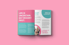
I can use text to help add context and further the style of my zine. I will have a title to help give an idea bout the zine on the cover other than the cover photo. I might also put a small paragraph or sentence on the first page to make use of blank space and provide a small explanation before the zine is continued. This gets the reader to think with a purpose and ask questions about each photo related to the theme rather than just guessing.
Typography
The art and technique of arranging type to make written language legible, readable and appealing when displayed.
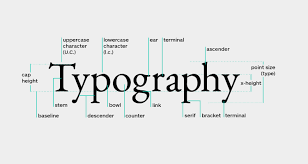
I can use typography on any text I put in, including the title this will help create a style to the zine.
Examples: creative uses of words, letters, font-types, sizes
Mood Board
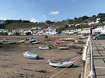
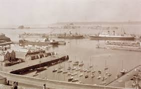
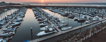
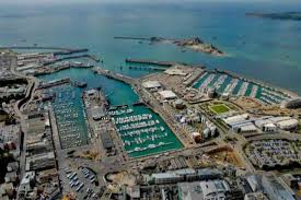
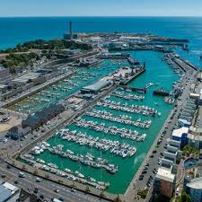
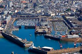
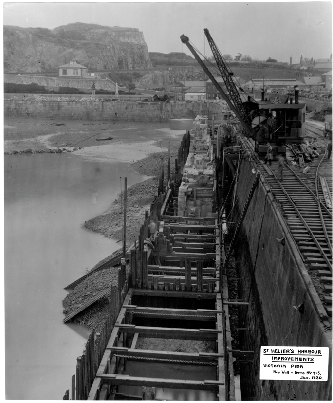
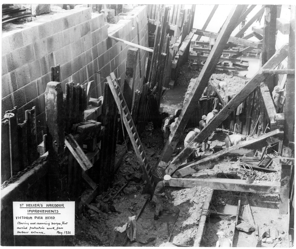
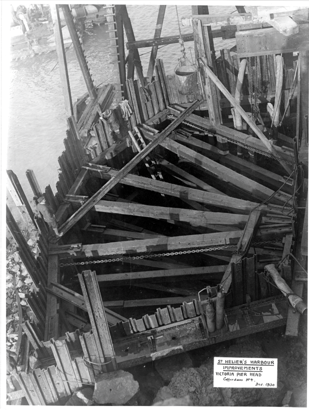
In this mood board I used a mixture of photos from the SJ archive as well as photos of how the harbour is today. I like the mixture of overview shots combined with all the smaller detailed shots. This provides contrast while keeping a full picture of the harbour from the smaller details of industries to the larger structure itself.
