We explored all around St Helier Harbour, including the three marinas, the steam clock, maritime museum and more. Our aim was to explore the harbour and capture all the different elements and aspects of it.
Contacts Sheet


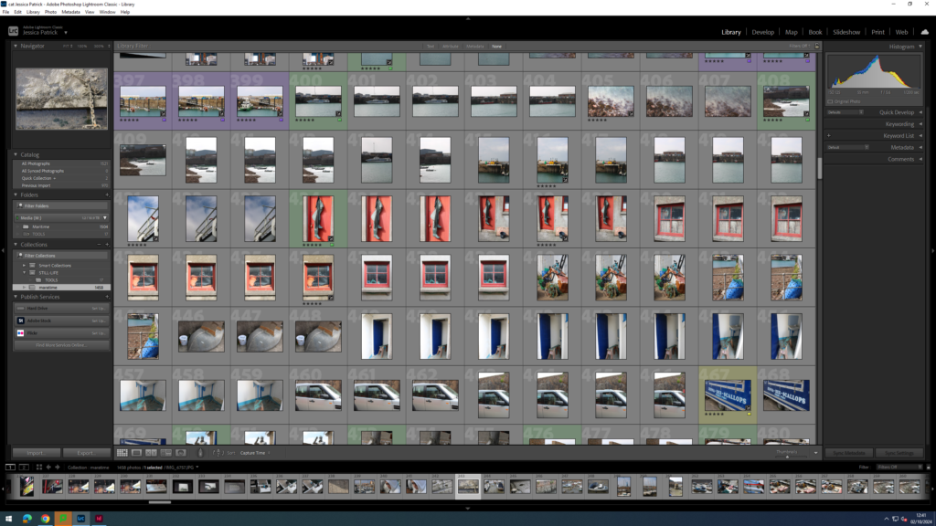


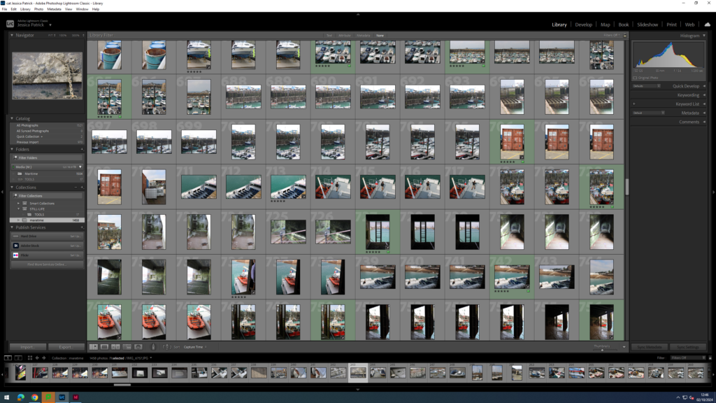


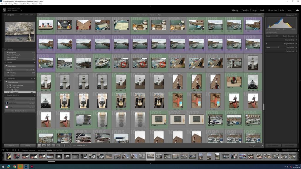


The images which are highlighted green are the images I have chosen to edit in this photoshoot, because they present lots of different aspects of the harbour and have the best composition and layout and are my best photos.
Edits
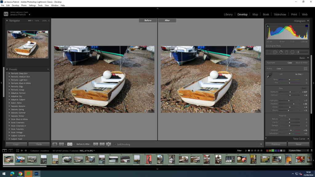
I edited this image by increasing the exposure, contrast shadows, whites, vibrancy and saturation, while decreasing the highlights and blacks. I did this, so that the image would be brighter and more vibrant, so that the boat was more bright white, and so the sand was more coloured.

I edited this image by increasing the exposure, contrast shadows, whites, vibrancy and saturation, while decreasing the highlights and blacks. I did this, so that the boats would be brighter, as well as the sea in the background being more blue and vibrant.

Then, I made a virtual copy of the edited image and increased the contrast, highlights and whites, while decreasing the blacks and shadows. I did this to create more contrast between the different shades of grey throughout the image.

I edited this image by increasing the contrast shadows, whites, vibrancy and saturation, while decreasing the exposure, highlights and blacks. I did this, so that the image was slightly brighter and more eye capturing.

I edited this image by increasing the exposure, contrast shadows, whites and vibrancy, while decreasing the highlights and blacks. I did this so that the image would be brighter and more vibrant.
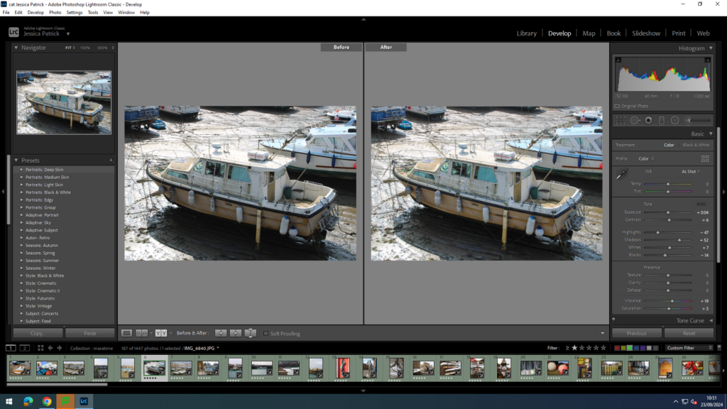
I edited this image by increasing the exposure, contrast shadows, whites, saturation and vibrancy, while decreasing the highlights and blacks. I did this, so that the boat was more vibrant and saturated, so it stood out more. I also wanted the yellow colour of the boat the be more saturated.
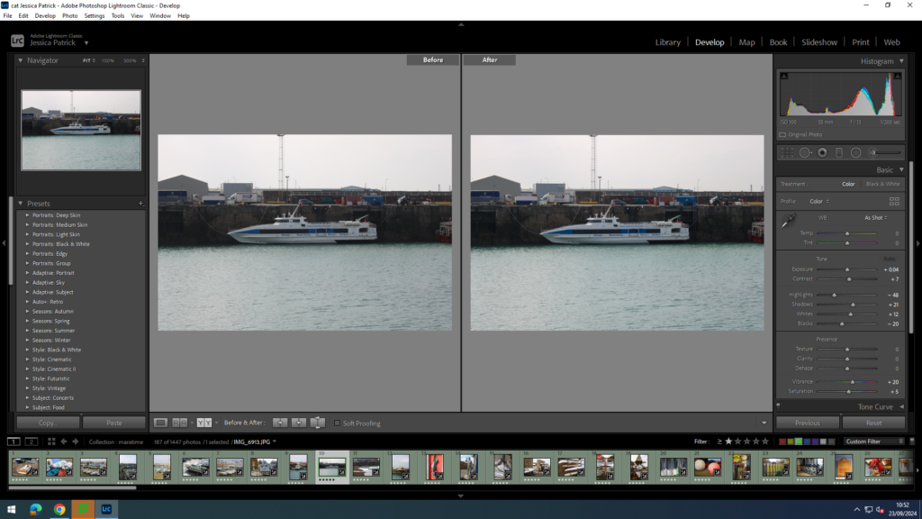
I edited this image by increasing the exposure, contrast shadows, whites, saturation and vibrancy, while decreasing the highlights and blacks. I did this, so the sea was a nicer blue, as well as the blue on the boat.

I edited this image by increasing the exposure, contrast shadows, saturation and vibrancy, while decreasing the whites, highlights and blacks. I did this, so the red door was more vibrant, along with the green boots, so they would compliment each other more, as they are complimentary colours.

I edited this image by increasing the contrast, shadows, white, vibrancy and saturation, while decreasing the exposure, highlights and blacks. I did this, so that the tin man was brighter, as well as the rust, so it created more texture and contrast.

I edited this image by increasing the exposure, contrast, shadows, white, vibrancy and saturation, while decreasing the highlights and blacks. I did this, so that the image would be slightly more exposed.

I edited this image by increasing the exposure, contrast, shadows, white, vibrancy and saturation, while decreasing the highlights and blacks. I did this, so that the image was more exposed and more vibrant.

I edited this image by increasing the exposure, contrast, shadows, white, vibrancy and saturation, while decreasing the highlights and blacks. I did this, so that the image was slightly more exposed and the water brighter and more vibrant and saturated.
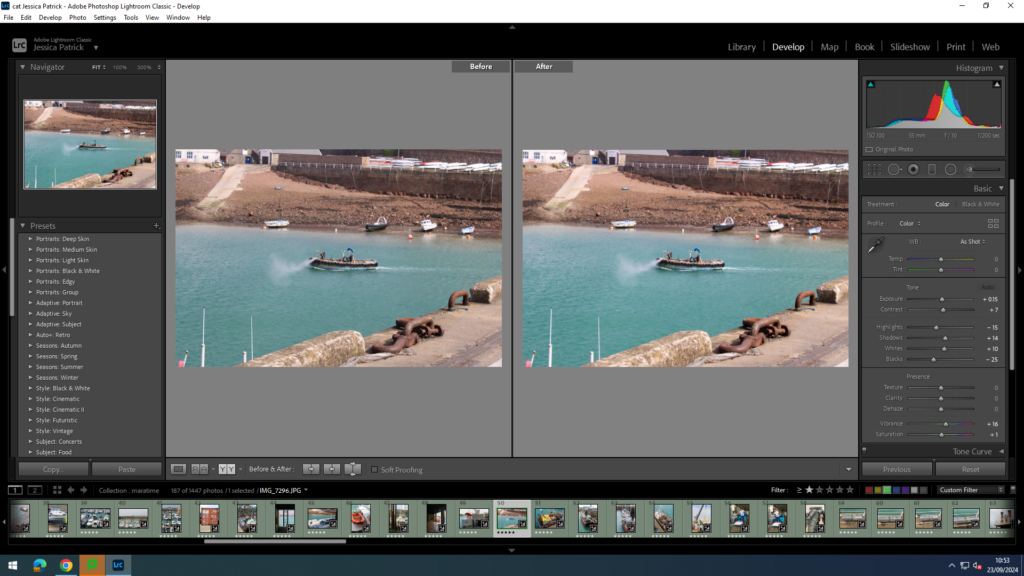
I edited this image by increasing the exposure, contrast, shadows, white, vibrancy and saturation, while decreasing the highlights and blacks. I did this, so that the image was slightly more exposed and the water brighter and more vibrant and saturated.

I edited this image by increasing the exposure, contrast, shadows, white, vibrancy and saturation, while decreasing the highlights and blacks. I did this, so the yellow boat was more vibrant and saturated, so it popped more.

Then, I created a virtual copy and made it black and white. I also increased the contrast to the max and adjusted the highlights, blacks, whites and shadows. I did this to create more contrast and light and dark tones in the image.

I edited this image by increasing the contrast, shadows, white, vibrancy and saturation, while decreasing the exposure, highlights and blacks. I did this, so the complimentary colours (green and red) are more vibrant and therefore compliment each other even more.

I edited this image by increasing the exposure, contrast, shadows, white, vibrancy and saturation, while decreasing the highlights and blacks. I did this, so that the image would be brighter and more exposed, so it was more visible.

I edited this image by increasing the contrast, shadows, vibrancy and saturation, while decreasing the whites, exposure, highlights and blacks. I did this, so the image would be less bright.

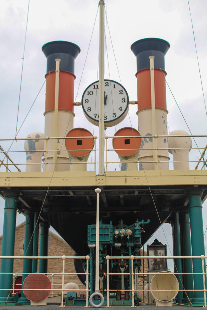
I also made a black and white copy of a similar image and increased the contrast, shadows and whites, while decreasing the highlights and blacks, so that I can create more contrast between the dark steam clock and the bright sky.

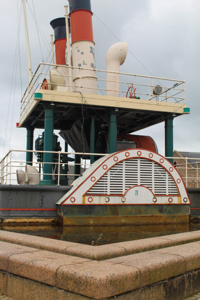
I edited this image by increasing the contrast, shadows, white, vibrancy and saturation, while decreasing the exposure, highlights and blacks. I did this, so the image would be more vibrant.

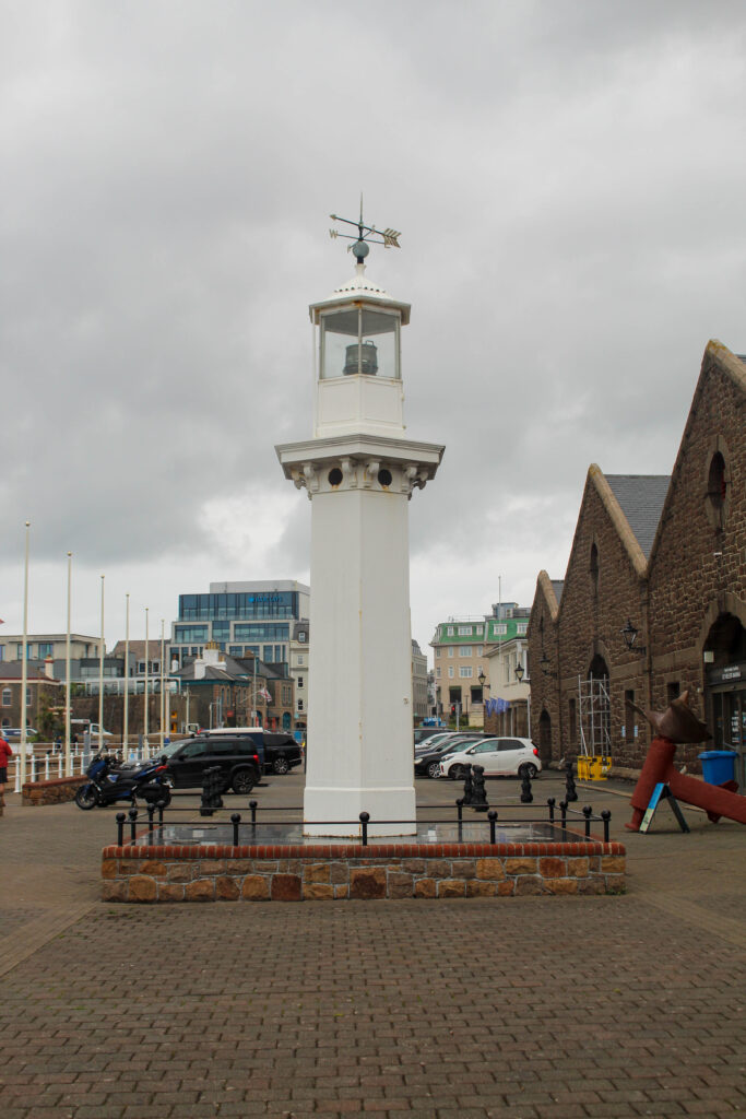
I edited this image by increasing the exposure, contrast, shadows, white, vibrancy and saturation, while decreasing the highlights and blacks. I did this, so the lighthouse would be a brighter white, instead of dull.
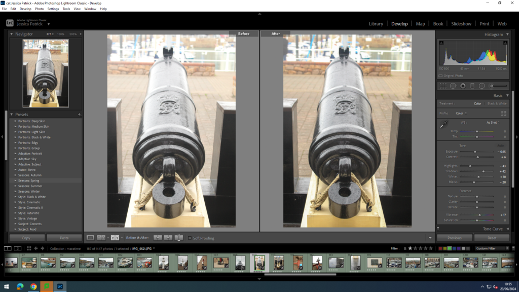
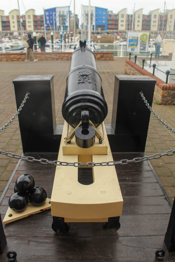
I edited this image by increasing the contrast, shadows, white and vibrancy, while decreasing the exposure, highlights and blacks. I did this, so the cannon was more visible.

I edited this image by increasing the contrast, shadows, white, vibrancy and saturation, while decreasing the exposure, highlights and blacks. I did this, so the image is more vibrant and saturated.

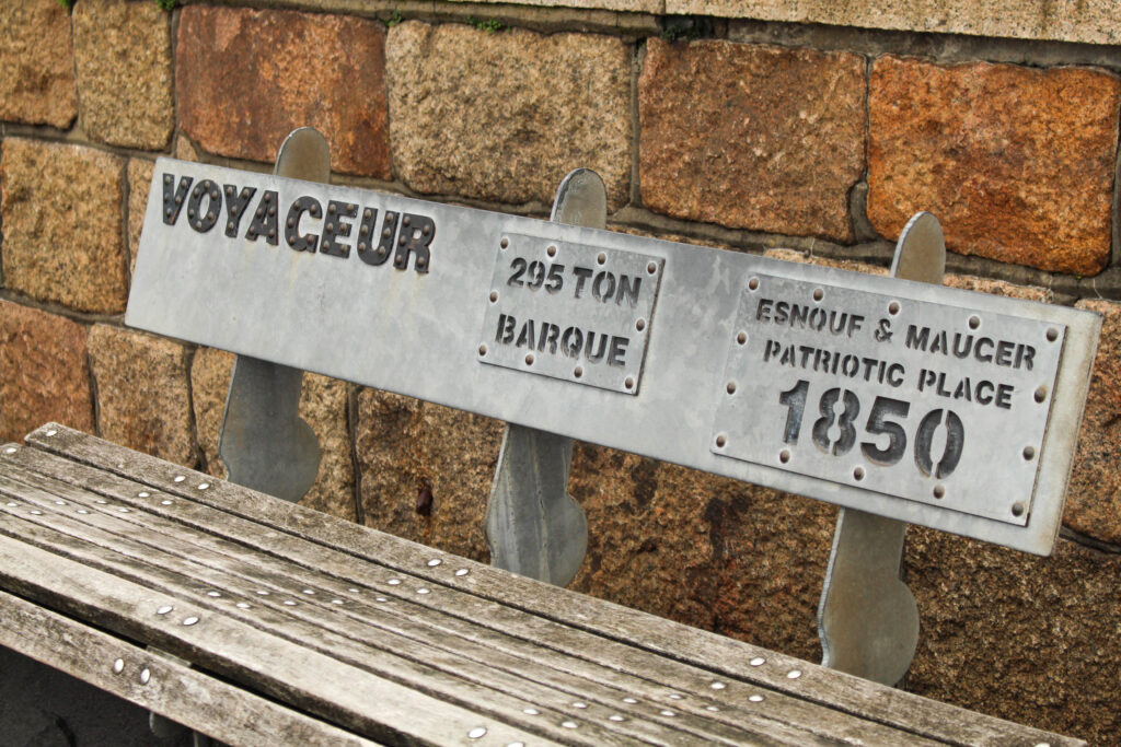
I edited this image by increasing the contrast, shadows, white and vibrancy, while decreasing the exposure, highlights and blacks. I did this, so that the writing in the image is more visible.
Jersey Rowing Club
The Jersey Rowing Club has a long and celebrated history dating back to the early 1960s and was officially founded in 1971 when the sport of rowing was growing fast in the Island because of the popularity of the Sark to Jersey Rowing race, which started in 1967.
The club is based in the Old Lifeboat Station at the bottom of Mount Bingham, where there is excellent boat storage facilities and direct access to the water.
The JRC runs a full race calendar of coastal and bay events ranging from 8-15km, to the great endurance races 27km Gorey to Carteret, the 26km Sark to Jersey and the 48km Round Jersey.
They have close relationships with both Guernsey and French rowing clubs and are looking to include both the Herm weekend and Cherbourg regatta into their future events calendar.

I edited this image by increasing the exposure, contrast, shadows, white, vibrancy and saturation, while decreasing the highlights and blacks. I did this, so the image is brighter and more vibrant.

I edited this image by increasing the exposure, contrast, shadows, white, vibrancy and saturation, while decreasing the highlights and blacks. I did this, so the boats are more saturated.

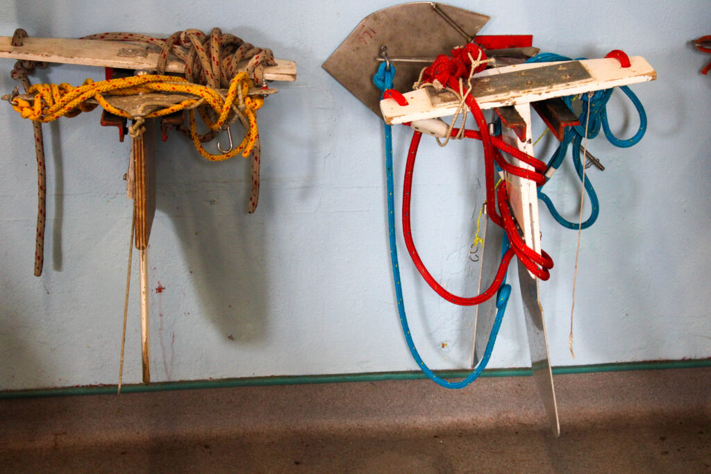
I edited this image by increasing the exposure, contrast, shadows, white, vibrancy and saturation, while decreasing the highlights and blacks. I did this, so that the ores and the blue background would be more vibrant and saturated.
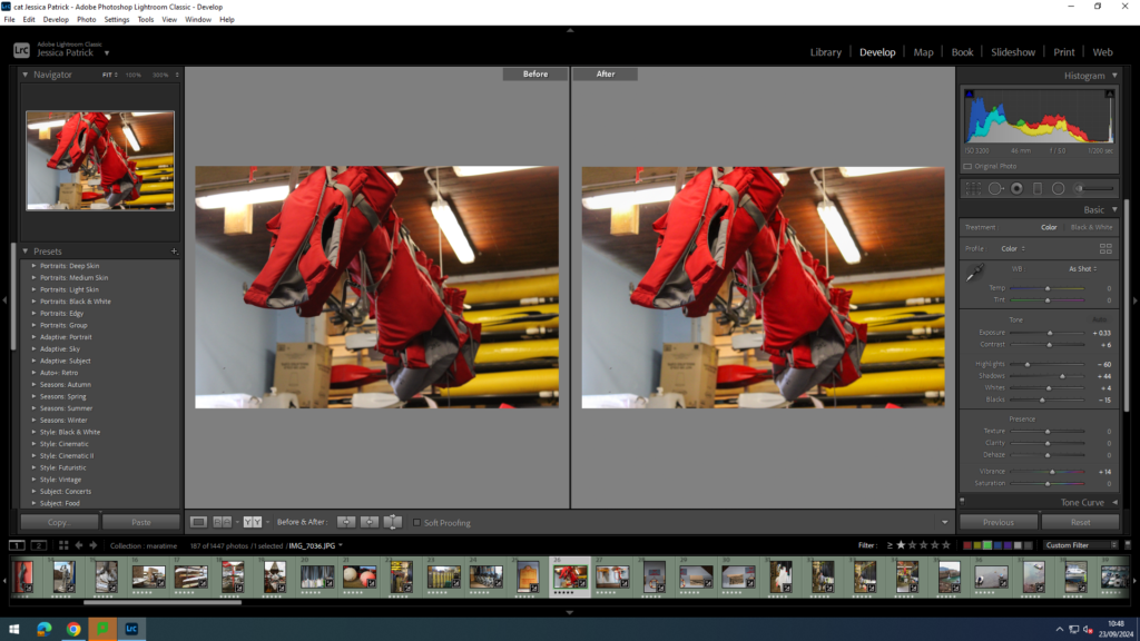
I edited this image by increasing the exposure, contrast, shadows, white and vibrancy, while decreasing the highlights and blacks. I did this, so the image would be brighter and more vibrant.

I edited this image by increasing the exposure, contrast, shadows, white, vibrancy and saturation, while decreasing the highlights and blacks. I did this, so the image would be brighter.
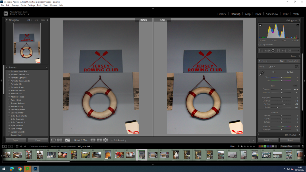
I edited this image by increasing the exposure, contrast, shadows, white, vibrancy and saturation, while decreasing the highlights and blacks. I did this, so the image would be brighter.
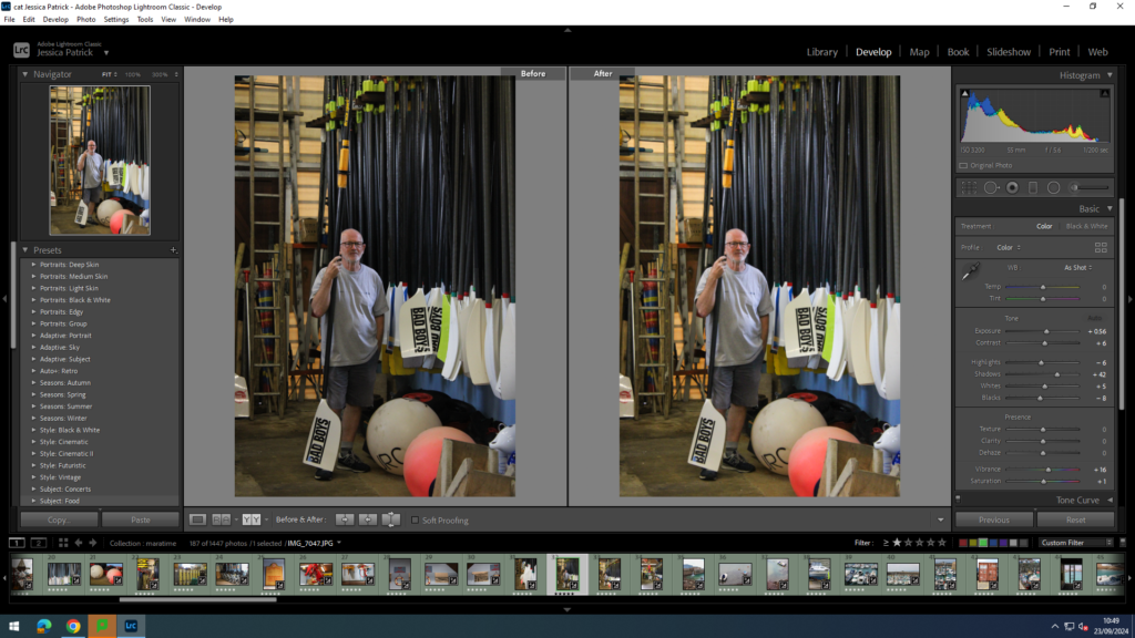
I edited this image by increasing the exposure, contrast, shadows, white, vibrancy and saturation, while decreasing the highlights and blacks. I did this, so that the image would be brighter and more vibrant.

Then, I created a virtual copy and created a back and white version. I increased the contrast, highlights and whites, while decreasing the blacks and shadows, so that I could create more contrast and light and dark tones in the image.

I also took the same photo, but from further away. I edited this image by increasing the exposure, contrast, shadows, white, vibrancy and saturation, while decreasing the highlights and blacks. I did this, so the image was brighter and more vibrant.
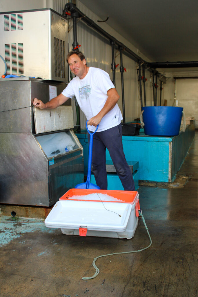
Final Images of the rowing club


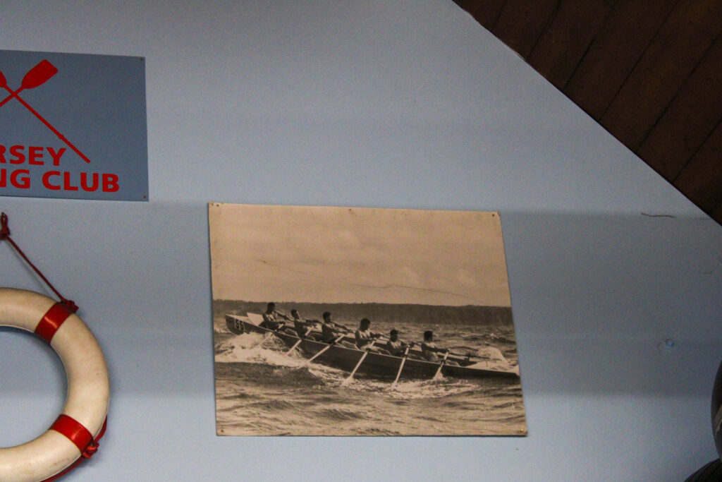




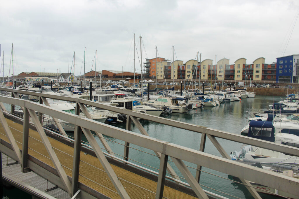
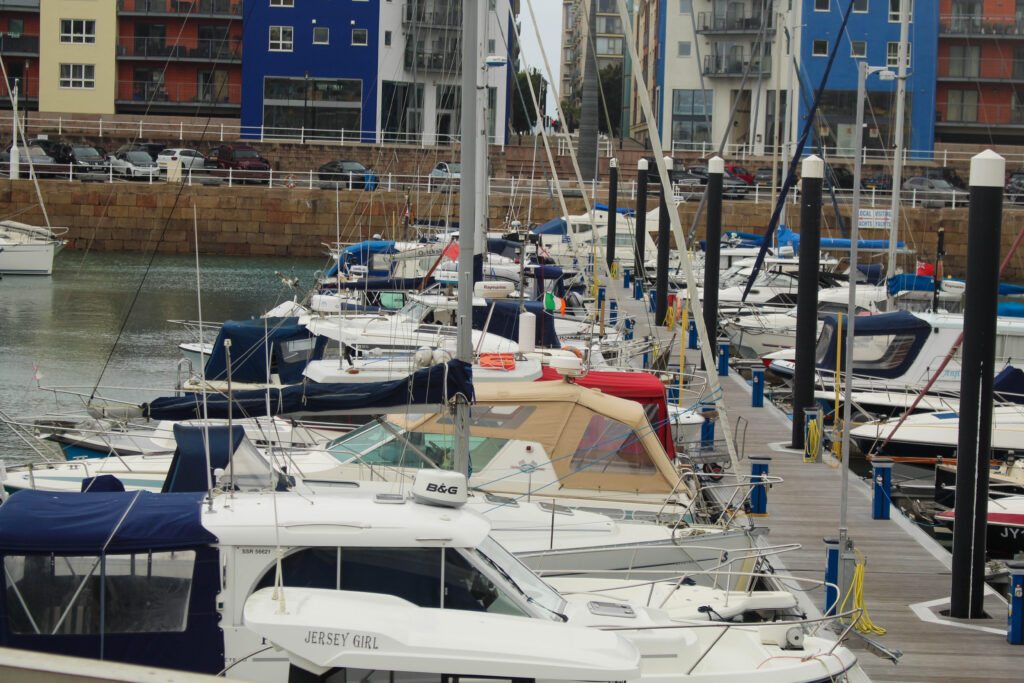
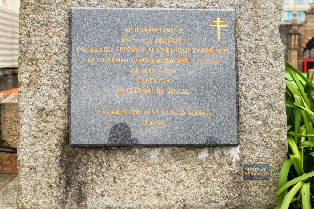
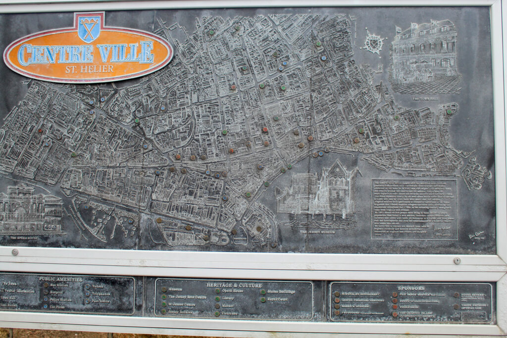
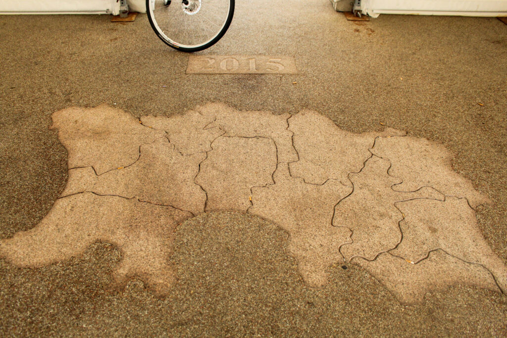
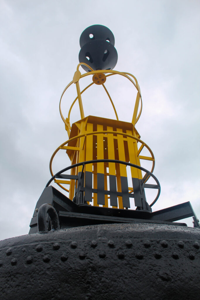
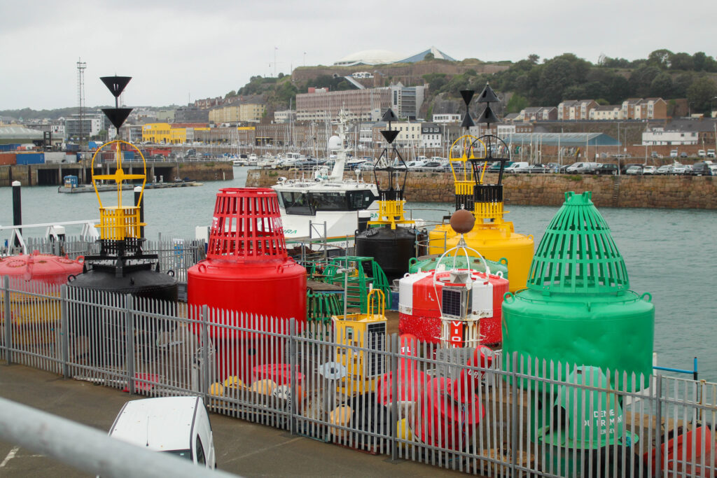
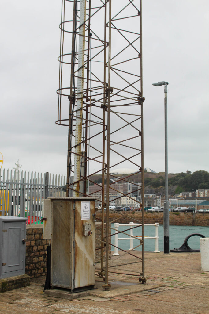
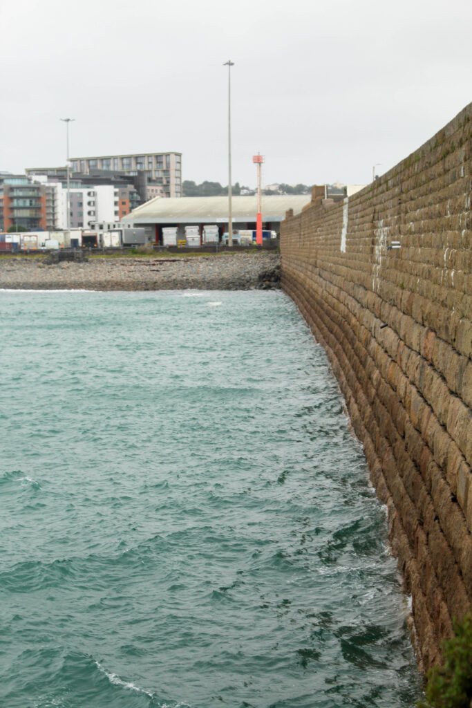
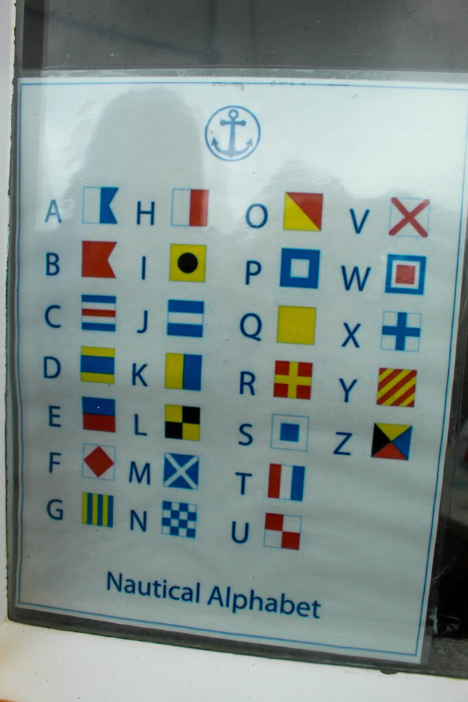
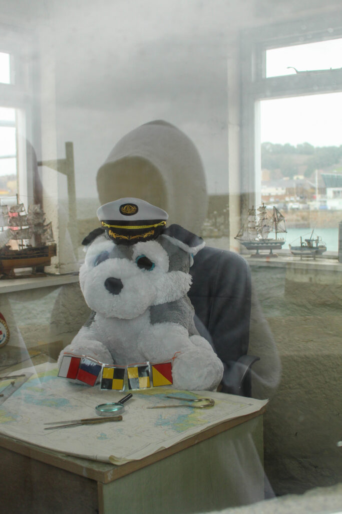
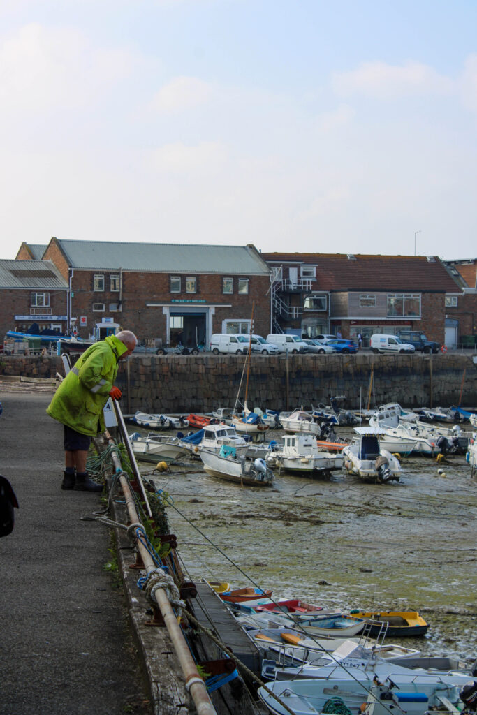
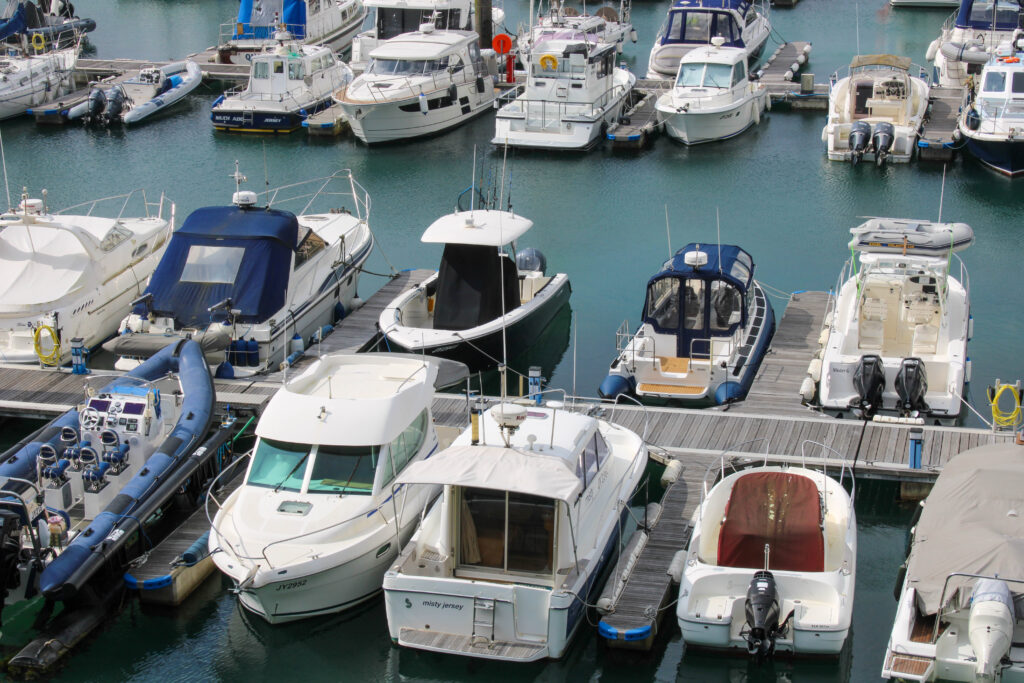
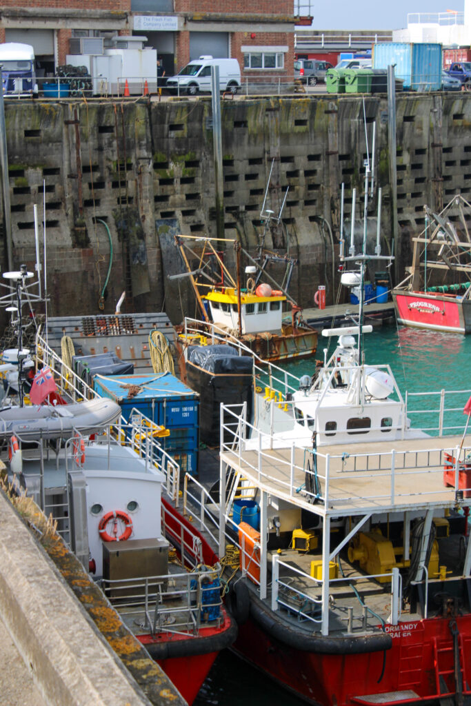
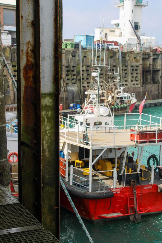
Final Images of Jersey Harbours




































Evaluation
In conclusion I think this photoshoot went well, because I explored and captured all different areas and angles of the harbour. I was also able to obtain portraits at the rowing of Michelle, who is part of the rowing club. I think capturing portraits as well as landscapes really allowed me to explore all the different elements of the harbour.
I also think the editing of my images went well, because I was able to slightly adjust the images to make them more bold and vibrant. I was also able to experiment with creating black and white images, so I could create more cool tones and contrasting images. However, next time I would like to experiment with cropping and photoshop a bit more, because I ran out of time to experiment fully in this topic.
Analysis of top 3 images

This boat is a boat that is docked at the harbour, next to the fish shop, where they keep all different types of fish, so they can later be sold and eaten by people. This fishing boat is used by the fisherman and they go out into sea and use the nets on the side of the boat to catch fish, crabs, lobsters etc.
Some people (vegetarians for example) may not appreciate this image, because they believe that capturing fish to kill them and eat them is morally wrong. However, I like to eat fish, so I appreciate this image, the boat and the work the fisherman do capturing these fish.
The type of lighting used in this image is natural lighting, because the image was taken outside in the daylight. I had no control over the composition, or the layout of the boat, or the upward angle of this image, because we could not go lower onto the deck, so had to take this image from above. However, I did have control over my distance from the boat, because I could move left or right along the top deck. However, I quite like the upward angle, looking down onto the boat, because it allows everything that is on the boat to be visible.
Camera Settings:
F stop- f/5.6
Exposure- 1/200secs
ISO- ISO-100
This image is quite saturated and contains both warm (yellow) and cool (blue/green water) tones. This image also contains a few red/ rust colours, which compliment the green water very well and create harmony in the image, as they are complimentary colours. There are also light and dark tones, which create contrast in this image, as the deck of the boat is dark and the yellow colour contains more light. There are also lots of visible textures on this boat, including the rough fishing nets hanging over the side of the boat. The vibrant, saturated colours in this image lead the eye to the boat, causing it to be the main viewpoint of this image.

This image is of boats docked at the harbour, while the sea is out, so they are rested on the muddy, wet ground. Jersey citizens own these boats and pay money to dock them at this harbour. They may use these boats to go fishing, live on, or just to go out on a nice Summer’s day.
The type of lighting used in this image is natural lighting, because the image was taken outside in the daylight. I had no control over the composition, or the layout of the boats, because I could not manipulate the position and layout of these boats in the foreground. However, I could manipulate the angle of this image, because I was able to move left to right along the side of the harbour when taking this image. I could also manipulate the distance I was from the boats, because I was able to zoom in and out on my camera. I also like the angle and distance of these boats.
Camera settings
F stop- f/10
Exposure- 1/200secs
ISO- ISO-100
This image is in black and white, so is vey cool toned. It also has lots of light and dark tones throughout it, as there are lots of different shades of grey running through the image. There are lots of patterns of repetitive shapes throughout the image and lots of repetitive forms, because of the pattern that the boats present, because the boats are laid out exactly the same next to each other and are very similar looking boats. This gives the image a good composition and layout within the frame. The boats in the foreground are the main viewpoint in this image, but I think the sea in the distance in the background keeps the image more exciting and less boring.

This image is of Michelle, who is apart of the Jersey Rowing Club, which is a club of rowers, who take part in competitions across the Channel Islands and France. The location of the image is at St Helier Harbour, in there stock room (where they keep all their equipment eg ores).
The lighting used in this image is artificial lighting, because this image was taken inside. I had complete control over Michelle and some of the equipment in this portrait, so I asked Michelle to hold an ore and stand next to the other ores. I also had control over the distance I stood from him and I could zoom in and out on my camera.
Camera Settings
F stop- f/4.5
Exposure- 1/200secs
ISO- ISO-3200
There are many different colours in this image, including pink, blue, brown, green, orange, yellow etc, but the main colour in this image is white, which is very bright and vibrant, while the other colours are also vibrant and saturated. There are mainly light tones in this image, because the colours are so saturated and the white is so bright. The row of ores also create a repetitive pattern in the image, with a leading line, which leads the viewers eyes to the main viewpoint of the image, which is Michelle, who is stood more in the background. This creates a sense of depth in the image.
