Photoshoot


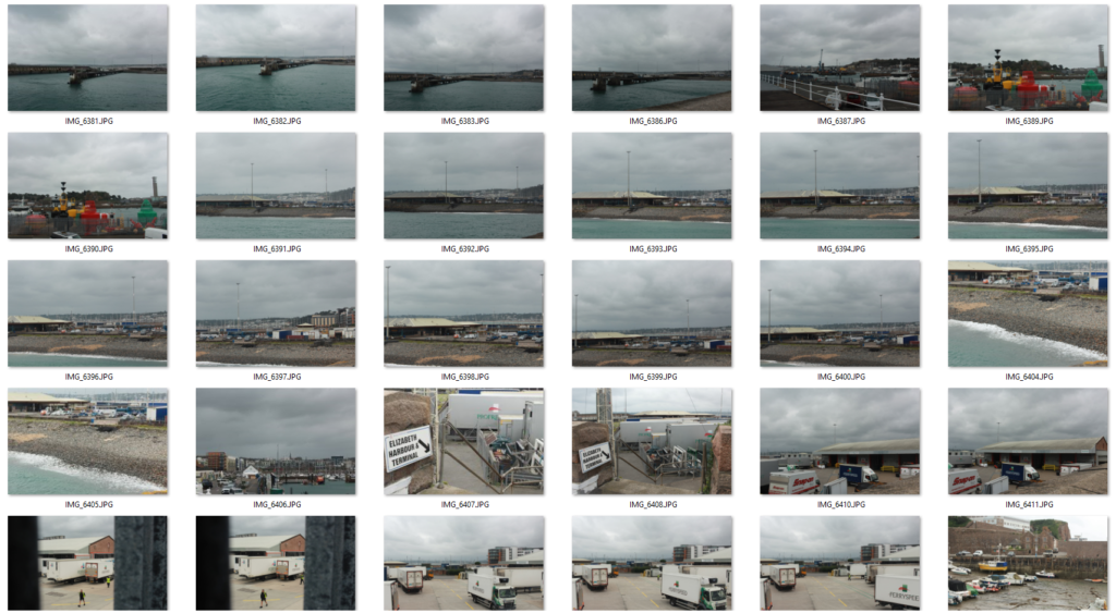
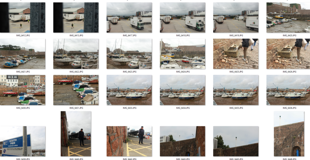
Analysis
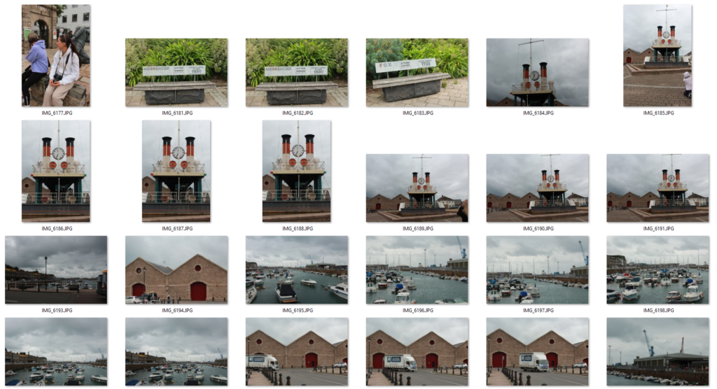
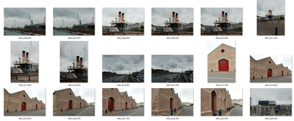
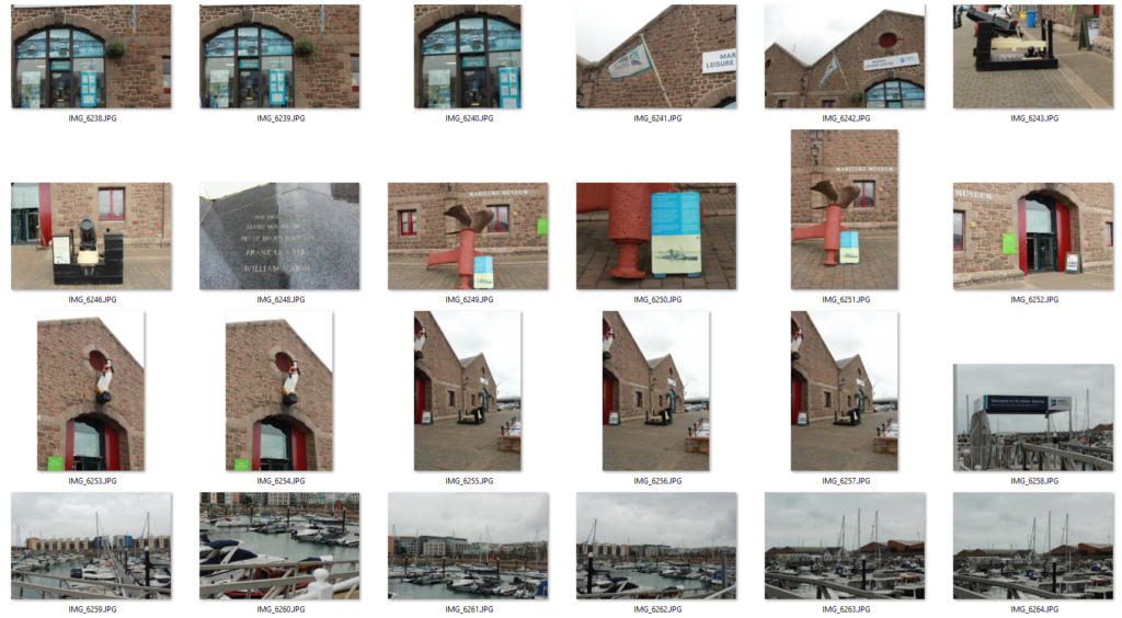
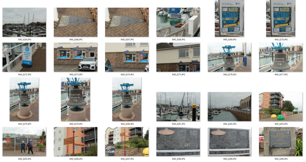
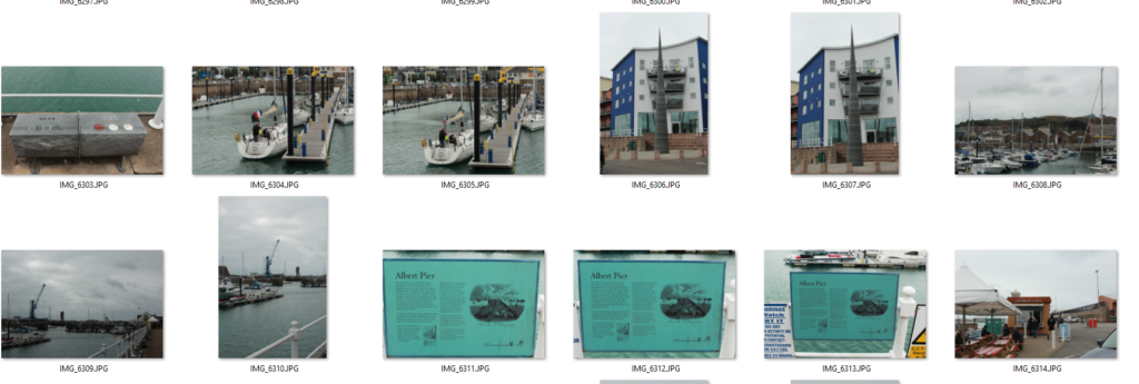
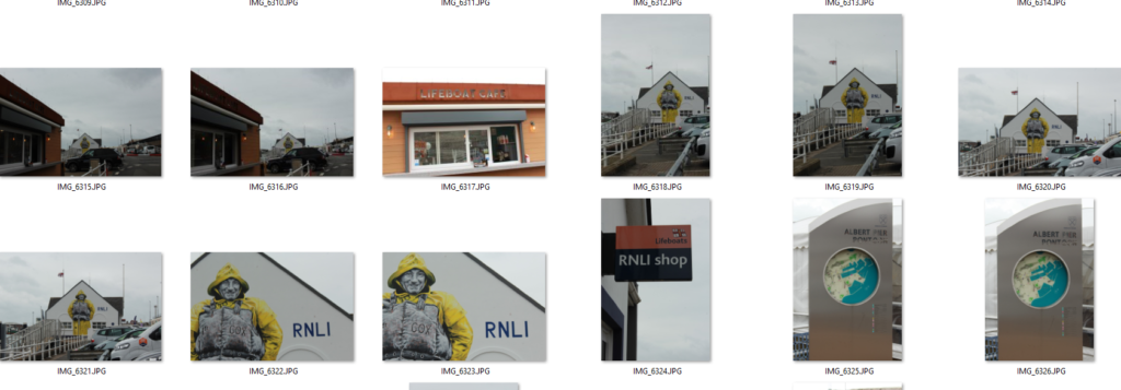
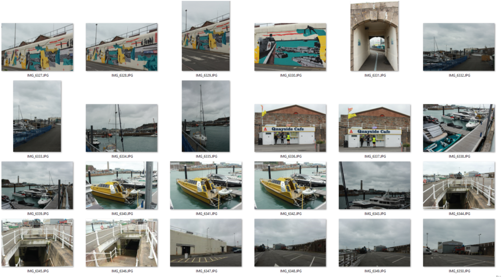
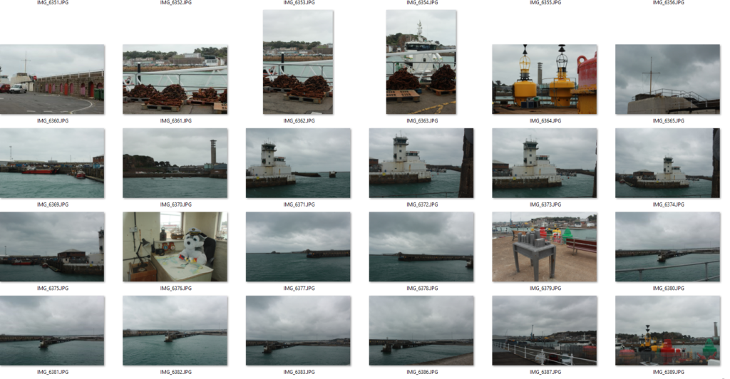
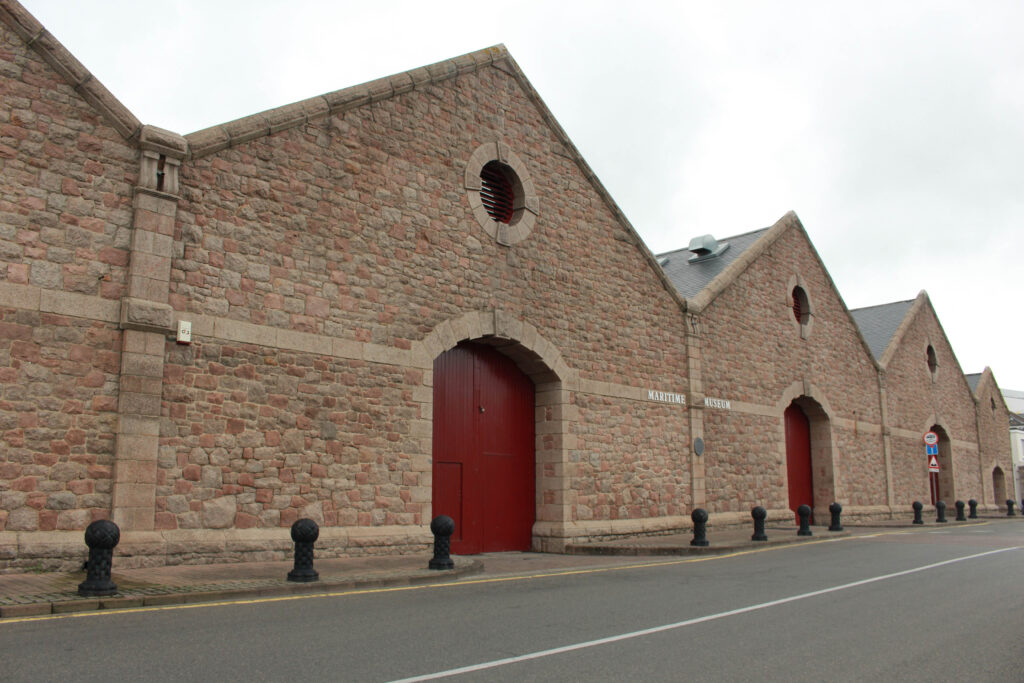
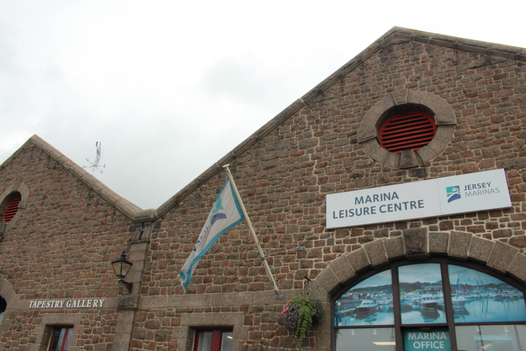
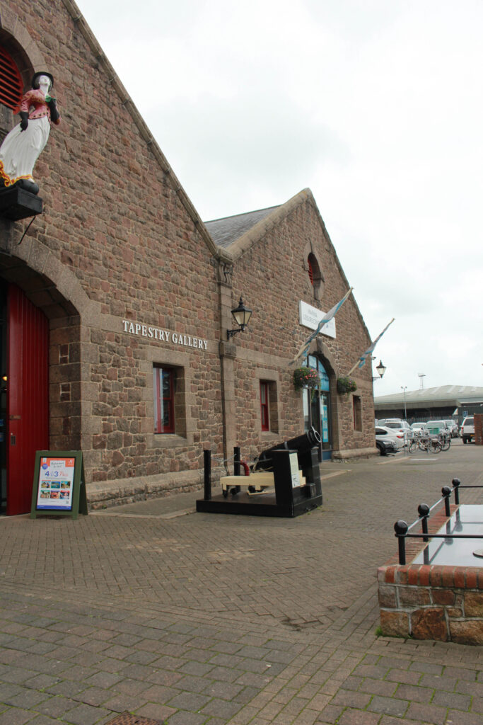
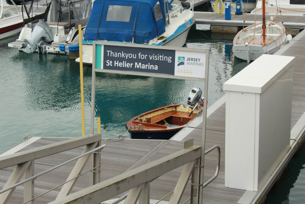
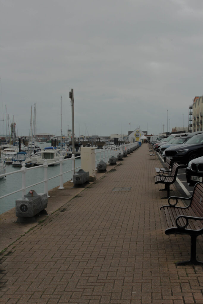
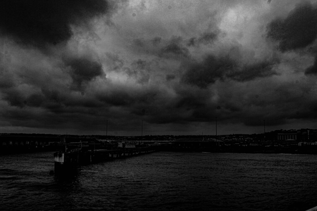
Overall I took mostly landscape pictures of St. Helier’s harbour, my reasoning for that was because a portrait shot just wouldn’t be able to capture it all. The lighting of all the photos are general daylight, on a cloudy day, but you can see the sun peeking out at certain times, allowing me to capture images in different lights. There is quite a lot of repetition within my images, because I really wanted to capture the right angle of things, such as building’s. I wanted to be able to get all three buildings with the red doors in one image. I have mainly led the eye with objects being in the foreground in most of my images, rather than having things hiding and making people really look to find an object, this is because I wanted to show the historic simplicity of the harbour, for example those buildings have been there since forever and will continue to stand, so I wanted to portray how bold they are.
Editing In Lightroom
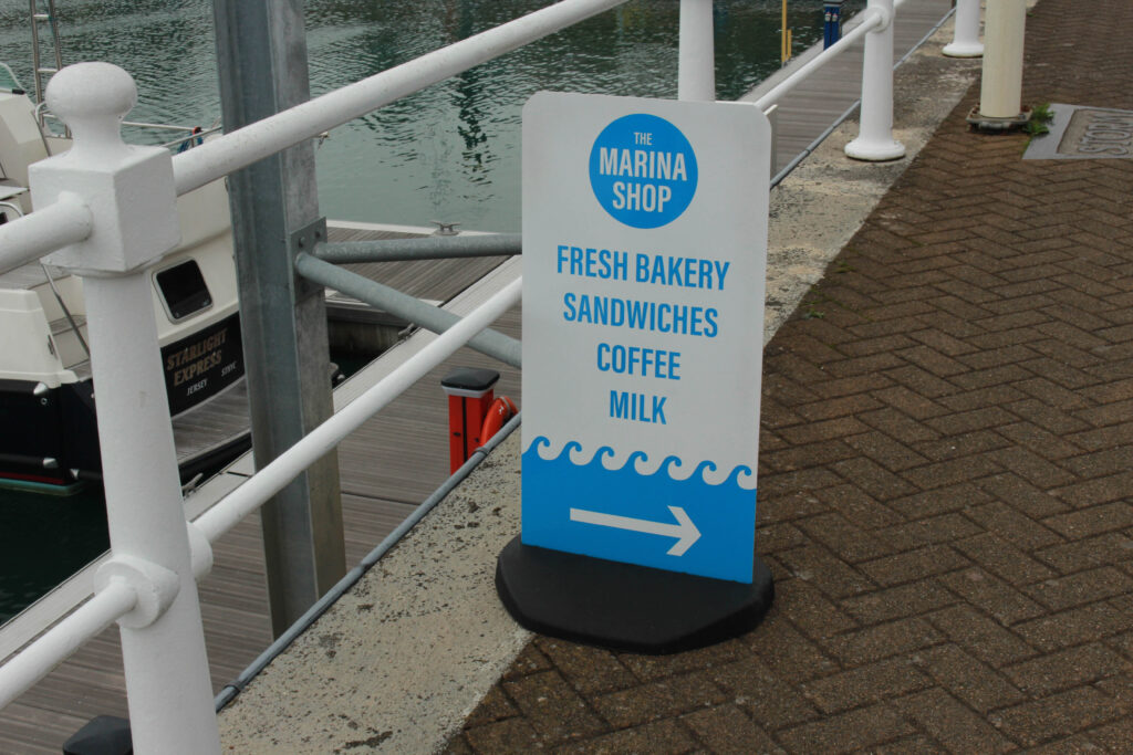
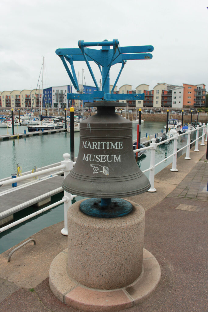
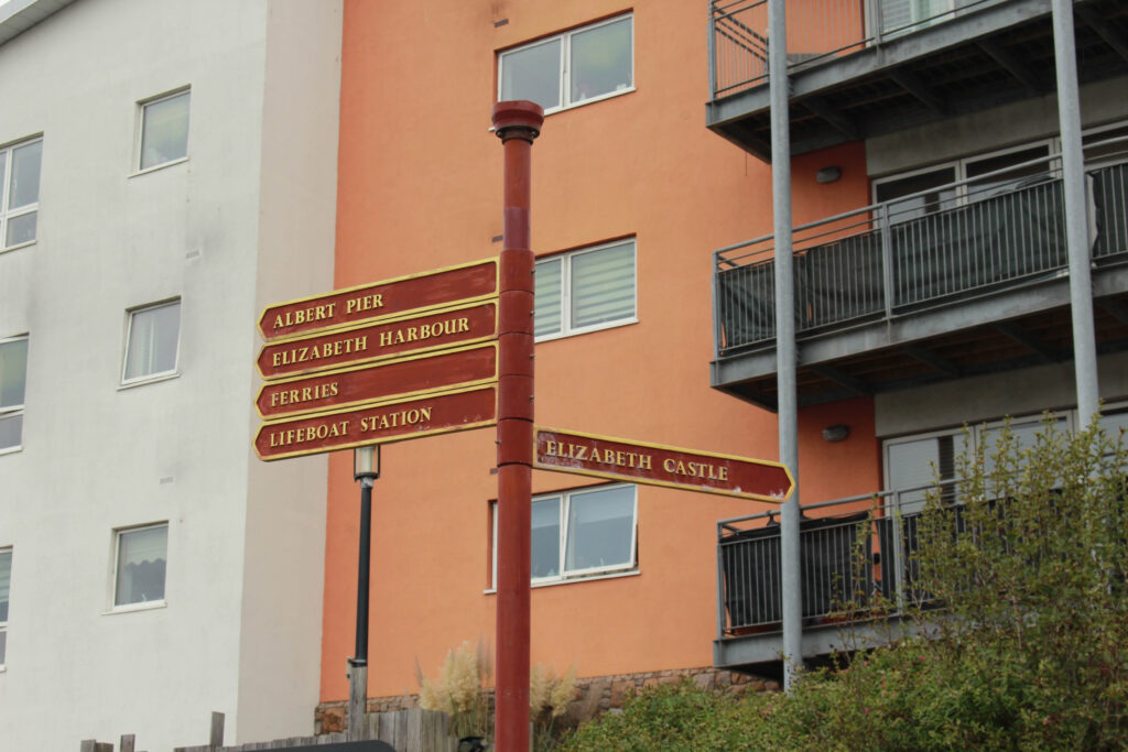
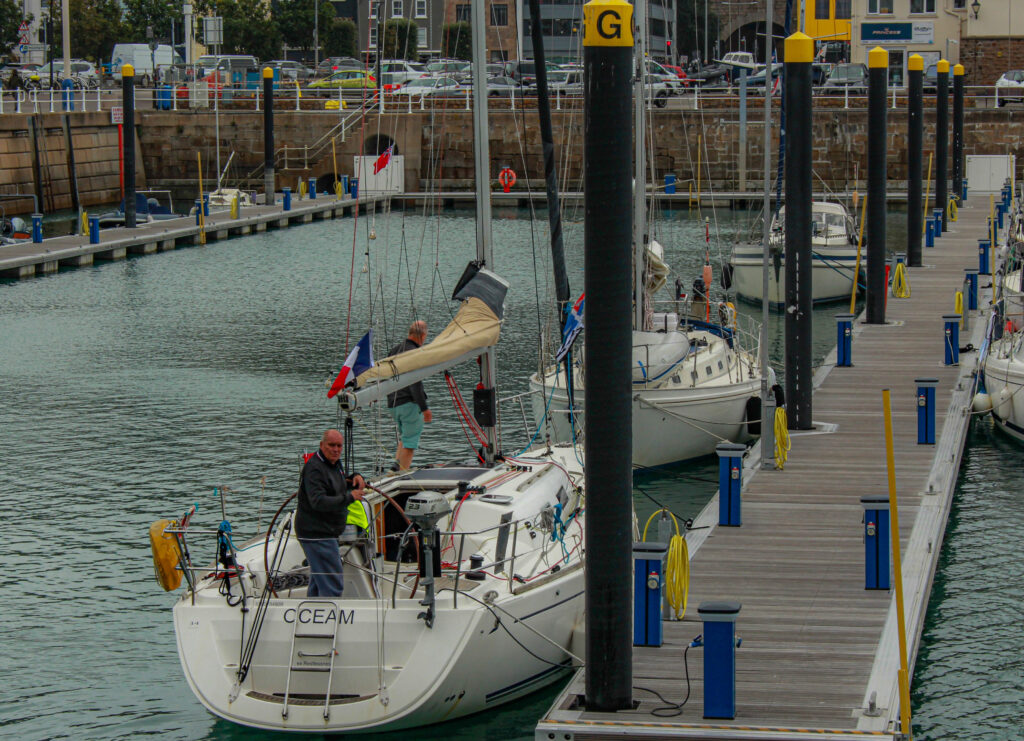
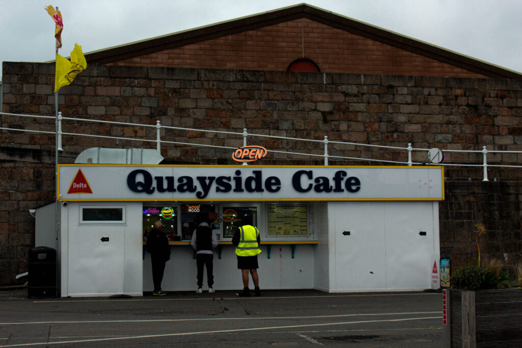
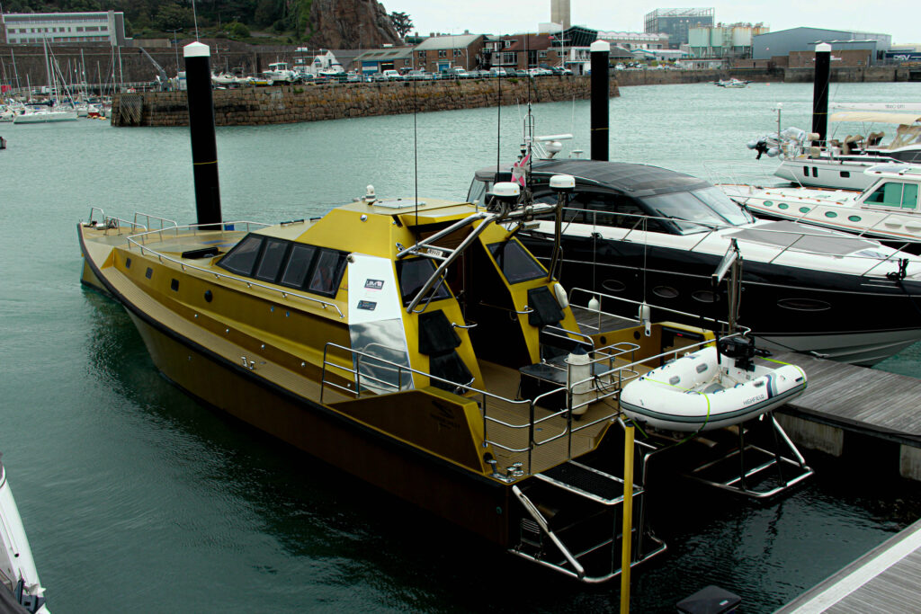
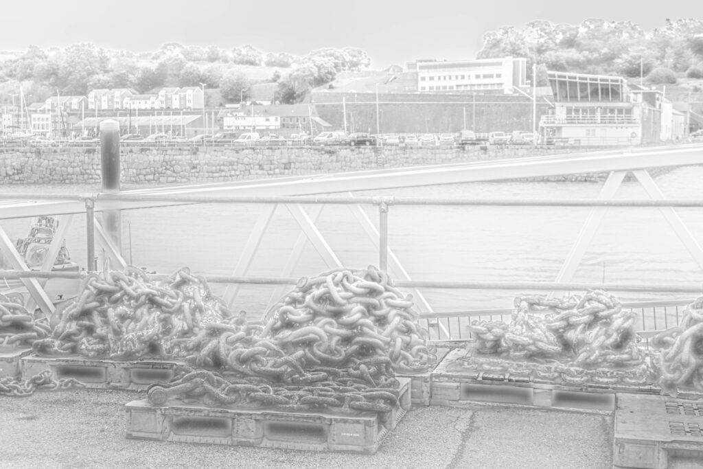
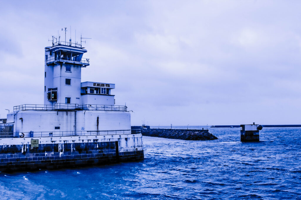
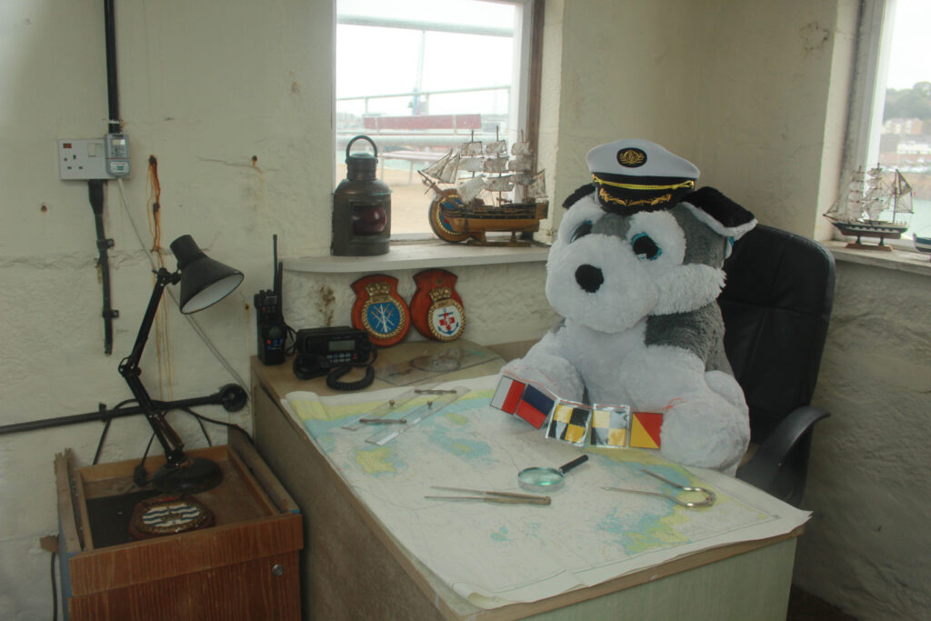
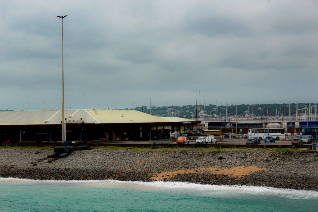
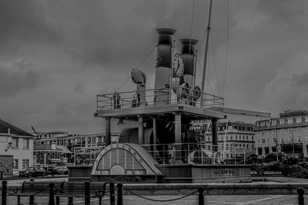
Reasoning Why
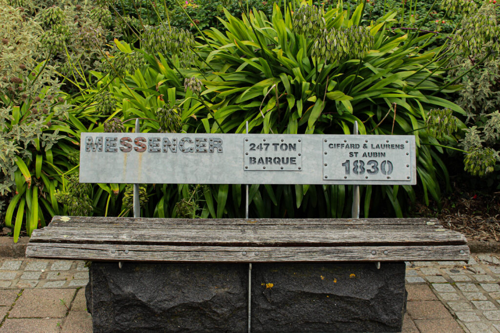
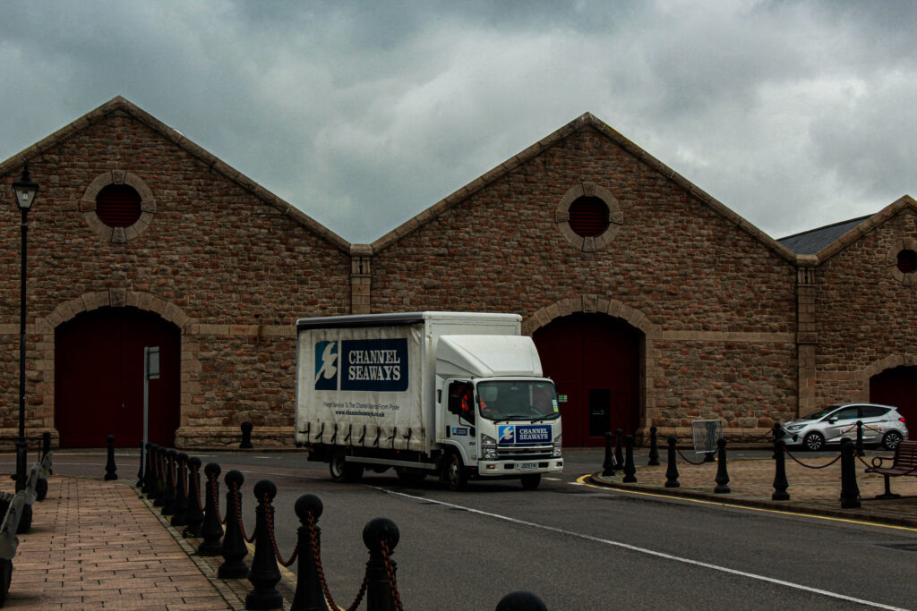
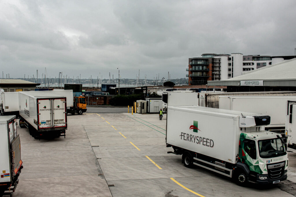
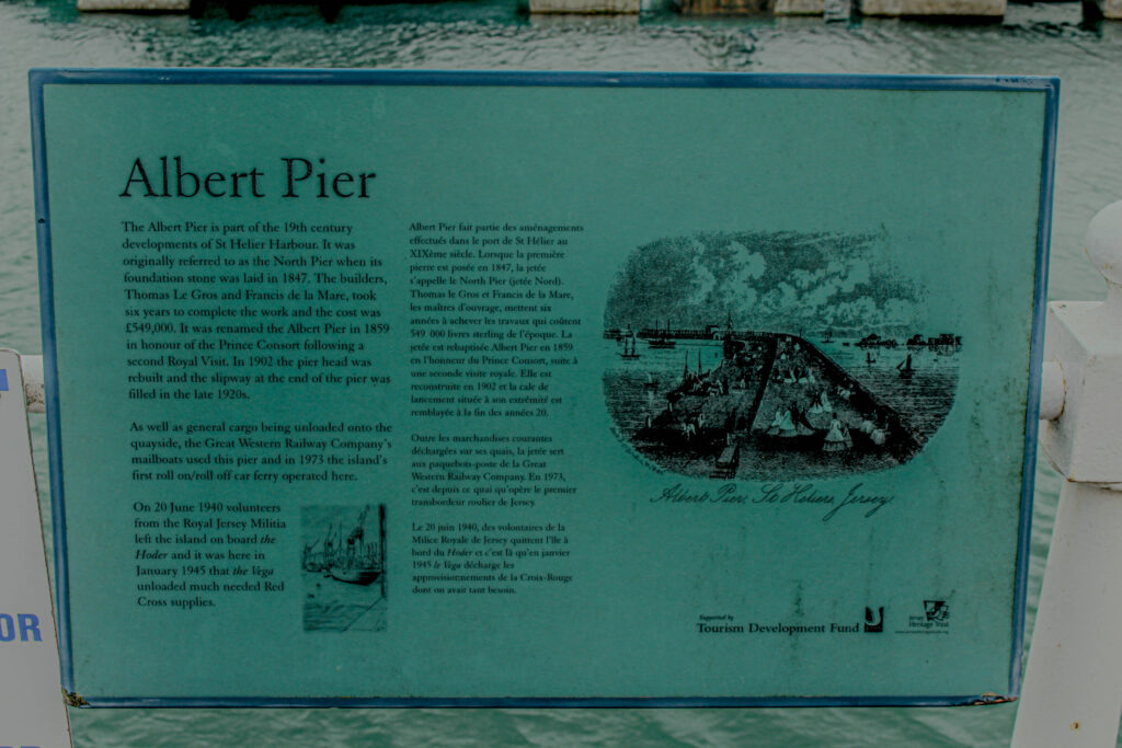
I have edited my images with a lot of light dark contrast, the reason for this is because I wanted to portray the bold seas against the light breeze. I have used a lot of anchoring to portray my images, for example the image of the van being the main object at the front of the foreground, this helps lead the eye to the words “Channel Seaways”, to make people wonder about what was in the van, and where it was going. It also makes people realise that although the harbour seems to be very historic and out of use it is still indefinitely in use, people are spending their whole days there working 9 to 5s. I think a lot of my images have good harmony, all aspects of the image correlate with each other, for example the image of the RNLI lifeguard mural, and with the rocks around the path that state different boats and there weights and what they’re made of.
Favourite Image Analysis

This image was taken within natural daylight, it was a cloudy day which makes the sky look darker, looking like the image is taken in the evening or night when really it was the start of the day. This image has a overall dark tonal range, with a lot of blacks an browns apart from the white of the truck it is overall neutral tones. This was taken with a wider lens, zoomed out and landscape to capture the whole vehicle, the road, pavement and the buildings behind. This image is a bit over exposed, but I have done this to portray the boldness of the modern vehicle against the old brick buildings. The image is very textured, being able to see each stone used to create the buildings and the pavement. Also being able too see the clouds with a lot of texture, to create a darker feeling, like the camera has taken a photo so clear that you would’ve seen something more blurry if you were there. I have confined this image to have the truck in the main depth of field, drawing you to that straight away, and then having the poles and pavement in the foreground an the buildings in the background to create a nice harmony, using a rues of third’s, the truck, the pavement/poles and the buildings. My idea between this image was mainly contrast, I wanted to create multiple different types of contrast, for example the colour contrast and the modern vs historical contrast.
Overall Evaluation
I overall think that this photoshoot went very well and I was able to capture multiple different elements of the harbour, trade, lifeboat’s and fishing. This allowed me to edit my images in a creative way to dictate contrast and historical presence. One thing I would do next time would aim to go on a nicer day, with a clearer sky, whether that be in the evening or a day just a less foggy environment, to create better lighting.
