The Harbour development –

Over the years, the harbour did develop a lot. From the 19th century to the 21st century, the size, technicality and involvement has changed dramatically as the roads and land grew near the harbour.
In the 19th Century the Old Harbour was constructed. The Chamber of Commerce urged the States Assembly to build a new harbour, but they refused, so the Chamber took it into their own hands and paid to upgrade the harbour in 1790. To shelter the jetty and harbour a new breakwater was constructed and in 1814 the merchants constructed the roads now known as Commercial Buildings and Le Quai des Marchand’s. They did this to connect the harbours to the town and in 1832 construction was finished on the Esplanade and its sea wall. In 1837, a rapid expansion in shipping led the States of Jersey to order the construction of two new piers: the Victoria and Albert Piers
Harbour trip –
St Helier Harbour is the main Harbour in Jersey. This harbour is used to dock Jersey citizens boats, as well as how Jersey citizens travel to and from the Island on the Condon Ferry. There are 3 marinas in St Helier Harbour, which are used for private yachts on pontoons and drying harbours for commercial shipping, with facilities including a dock for lift-on/lift-off cargo ships, roll-on/roll-off ferry berths and a tanker berth. This harbour is operated by Ports of Jersey, the operative government company.
Today, Ports of Jersey operates all entry and exit points to the island, including harbours and airport. They have plans to re-develop St Helier Harbour into a modern commercial maritime hub.
Currently this harbour is used for citizens to dock their boats and for cargo ships to leave and return with goods from other places around the world
Photoshoot 1 –


Photoshoot 2 –


Final photos chosen before editing –


Evaluation of chosen photos –
I chose to pick these photos because they all have very distinct colouring of either yellow and red. Due to some of the photos being taken around the harbour, yellow and red are the most prominent colours I saw so I thought that it would be nice for that to be the focal point of my photoshoot.
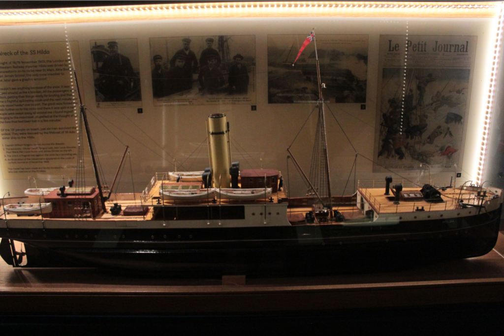
The photos used from the maritime museum I wanted to help dictate the history of the harbour so I thought that the two would work really well with each other to almost show a story of the harbour and the boats that reside in it now, and societies ago.
I thought that due to the fact that I haven’t really included colour in my previous shoots, I can make this one colour based.
Edits analysation –
For my edits, I want to group some photos together, the photos with prominent red colouring in them will be together, prominent yellow will stay together too and the photos with both red and yellow will be sperate from all others.
I want to mute all colours from photos that aren’t the prominent red or yellow colouring by making the back of the colour black and white.
Edit 1 –

To achieve this edit, I used the HUE dials, and muted all insufficient colours in the photo and with the red colour I wanted to keep, I saturated the colour to 100% making it a lot more prominent . I wanted to enhance the red in this photo due to the almost dominant power this boat clock holds. It is the focal point of St Helier harbour and is the first thing you see as you come through the tunnel on the way into town.


Edit 2 –

For this edit I did the exact same thing as edit 1, changed the hue and saturations and heightened any saturation I needed more prominent. The importance of the red in this photo is to show the danger and things that the island had to earn to have what it does. Since the harbour played a fair part in the occupation, and boating life of jersey, the red shows the hurt and the history of the harbour and the areas surrounding it making it a focal part of the liberation area and the surrounding harbours.


Edit 3 –

In this edit, I initially muted all colours apart from yellow to emphasize it, however I started to play around with the luminance of the colour and thought that if I enhance it, the colour will make the photo more eye-catching and intriguing for people who view it.


Edit 4 –

With this photo, I wanted to focus on the colour. Instead of muting them, I wanted to enhance them, the pictures in this photo show a history to out island and what was not only worked for but important to the society who live here. The colour brings the photo to life and helps show a story through them, even with minimal information to grasp.


Edit 5 –

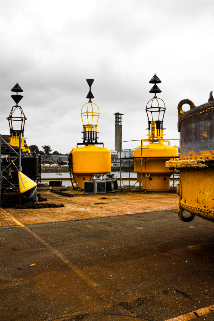
For this edit, The colour editing proved quite difficult due to the orange and yellow hues on the floor and the boeys. I stuck with keeping the yellow hues in even through the floor seemed to interrupt the black and white overall vibe of the photo so more editing may be needed on this one. The boeys seem to be a very big part of seaman life throughout the years so I thought keeping them as the main colour could emphasize their importance.


Edit 6 –

This edit initially had a lot of yellow, green and red, but due to the hues in the background I decided to focus on the red and the view of the harbour. The view included some yellow, blue and green hues, which would have made it substantially more difficult to cancel out from the background. So, I stuck to red. Also increasing the clarity and texture, and tone of the picture.


Edit 7 –

This photo almost gave me eerie feel to it due to the well shown rule of thirds so I thought while still keeping the red colour in the photo, I made the texture and shadows quite prominent to keep the eerie feeling about it.


Edit 8 –

This photo, like the other, it has a scary eerie kind of feeling to it. I wanted the shadows to really be dramatic as well as the colour red to pop out a lot. The use of muting all the colours apart from red really helps to do this because that alone enhances the shadows and whites in the photo making the red really pop.


Edit 9 –

With this edit, I wanted to include some of the wildlife that you find in the harbour and around the fisheries that we saw. I wanted to still stick to the idea of muting all colours apart from one in particular, but with this one it seemed quite difficult. Because the colours in the original photo aren’t man made, like paint it was difficult to segregate the different hues of orange and red and yellow. I played around with each colour and decided to stick with red and see how it played out.
I also did focus on the shadows and brightness and leant towards having this photo more bright. I levelled out the shadows and highlights as much as I could, while still keeping the natural lights as well as natural shadows.


Edit 10 –

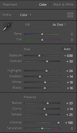
I loved the use of the border light in this photo and thought that enhancing that would make a really great focal point. I also muted all other colours apart from yellow due to the border light being a yellowy tinge. The colour yellow also depicts an aging feel to the photo and due to this photo showing a ancient boat which resided in the harbour years ago.
I enhanced shadows and highlights in this photo, and due to this photo being taken not at a front facing angle I decided to crop and move the photo slightly to give more of a face forward look.


Edit 11 –

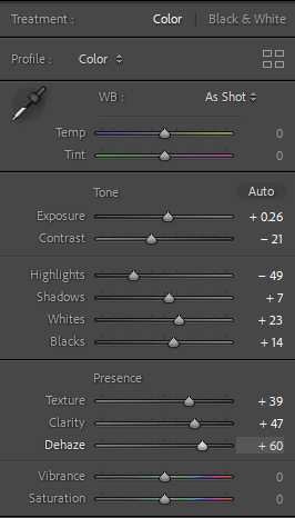
These photos from the museum really all show the history of the boats and harbours but due to the ominous and spooky feeling of this photo, I decided to really focus on the shadows and the darkness of the photo, while still looking at segregating the colour yellow to give the photo a focal point. This could also show that the history of the harbour is not all good and positive, there were dark times and things that weren’t good that circled the harbour too.
I made the photo more clear and enhanced the texture to give the photo more of a realistic feel rather then a photo as well, this is to show that the history of the harbour did happen and should be taught and spoken about due to the importance it has on Jersey and it’s society.


Edit 12 –

This photo really looked at the spooky side too, the segregated red really shows a lot and the use of the enhanced shadows and almost deathly mood this photo sets, shows the amount of deaths that surrounds the fishing and boating society even up to this day and age, its a way of remembering and understanding.


Edit 13 –

This photo has the same editing idea of edit 10. The use of using yellow as the depicted colour works so well due to the gold/yellow tinge that the lights let off. I thought the use of shadows and highlights being extenuated worked so well for the eerie ominous feel this photo lets off.


