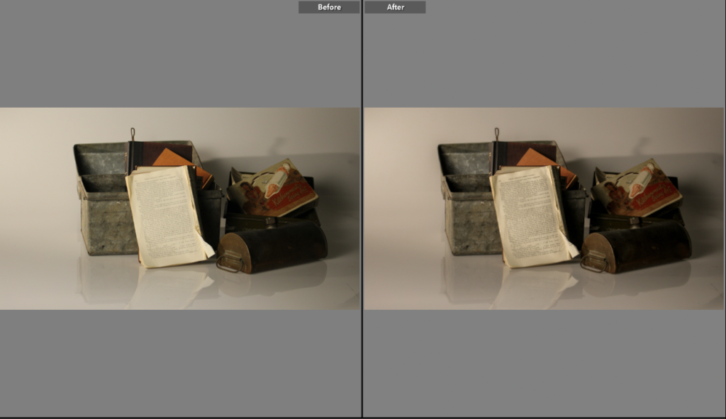
For this photo I had a metal box and piled books into it. I edited and got rid of the highlights and added extra shadows for an older look. The original photo was a lot brighter and less vibrant so I added clarity into the photo which made the photo and the reflection clearer. I added texture and shadows in the photo because I think it looks much better dark.
Before
after
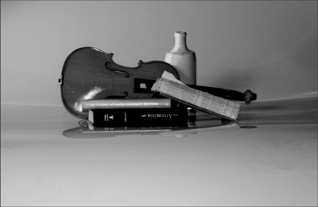
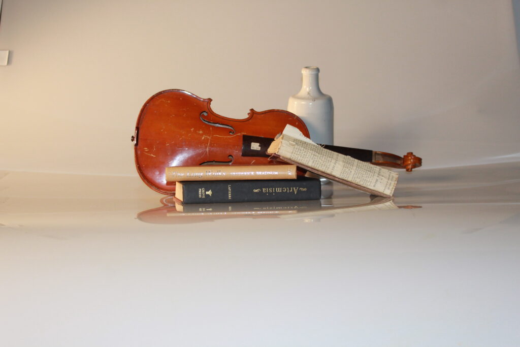
For this photo of a violin and books I changed the colour to black and white to change the aura of the photo. This created a clearer image of the violin and books to make you focus on them more than the colour of the original photo. I cropped out the edges of the original photo as it looked messy and straightened it out as evenly as I could to make the photo look clean.
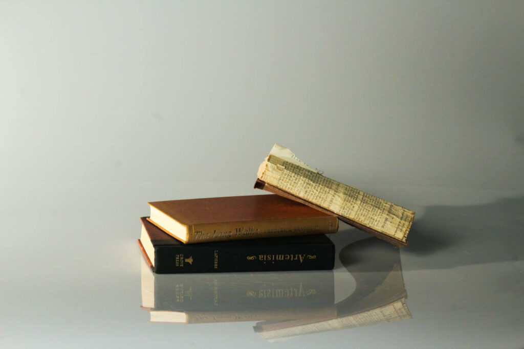
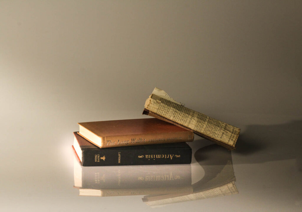
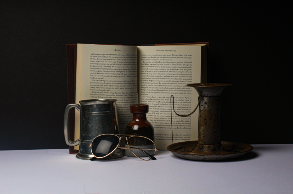
These photo of books are both edited but I prefer the second one as it is less dull and has a mystical feel to it as the books are glowing. I added texture to the second photo to give it a vintage vibe and added less clarity compared to the first photo for a less sharper image. the second photo gives a warm hue while the first photo has cold hue making it look crisp and sharp.

Please add more insight / images / to each blog post…they require depth and detail.
Please add missing blog posts too!
ALWAYS Follow the 10 Step Process and create multiple blog posts for each unit to ensure you tackle all Assessment Objectives thoroughly :
Mood-board, definition and introduction (AO1)
Mind-map of ideas (AO1)
Artist References / Case Studies (must include image analysis) (AO1)
Photo-shoot Action Plan (AO3)
Multiple Photoshoots + contact sheets (AO3)
Image Selection, sub selection, review and refine ideas (AO2)
Image Editing/ manipulation / experimentation (AO2)
Presentation of final outcomes (AO4)
Compare and contrast your work to your artist reference(AO1)
Evaluation and Critique (AO1+AO4)