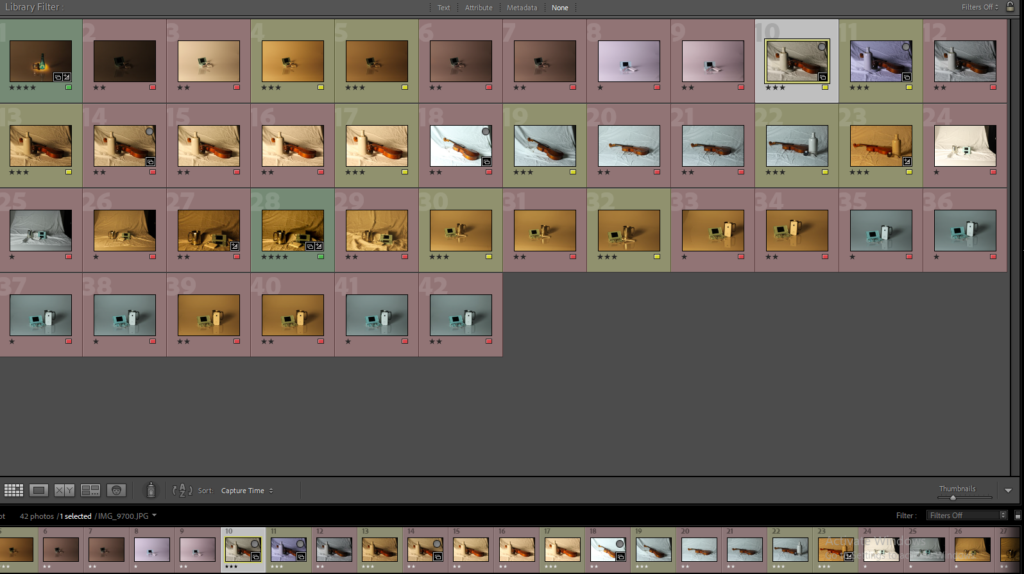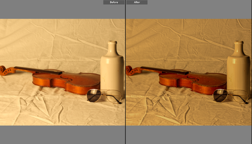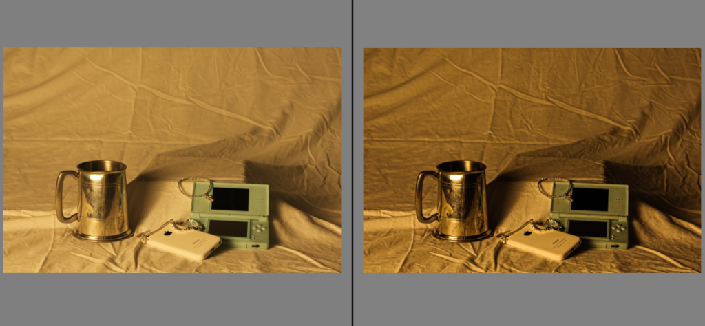
Before Vs After editing


In all of these images I increased the texture and clarity to sharpen the objects and background, so the objects are more in focus and the detail is precise.

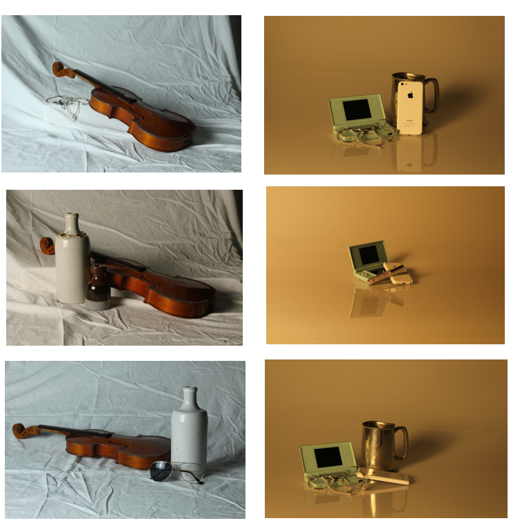
These particular images are all unedited but I really like how in the warmer tone images the background looks really glossy rather than textured, so we can therefore see the reflection of the objects. But as we can see on the left hand side, in the cooler toned photos, the cloth which is used as a backdrop is textured to show the objects in a clearer perspective to focus on them.

Use the image diagnosis sheet to help you evaluate the quality of your photos. This includes the details below:
Focus :
– Is this image in focus? Partly in focus? Is the depth of field shallow or wide?
Lighting
– What lighting has been used? Flash or continuous? Hard or soft? Is the lighting effective? Why / why not?
Exposure
– Does the image have a balanced exposure? Over-exposed Under-exposed ? What are the signs of this? What is the connection between the kind of lighting used and the exposure?
White Balance
– Does the image have a hue / tinge to it? Do the white objects appear white or is there a colour cast?
Include the FILE INFO (remember you can get this info by right clicking on the image in media library):
– Aperture / Shutter Speed ISO