
Text draft –
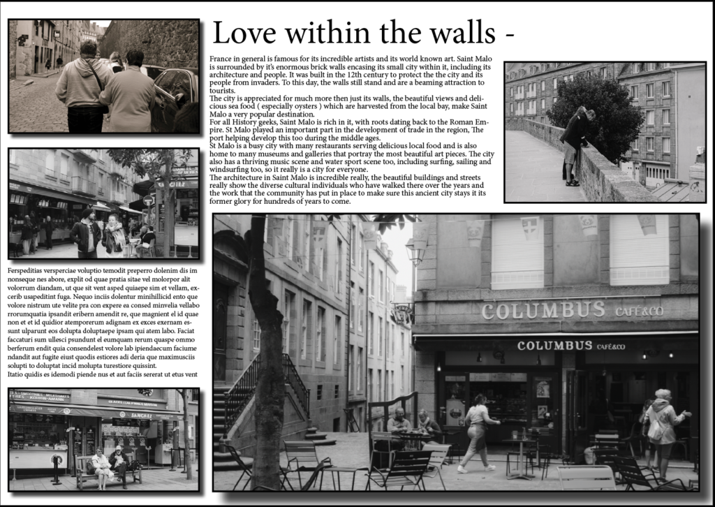
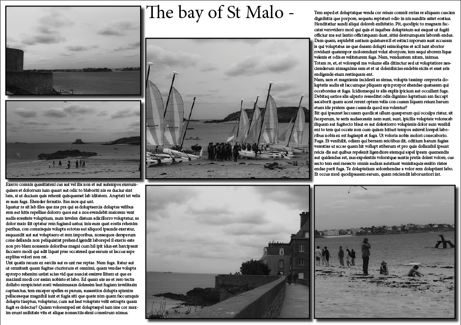
France in general is famous for its incredible artists and its world known art. Saint Malo is surrounded by it’s enormous brick walls encasing its small city within it, including its architecture and people. It was built in the 12th century to protect the the city and its people from invaders. To this day, the walls still stand and are a beaming attraction to tourists.
The city is appreciated for much more then just its walls, the beautiful views and delicious sea food ( especially oysters ) which are harvested from the local bay, make Saint Malo a very popular destination.
For all History geeks, Saint Malo is rich in it, with roots dating back to the Roman Empire. St Malo played an important part in the development of trade in the region, The port helping develop this too during the middle ages.
St Malo is a busy city with many restaurants serving delicious local food and is also home to many museums and galleries that portray the most beautiful art pieces. The city also has a thriving music scene and water sport scene too, including surfing, sailing and windsurfing too, so it really is a city for everyone.
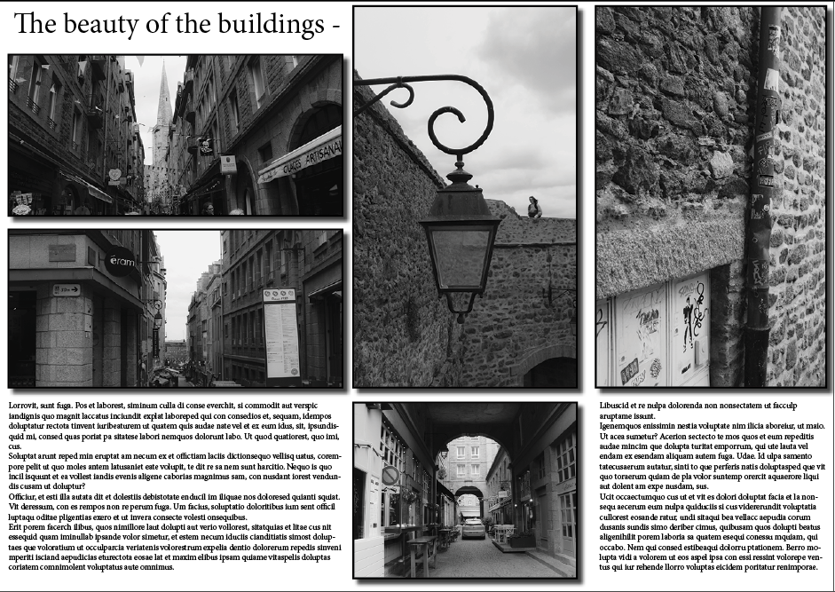
The architecture in Saint Malo is incredible really, the beautiful buildings and streets really show the diverse cultural individuals who have walked there over the years and the work that the community has put in place to make sure this ancient city stays it its former glory for hundreds of years to come.
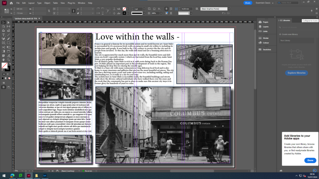
Page spread 1 –
Page spread 2 –
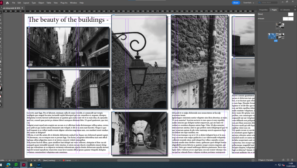
Page spread 3 –
I felt like overall, these 3 topics really stood out and captured my St Malo trip really well, grabbing some of the most important things that I feel St Malo has to offer. I not only included the people and the atmosphere, but the architecture too. This overall making my picture stories effective in presenting St Malo as a whole.
InDesign terminology –
workflow – 0 for the purpose of this course, I refer to workflow as the order in which you work in a program as you’re designing a project (a very watered down example: first you setup a new document, then you create a background, then you add text, etc.)
margins – the negative space around the inside of a page, a safe zone for all content / text / images
bleed – used for print only, extra space in addition to your page size that’s cut off when artwork “bleeds” to the edge of the page, so you don’t have any white border
slug – extra space on the outside of your document, different from bleed, used to show markings or notes for the printer (commonly used for printed magazines or newspapers)
grids / guides – the thin colored lines on your IND document that do not appear on your final document, but are just used for aligning objects on your page or showing where the margins are placed
facing pages – two pages shown side-by-side, also known as a spread – used for documents that will be printed and bound
parent pages (formerly called master pages) – mini templates you can create and use throughout your document for pages that have repeated content on them, like a page number or footer (they’re not part of your page count)
character / paragraph styles – a pre-set of settings and formatting that can be applied to a word, a line of text, or an entire paragraph in one click
frame – the invisible box that an object, link or text is contained within (also called container)
flow / reflow – how your lines of text continue from one frame / text box to the next, from one page to the next, and around other objects in your layout
overflow – when the amount of text in your text box is more than the size of your frame and overflows into a second text box
widows / orphans – a single word left by itself on a line of text at the end of a paragraph, or a single line of a paragraph left on a page by itself at the beginning or end of the paragraph
page break – when a section of text is cut off and the remainder is bumped (or reflowed) to the next page
line break – when a paragraph is cut off and the remainder is bumped (or reflowed) to the next line
frame break – when any part of a text box is cut off and the remainder is bumped (or reflowed) to the next text box / frame
keep – regulations for where line breaks can occur, so you can avoid widows / orphans and keep a certain number of lines in a paragraph together at all times
endnote – a group of notes shown at the end of an entire document that each refers to a reference number made in the text
footnote – a note shown at the bottom of a page that refers to a reference number made on that same page in the text
drop cap – a decorative feature at the start of the first paragraph of a section or page; usually an enlarged first letter in the paragraph or the first few words in the paragraph
small caps – when you use all caps for a word or phrase, this makes the letters a little smaller than a typical capital letter to make it easier to read and not so “loud” (as sometimes all caps can appear)
glyph – every character in a typeface, (e.g.: G, $, ?, 7), is represented by a glyph; this includes all capital and lowercase letters, numbers, and symbols