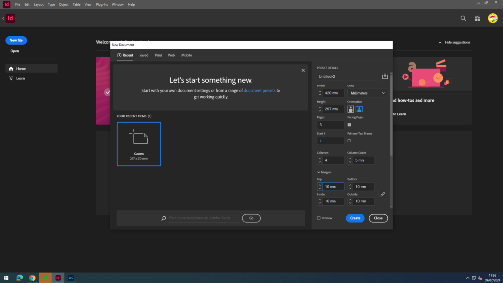
Firstly, I selected my page spread size and layout, I could have an A3 spread. I used the measurements and layouts below.
Experimentation
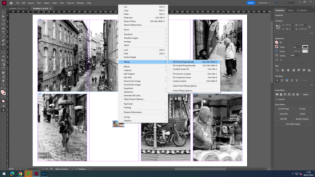
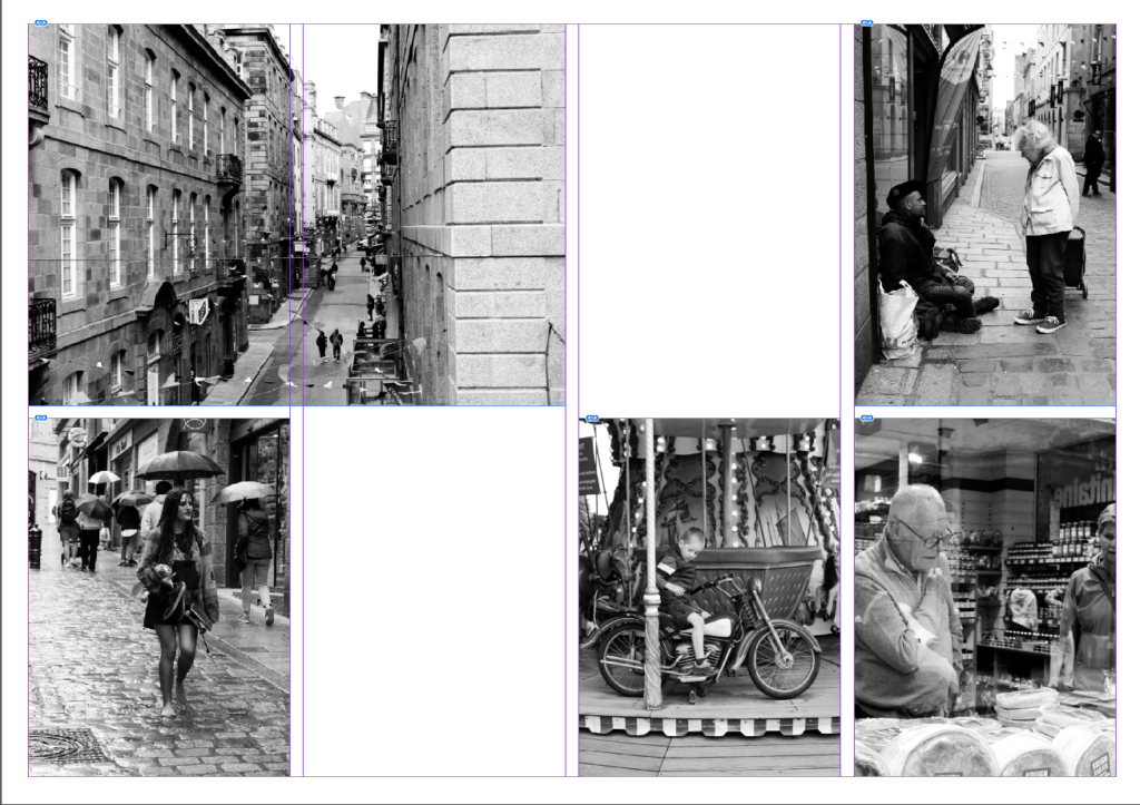
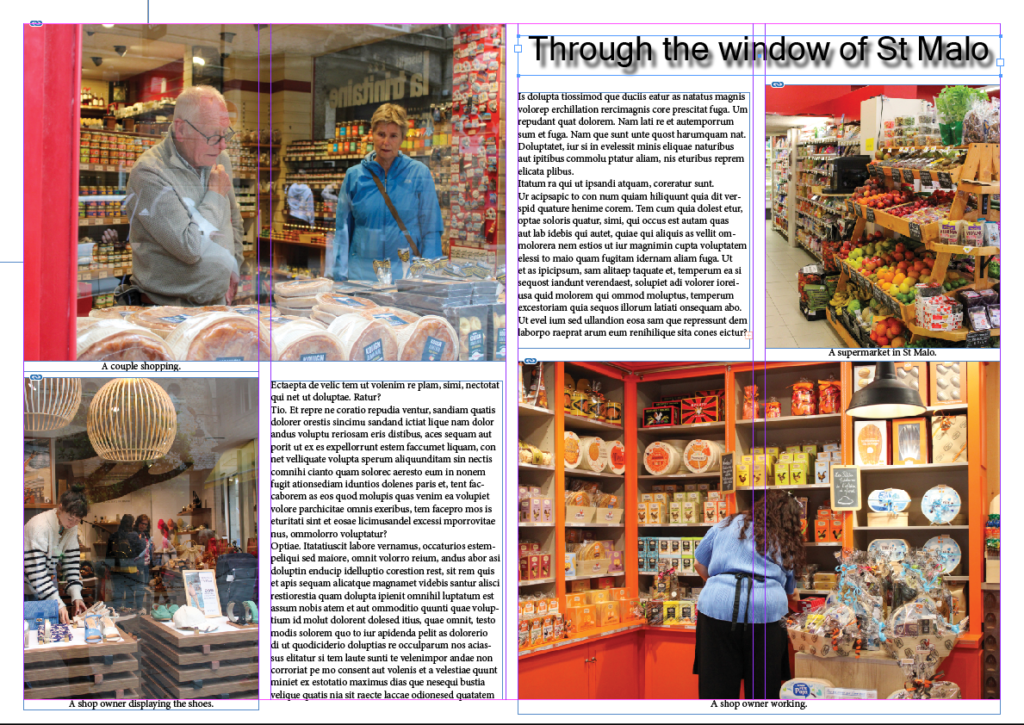
Next, I selected the area of where I wanted my image and went to file and place and selected which images I wanted to use. Once they are on my page spread I right clicked selected fitting and selected fill frame proportionately.
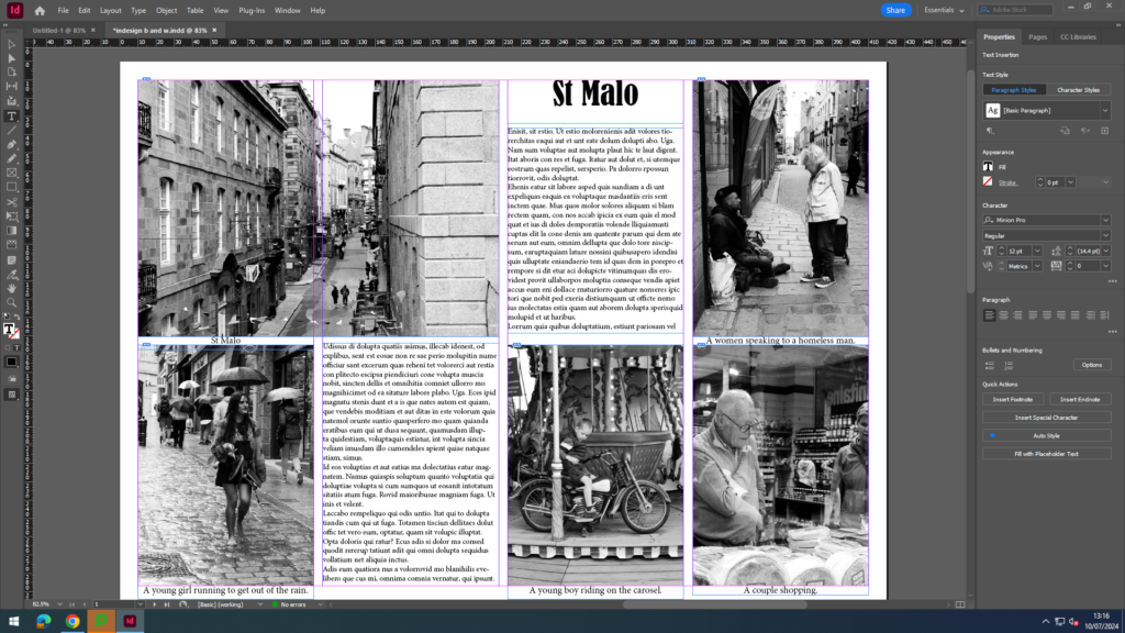
Next, I added a title, captions and some placeholder text for now.
Next, I experimented with different images and coloured images and repeated the same steps. I also experimented with creating a drop shadow for my title.

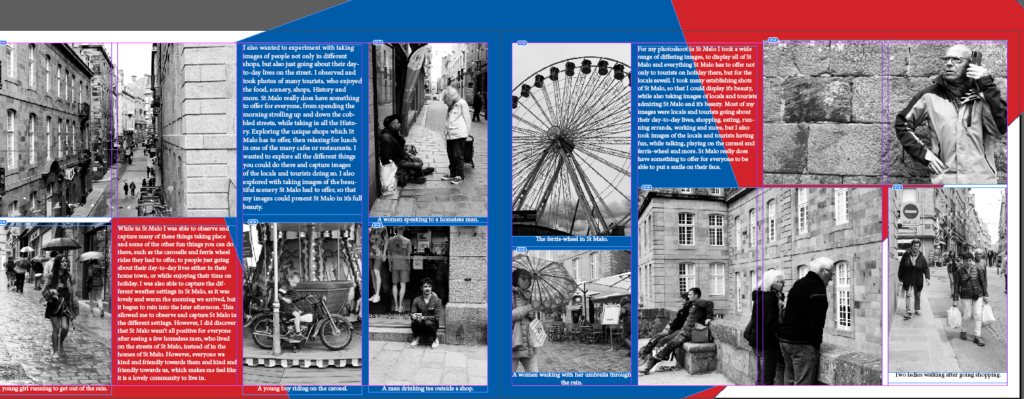
I also wanted to experiment with the colours of the French flag (red, white and blue) for one of my page spreads. I selected an area and then filled the area with a colour. Then, I went to file, arrange and then send to back, so that the colour was behind my writing and images, instead of on top. Finally, I adjusted the size and angle of my coloured blocks.
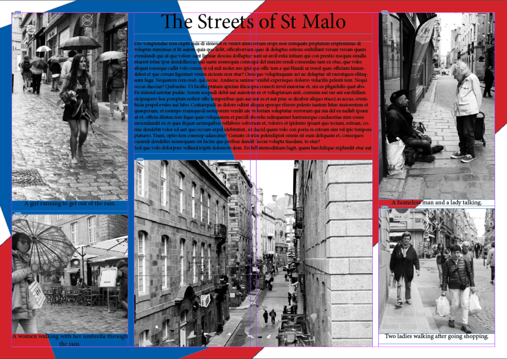
Next, I experimented with making the writing white, so I could see if it would be more visible than the black.
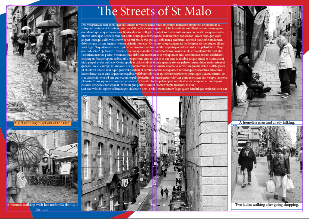
Finally, I started to replace to placeholder text with my own text.
Images I have used
Establishing shots:
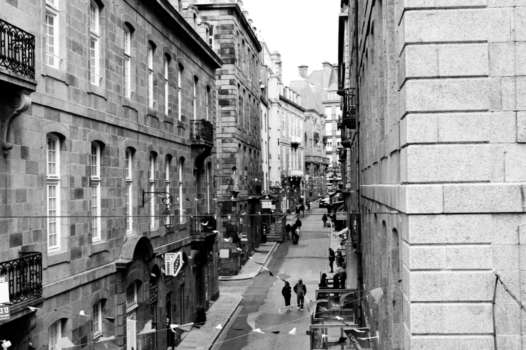
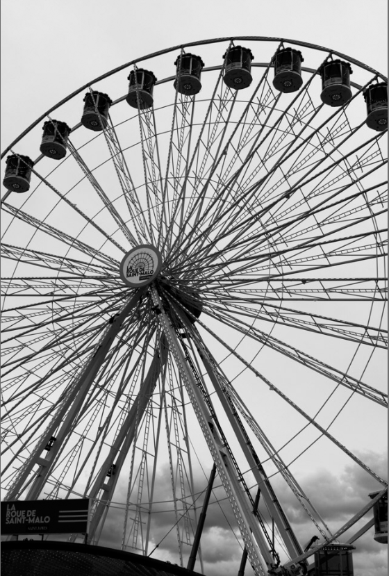
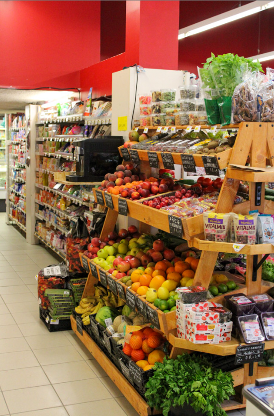
I used these images in my book, so that I could present St Malo, so it is clear in my book where these images have been taken and where all the other images have been set.
Relationship shot:
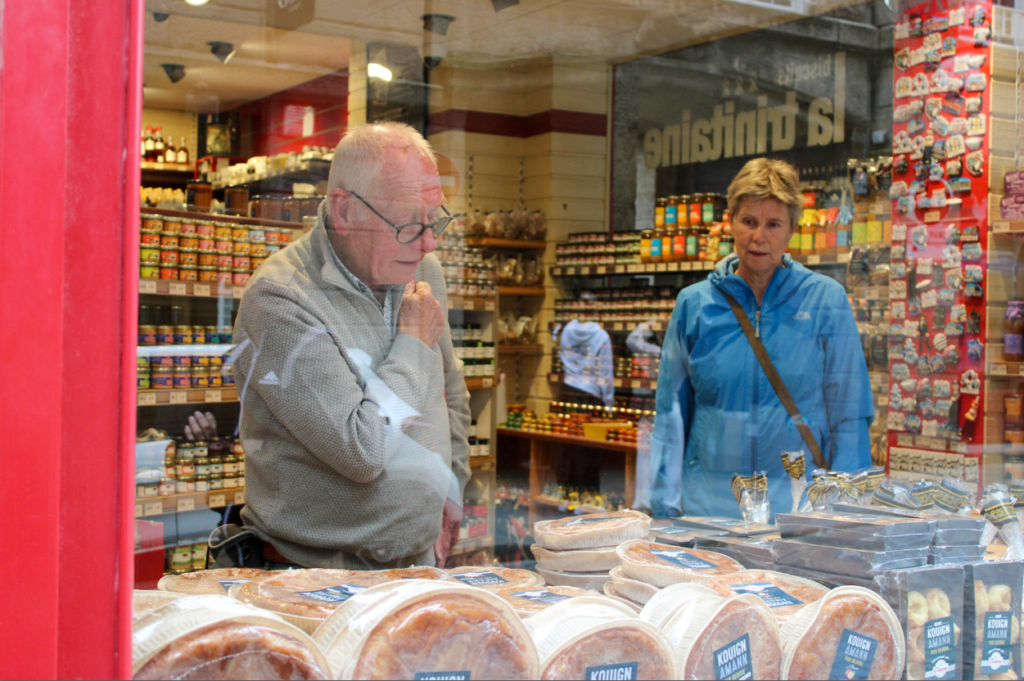
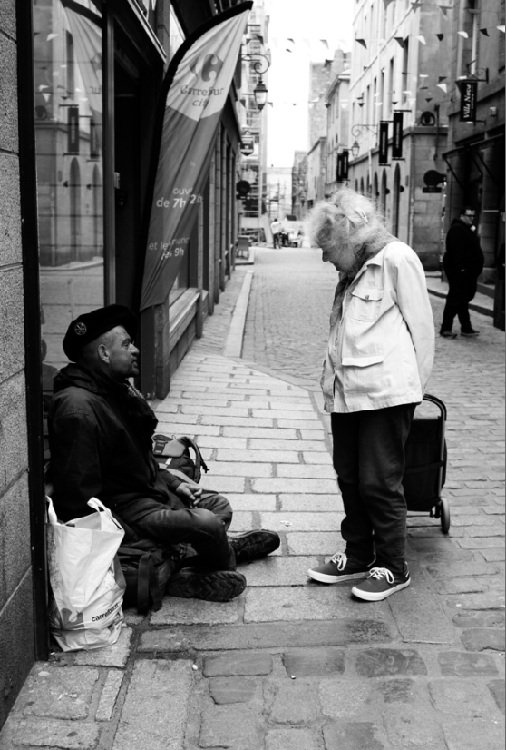
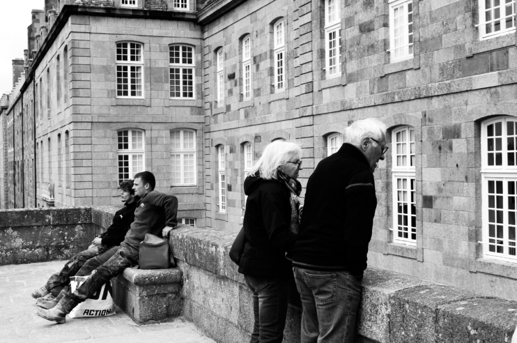
I used these relationship shots in my book to display the different relationships (lovers, friendship, colleges etc.) all through St Malo that I witnessed.
Person at work:
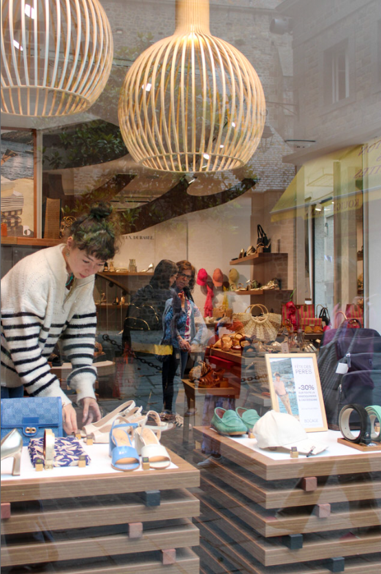
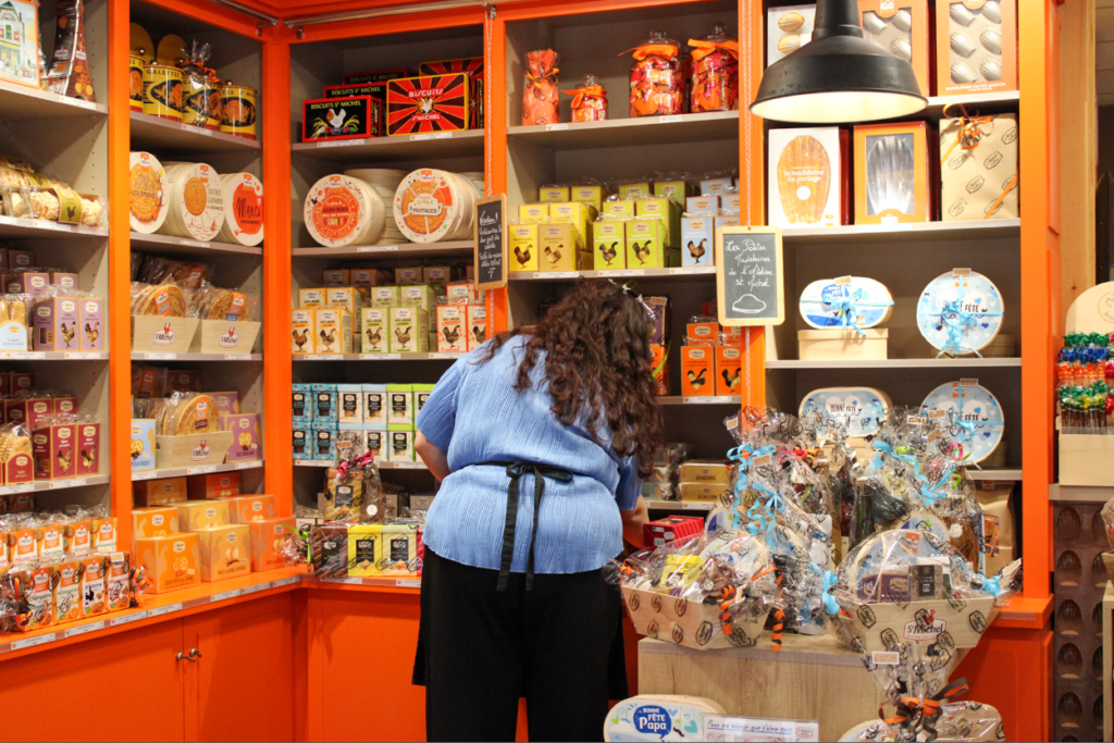
I took these images of people at work, so I could explore the different shops and places in town, so I could display the uniqueness of all the small businesses in St Malo.
My Book
Once, I had finished experimenting, I decided that the front page of my book would be through the window of St Malo, and that would be my title.
For my double page spread, I decided to use the colours of the France flag on both pages, because I liked the look of the colours, so I wanted both pages to match and work well together.
Evaluation:
In conclusion, I like my book, because I enjoy the exploration in it and in my images. I like how I explored with the colours of the French flag on my double page spread. I also like the concept of my book of ‘looking through the window of St Malo,’ but I would of liked to explore this concept more with my images. I should of used images of more shops and used my images experimenting with window reflections more, but I felt like they were not my stronger images, and the ones I did use were. I also like how I have explored with coloured and black and white images, but next time I think I will keep the images either all coloured or all black and white, as I think they go together better. I also like how I have used different types of images (establishing shot, relationship shot, person at work, etc.) because I feel like it displays St Malo as a whole very well.
