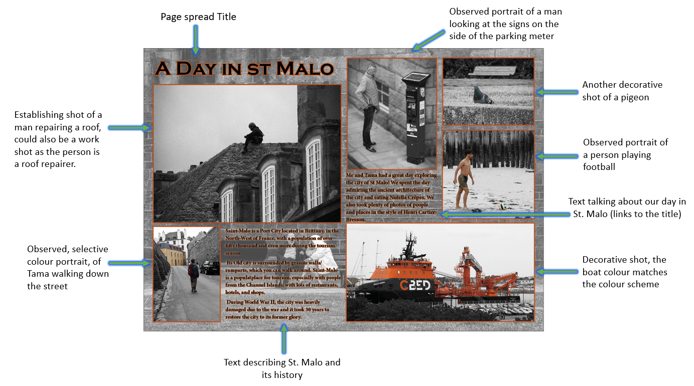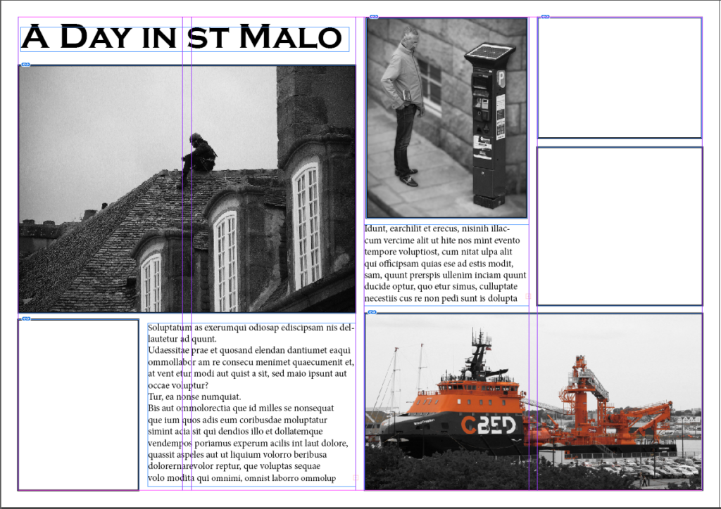
First I started by creating the layout for my spread by using placeholder text for the text areas as well as starting to fill in the images such as the establishing shots. I also created the Headline and chose an appropriate font for it.
Version 1
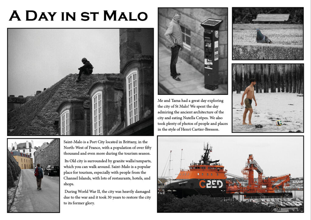
For this I added the text in and the photos. I might change some of the photos to see if I can improve. but for now I’m going to experiment with the background.
Version 2
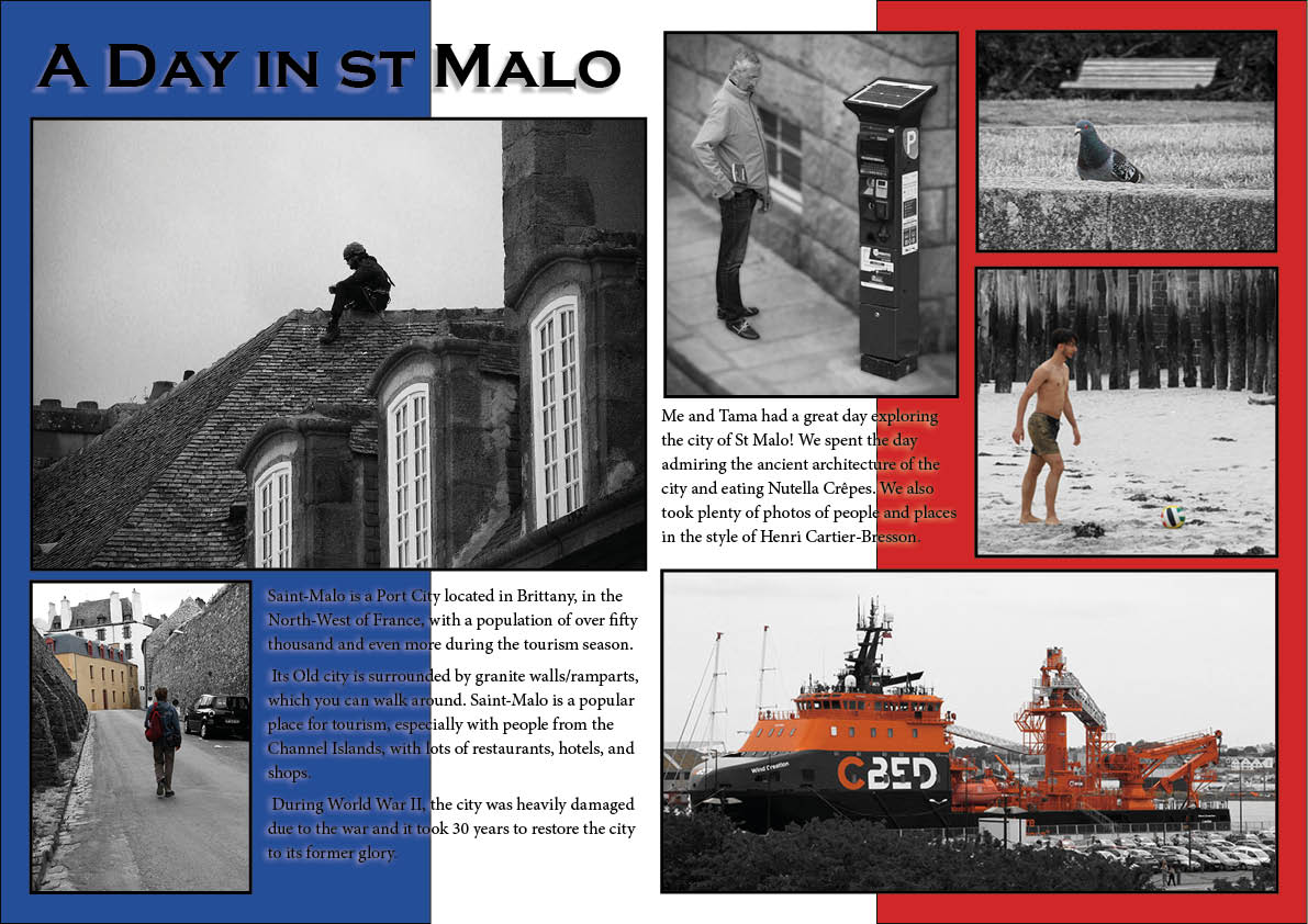
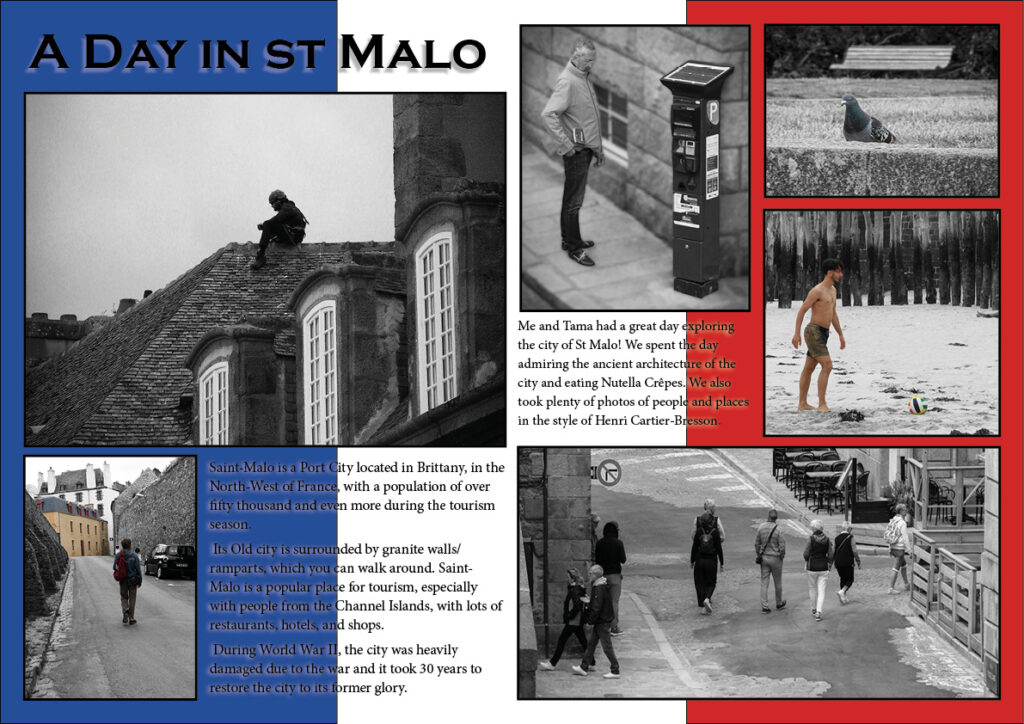
For this one I experimented by making the background the French flag as St. Malo is located in France. I did this because I wanted to experiment with having a simple colour background instead of an image which I will try doing next.
Version 3
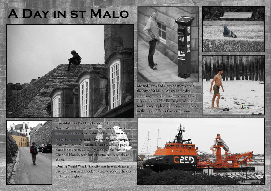
for this I got one of the photos and put it as the background. The text was hard to read because the background is also in black and white but I lowered the transparency a bit and it looks better and makes the text a bit easier to read.
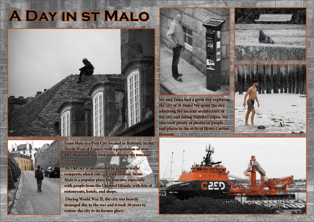
I wanted to experiment with adding colour, so I took the orange colour from the boat in the bottom left and used it as part of the colour scheme.
I stared by adding a small orange text stroke to the text and then went a step further by changing the frame/boarder around my photos to the orange colour as well. Overall I am pleased with how it turned out.
Version 4
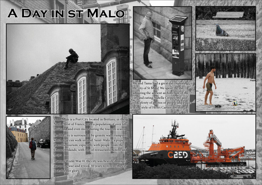
For this version I changed the photo to one of a street in St. Malo I took.
Personally I prefer the previous image as this one of the street doesn’t look as good because the stone texture in the previous version looks better as the background on my page spread, compared to this photo as the background.
Final Designs
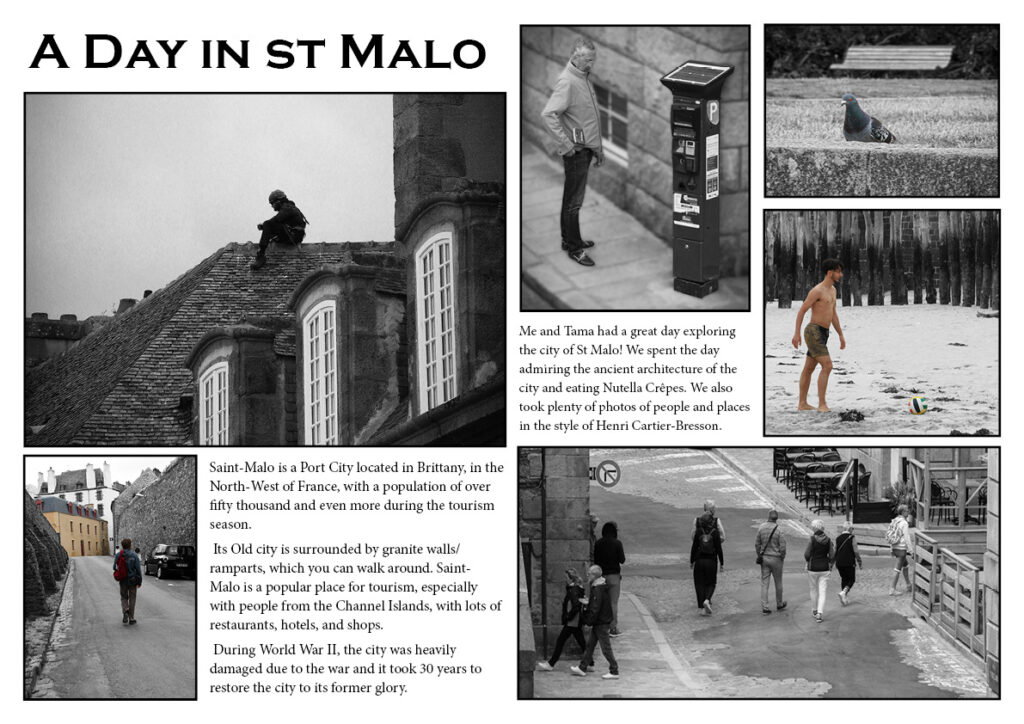

Out of all the designs I feel like these ones are the best outcomes. I replaced the image of the boat on the first two page spreads to make it fit the theme of the images and designs. Overall I am really happy with how it all turned out.
Brief analysis
