Michael Marten (Artist Photo)

My Photo

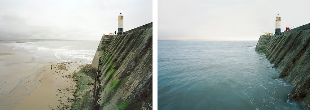
I think my inspired photo turned out well and I was able to capture the same effect as Marten’s photo. Both images represent the rinsing tides and how a landscape can be completely altered with one simple change such as water. Marten has done well to stay in a very similar position and been carful not to change the angle of both shoots. as well as this, the weather hasn’t changed and it still provides a grey sky. This is a similarity but also a difference when looking at my image.
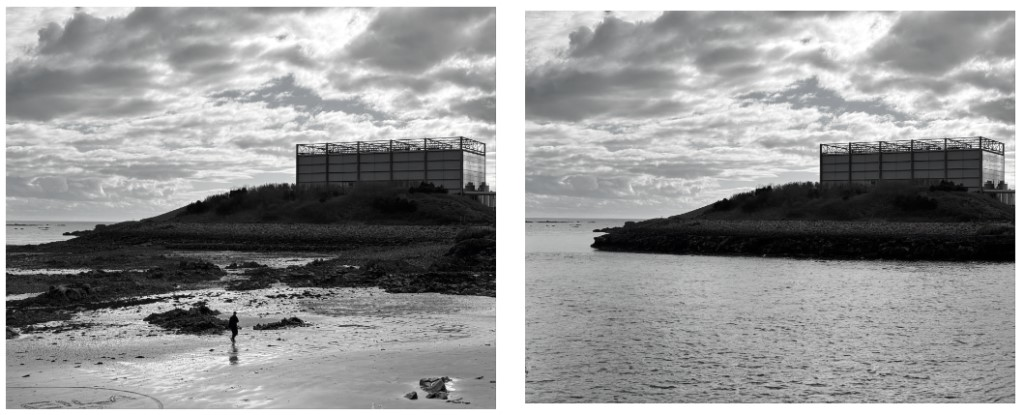
The similarities are my photo are also kept in the same position as well as the weather being the same. However, the difference is that my take on the image was created using AI so that I added my own ideas into an inspired piece. So both images are the same as the left image but just with the input of the sea using AI. Another difference is I decided to edit mine into black and white rather than keep it in colour like Marten has done. I decided to do this so that the AI would be even more discrete as there was a slight colour different when the artificial sea joined to the actual sea in the original image. I also decided to place both photos in the same format Marten usually does by placing the two images side by side.
Yves Marchand & Romain Meffre (Artist photo)

My photo

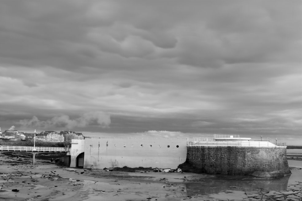
I found it difficult to find somewhere in jersey which can relate to the artist image so I used the skills of AI to change an image that I had originally taken to be more inspired by Yves Marchand & Romain Meffre.
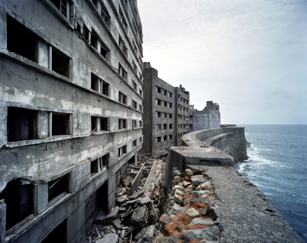
Both images represent destruction of buildings and landscapes. in Marchand & Meffre’s image, the destruction is visible where the windows are smashed in, leaving empty holes in the building and where the sea wall has crumbled, leaving debris scattered everywhere. In my image, the destruction is visible where the wall has cracks in it and marks down the sides. it also has rubbish scattered on the beach near the building and the air pollution coming from buildings in the background. Both images are examples of destruction of manmade things, however, both images are in similar environments where they are near/surrounded by natural landscapes such as the oceans and the beach.
The artists image does well to create some juxtaposition where the destruction is directly opposite to the sea which creates a contrast of colour and feeling as the sea is bright and the destruction is not. My image doesn’t do that as I decided to put it in black and white and so I am unable to see the colour differences. Another difference is where the photographer is positioned when taking the photo. in Marchand & Meffre’s photo its clear they are alongside the building and capturing the image from that position. However, in my image I decided to take it straight on and include a large portion of background and other surrounding areas as well as the main focus which is the building.
