

I like this image as the whole lower section is waste, with an ironic text on the vehicles container saying ‘waste disposal’. This is further amplified by the only colour in the image being this text. However, some parts of the photo is lacking like how most of the image is in a mid grey tone, especially the sky, giving this image a blander look. This photo had some similarities to Edward Burtynsky photos with the presentation of large waste areas.
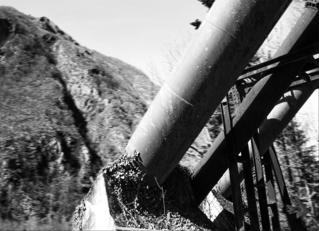
This image is good in the use of motion blur as it draws the eyes to the main focus point of the image (the large industrial pipes), making it seem more important and more destructive to the natural environment around it. the organic background paired with the subject creates a contrast between the pipes and the landscape. I think the editing could be improved on as the edges from the foreground to the background looks odd.
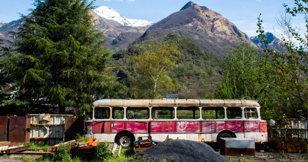
I think this image is a good representation photos from the likes of Edward Burtynsky. This is because the image is packed with detail and is very vibrant. The image does lack in some ways as the subject (the bus) doesn’t stand out as much from all the details elsewhere in the image.
Virtual galary:
