Single Objects
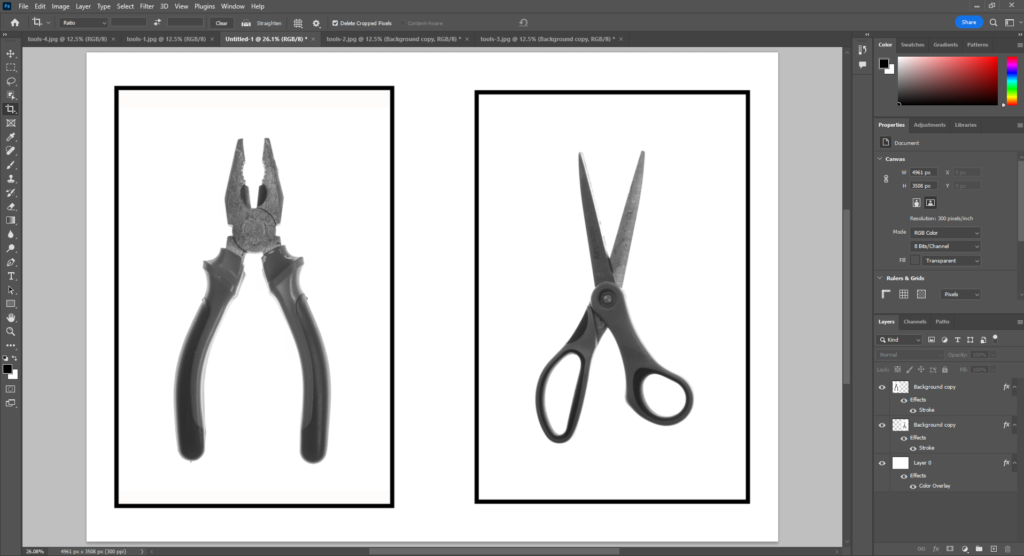
I chose four images overall as my final images. This included two single tools and two arrangements. The single tools were set in black and white inspired by Walker Evans.


I used a black and white preset which had high contrast. I then opened them in photoshop to add a border with the stroke option. I added this because the white background meant that the frame around the objects wasn’t clear. The framing was different between both images also, scissors were wide and pliers were thin. In photoshop I could crop outside of the image to add in more white around the plyers so they’d both have similar boarders.


Both of these images now look like they should be together so in photoshop I opened a A4 landscape page which I added both images to. I really like how the boarders look when the images are together and this helped visualise what the images would look like mounted. I chose the diptych style of presentation which places two similar photographs together. This process taught me how to experiment with arrangements as well as how to edit in photoshop.

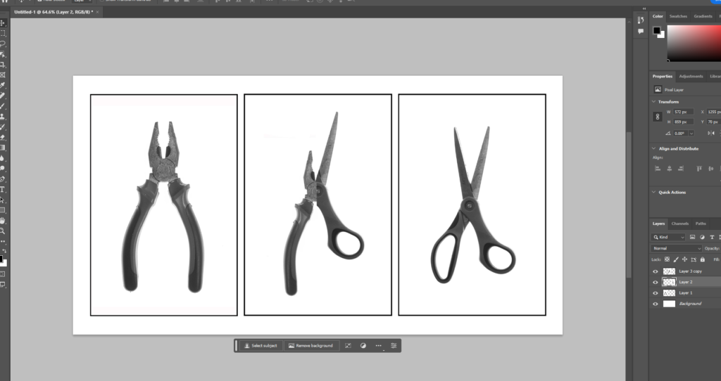
I tried a triptych including the mixed photograph too but I don’t think the three sit together very well. The two are similar enough but the edited one is changed a little too much from the other two. Both halves are smaller and moved which becomes obvious next to the original.

Still-life arrangement


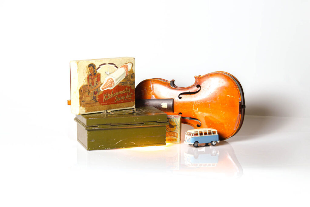
These two images don’t look like they would look right in a collage together and I believe this is because they are at different angles at different distances from the camera. The plyers are much closer to the camera than the violin. Also the set ups are different. I took the plyers in front of two pieces of card with a harsh split between the two. The card is matt and the lighting was just natural lighting. This looks significantly different to the infinity screen I used with the violin which used a continuous spot light, a backlight and a reflective white background without any harsh lines behind.
I tired arranging both photographs into a diptych but I think presenting these as single photographs looks better. This is because the objects used are extremely different. The plyers are balancing with tapes which have an industrial style while the violin uses household items which creates a homely feeling. This shows the importance of items as they can completely change the meaning of a photograph.
