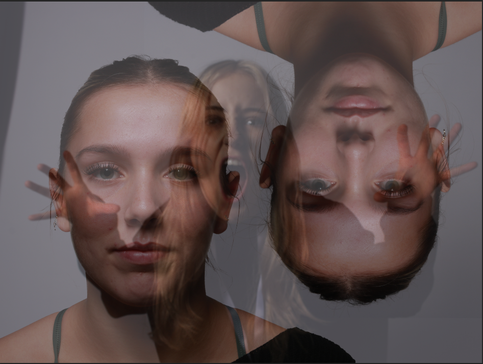
For this photoshoot, I took simple, portrait photographs, which I will be using to show multi-exposure through editing.
Photoshoot 1 –

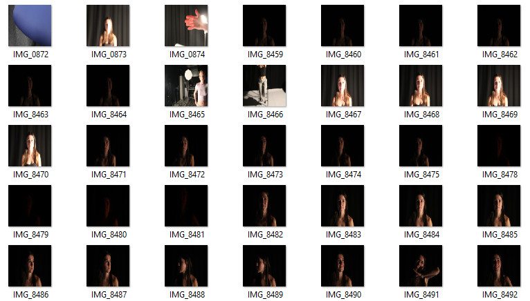
I gathered a variety of different types of lighting in every few photos, such as ; Chiaruscuro, Rembrandt and butterfly lighting. This is to have different area of light to play around with and explore my editing and colour handling.
Photoshoot 2 –
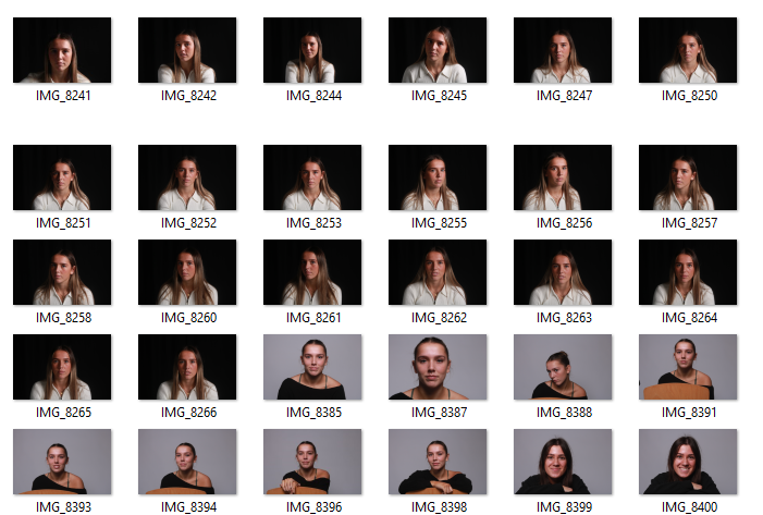
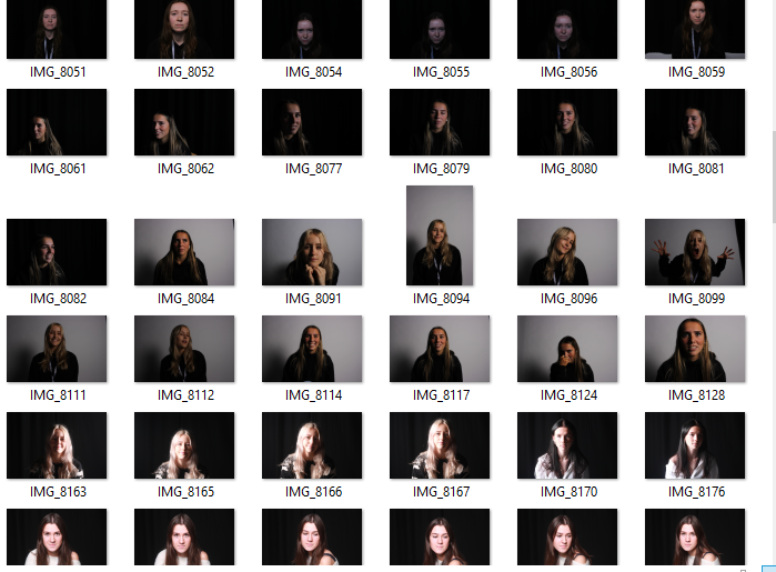
With this second photoshoot, the use of different lighting, would give even more variety of the types of lighting that I had to manipulate.
Edits –
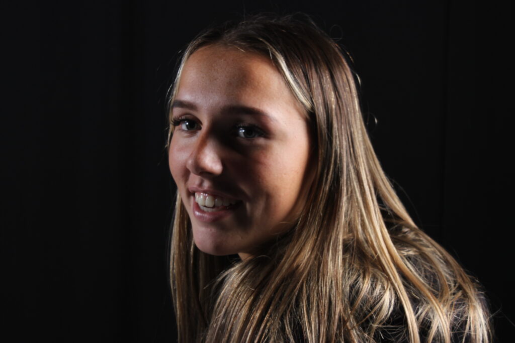
For this edit I was playing around with layers and opacity on my photos. I dragged this photo onto photoshop and duplicated the layers 3 times. Changing the opacity on the original photo to 50%. I slowly enhanced the opacity on each layer from 50% – 60% until I had a mirrored looking edit.
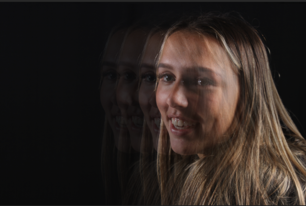
Edit 2 –
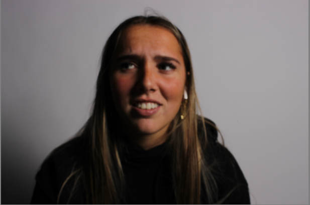
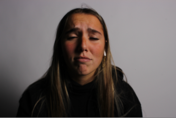
I used these two photos to edit together. I wanted to show a contrast between emotions as well as colours and I thought that could be quite powerful.
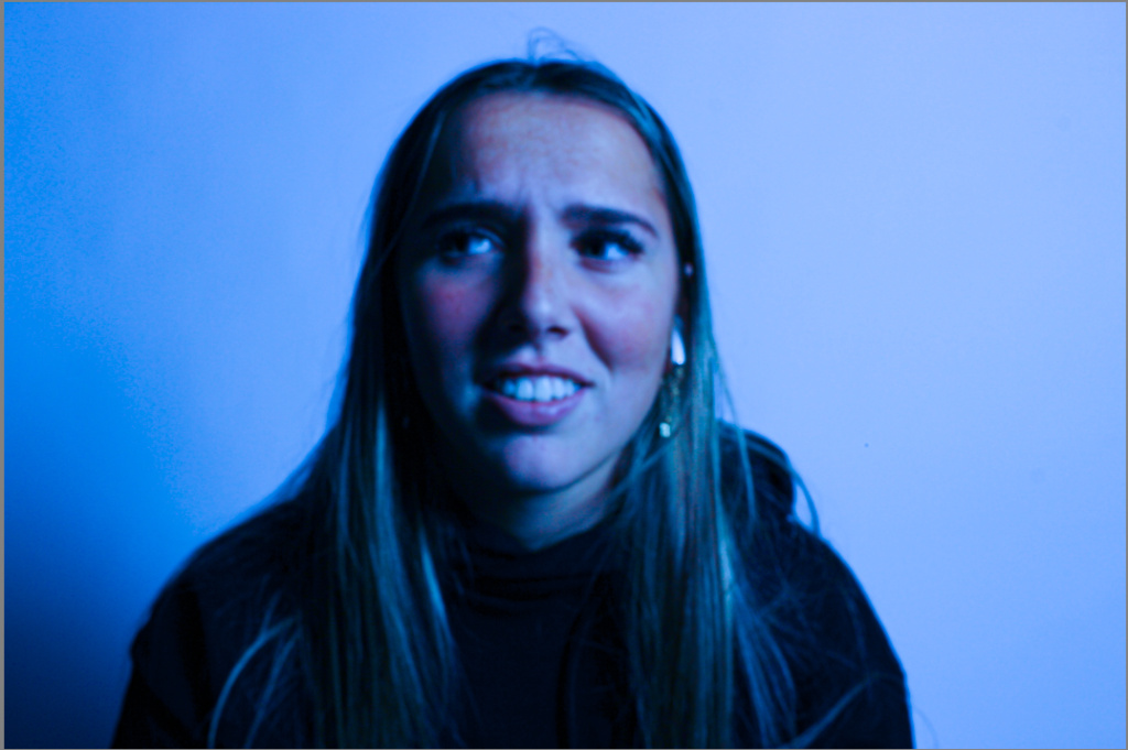
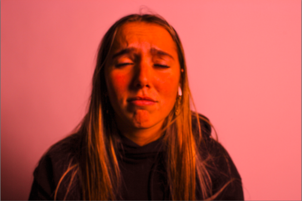
I edited both photos different ends of the colour wheel to show contrast, this I did in Lightroom-classic. Blue to the sad photo, and red to the angry photo. This is the emphasis the stereotypical emotions and the colours that are subdued to them.
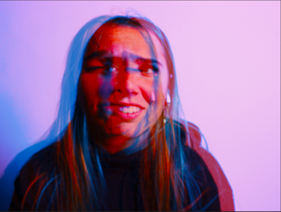
I brought both edited photos from Lightroom Classic and put them in photoshop. I played around with the saturation and vibrancy of both photos getting them to the exact colour that I wanted.
Then placing them on top of each other, I controlled the opacity of the photo on the top bringing it down to 50% so the background went transparent while keeping some of the blue hue on top.
Edit 3 –
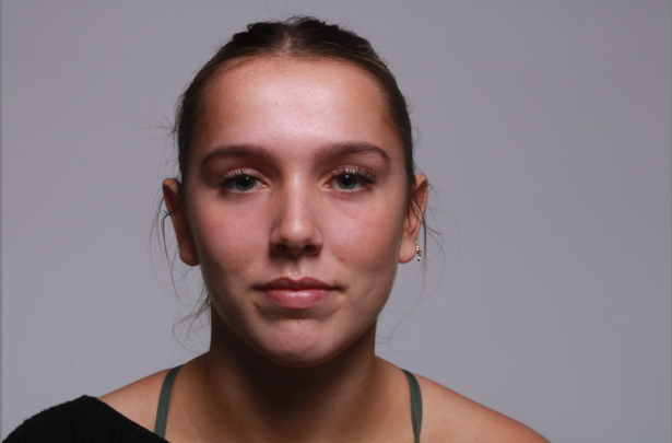
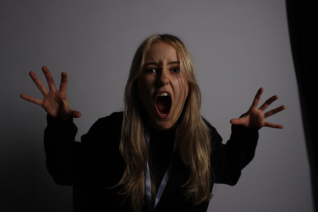
For this edit I wanted to do something similar to the first one but making it slightly more difficult, adding more layers and different ideas.
I dragged the first photo into photoshop and flipped it upside down first of all. Then using the eyedrop tool to match the colour, I coloured the background the same grey hue as the photo. After that was done, I dragged the same photo in again, keeping it the correct way up but moving it across so each subject was in opposite thirds of the photo keeping an inch of space between.
I then cut the background from one of the layers to help not show original background on the photo. When the photo looked smooth, I dragged in the second photo on top keeping it the correct way up, then changing the opacity to 50% to show background of the other photo.
