Mood board of layouts:
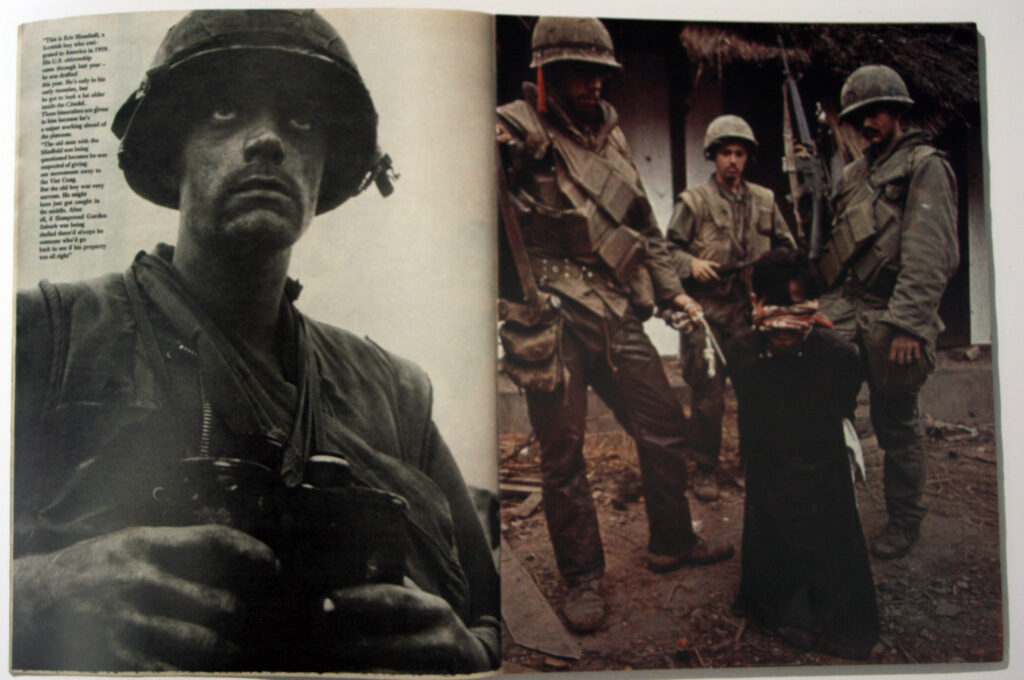
This page layout where a subject covers an entire page is something I’d like to try and incorporate into my work, I chose this as it simplifies viewing the work and can provide more impact to contents within that image.
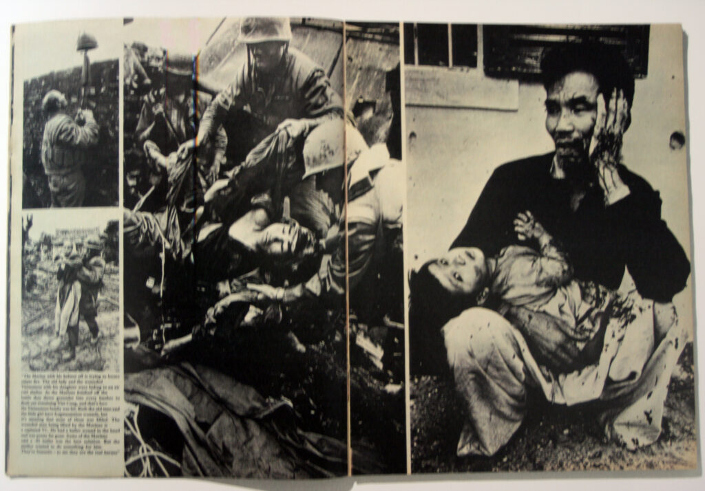
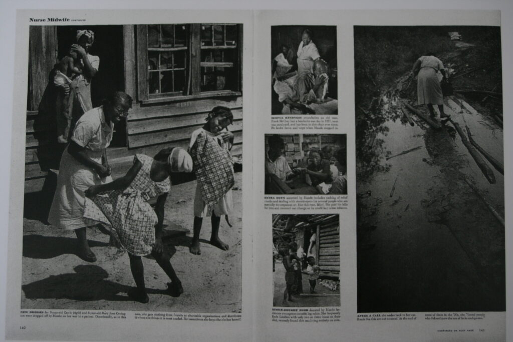
These Layouts with a combination of very large and small images attracted my attention due to its interesting composition. Something like this could work for images that are taken within the same area, like how in these references they all take place within a combat zone or a village .
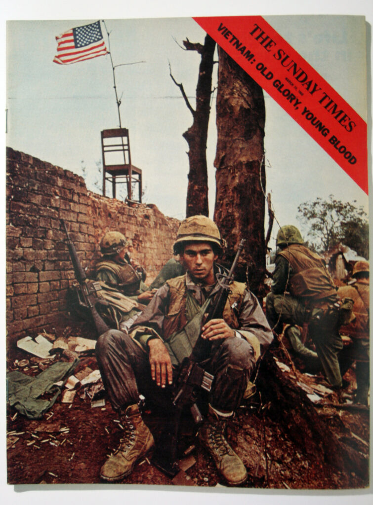
this picture story’s use of a full image for the front cover, with limited text is a good example of how to present my work. By having one area sum up the contents this could apply for my St Malo images.
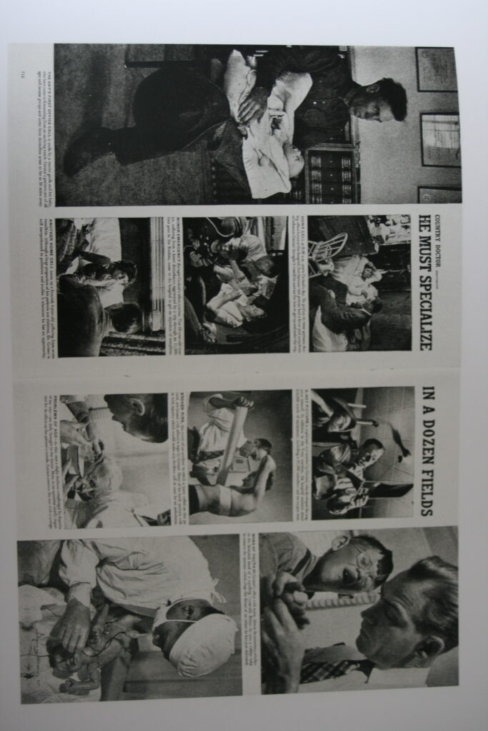
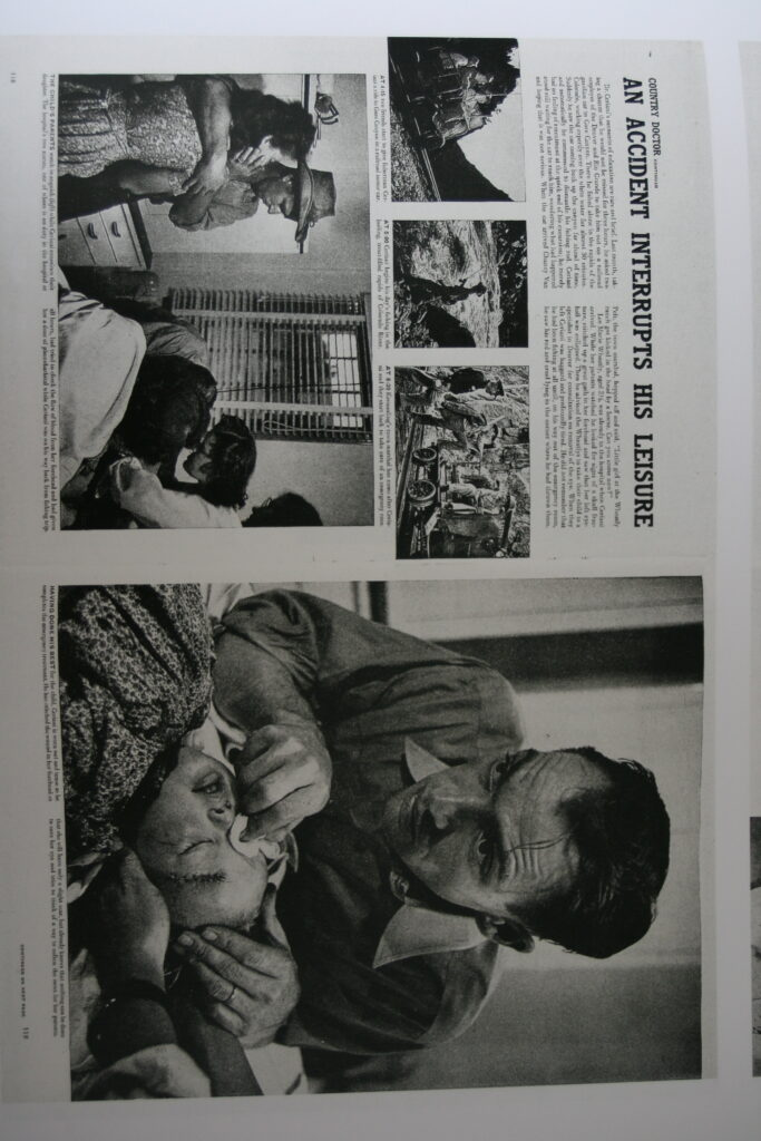
This picture story is a good reference for its, easy to follow narrative through inter-connected photos and text description. By added context this creates and interesting story to follow.
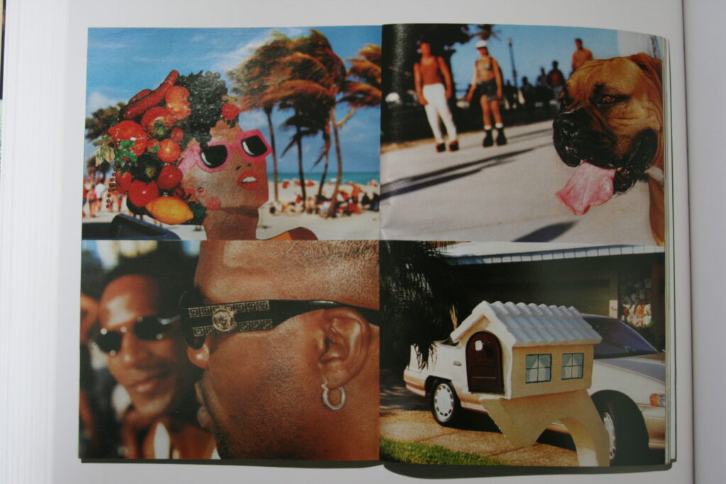
Without text, multiple images on a double page spread is another unique way of presenting images. As mentioned previously, this would apply well to my images taken within the same context.
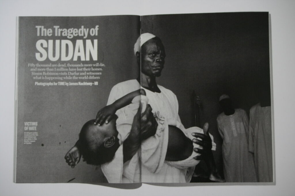
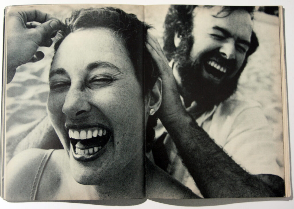
Having a singular image spread over an entire page, with or without text, is another method of picture story design I might incorporate into my work, depending on the picture and its contents this could make it stand out a lot more to viewer.
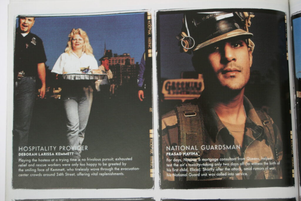
Text overlaid images is another interesting way to incorporate information about the contents of your image. Darker areas of images are best for this as it acts as a back drop within the image for your text.
