Walker Evans
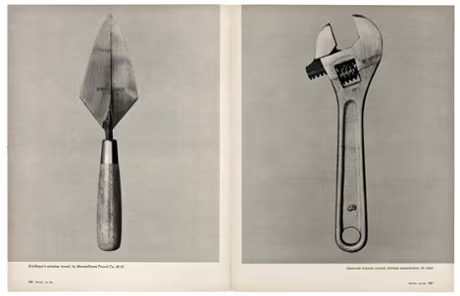
Walker Evens was a photographer and Photojournalist who was born on November 3rd 1903. In 1955 he was commissioned by the Fortune magazine and he took photos of tools in an article called ‘Beauties of the Common Tool’.
His photos of tools have no colour and a little amount of shadow. The tools are placed at the centre of the photo close up so we can see the detail and because they are the subject. The plain background helps draw our attention to the tools.
Darren Harvey-Regan
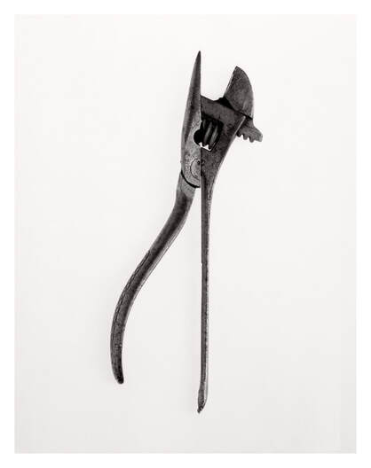
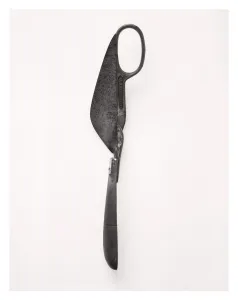
After Walker Evans article was published in the Fortune Magazine, Darren Harvey-Regan gook great inspiration in his photos.
What he would do is collage Walker Evans photos by cutting them in half and combining them to create photos with 2 different tools combined in a way that makes them look realistic.
Creating images in response to Walker Evans
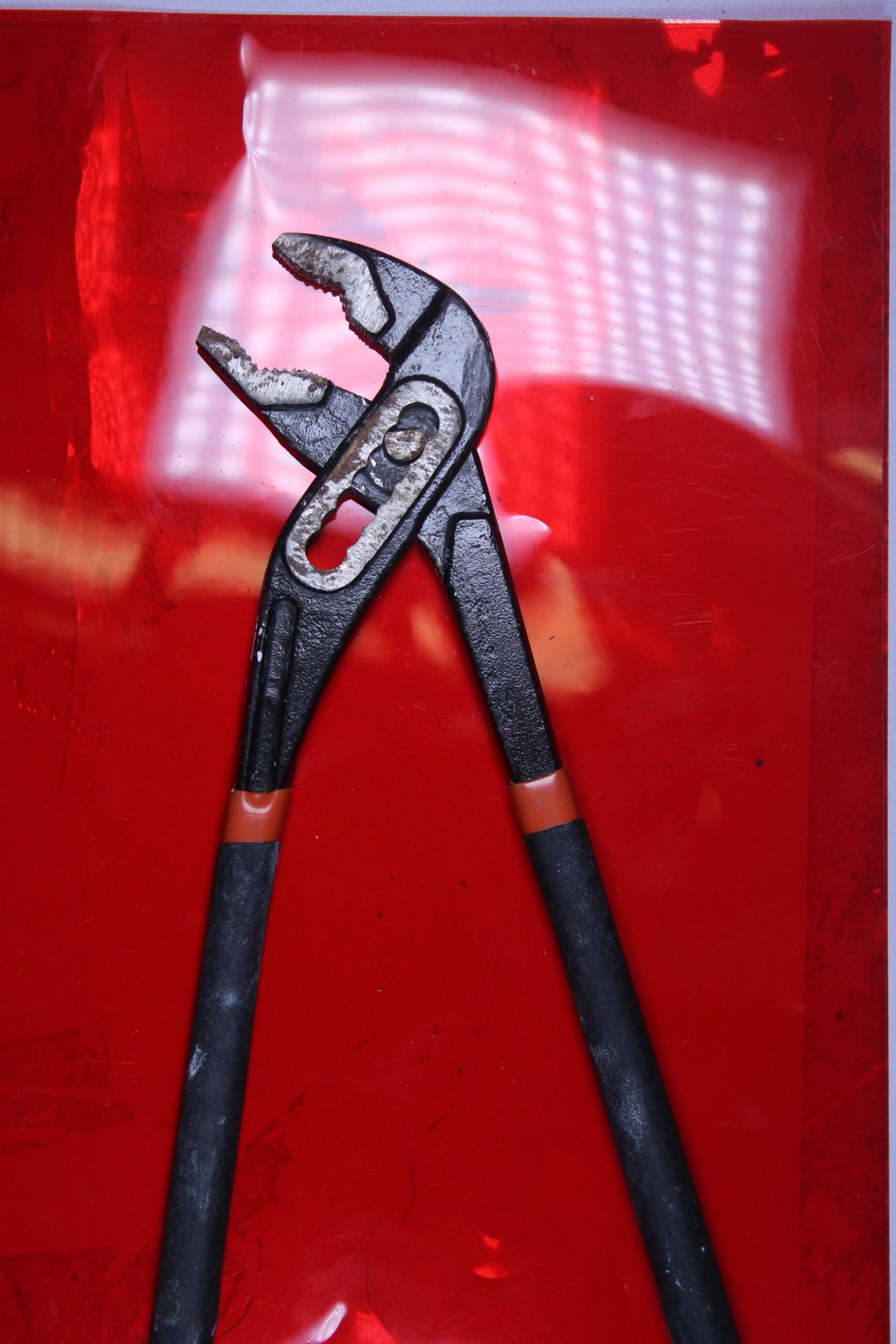
To start I selected some tools similar to the ones that Walker Evens would have photographed. I decided to put a creative spin on his work by using colour instead of my photos being all black and white.
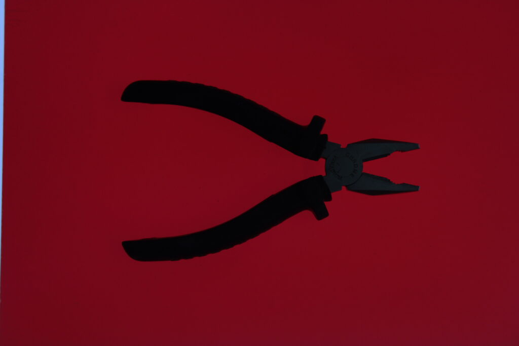
I decided to go into the lighting studio and take some photos of the tools using transparent colour sheets. here are some of the results:
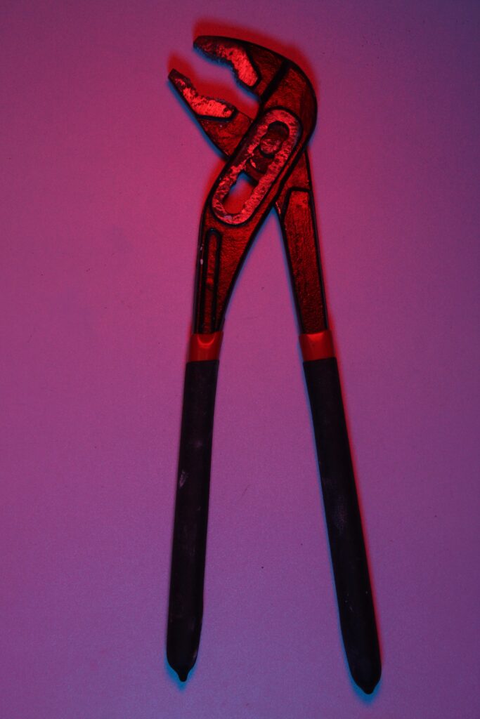
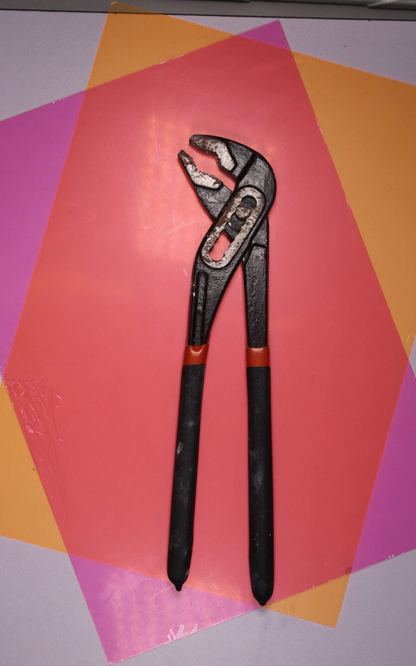
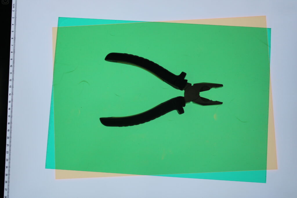
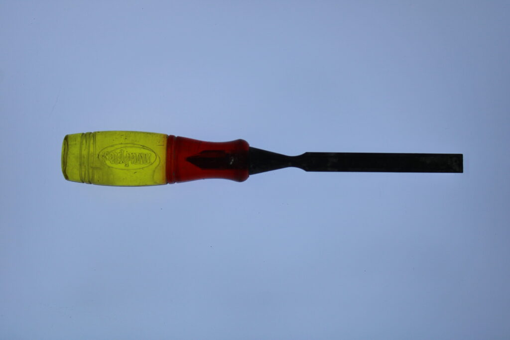
Afterwards I uploaded all the photos I took to Lightroom and filtered the photos by flagging them and giving the photos star and colour ratings.
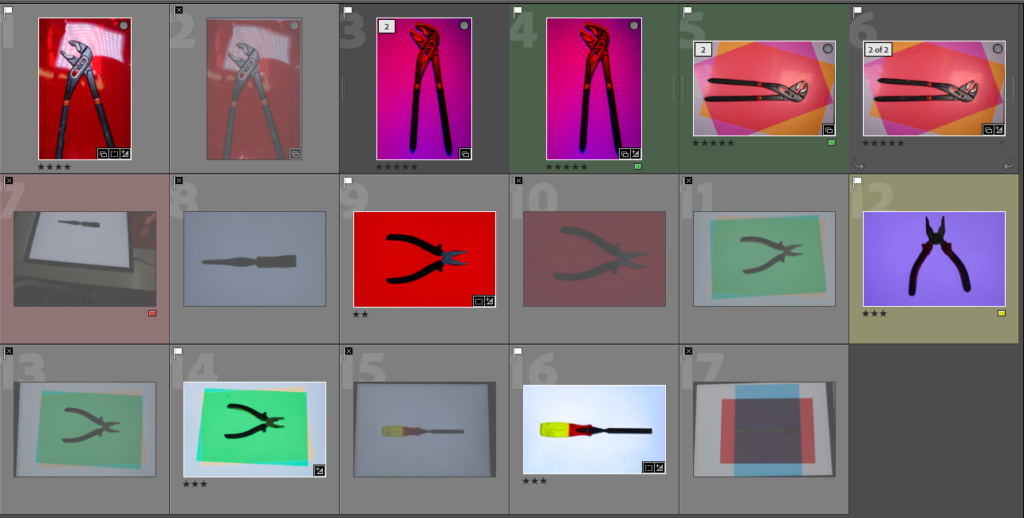
Some of the photos I took looked a bit underexposed because of the lighting so I fixed them in Lightroom and I also got rid of any dust marks caused by the camera lens with the spot remover tool. I also cropped some of the images so they were more centred and so there was nothing else in the frame.
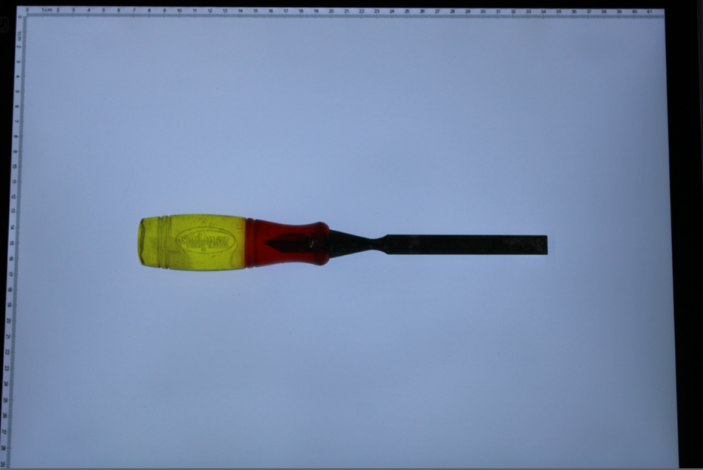
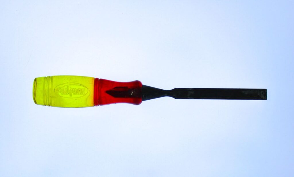
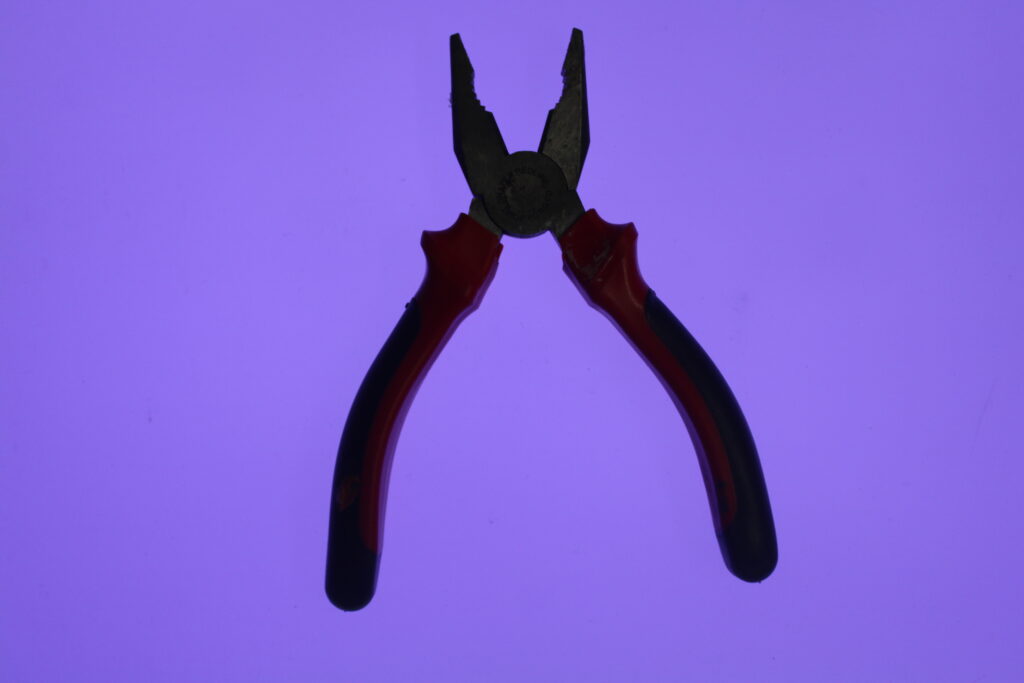
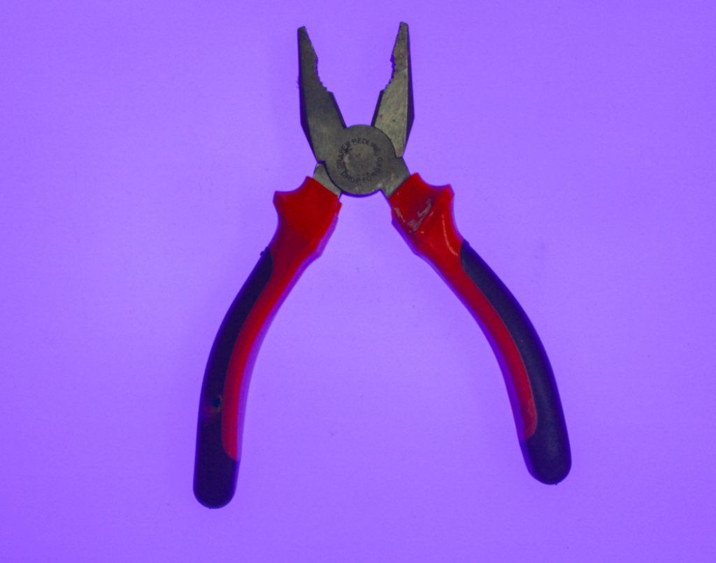
Final images
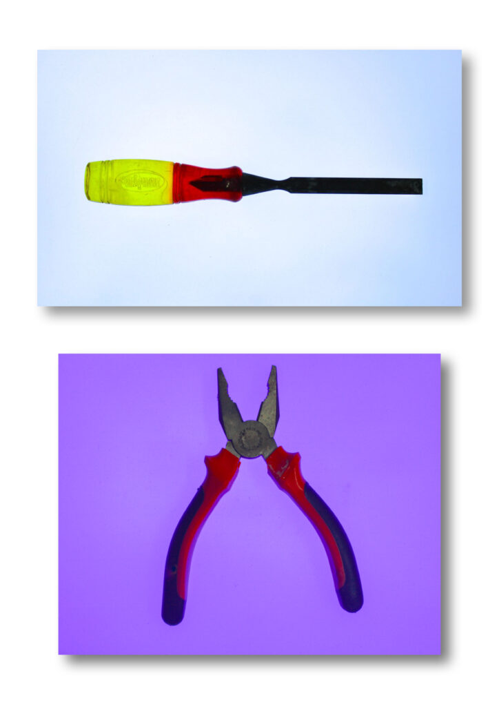
After filtering and editing my images I had my final images, however I needed a way of presenting them. so I started by first creating A3 layouts of my final images on photoshop.
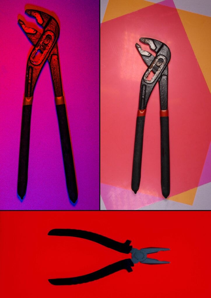
On the left image above I used triptych layout as I like the way the photos fit together almost like a jigsaw and added some thin black borders between the photos to help separate and define each photo.
On the right I used a diptych layout and added a 3D drop shadow to make the photos look like they are placed on top of a Portrait piece of A3 paper, as that’s the size of both the layouts I created.
Virtual Gallery
I wanted to see what my photos looked like in a gallery so I created this virtual gallery with my final photos in.
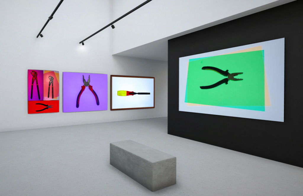

lol