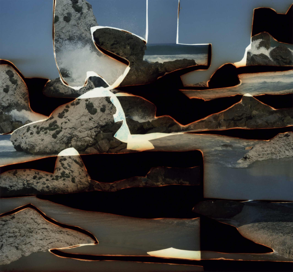
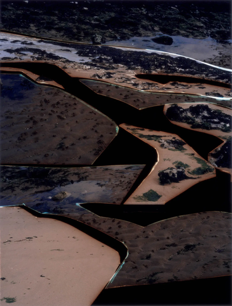
Dafna Talmar was on of my artists study’s as I liked the way her photos where presented and wanted to attempt the same with my final images.
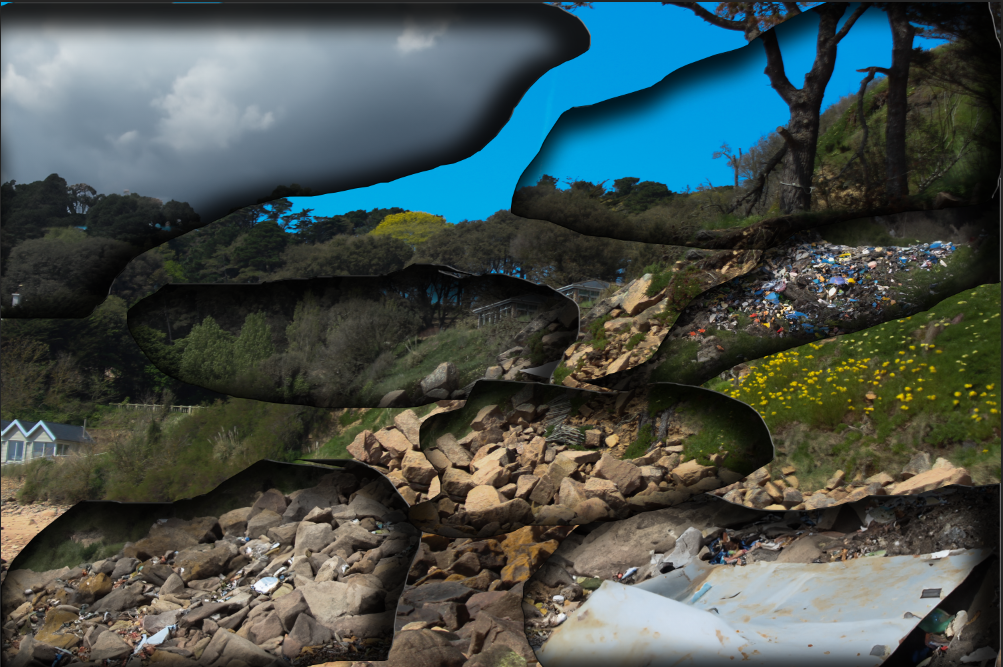
Here is one of my final images I attempted to do like Dafna Talmar, with my image it is slightly different as I edited and cut different images with pollution onto my sunny nice image. It is similar to Dafna Talmar because it has all the cut out pieces of the images stuck back on and burnt black edges around the side, its slightly different to Dafna as I did mine virtually using photoshop to burn around the edged instead of actually doing so like how she did.
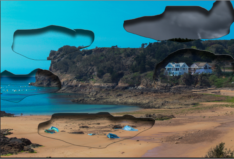
This is another version of a Dafna Talmar inspired image, it is also a similar vibe to my photo above as I have cut in different weathers and litter into the image giving the burn affect around the edge, its still not exactly like Dafna Talmar because I liked her way of burning the edges and cutting up all the images in a scruffy yet unique and beautiful way, which I also wanted to do for my images, where it is burnt and cut and scruffy but still able to see the message I was try to present and the beauty of the world as well as the ugly.
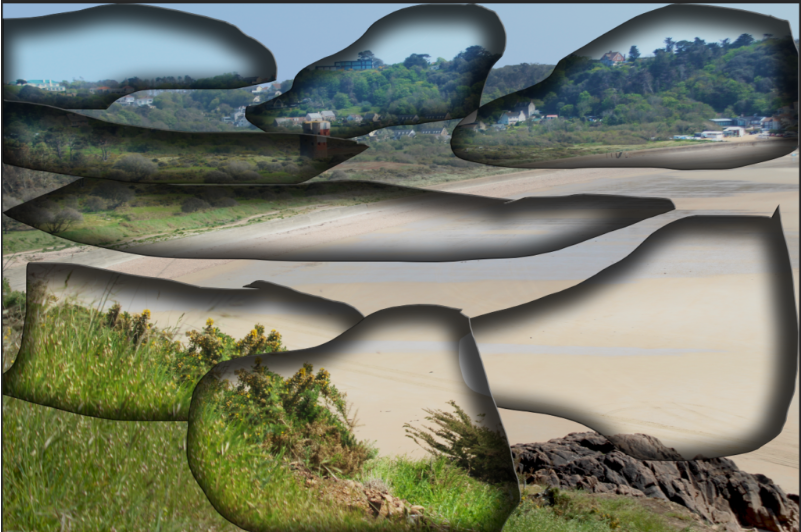
This photo was probably my most similar to Dafna Talmar as I am not changing and adding anything to the image to do with pollution I am simply just cutting up one image and placing git in a similar or same place to create the burnt and cut up look, with Dafna Talmar though when she cuts its up you cant really make out what’s in the image when with mine you can.
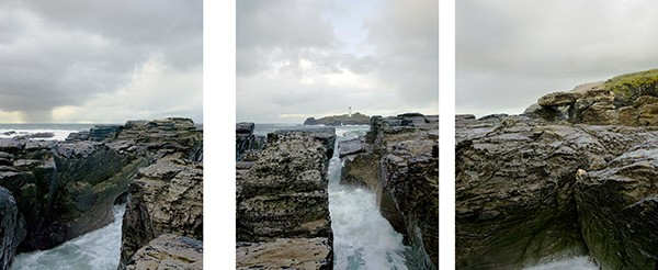
This is an image from Michael Marten which I really like because again I liked the way he presented it, with the same image cut up and split apart, almost like its telling a story.
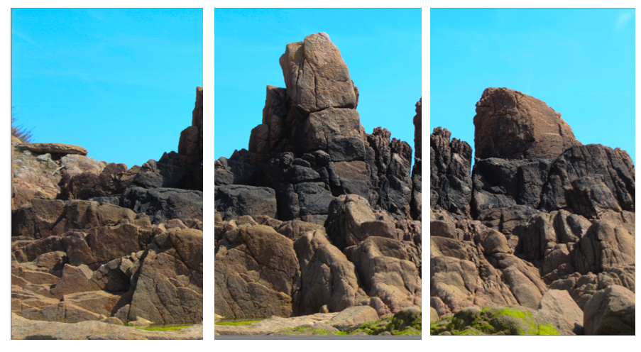
This one one of my attempts doing the same thing, I don’t think it is the most exciting but I just like the way it is presented and think there is a lot you can do with it. My image is similar to Michael Martens because it is also of rocks at a beach, and the image is cut up and presented with breaks between them/
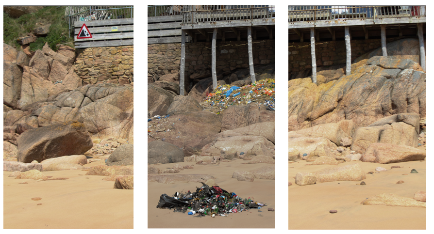
This is another attempt of work similar to his, it is similar in the way that its one image cut into three separate section next to each other to tell a story, this one is slightly different though because I edited the the middle one to have litter and show something different in the same place for more affect, that could be similar to Michael Marten in a way because in some images he shows the same place but with the tide up or down, I haven’t done exactly that but I have shown the same place just slightly different to show what can and will happen to our planet.
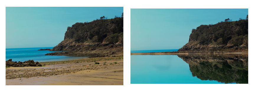
This is also what Michael marten does in a lot of images because he likes to show ‘sea change’ so I have attempted to present the same thing in this image of the exact same place but one when the tide is high and the other when the tide is low.
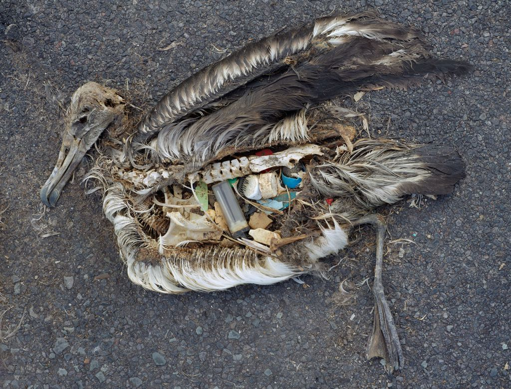
This is an image from Chris Jordan I only attempted one image similarly to Chris Jordan, and that is because he used a real bird cutting it open and putting plastic inside, mine is edited from photoshop because I thought his images where cool and was a great way to get my message across.
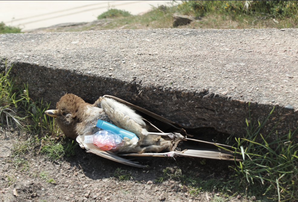
This is my version of his image, i think it is very good and similar to his image as it is both dead birds on the ground with plastic spewing out of their stomachs, other then that the only difference is that mine is edited and they are different birds.
