Typologies

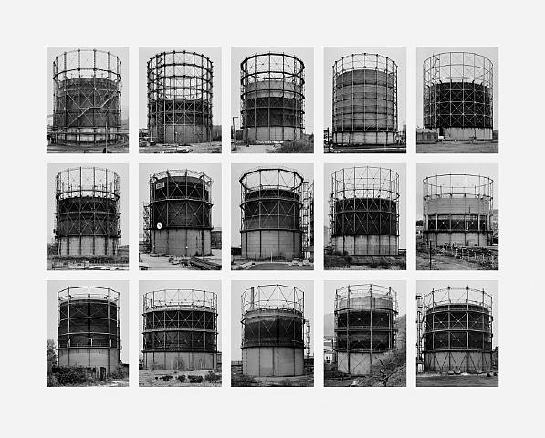
A typology is a single image that generally involves one aspect of any size which fills the whole image. The image above focussed on taking an industrial approach which works well with some of my own photos such as the jersey incinerator below. These images are typically in black and white and the time and weather in the day is also a factor typology photographers have to large take into account. as the industrial building itself is a darker colour, that makes the shade dark once its in black and white. this means that you cannot produced these images with the same affect if the sky is blue and clear as this will make it a darker shade. therefore, making sure this is taken on a cloudy day will create contrast with the building that is being photographed and make it further stand out so it does not blend into the dark shade of the sky and get lost.
Bernd and Hilla Becher
“The question ‘is this a work of art or not?’ is not very interesting for us.”
– quote by Bernd and Hilla Becher
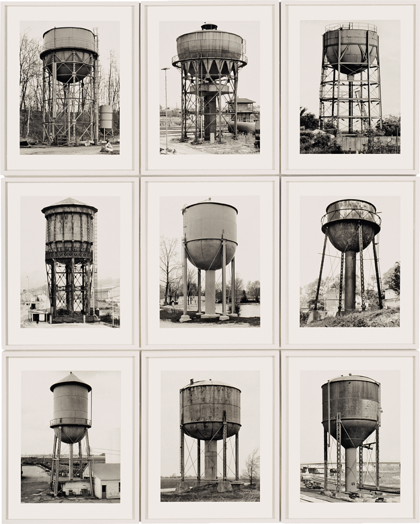
Bernd and Hilla Becher are a photography duo who are husband and wife who started photographing together in1959. For close to fifty years, they documented architectural forms they collectively referred to as “anonymous sculpture.” They produced photos that only included singular buildings which were usually in the centre of the image to make it the main focus. the buildings they photographed included water towers, blast furnaces, coal mine tipples, framework houses of mine workers, and other vernacular industrial architecture.
they would generally take these photos using black and white instead of colour. They would then group these images together in a grid, they produced what they called “typologies,” which grouped buildings by function creating a simple but unique idea of photography

In this photo, it is displaying the same structure but in many different forms and locations. each photo has been taken front facing and made sure to get the structure exactly in the middle. this works well because if the photos were not directly in the centre then it would look off when put onto a grid with other similar photos. This photo documents industrial structures which all look fairly old and well used and so I like how they haven’t used colour for their images.
I think the black and white works as it further brings across the industrial feel to the image whereas colour would probably make it too bright and each image one the grid wouldn’t be able to match each other. the distance of zoom on the camera also works well with each image to make sure they all take up the same amount of space on the image and match sizes. I also like how each image does well to not involve background. almost each image is basically empty which works well to make the main structure the dominant focus within the image.
Typology Practical response


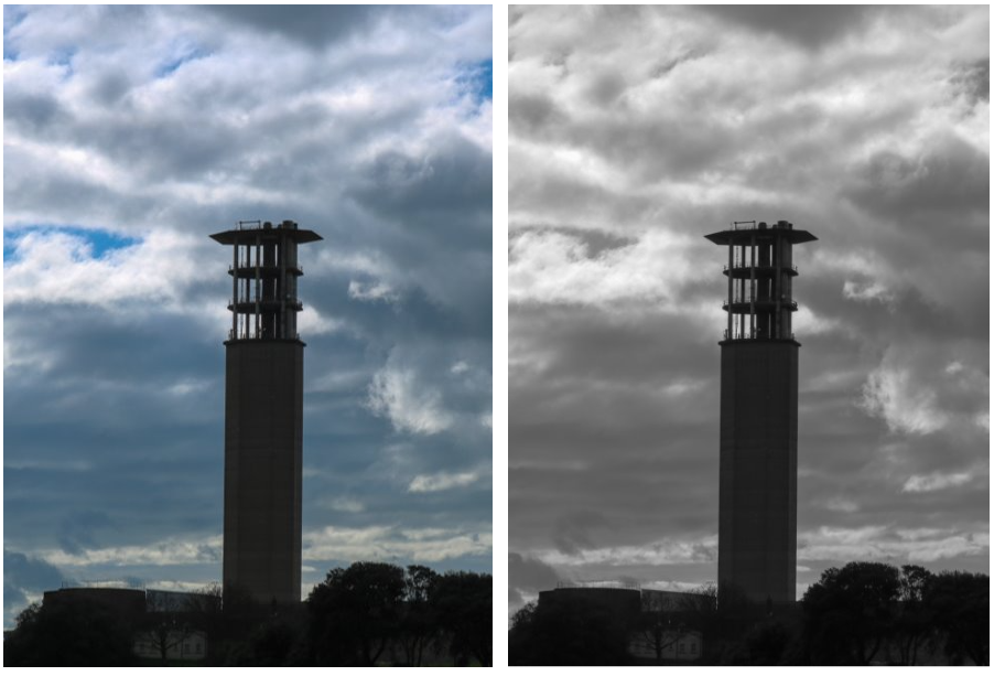
One disadvantage of this shoot was that the sky was generally more blue, however the many clouds in the sky still managed to create that contrast with the building but just not as much as I would have liked.
I think this image works well as typology as the building is centred in the middle and is clearly the main focus of the image.
