Images prt1:
Images prt2:
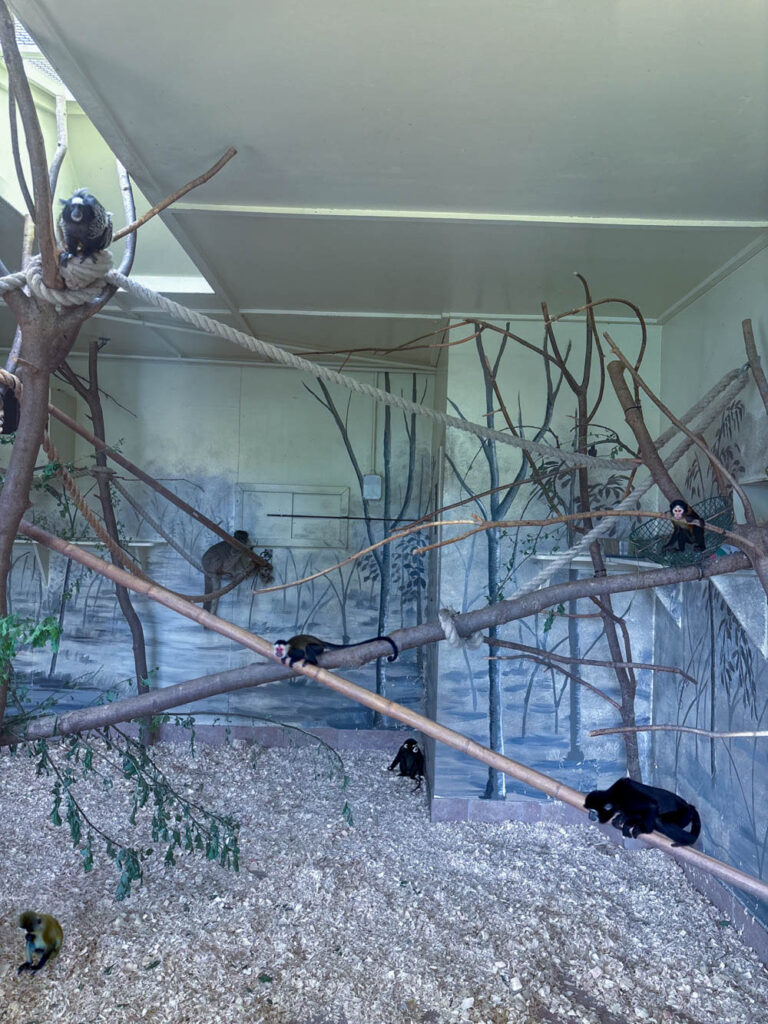
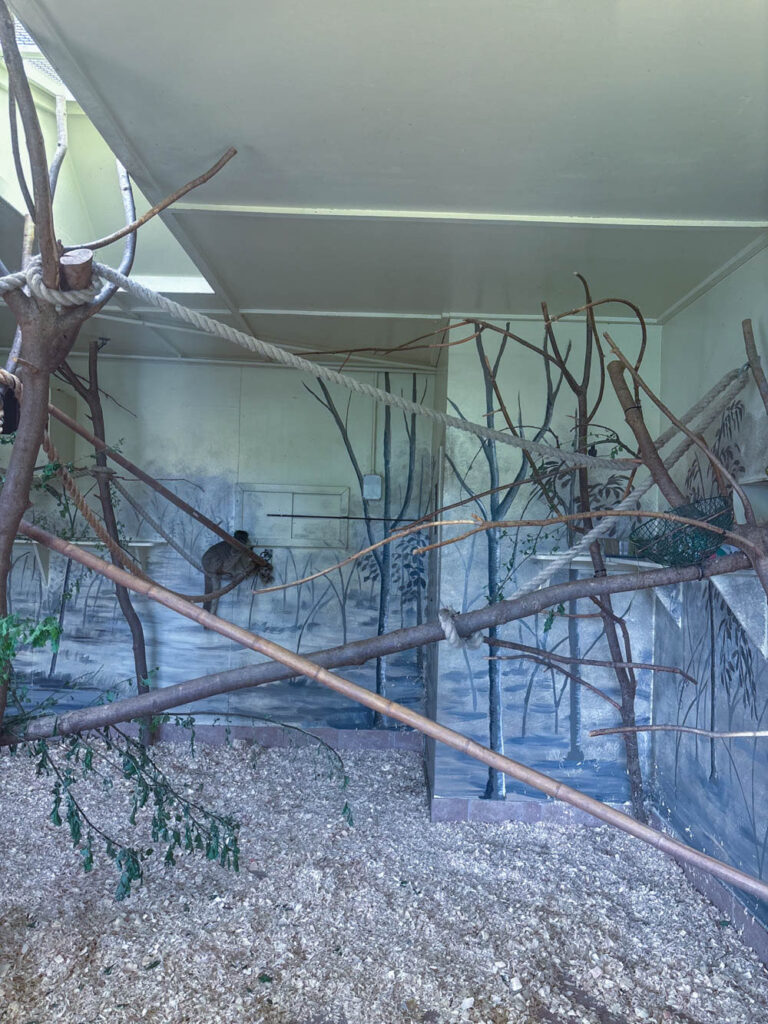
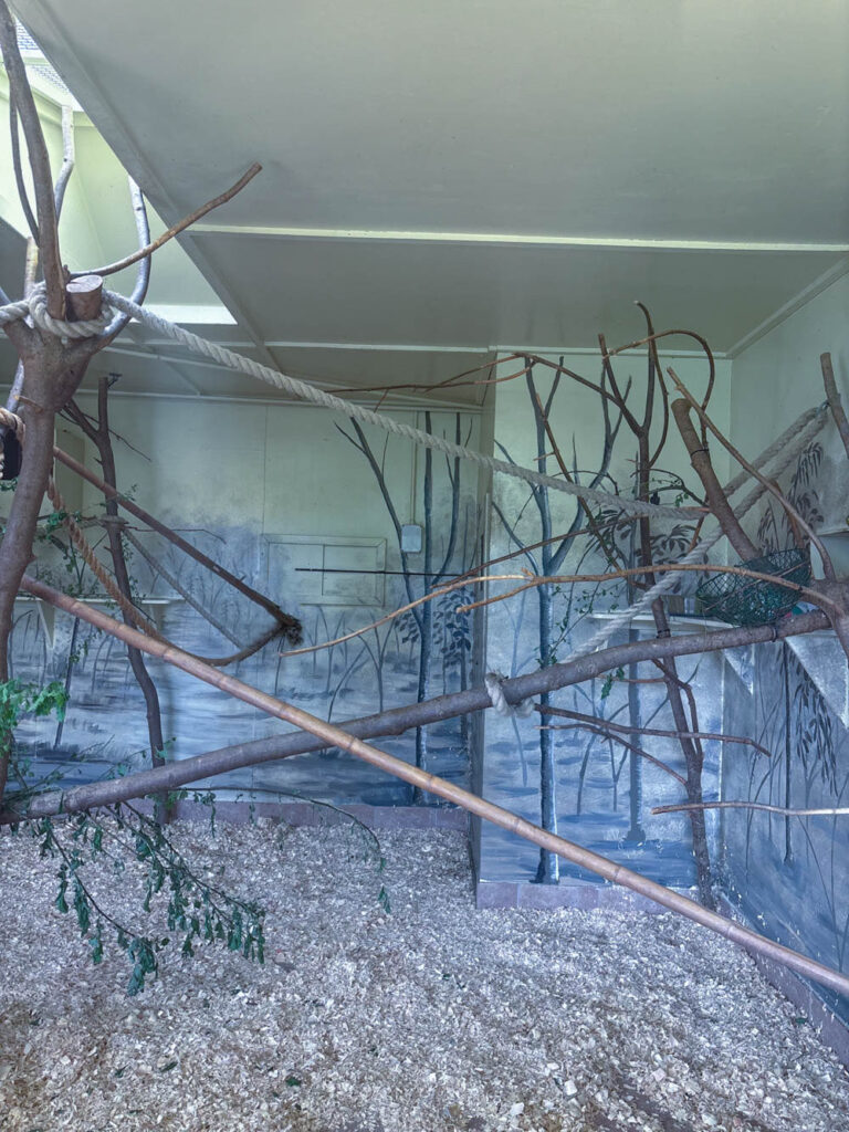
Image prt3:
Presentation
Presentation 1:
Presentation 2:
Presentation 3:
Evaluation
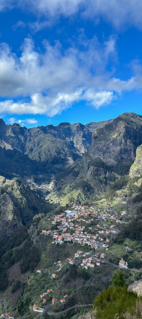
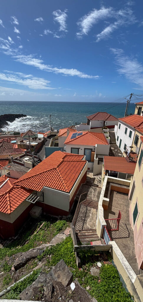
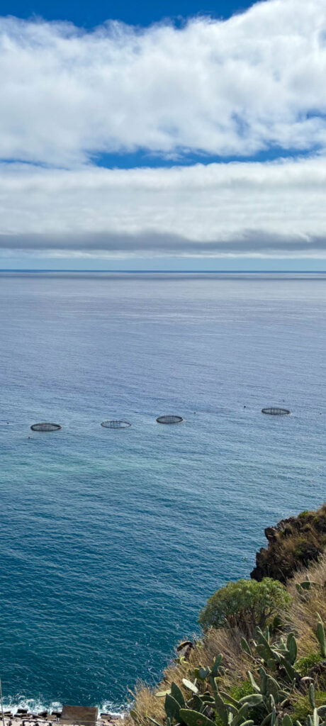
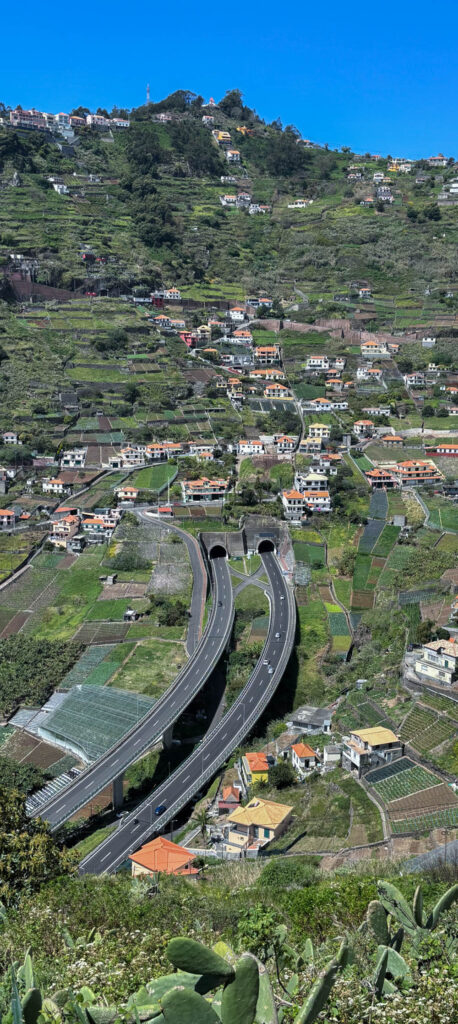
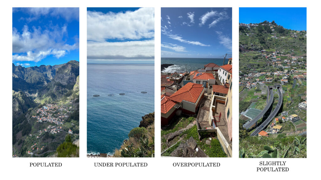
Overall, I think that my pictures are obvious and powerful. This is proven in my images prt1 where it is a series of pictures that show different areas, highlighting the amount of population in the area, etc…populated and unpopulated. This whole concept was created by myself. I did this to show how different developed and not so developed areas look like and to bring some realization that, the images that show an area where it isn’t as developed, will gradually become areas that are overly populated due to the fact that population is rapidly increasing. In these images, I cropped the area where I wanted the focus to mostly be in, so I basically created a focal area for audience to look at instead of getting distracted with the landscape of the images. I think that when it comes to the editing of these images, I did really well, especially enhancing colour and meaning. However, I think that these images could’ve had some more creativity to it, like AI generated stuff to make the images more interesting and maybe some type of design on the picture or some type of zoom in to the part of the image where is showed the population, to spotlight what I was trying to show, even more.
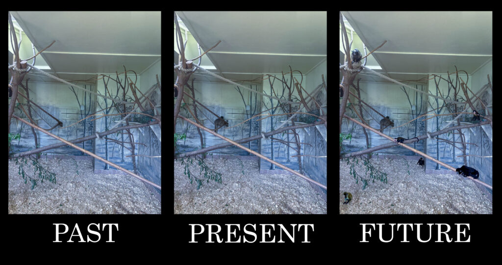
In images prt2, its shows a trio which consists of a photo where there isn’t any monkeys, a photo with one monkey and lastly a photo with loads of monkeys. This was to show the past, present and future of what animals in captivity look/looked like. I think that my colouring in these images are cold and sad which was intentional as I wanted to portray what the animals in captivity feel like. I wanted the audience to feel a sadness wash over them, to make them feel bad for supporting or stepping foot on a business like that. I think that my presentation is clear in terms of what I wanted to communicate. I also think that the meaning is influential and firm. However, I think that there is some improvements I could have done to these images. I could’ve made the image that represents the past (no monkeys), as a little brighter to imply happiness because no animals are being held captive, the image that shows the present (one monkey), I could’ve shown the image slightly more gloomy and cold to display the sadness the animals feel, being held captive and last the image that shows the future (loads of monkeys) I could’ve made it really dark and miserable to indicate how the animals will feel as they gradually get stolen from their families in scary amounts.
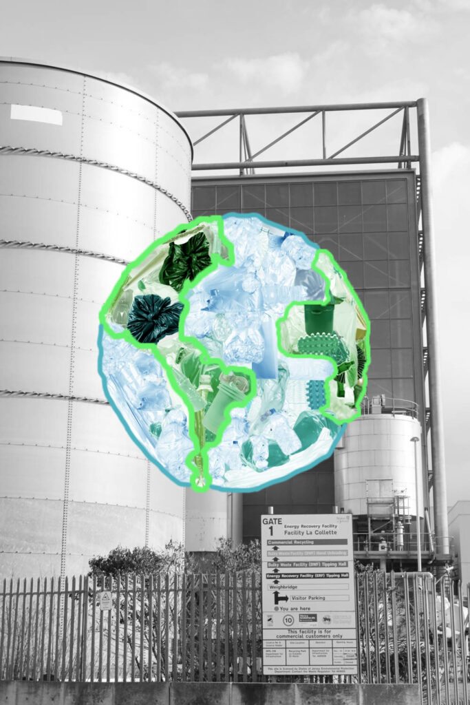
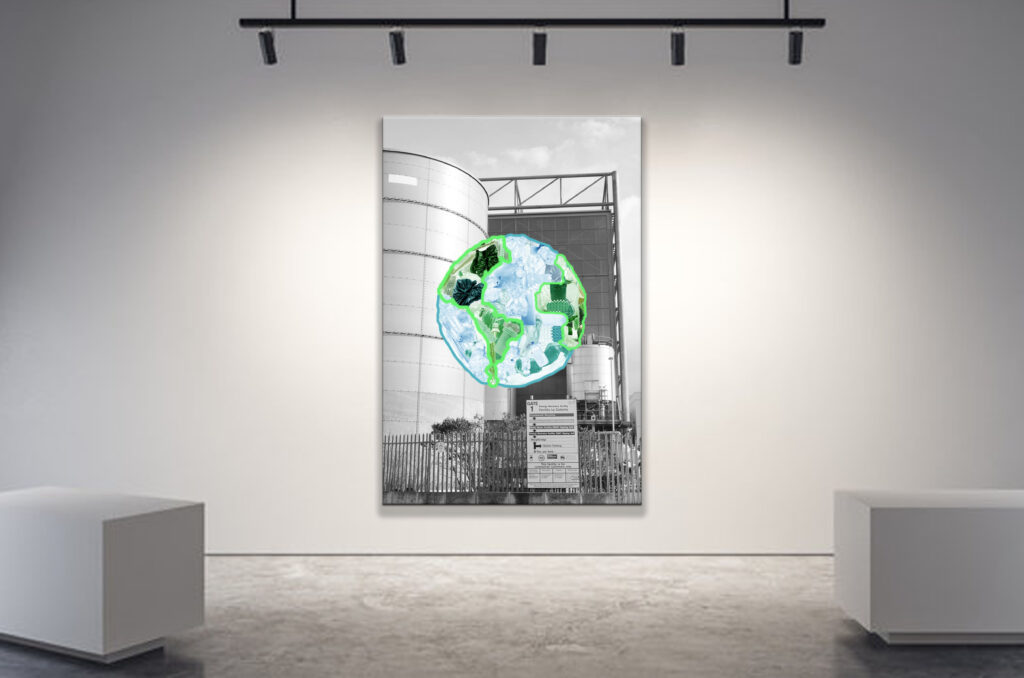
Lastly, I believe that Image prt3 is a really captivating image. It has creativity and uniqueness and I think that the image is pretty self explanatory. The use of contrast between black and white and colour really makes it eye opening. I also think that the use of AI generated litter was powerfully used as it shows a world full of rubbish, which foreshadows what earth will look like in the future. The urban landscape behind the earth, in black and white, suggests a certain fault towards urbanisation. However, I strongly believe that the intention behind this image could’ve had a more obvious meaning. This could’ve been done by adding some text to the black and white background, like ‘reason?’ or ‘urbanisation’ plastered all over the background. I could’ve had some text at the bottom of the image to explain what the image is implying just in case people didn’t quite get it which would be alarming because the message is quite clear.
Finally, I think that my overall projects were really good. I think that the message I wanted to portray in my images were really clear and had depth. However small improvements that lacked in my images could’ve really made my images better and more understandable.
