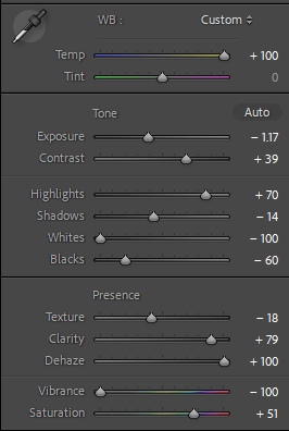
In an attempt to get any work done in photography I have resorted to creatively destroying my work by creating the worst images possible.

This is a photo i captured at the new flats at Havre de Pas. In the beginning I turned tint and exposure fully up and decreased blacks and whites fully.


After messing around with the colour grading I brightened the highlights and gave it a hazy effect. I really enjoy the chaotic composition of the balconies.
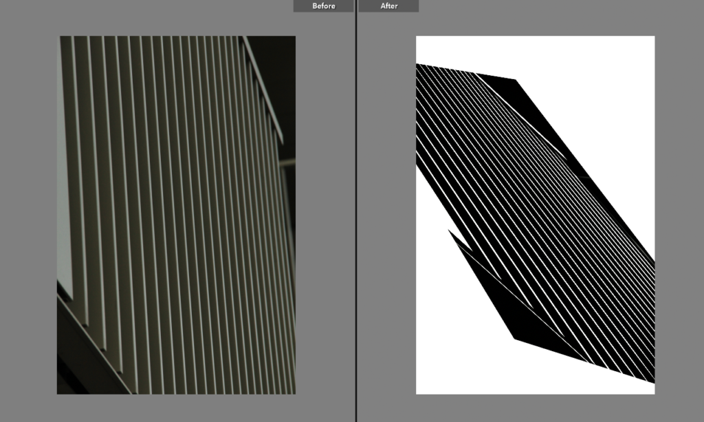

After maximising and minimalising most of these values I had made the image monochromatic.
All the low-mid to high values have been boosted.


Finally I adjusted the position of the photo.

It turned out like an optical illusion comprised of lines, stripped of any depth or colour it had in the original.
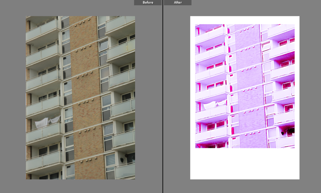
This image went over a similar process to the other photos with some additional grain.
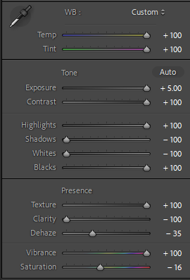
Random parameters being removed or maxed out.
As the image was heavily overexposed I took away as much as I could from the midtones and shadows.



I’ve also positioned the image to give a polaroid style position. This is obviously really out of place on purpose because otherwise the image would look entirely unfamiliar and the loss of the detail and sparkly pink reminds me of the y2k photography aesthetics.

This photo reminds me of what could’ve been old colourised photo from the 19th century because the vignette and overall image looks quite smudged. The vignette also almost adds a subtle fish eye effect.

I found these settings gave it quite a ghostly appearance.
I was curious as to how following the general slope of the histogram would look which gave it a similar output to the pink polaroid photo.


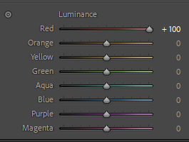
HSL and colour grading was again me trying to figure out the most appropriate and jarring colours.

I actually genuinely really liked the original photo as it obeyed the rule of quarters and has a lot of interesting textures but I find the colours to be quite cumbersome. But I thought, ‘time to ruin it’.
I won’t talk through any of the changes I have made already to other photos.
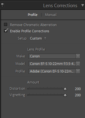
I wasn’t happy with the natural distortion of vignetting on the original image so to give the photo more character I changed that.
I added this grain as a final touch to add to the worn and torn look of the image.

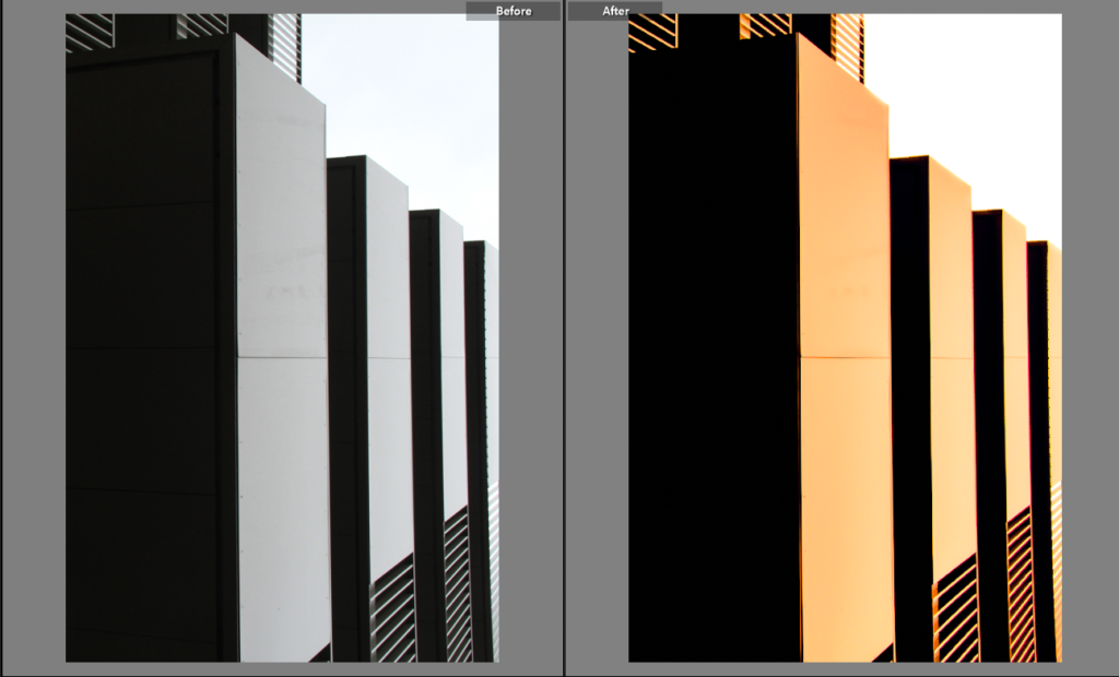
This original image was cropped and I made two edits of it. I thought it kind of looked like a western concept of cyberpunk skyscrapers because of the confirmative and geometric shapes. I leaned into this idea by darkening the shadows and adding a dirty-dusk colour scheme.

