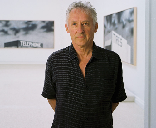
Who is Edward Ruscha?
Edward Joseph Ruscha IV is an American artist associated with the pop art movement. He has worked in the media of painting, printmaking, drawing, photography, and film. He is also noted for creating several artist’s books. Ruscha lives and works in Culver City, California.
Who was Ruscha inspired by?
In the 1960s, inspired by artists like Raymond Hains, René Magritte, Jasper Johns, and Kurt Schwitters, Ruscha became a vibrant part of the art scene surrounding Ferus Gallery in Los Angeles. Ruscha became well known in the late 1950s when he began making small collages using images and words taken from everyday sources such as advertisements. This interest in the everyday led to him using the cityscape of his adopted hometown Los Angeles – a source of inspiration he has returned to again and again.
Why did Ruscha typically take photos of gas stations?
The son of an insurance auditor, Ruscha was raised in Oklahoma City, but moved to L.A. in 1956. The gas stations he photographed all sat on Route 66, the highway he rode on his regular visits home.
“I just had a personal connection to that span of mileage between Oklahoma and California,” Ruscha explain
The gasoline station is Ruscha’s most iconic image. He began
The gasoline station is Ruscha’s most iconic image. He began experimenting with the subject in his first artist’s book, Twentysix Gasoline Stations (1963), which reproduces a series of banal photographs the artist took while driving on Route 66 between Los Angeles and his hometown of Oklahoma City.

Ed Ruscha often edited his images to collage all together to make it even more eye catching then it is. This is called TYPOLOGY.
A photographic typology is a single photograph or more commonly a body of photographic work, that shares a high level of consistency. This consistency is usually found within the subjects, environment, photographic process, and presentation or direction of the subject.
An example of typology


Ed Ruscha’s typology


Mood board of Ruscha’s work within gas stations

As shown, Ed Ruscha clearly had a love and soft spot of gas stations in the 1960’s. He typically preferred photographing in black and white especially as colour was starting to evolve during 1970’s as a number of American photographers turned increasingly to colour. This creates an interesting factor to Ruscha as he decided too keep it in black and white during the time colour was trending due to it starting. However, as these photos were taken in this time it may of been more challenging and difficult to be able to get them in colour. Until well into the 1970s, the only photographs that were actually collected and exhibited were in black-and-white. The reluctance to accept colour photography was mainly due to conservation reasons, since the pigmentation in early colour photographs was highly unstable.
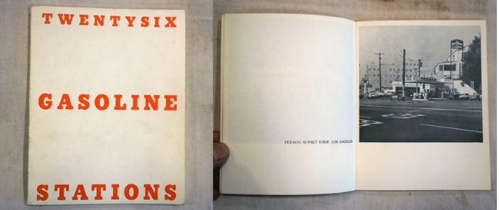
Twentysix Gasoline Stations (1963)

As seen, Ruscha made a book and documented him taking images of 26 gas stations and put them into a famous book in a very simple and dull layout. The simple layout and the black and white images makes not the book itself interesting but the images as his aim and intention was to get viewers to focus on the images rather than the pages in the book.

It is often considered to be the first modern artist’s book, and has become famous as a precursor and a major influence on the emerging artist’s book culture, especially in America. The book delivers exactly what its title promises, reproducing 26 photographs of gasoline stations next to captions indicating their brand and location.
Ruscha has said:
I wasn’t coming out here [California] to do anything in particular, or to be anything in particular except…except out of Oklahoma…a long way from Oklahoma, that’s what I wanted to be, and everything it stood for. And away from the Catholic Church too, and Sister Daniella who beat my knuckles with a pencil the one year I was in parochial school.
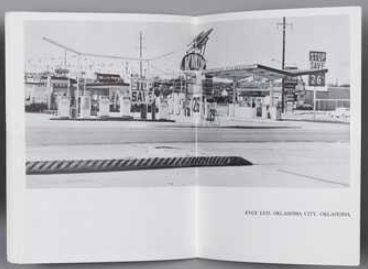
Image Analysis

In this image, its interesting as it depends on the way you view it. One factor is, the fact it is deserted and you can instantly tell that is there is not many surroundings. This could be on purpose as his intention and aim may to get the viewer to focus on the gas station itself or to show the different features and difference within each gas station in California. This makes the viewer think of things that you wouldn’t think of on an every day basis. This is what makes his photos so interesting as he is the first to take something of something so simple but yet an underlying fascination. The photo is in black and white possibly to keep it in an old aesthetic but also to stop viewers from getting distracted and to focus on the gas station. It is slightly fuzzy which represents and tells modern viewers that it was taken before cameras had evolved. It is a bit unclear so it makes it difficult for viewers to focus but challenges them to look harder to create more time viewed on each image.
