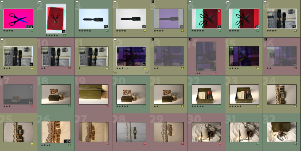

To edit and categorize these images I decided to rate my photos from 1 star ‘*’ to 5 stars ‘*****’ as a way to pick my favourites.
I also colour coded them with ‘green’ for my best, ‘yellow’ for my unsure and ‘red’ for my low quality bad ones. This helps me to easily display favourite and least favourite images more specifically.
I took these photographs in the studio using a DSLR camera and a studio light.
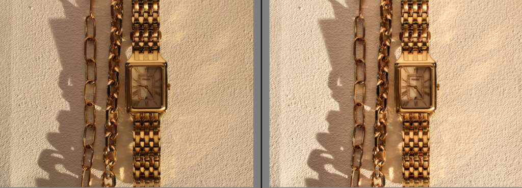
I really like this image because of the gold shimmer that the jewellery creates. I also really like the warm tone that the gold creates, I think this differs from my other photos I have taken because I have focussed on more cooler tones. If I was to change two things it would be: 1. I would erase the shadow of the jewellery and how it takes the focus away from the bracelets. To do this I would need to change the camera angle, background or camera settings.
2. I would also change the setup of my jewellery, I think I should’ve thought more clearly about my setup in order to escalate the image and give it higher quality.
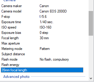
These are the camera settings that I used to achieve these photos.
Shutter speed : 1/40 sec.
ISO: 150- 160
Aperture: f/5.6
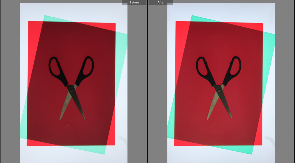
I edited this photo and focused on making it slightly brighter. I did not particularly need to edit the photo as it would lose quality and quickly become too bright or too dark. I also edited this photo whilst mainly focussing on and getting rid of the texture in the top and bottom part of the red paper. Erasing this texture helps my photo to become a higher quality and more effective.
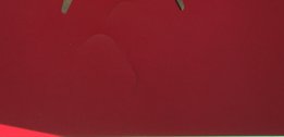
I did not like this part of the texture of the picture so I attempted to erase it to make the image more effective. I had to experiment with the tools in order to find out how to erase this part of the image. However, this worked by helping me to gain more skills whilst working in Adobe Lightroom.
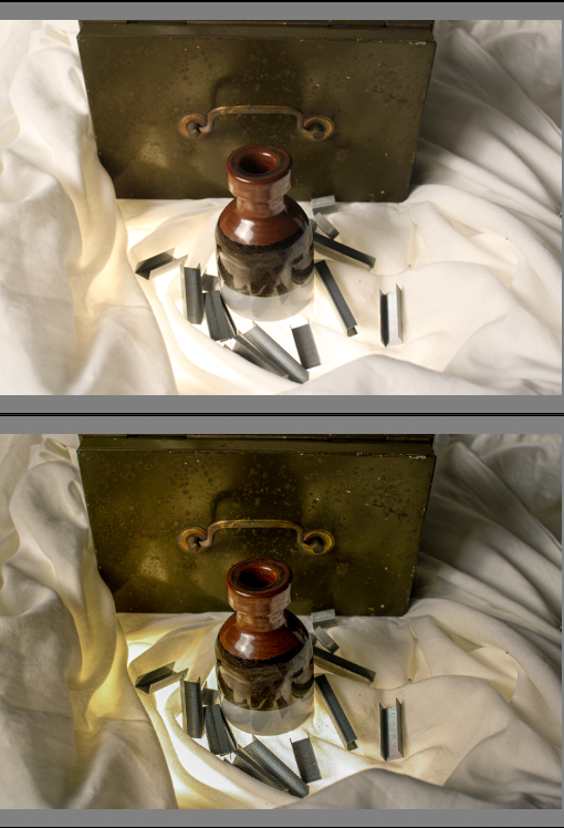
I also edited this photo to give it a higher quality and make the background a bit darker so that the details of the objects and light from below stands out more. I think that this makes my image stand out more and become more focussed.
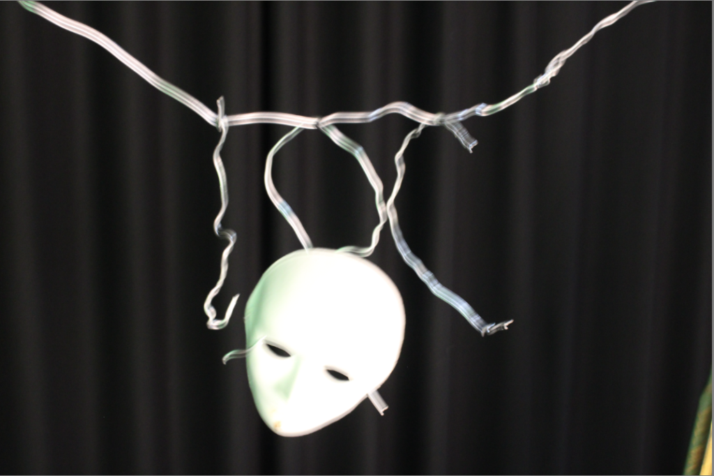
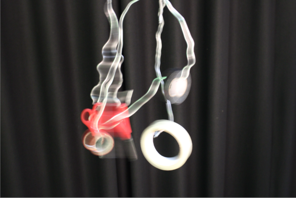
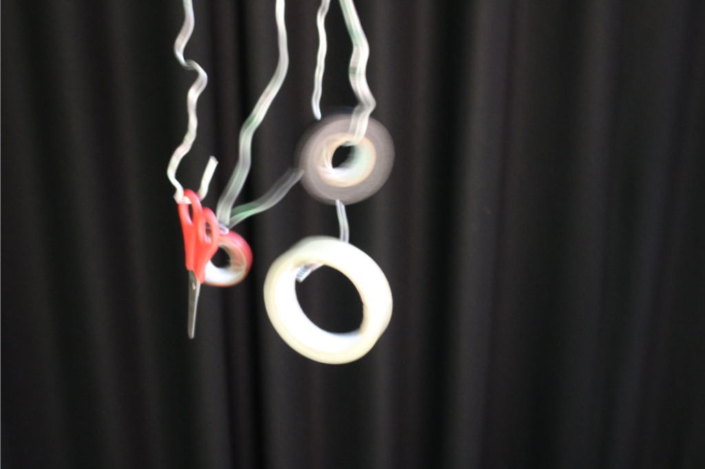
I also took these photos however, whilst taking them I was unsuccessful with gaining a clear, controlled image and they came out very blurry. Next time, I should increase the shutter speed so that I am able to capture the moving image more quickly. These photos also do not particularly represent formalism and I think would fit well under still life if I was able to capture a less blurry image.
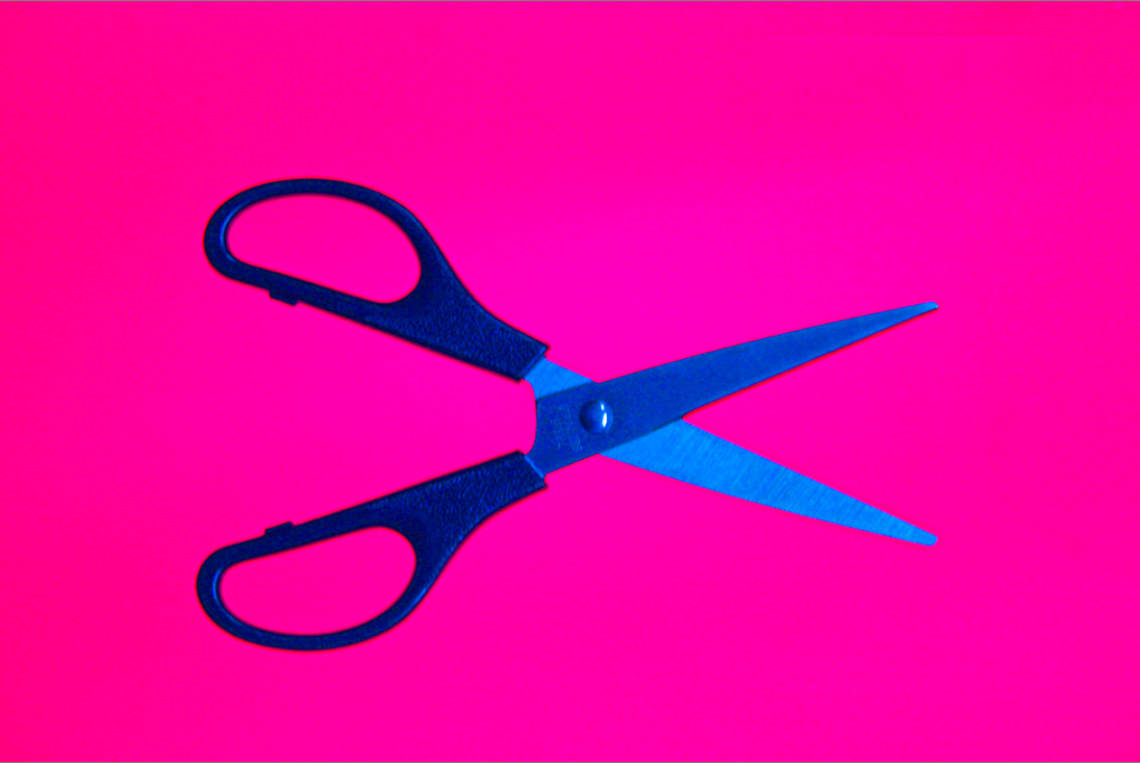
I edited this photo to make it clearer and focus on the small details of the scissors whilst also still maintaining the brightness and vibrancy of the pink background. This was difficult as my aperture was already low which lowered the exposure. To help brighten up this photo more I had to subtly heighten the exposure whilst editing in Adobe Lightroom.
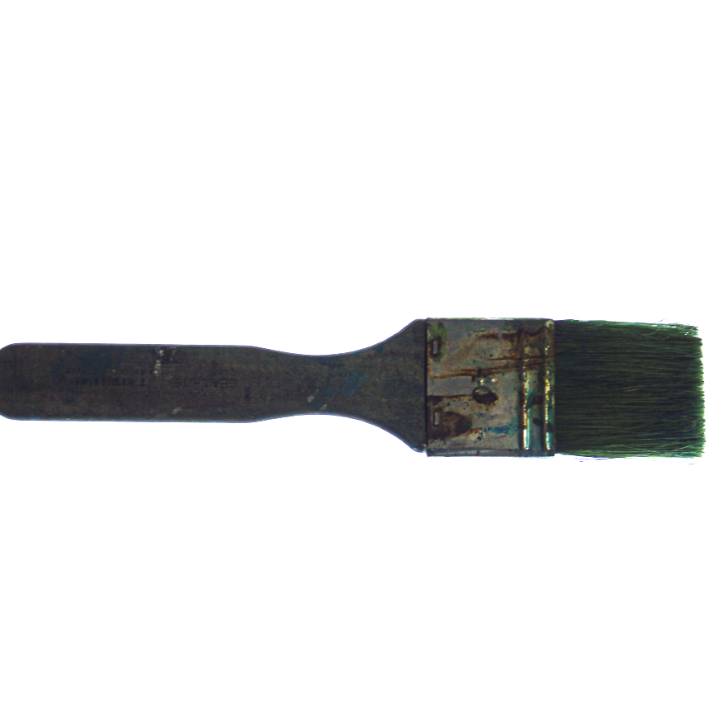
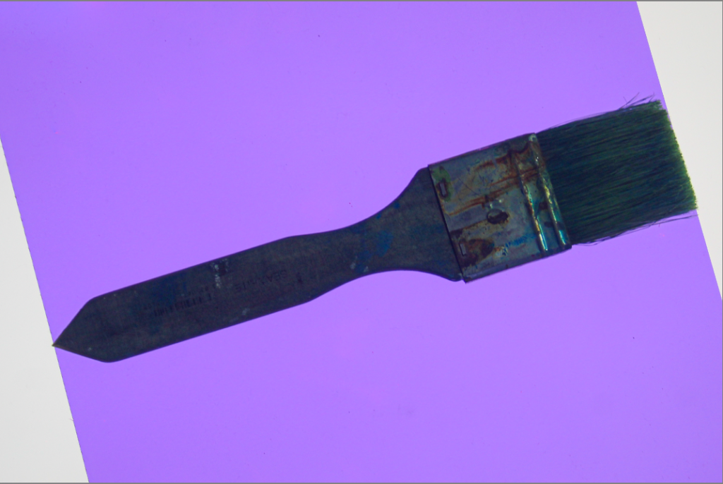
These are my two favourite edited version of a paintbrush I photographed. I think these signify formalism very well because It is a single object and the images focuses on appreciating the object rather than a variety of things.
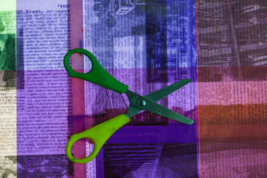
I do not really like this image I took because I think the background is effective, however, the brightness and shape of the scissors clashes with the background colour and creates a confusing image with too many colours not working together. To improve this image I could use a single coloured object so that the background can bring out the shape and dimensions of the object.
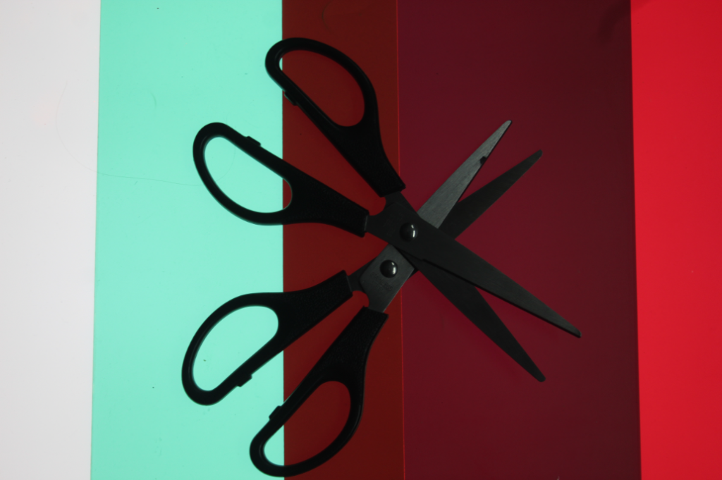
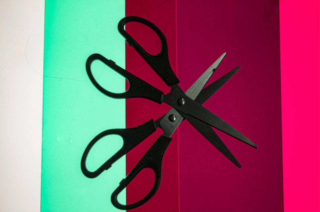
Whilst editing this photo, I thought about attempting to maintain the colourful background whilst showing the details of the scissors. I placed the scissors in a way so that they are both displayed clearly and look good. I think this really helped to make my image look interesting and appealing to look at because there is two objects that are the same, his is to maintain the idea of formalism and appreciation of one object whilst having two of the same object.
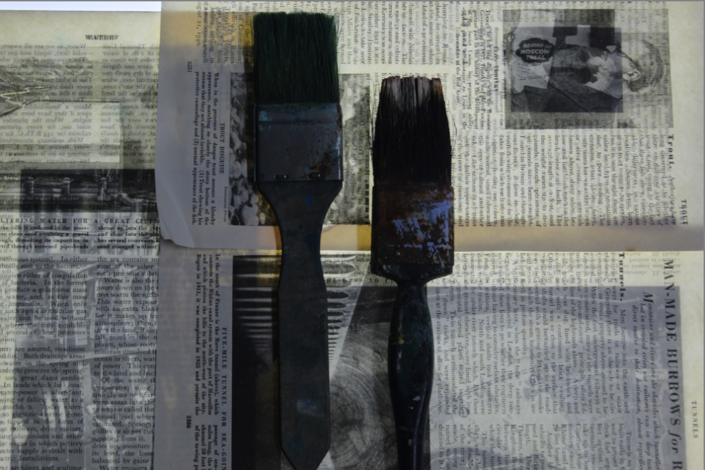
I really do not like this image because It is far too dark and is very low quality, however, I attempted to edit it anyway and see if I can elevate it and help it look better.
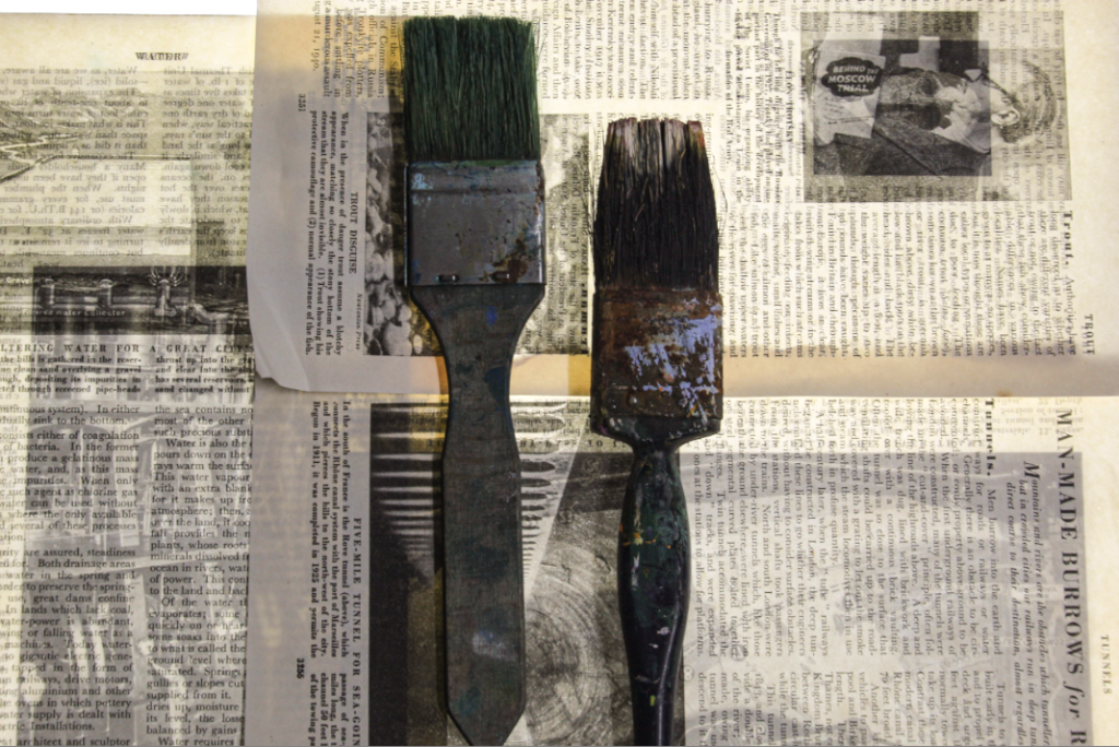
After editing this photo and focusing mainly on improving the whites and definitions I much prefer it. I think that once the image is brightened up, you can see the details and different textures from the object. However the newspaper behind the paintbrushes clashes slightly with the different colours and shades on the old paintbrush which I think makes the image look confusing and unappealing to look at. To improve I should change the objects on top of the newspaper to an object on one solid colour. If I did this, I think that the newspaper would bring out the detail of the objects much more.
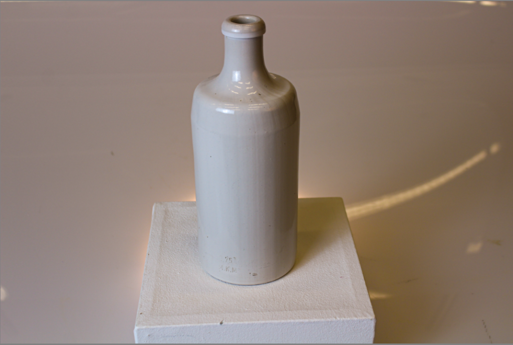
I only had to briefly edit this photo because It was already high quality and does not include a wide range of colours. This photo helps to appreciate the object whilst pairing it with whites and yellows on a subtle spotlight.
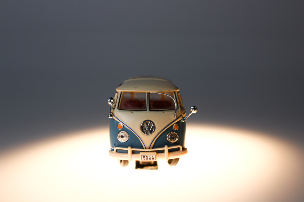
I also decided to take this photo from the same angle so that you can see the object from a direct point of view. I think if I took this from above it would not be as good and would not be as effective. The bright blue and orange really makes this image so much more eye-catching and structured. I really like this image however, the bright spotlight causes a slight blur from the bottom of the car. This takes detail away from the wheels and sign at the bottom of the car.
