#1

These 2 pipes going into and from the incinerator at La Collette. I decided to emphasise the reflective and battered texture of the pipes by increasing the overall presence, shadows and whites of the image. This also helped the lens flare stand out on the left pipe.
The beautiful clouds in the background of the image gave nature a presence in an image of mostly manmade components. To reveal them I lowered the exposure of the sky using the LRC masking brush.
Just to add a bit more tone contrast I used a graduated filter to the bottom with -2 exposure.
Like Albert Renger-Patzsch, I’ve made the most of the subjects fundamental shapes and lines photographing the pipes at a warped perspective.

The bricks, cracks and metal rail going up this chimney are all made more interesting and given more depth with the use of the shadow that takes half of the left half of the chimney. It’s important that the shadow isn’t too dark that it hides the bricks.
Similarly to Renger-Patzsch, the shadows on the underside of the pipes are just bright enough to see the detail of the scratches and welding, whilst the bright light hitting the top and right of the pipe reflects onto the underside making the tubes less flat. Additionally, the symmetry is broken with the same rail looking thing on the side.
Renger-Patzsch wanted to capture objects as interestingly and objectively as he could. Compared to my image, the blending between tones is smoother and tonal range is lesser so the environment doesn’t effect the subject too much. Though I have included a lens flare and brightened the highlights, the environment doesn’t effect the subject too much and still gives an accurate representation of the pipes.
#2

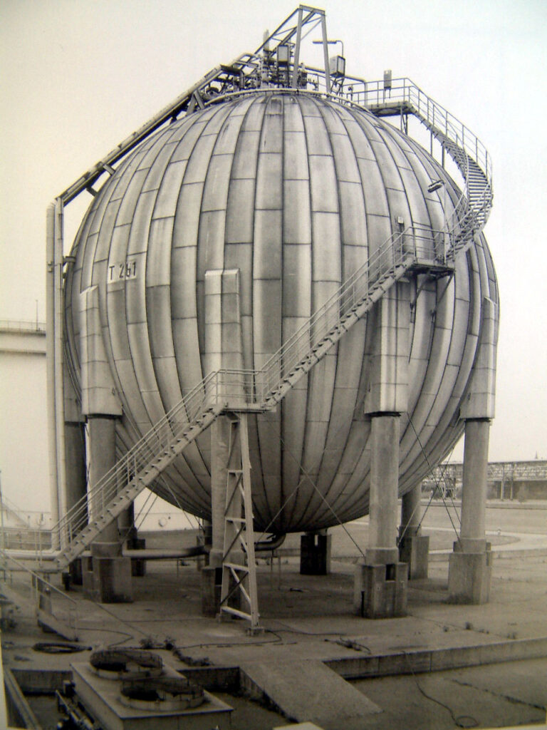
My next few photos take some influence from Hilla and Bernd Becher as I wanted to capture the texture and shapes within the industrial structures but with a less dead pan and more cropped approach.
[Hilla and Bernd Becher ->]

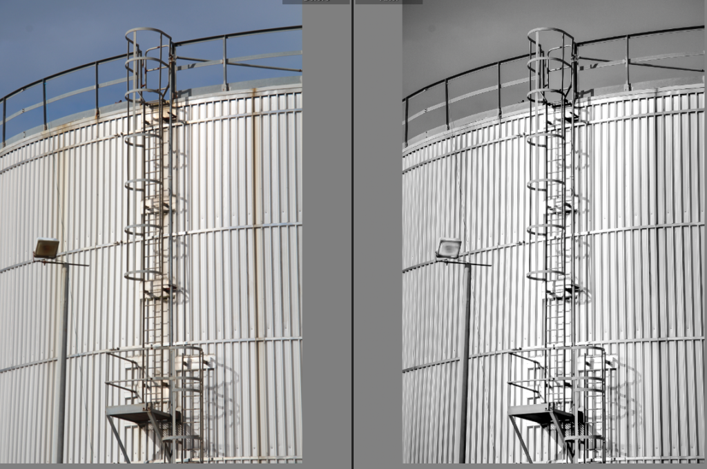
To uniquely enhance the grate-like texture on this container of sorts I increased the highlights and blacks of the shadows of the image. Because this was quite harsh and unbalanced I added a brush mask around the ladder not only to draw your eye to it but to lower the exposure.
Additionally the spotlight was too dark so I made it sharper and brighter with a brush mask.

The crop gives more attention to the lamp post and ladder with the grate-like texture in the midground being quite distracting to the eye.
Slightly blending a navy blue in the shadows and mid-tones actually softened the grate-like texture further whilst giving it a more metallic appearance.


I think the composition of my image takes great influence that of Hilla and Bernd Becher, but emphasises the lines that wrap around the industrial structures.
My use of shadows is more similar to that of André Kertész in this image here. The shadows almost paint over the scene.

#3


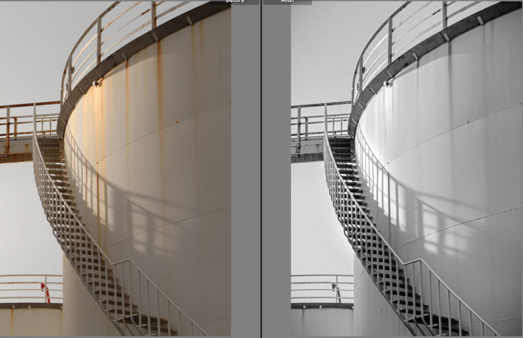
The subtle blue added to the mid-tones makes the image whiter and cleaner.

The final B&W version came from an edited copy of the original


In comparison to Hilla and Bernd Becher, I’ve tried to include sharp shadows to add contrast and add lines in my photos. Whereas their photos feature quite diffused and blob-like shadows.
#4

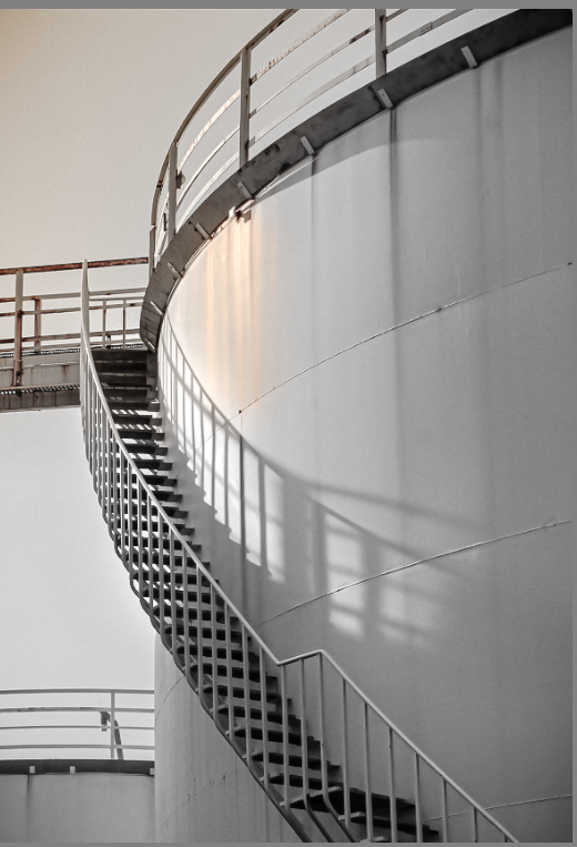
Originally cropped to focus on the the shadow of staircase

After this version I realised a splash of colour made the image more interesting. Colour grading the mid-tones an aqua blue gave the de-saturated cream a cleaner, whiter hue.


Looking back at the original composition of this image made me realise the negative space was important in effectively establishing the forms of the subjects in my image. The new coloured area proved to help the negative space give depth to the structures and divide the image into two sections. Additionally, the added warm colours narrates the direction of the light source some more.
