My take on Topographic Photography.
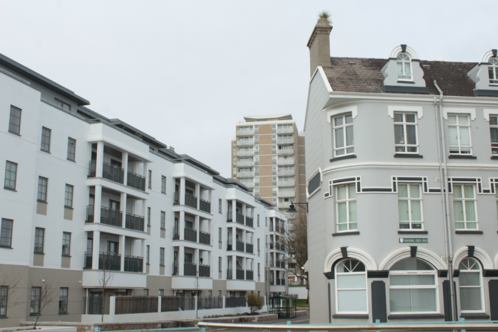
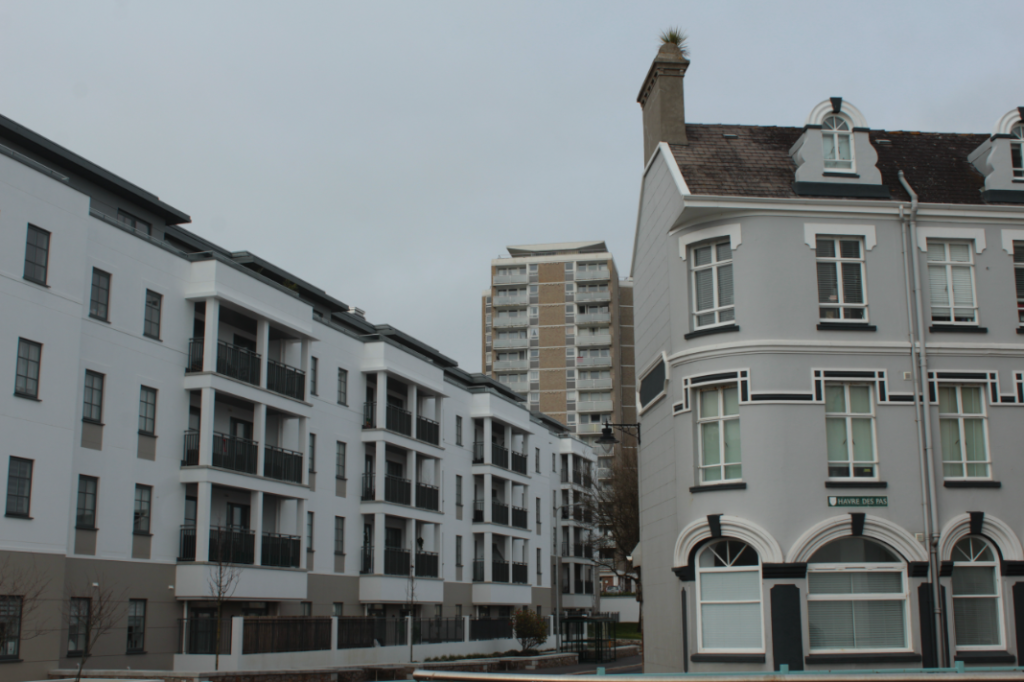
I started by seeing this perfect angle with these three buildings next to each other. At first they look similar, but if you look closely you can see they are all different styles with the front right building being old fashioned with the curved walls and windows and with the pointy roof chimney. The building in the back being 50/50 old and new with the old style of colours/windows and materials. But the new style with balcony’s and straight edged walls and so finally the long building to the left being fully modern with the white plane walls, mixed with black balcony gates, plus modern looking windows and straight walls and roof.


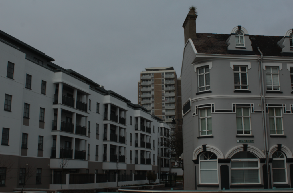
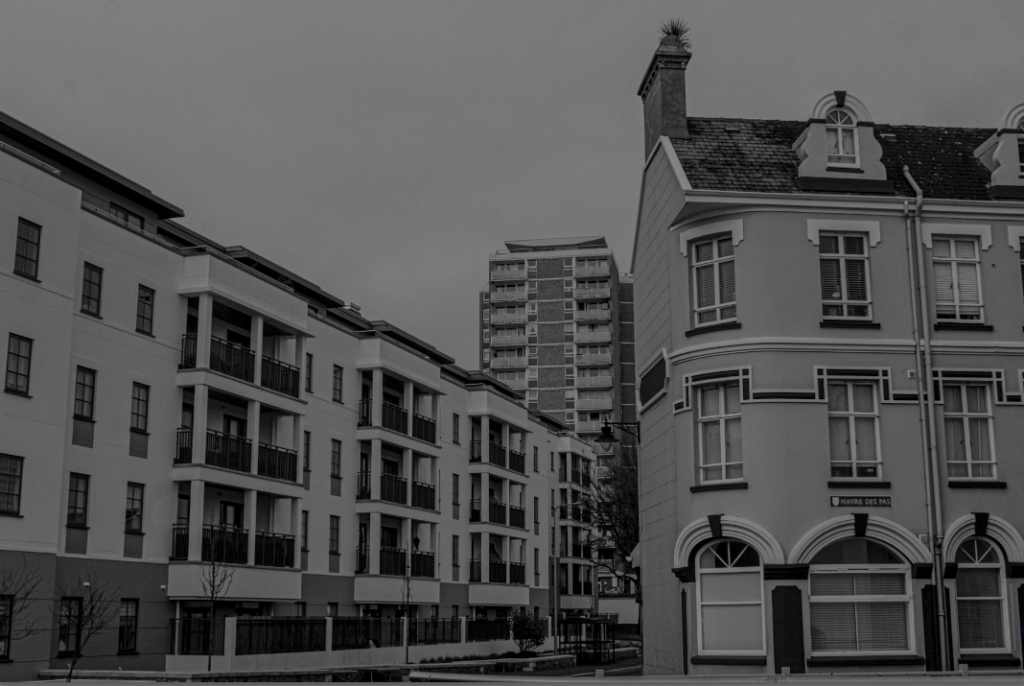
I really liked how these three different exposures looked but I felt confident with trying the B/W style on it. This worked very well with still showcasing each era of buildings but also the same contrast gives the photo the same idea of buildings.

This was the final photo after editing and the B/W added on top of it came out just as I imagined. I also love how each building is a different shape with the left building being rectangular going away from the camera. The right square-like building standing flat, face-on towards the camera and then the tall building in the background still very distant from the other two but still stands out as a main view in the photo.
