Photoshoot 1:
Before:

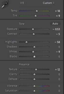
Edit Settings:

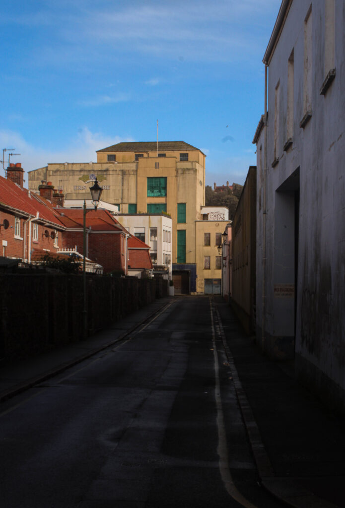
For this photograph, I used highlights, temp ands hue to make the colours pop out more, with a vibrant mixture of colour, Blue, Orange these help bring the viewers attention from the darkened alleyway.

Final Result:
Before:
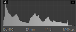

First Edits:
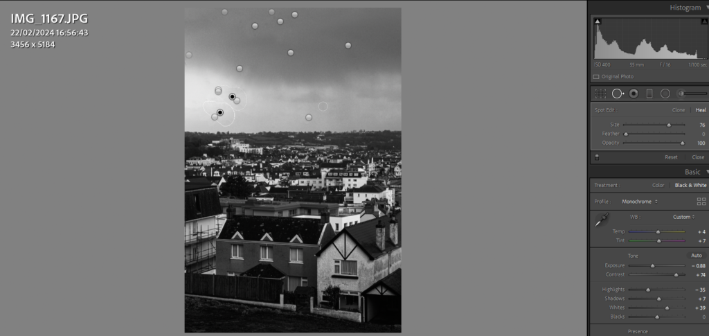
Due to the lack of colour in the buildings stretching across the landscape, I decided to make it into black and white to create a visual contrast between their tones.

Final Result:

Mobile Edits:

These Edits have been made on the App, Snapseed, Using their features of filters, and adjustment settings, similar to Lightroom I altered with the exposure, White & Black balance and other settings to improve them further.






Photoshoot 2:
Before:


First Edits:
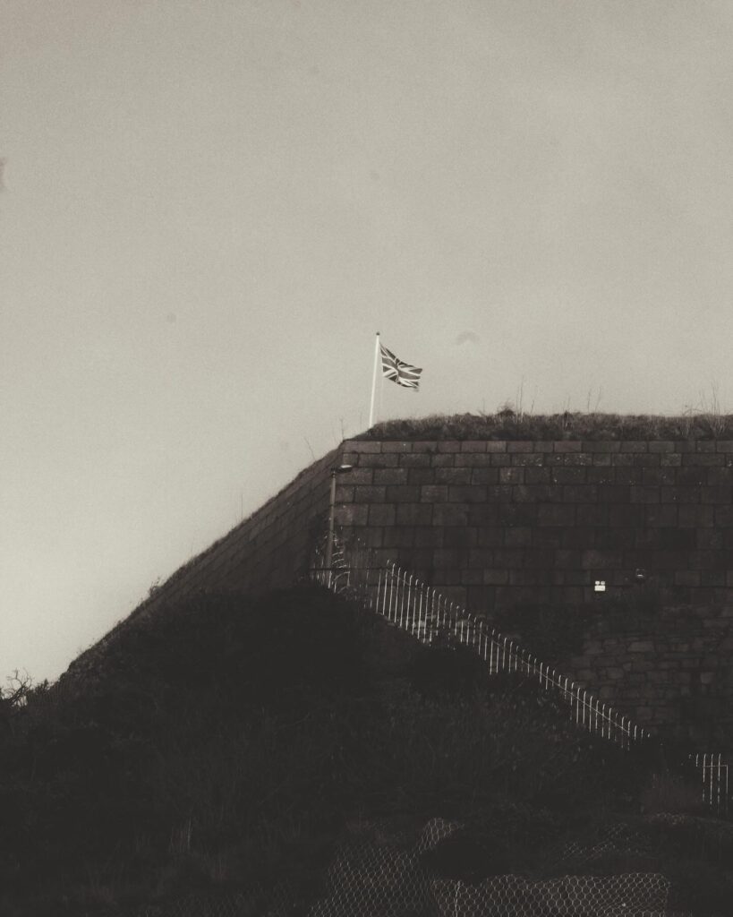
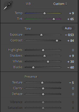
For this image, I was Inspired from the works of Lewis Baltz, With his dead-pan shots of purpose built environments I believe I have captured that in this image, by adjusting the exposure, contrast and the WB balance I was able to create, what I think is a similar image to his work.
Final Results:

Before:


First Edits:

Like the previous image, I took inspiration from Lewis Baltz as well as Robert Adams. With Lewis Baltz’s restricted shot angle and as a conceptual basis of housing being photographed due to an increasing population which I believe fits the topic of New Topographics. Using the WB balance, contrast and highlights this is what created that dramatic tonal difference from black windows to the flat white walls.


Final Results:

Before:

First Edits:
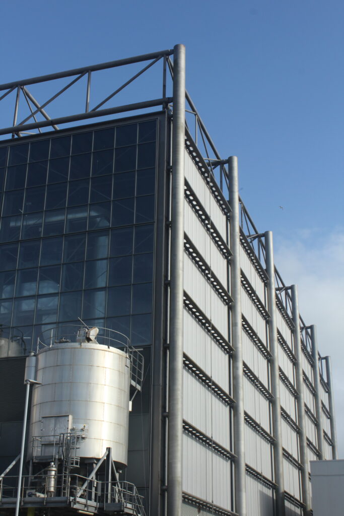
Having the same conceptual basis of Lewis Baltz, the empty, dystopian sense of his images of industrial areas on a grandeur scale. Using tone setting such as highlights, shadow and whites and blacks I was able to create a shiny effect on the sun surfaced part of the building and big tanker.

Final Results:

Before:

First Edits:

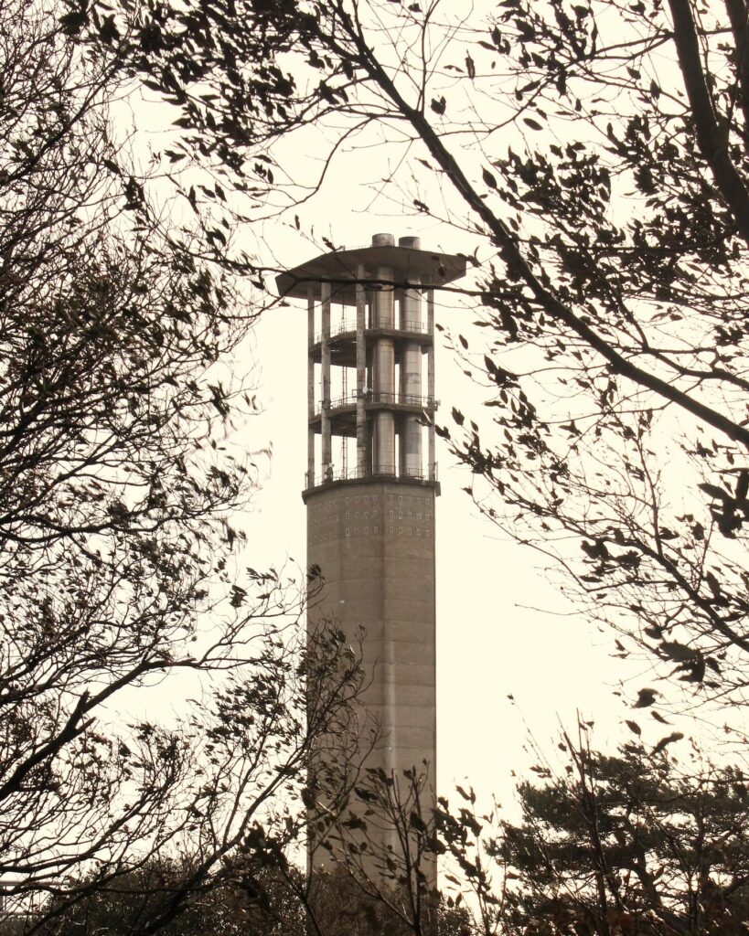
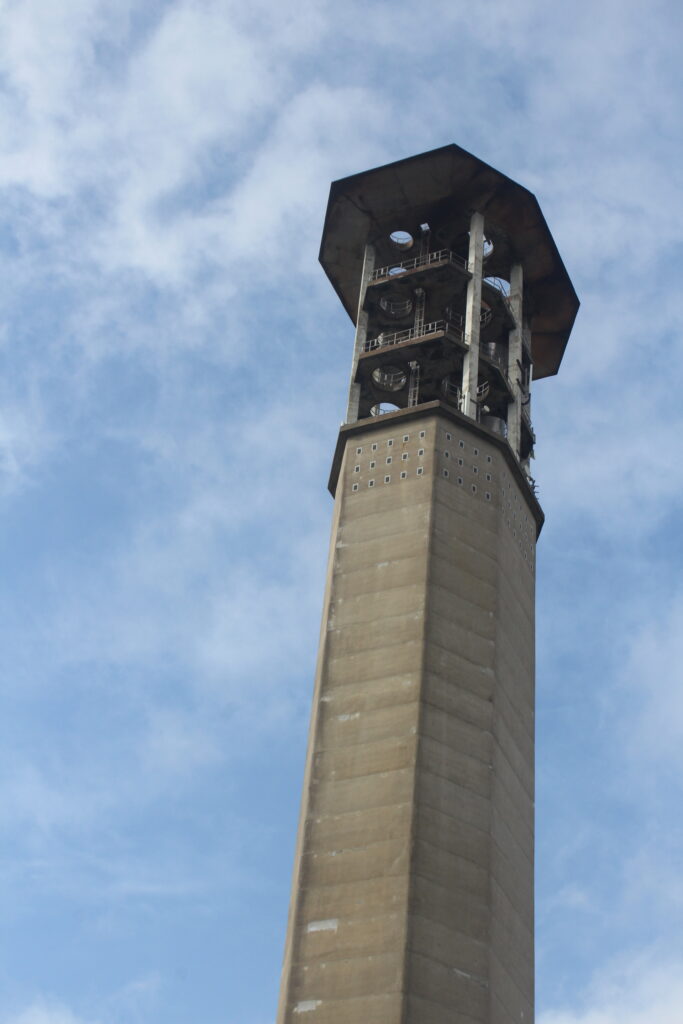
Inspired by the works of a New Topographics photographer, Kieran Gosney, who I didn’t mention in my art reference, he photographs large industrial structures similarly to this one.
By altering the dramatic tones of the whites and blacks in the image, this is how I created the dramatic sky behind the brutalist tower. Like the previous image, I used contrast to have that shiny effect on the metal structure of the towers support beams.
(Kieran Gosney’s work)


Final Results:

Before:


First Edits:

By turning down the saturation entirely and highlighting the tone of the black and white parts of the buildings this adds much more volume to their architectural features as prior to being edited their colours are quite faded and muted.


Final Results:

Before:

First Edits:

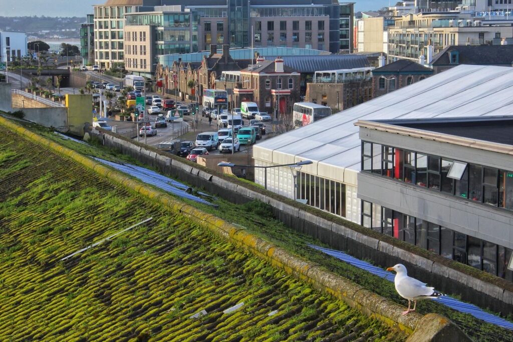
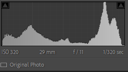
Specifically inspired by this image of the New Industrial parks by Lewis Baltz, the use of space within the photograph shows the dystopian emptiness of industrial areas. In my image I feel I replicated that conceptual idea through capturing a large empty are where no people are in sight (despite the car).
Using effects such as contrast and tonal features like shadows I was able to create a deeper feeling to the image of the sites vast size, to further express this I also increased the clarity.


Final results:

