I went on a photo walk around Harve de pas and La Collette. Afterwards I continued the walk and went around fort regent and pier road. I took these photos using a mix between a DSLR camera and my phone camera. In total taking 237 photos.


Edits


I edited this photo by cropping and rotating it, so it was more centred. I also increased the sharpening to make the image look more clear, and I made minor adjustments to the temp and contrast to improve the overall image.
I like this photo as I feel like it does a good job at depicting the industrial landscape due to the objects in the photo, like the metal fence and metal thing in the middle. Furthermore I am also pleased with the Lighting in the photo as there aren’t too many shadows and the lighting is consistent throughout the photo with no incredibly dark or light patches.


I also made an edited copy of the photo in Black & White in the editing style of John Schott’s topographic photos. I feel that the photo also looks good like this.
Photo edit #2


The photo above I took of the landscape of St.Helier and shows urbanisation. I like the way there is a church in the middle of the photo surrounded with buildings, it really captures the urban sprawl and is a good anchor point for the photo.
I edited the photo to improve the contrast and exposure, as the contrast wasn’t the best. I also cropped the image to make the church more centred and the image more level. After some small changes to the image levels and tones I felt it looked much better and less bland.
Photo edit #3
For my third edit I am going to experiment with creating a high dynamic range (HDR) photo. To start I got the three photos I took using exposure bracketing.


The photo on the left is the result of merging the photos in Lightroom to make the photo have a high dynamic range.

The Camera lens was a bit dirty when I took these photos so I removed any marks with the spot remover tool. I am really pleased with how the photo turned out and I believe it looks much better now the Photo is HDR. I also feel the photo represents industrial landscape really well as it contains the incineration plant and the chimney in it with them being the main focus of the image.
Photo edit #4

I decided to edit this photo to enhance the sky as I wanted to improve its exposure, I did this by using the graduated filter. I also Removed any marks caused by the camera and made minor adjustments to the whites and blacks.

Evaluation
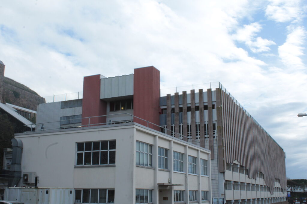
Out of editing all my favourite/best outcomes from the New Topographics, this photo below is my favourite. As it really shows the industrialisation which is a common theme in the new topagraphics. I also feel that the photo has an interesting feel to it as there is a lot going on in the photo, architecture wise.
I struggled to choose between this edit or the one in black and white, but after careful consideration I felt that the colour looks more better in the photo compared to it being in black & White.

Analysing the photo I took
In the photo the technical elements are not really important, but the lighting is good and there are no badly lit areas making all the photo easier to see. The temperature is also on the warmer side which is helped by the way the sun was shining when I took the photo.
The colour in the photo is mainly beige and grey/silver which can be seen as being quite dull, reflecting on what people see industrial architecture as. The blue of the sky almost creates a contrast, brightening the photo up and making it look less dull, as I feel if the sky was overcast the photo would probably look quite depressing and gloomy.
The photo has a variety of lines with horizontal, vertical and diagonal lines, however there are no leading lines. The texture and pattern in the photo are quite evident as on the left the silver structure is kind of shiny helped by the vertical lines which wrap around it creating depth. on the right there are the bricks on the building which are repeated across the building, creating pattern. The structure on the left, the metal fence in the middle and the bricks on the building on the left help give the photo a rough texture which fits in well with the theme of industrial architecture.
Next Steps
Next I need to focus on presenting my photos which I could do as a collage and/or a virtual gallery.
