Photoshoot 1:
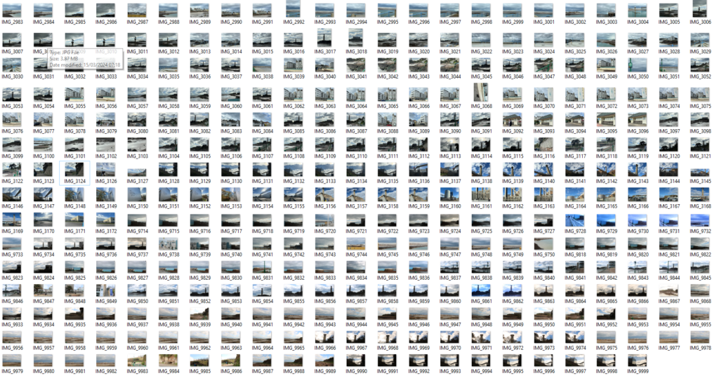
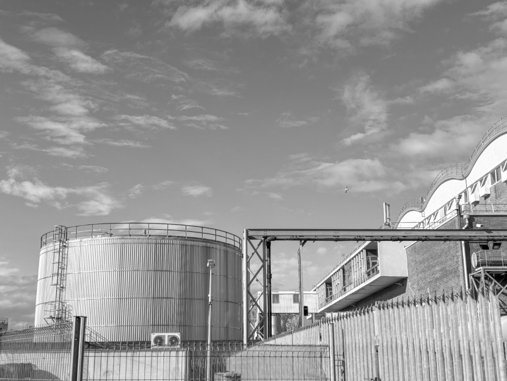
This photoshoot was done as a class during our lesson time. the location was harve de pas swimming pool and round to La Collette. I think these locations were good as it gave you different variations of building types and sceneries. For example, the reached the modern built apartments which contrasted to the older buildings that stood behind them. I was able to capture a photo where this contrast was shown. further round, you reached the industrial areas where I was able to take photos of Jerseys incinerator and waste buildings. I think thus part of the photoshoot turned out nice as I loved the reflection the clouds had on the windows of the building creating a warm tone to the image and showing the beauty of the sky. overall, in this photoshoot, I think the time of day and weather worked really well. the position of clouds really helped bring across the romanticism theme as in some photos they come across as quite stormy and a darker grey.
My favourite photos from my shoot (colour and black and white)
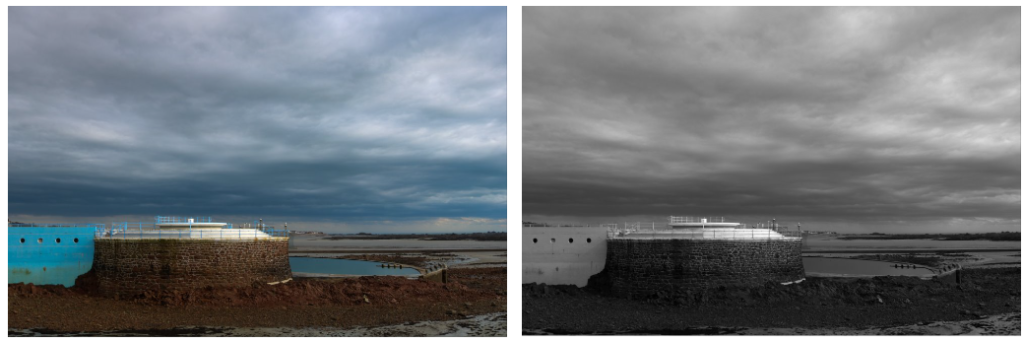
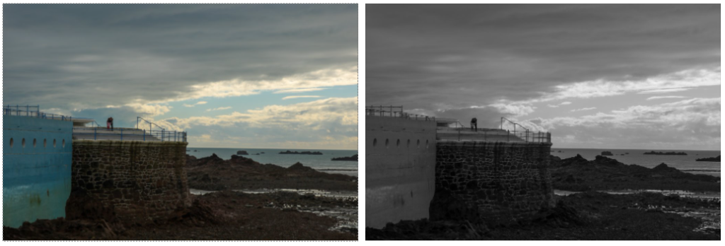
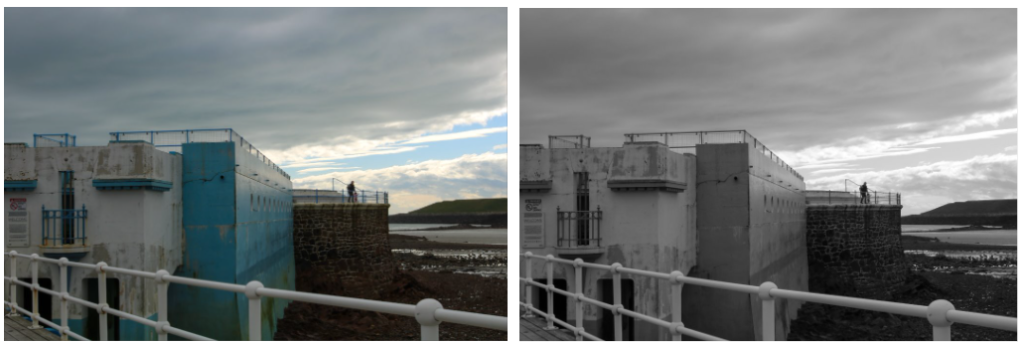

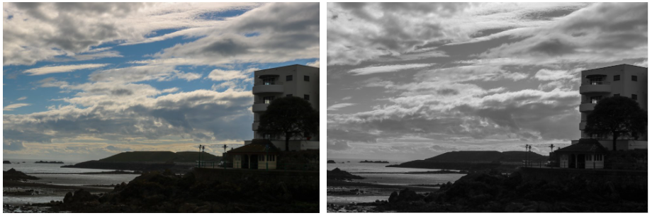

One thing that I would change next time would be to aim on not getting people in my images. from the ones I didn’t show above, I captured a few good photos but there was presence of other people stood in it which brought the photo down and I chose not to use it. however there were a few photos where having people worked, for example the father and daughter stood on the top by the railings. Another weakness of my shoot was the blurriness of some of the images. I think I should’ve took more time to stop and capture images as you can tell I might’ve been in the middle of moving when taking photos which decreases the quality by a large amount.
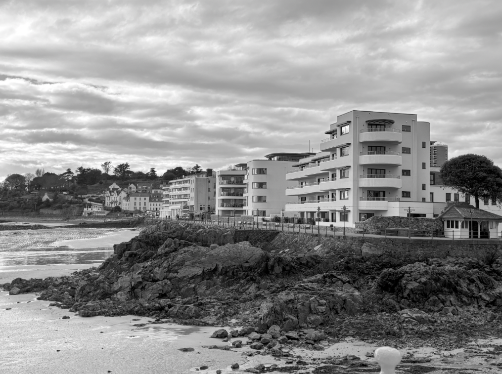
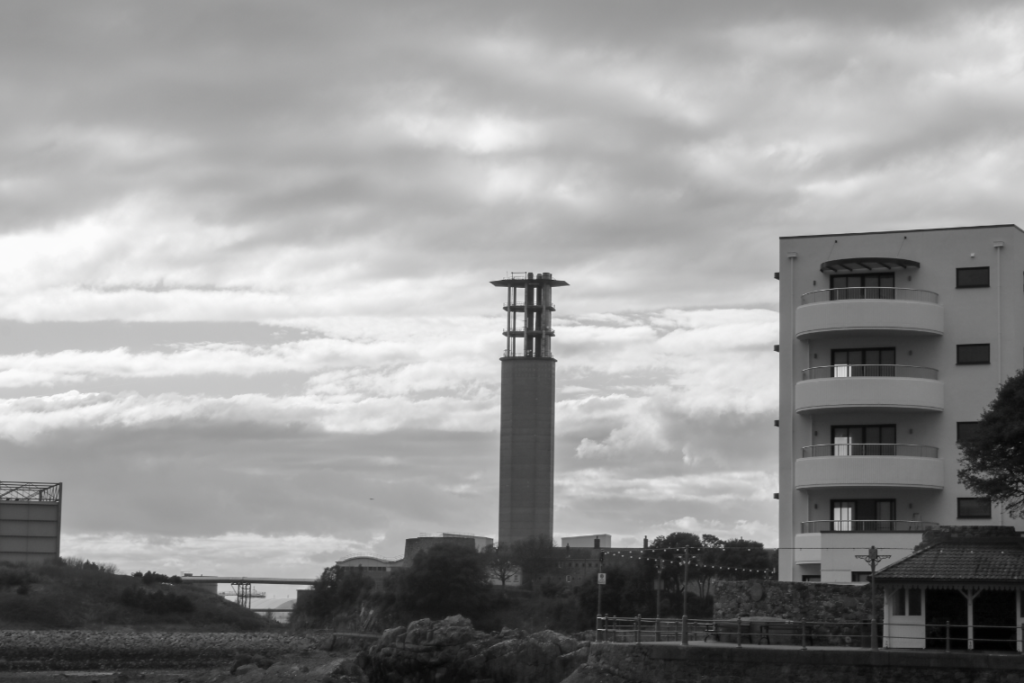
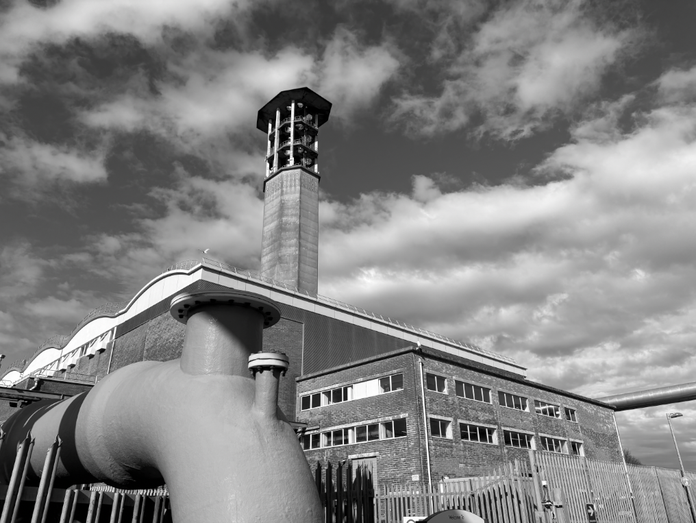
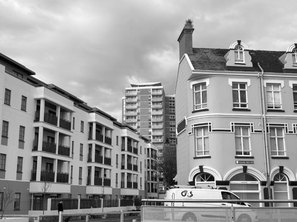
The photo above is one of my favourites, though it can look like simple photo of 3 buildings, it is showing the contrast between all 3 styles. the left building is very obviously the newest building out of the three. The modern structured style with the smooth brick work and use of black white and grey makes this building stand out and noticeable by the viewer. The building in the background is the tallest and furthest away. its presence behind the newer building makes it clear to the viewer that it is older and in not as good of a condition. the building on the right may not be clear if its older than the back building or not however the decorations of the exterior could remind someone of an older home.
