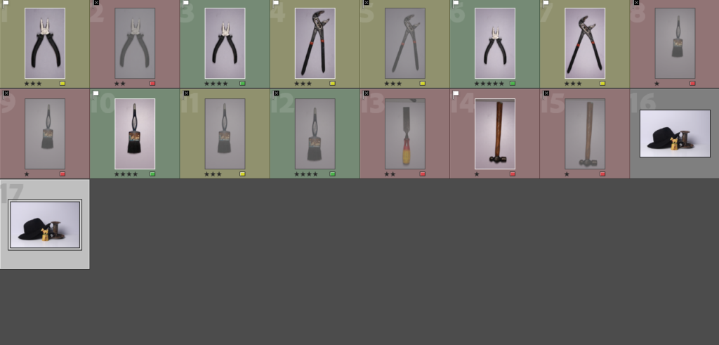
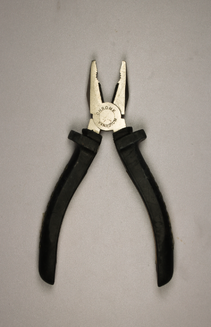
In todays lesson, we moved all of our photographs we took in the studio and imported them from our media drive onto Adobe Lightroom classic. We placed them into colour co-ordination and star rating to make it more organized to see our personal ranking of our photos. A range from green and red with green the best and red the worst.
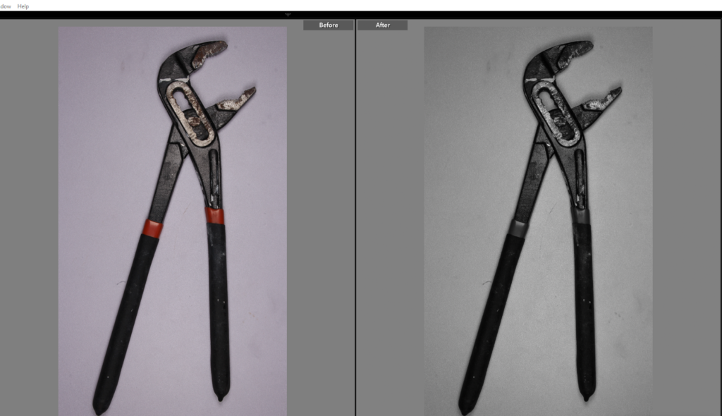
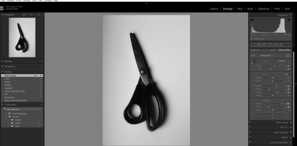
Lastly, I chose this photograph as it was green flagged and 5 star rated as it was my favourite and personal best. After, I edited the photo to make it look even clearer and more similar to Evans ‘ Beauty of the Common Tool’. I did this by changing the white balance to auto the make it more white and clear, I then adjusted the photo with exposure, highlights, and saturates. With the correct adjustment I created more depth of the shadows and clearer, brighter details. This contrasts to Regan’s work as Evan’s work has more depth of shadows and different shades of white, whereas my photo is more similar to Evans.
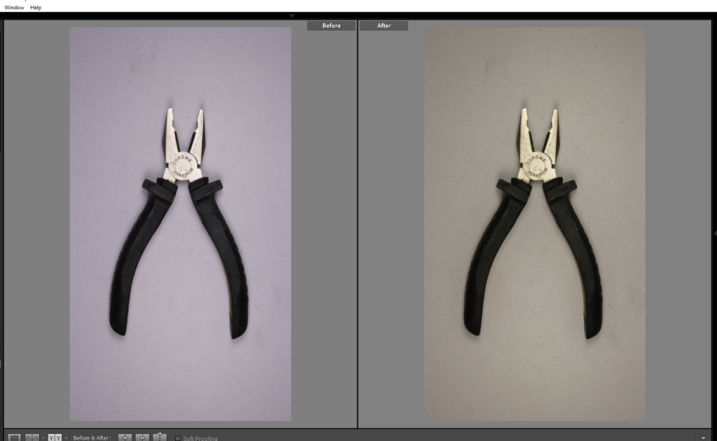
There are formal elements of this photo to make it a formalist photograph such as,
Form- This photograph relating to Evan’s and Regan’s work is 3D which is proven by the dark and clear shadowing. The effect on both of their work is that the object is slightly hovering from the blank sheet or background underneath them throughout the shadowing and highlight of the photo. This signifies the importance of the object. This creates the image to not look flat and dull.
Texture- The surface and purpose of the subject is mechanical and to sort regular problems. The texture is metallic and rubbery but slightly smooth. The objects are also man- made which links to the choices of texture which will work best for these tools to be functional.
Colour- the colour of these photographs is black and white however edited to be so they have similar qualities to Evan’s work.
Size- although photographs can be manipulated to make the object seem bigger or smaller, in these photographs they are the size as they appear to be in the photographs.
Depth- the depth of field shows how much the camera is in focus. Within my photos and Evan and Regan’s in the ‘ Beauty of the common tools’, the objects are close up and in focus behind a blank white background so the photographer is showing the viewer where to look, which may be to value the objects because of their function for the world.
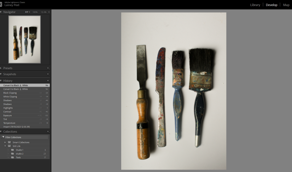
More photographs from editing in lightroom
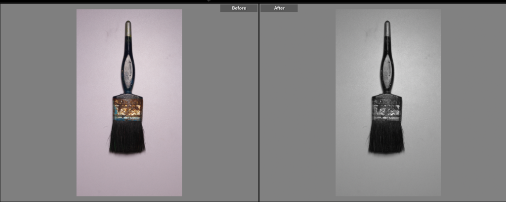
In this photograph, I edited the white balance so the background and the image itself was far clearer and whiter so the image looked more modernized and had a better background. The reasoning for this is because as you take a photo the camera should already have the setting ‘ white balance’ on however if your camera doesn’t capture the photo correctly or you forget to put it on Adobe Lightroom can do it to make the photo look more professional. This stops the photograph from looking off and dull.
After I edited the white balance I edited the images to be in black and white so it has more similarity to Walker’s and Regan’s.
