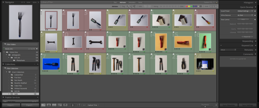
In this picture I rated, coloured and flagged my photos so that I could have an idea of what pictures I liked most and so that I could edit the pictures that I liked without editing the unnecessary pictures.
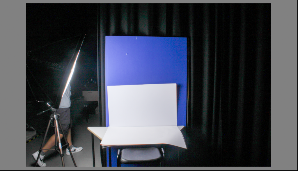
This was my set up. I took my all photos from the top which meant that I had to get on top of a chair and take the photo from there so that I could properly take the photo. I placed the tools in the middle of the white paper and then free handed with my camera and made sure my hands were stable enough and then took the photos when I was satisfied with the position of the tool. I took some in landscape and some in portrait because some objects were larger but some objects looked really good in landscape but better in portrait. my camera had the setting where when I took a picture the light on the left flashed. I didn’t have a continues light shining on my tools.
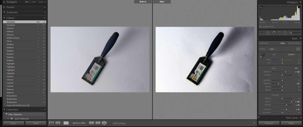
For this photo I wanted to enhance the shadows and colour of the tool. I kept temperature and tint the untouched, increased exposure for the photo to be brighter, clarity to increase the details in the photo, dehaze to increase the contrast in flatter areas and vibrancy to bring more intensity to colours that were ‘muted’. Then I decreased the shadows so that the shadows were more evident. I kept the highlights, contrast, whites, blacks, texture and saturation untouched because it didn’t add much to the picture and was unnecessary. This photo was taken free hand, I was standing on top of chair to give me height so that I could take a picture from the top. The photo was taken with a flash setting so when I took the photo the light on the left flashed.
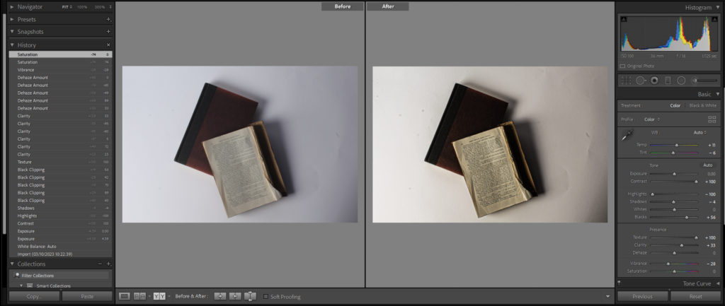
For this photo I wanted to give it more of a homey feel to it so I increased the temperature to make it warmer, decreased the tint so that I could affect the mood and later enhance it increasing other parts of the photo, increased the contrast to give the picture a more lively look, decrease the highlights to recover some of the details that aren’t as apparent, increased the blacks so that I can make a better use of the tonal range of the photo, increased the texture to show more of the details in the books, increased the clarity so that the letters in the book was much clearer and lastly decreased the vibrancy so that some of the brighter tones in the picture were ‘deafened’. I kept exposure, whites shadows, dehaze and saturation untouched because I felt like it didn’t add much to the photo.
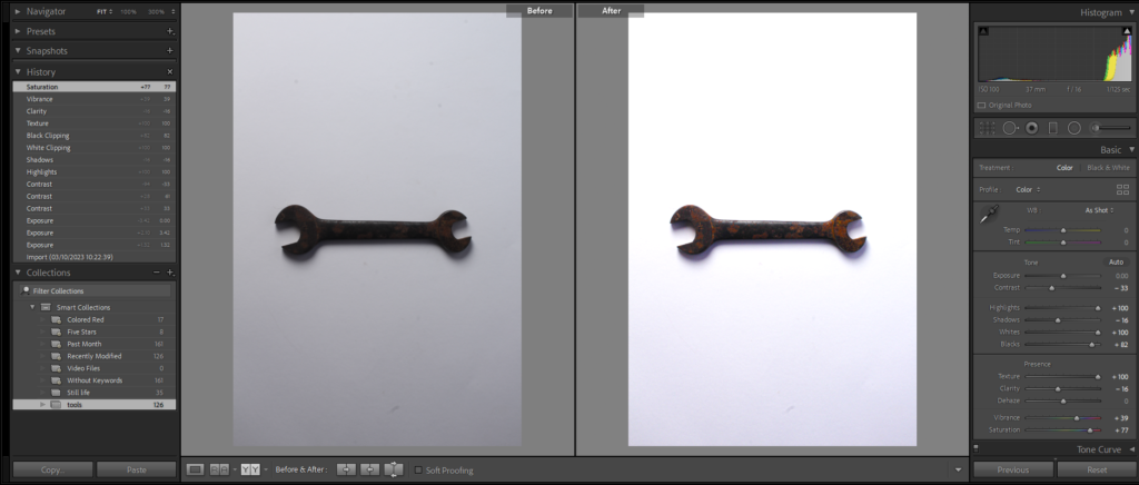
For this picture I wanted to highlight the rust in the wrench so I kept the temperature, tint, exposure and dehaze untouched because it didn’t do anything useful to my photo. To highlight the rust I increased the exposure to make the photo brighter therefore it increased the colour of the rust, decreased the contrast to soften the image, not give it such a rough tone to it, increased the highlights to highlight some of the lightest parts in the photo, decreased the shadows so that it increased light in some of parts of the photo that are quite dark, increased the whites to make the background much lighter, increased the blacks to bring out the darkness of the tool, increased the texture to show the detail of the tools and show the texture of the rust, decreased the clarity to create a more smooth tone in the picture so that is isn’t as ‘rough’, increased the vibrancy to make darker parts of the tool really come out and become present and lastly I increased the saturation so that the rust on the tool would become more visible which was what I was aiming for.
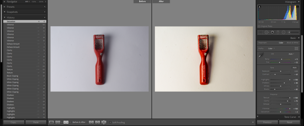
For this photo I wanted to make the red on the tool really pop out and I also wanted to make the photo warmer. I kept exposure, whites, and dehaze untouched because they didn’t do any good to the photo. To give the photo life I increased the temperature and tint to give it a warmer tone, decreased the contrast to make the photo a little muted so its not as harsh which is the opposite to warm, increased the highlights to make areas that are lacking of light become lighter therefore intensify the colour of the tool, increase the shadows so that the shadow the the tool created became more clear, decreased the blacks so that the background isn’t as dark but not too bright either, increased the texture so that the details in the photo are powerfully shown, increased the clarity so that the details in the photo reached their full potential, increased the vibrancy so that the red would really be brought out and finally I decreased the saturation so the photo didn’t have an ‘indie’ look to it.
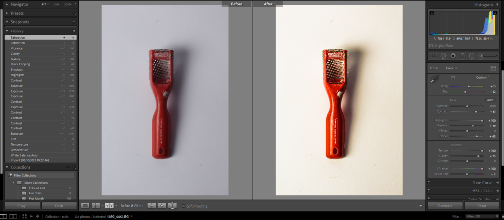
For this photo I wanted to make it the same as the picture before this which was make the red on the tool to really pop out and I also wanted to make the photo warmer. So I I kept exposure, whites, and dehaze untouched because they didn’t do any good to the photo. To give the photo life I increased the temperature and tint to give it a warmer tone, decreased the contrast to make the photo a little muted so its not as harsh which is the opposite to warm, increased the highlights to make areas that are lacking of light become lighter therefore intensify the colour of the tool, increase the shadows so that the shadow the the tool created became more clear, decreased the blacks so that the background isn’t as dark but not too bright either, increased the texture so that the details in the photo are powerfully shown, increased the clarity so that the details in the photo reached their full potential, increased the vibrancy so that the red would really be brought out and finally I decreased the saturation so the photo didn’t have an ‘indie’ look to it.
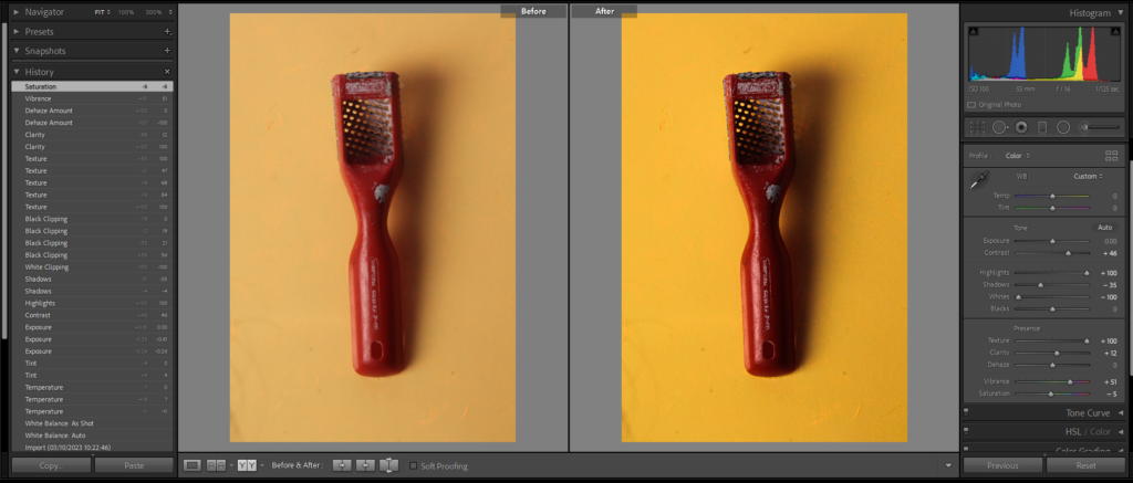
In this photo I wanted to darken the red but give more colour to the background so, I kept the temperature, tint, exposure, blacks, dehaze and saturation untouched as I felt like it didn’t do much to the photo. I increased the contrast to sharpen the image, highlights to give some light to parts of the picture that didn’t have as much light, texture to add more dimension so the photo isn’t as flat, clarity to make the image clearer and increased the vibrancy to give the picture more life and colour. Then I decreased the shadows to lighten darker parts in photos, whites to make the photo cooler and finally decreased the saturation so that the picture to mute colours I didn’t want apparent.
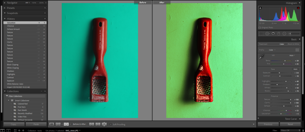
For this picture I wanted to show more texture and bring more colour to the photo so, I increased the temperature to increase balance in the photo, tint to expand the colours in the photo, highlights to make parts in the photo that were bright even brighter, whites to show more of the whites in the picture, blacks to give the red a more deep colour, texture to show all the little details in the photo, clarity to clearly show the details on the tool and background, dehaze to darken the image and add more saturation to the picture and finally increased the vibrance to bring more vibrancy to the colours in the photo. Next I decreased the exposure to make the picture darker, contrast to increase the differences in the photo, shadows to make some of the unneeded shadows go away and finally I decreased the saturation so that the photo didn’t have ‘fake’ look to it.
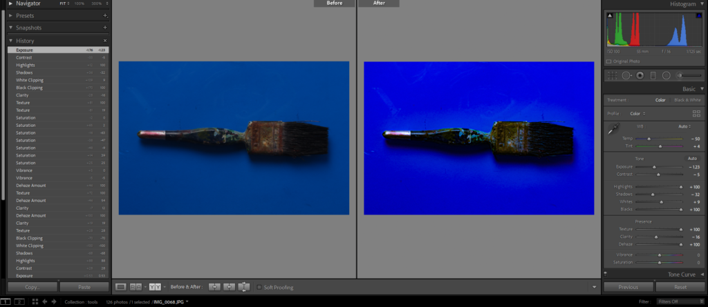
For this photo I wanted to bring out the colour that wasn’t as noticeable in the original photo so I kept the vibrance and saturation untouched because they gave the photo an ‘indie’ look to it. I increased the tint, to give the photo more colour, highlights to bring out more light in bright areas, whites to bring out more of the whites in the photo, blacks to show the unseen colours on the tool, texture to increase the details in the photo and finally increased the dehaze to help with the haze in the photo. Then I decreased the temperature in the photo to create and imbalance in the photo that I can build by decreasing other parts in the picture, decreased contrast to make the photo more vivid, shadows to decrease the unwanted shadows in the photo and finally decreased the clarity so that the details in the photo weren’t too harsh.
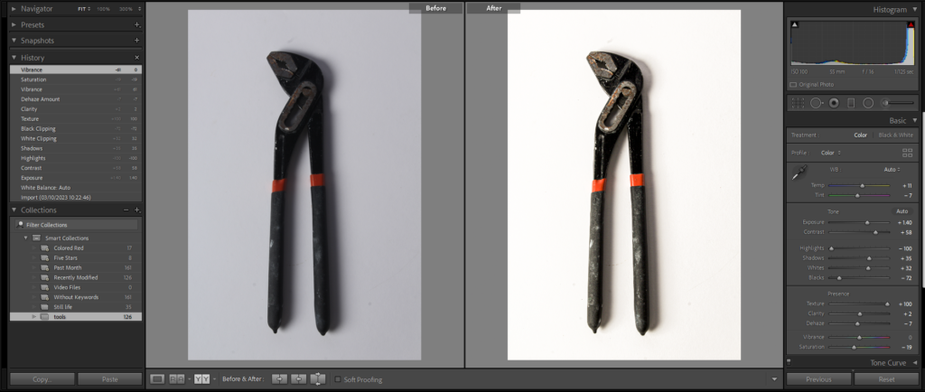
For this photo I wanted to increase the texture and lighting, so I kept the vibrance in the photo untouched so that it didn’t take the details from the photo. I increased the temperature to give it a more warm colour to it, exposure to increase the lighting on the background, contrast to sharpen the photo, shadows to give the tool more shadow, whites to increase the whites in the background and make it brighter, texture to show the Fine details in the photo and finally increased clarity to enhance the details on the photo. After I decreased the tint so that the photo didn’t have uneccesaary tint on it, highlights to recover lost details, blacks to not make the photo darker, dehaze so that the haze in the photo isn’t as evident and finally I decreased the saturation to mute and fade unwanted colours in the photo.
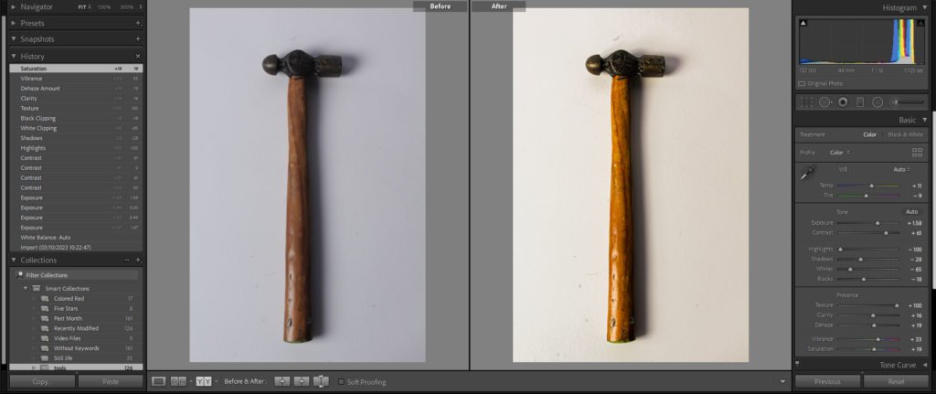
Finally for this photo, I wanted to bring the yellow that wasn’t really show in the original, unedited photo. First of all, I increased the temperature to give the tool a more warm tone to it and to intensify the yellowish brown on the tool, exposure to expose more the colours in photo contrast to sharpen the photo, texture to show the details on the tool, clarity to bring more clarity to the background therefore lifting the colour in the photo, dehaze to darken the image a little, vibrance to bring out the colours in the photo and finally saturation to portray the photo with an ‘alive’ tone to it. Lastly I decreased the tint to improve the contrast in the photo, highlights to so that lost detail in the photo is recovered, shadows to bring out more of the shadows in the photo, whites to give a boost to the white in the background and finally I decreased the blacks so that to make the photo brighter which gave it more life.
