‘A man altered landscape’
New topographic was a term created by William Jenkins in 1975, used to describe the style of American photographers. Including photographers like Robert Williams and Lewis Baltz who all had a similar style of light contrast black and white images of landscapes with new industrial work and areas that were just nature before being built up.
What was it a reaction to?
New topographics was a reaction to the irony of idolising the beautiful landscapes, like in Ansel Adam’s work in comparison to what we see every day and how in fact everything was becoming a lot more industrial and torn away from just nature. It was a contrast to landscape photography as it was known reflecting how quickly the world was urbanising around us without us even noticing.
What is a new topographic?
To be basic it is a photo or a series of photos in black and white of urban areas. However there are smaller details within each shot that is important to the idea of new topographic, each one is in black and white historically as it allows for the simplicity of some of the shots to seem more impressive. Using low contrast often allows the images to feel hollow and empty linking the stunning landscapes being eaten away at by urban industrialisation to the simple photo. Most new topographic will commonly have some sort of nature in the image, whether it be a perfectly cut lawn or unruly mountain range, juxtaposing the rest of the image which has buildings and human involvement of some kind. Unlike Ansel Adam’s work which aimed to inspire and interest people with hints of romanticism, the new topographic movement strays away from being romantic and instead the shots tend to be bleak and foreboding with the future of America’s nature and how it was becoming more and more mundane and built up.
Ansel Adam’s Connection to New Topographics

“I don’t like to think there are ugly streets in America, but when it’s shown to you—without beautification—maybe it tells you how much more we need here.” This was a response to ‘the Installation view, New Topographics: Photographs of a Man-altered Landscape, 1975, George Eastman Museum’ it describes new topographics very well. As the movement pulled away from Ansel Adam’s style of big, beautiful dramatic nature scenes with a style of romanticism people started to realise that even though, America particularly, has some stunning landscapes and breath taking views that in fact that wasn’t the reality of most of the places. It was also a clear difference to Adam’s style of differentiating nature from people where as new topographics pull both nature and human/human construction into one image. “At first it’s stark nothing, but then you look at it, and it’s just about the way things are.” New topographics showed the real America and what was the reality of what many people saw every day in comparison to Adam’s work that helped people escape and almost live in the naivety that we all appreciate nature and it’s strength just because we have seen a couple of stunning photos.
Formatting New Topographics
The photos are often filled frame, common place captures. However it always has an unfamiliar look to it as a camera can capture so much in one photo that would take the human eye and brain a few minutes to register all of the same things and even then not notice things we see everyday at all as we tend to pick up important details, bright colours, loud noises etc, but in a photo we do the same first taking in the bright colours, high contrast or unusual shapes. the difference being we also see so much more as we are only looking at one scene without any other option. This is quite interesting when looking at the style of the photos, being deadpan and removing any things lie horizon lies that would make the photo more impressive than what we would see if we looked past the scene everyday. This is why a lot of the photos use harsh lighting in the middle of the day as that’s what we seen when we walk past a scene.
Typologies


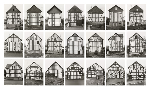
Typologies are a grouping of similar photos in a grid pattern. Often used for documentary, pattern and similar subject photography, it has a distinct look to it and is a great way to display multiple shots at once. Often used in the new topographics style as it can showcase the similar architecture and built up world around us.
Hilla and Bernd Becher

Hilla and Bernd Becher were a husband and wife photography team who made the typology style what it is today. They took photos of industrial architecture but specifically industrial architecture that was disappearing over time, forgotten about. The duo first started working together in 1959 after meeting in 1957 in Kunstakademie Düsseldorf the academy of fine arts in Germany. Bernd always trained in typology and fine art and Hilla a commercial photographer, combining their efforts created the pieces of their work we know now. From travelling around Europe and North America we now have images of the the long forgotten water towers and many other what would have been essential parts of daily life no one else noticed until put in a typology by the Becher’s. This really started the mainstream use of typologies all over the world, continuing to develop over time.
