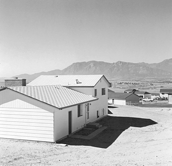
Who were the New Topograhpics?
New Topographics was a term coined by William Jenkins in 1975 to describe a group of American photographers (such as Robert Adams and Lewis Baltz) whose pictures had a similar banal aesthetic, in that they were formal, mostly black and white prints of the urban landscape. The New Topographics were inspired by Albert Renger Patszch and the notion of The New Objectivity.
They were inspired by the man-made, selecting subject matter that was matter-of-fact. Parking lots, suburban housing and warehouses were all depicted with a beautiful stark austerity, almost in the way early photographers documented the natural landscape.

The stark, beautifully printed images of the mundane but oddly fascinating topography was both a reflection of the increasingly suburbanised world around them, and a reaction to the tyranny of idealised landscape photography that elevated the natural and the elemental. They began to take pictures in 1975 in America. This was just after World War II in which people began to come back to America from the war and lots of places were being rebuilt due to the destruction. The New Topographics wanted to highlight and criticise human kind’s desire to expand and to show the interactions between humans and non-humans (nature).

Robert Adams was a key figure in the New Topographics movement. He revolutionised the way in which the American West was depicted on film, highlighting the effects of industrialisation upon what was once a vast, imposing wilderness. Depicting the unwavering presence and beauty of nature in the face of human intervention was a key element of the project for Adams.
“we also need to see the whole geography, natural and man-made, to experience a peace; all land, no matter what has happened to it, has over it a grace, an absolute persistent beauty.” -Robert Adams.
The New Topographics highlights the presence of humanity in natural landscapes whereas Ansel Adams photographed only nature and separated it from human presence. His images intended to provoke feelings of awe and pleasure whereas the Topographics often create a sense of despair in their images through the use of straight on angles and lack of enhanced tonal range. The Topographics didn’t only focus on how their images would look but how it would make the viewer feel too. By foregrounding, rather than erasing human presence, the photographs place people into a stance of responsibility towards the landscape’s future.
Photo Analysis:

Overall, I don’t really like the aesthetics of the image as there’s a lack in tonal range and the straight on angle doesn’t give the image any uniqueness or allow the viewer to see the natural landscape behind it as the house is blocking it. However, I think the use of the straight angle is good for portraying the idea of humans expanding too much and covering these beautiful natural landscapes with their creations. This may cause the viewer to think more deeply about how their constant building of new places is destroying the earths beauty and may even lead to a change in society. The lighting seen in this image is quite monochrome and boring due to it being taken in the middle day not allowing for any soft lighting to be seen in the image. However, their images are more realistic than Ansel Adams because of their use of the normal daylight that people will see if they were to go to these places, not creating a false narrative about these places and creating unrealistic expectations.
