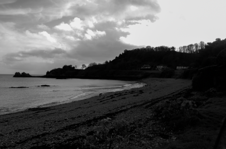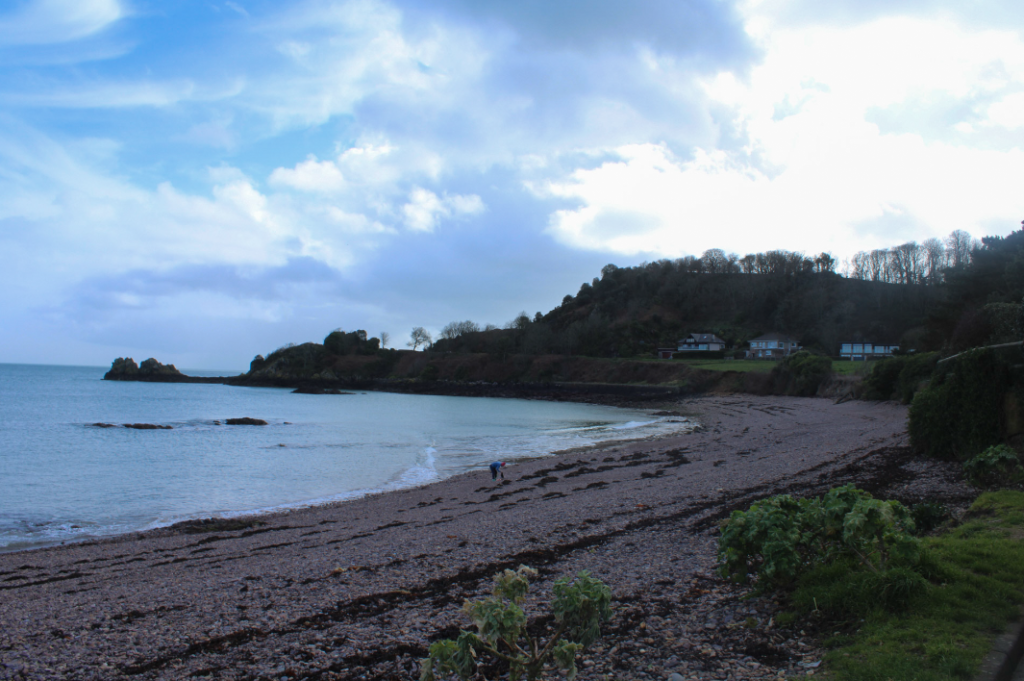
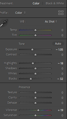
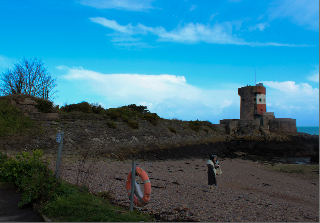
In this first image, I cropped out some of the left side which had very little nature as I think it helped keep the photograph on topic. I then decreased the exposure and increased the vibrancy because I wanted some tones and shades in the sky to be more emphasised. This looks effective because it gives a similar approach to Ansel Adams, who focuses on bringing out detail in his images. Although I kept the whites and blacks neutral as I wanted the photo to have a sense of realism and doesn’t look too different to how I originally saw the landscape with my naked eye.
My final image:

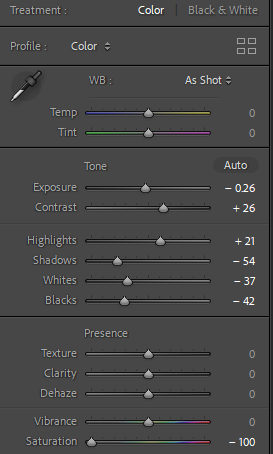
Firstly, I decreased the exposure again because it gave the photograph more life and also I think it looks better with the black and white filter, so overall it doesn’t look too washed out. I then increased the contrast like Adams does with his photos so it adds more depth into the photo, whilst also adding in more detail. I decreased the shadows which also helps to add a contrast between the lighter and darker shades. I like to keep the texture, clarity and dehaze neutral because I think they can add an artificial look to the image, which is not the approach I want to take with my photos.
My final image:
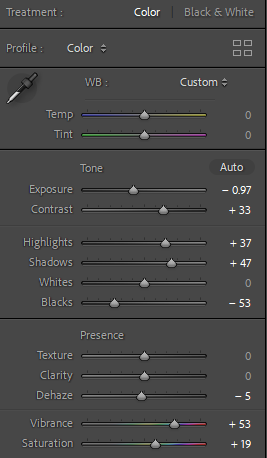
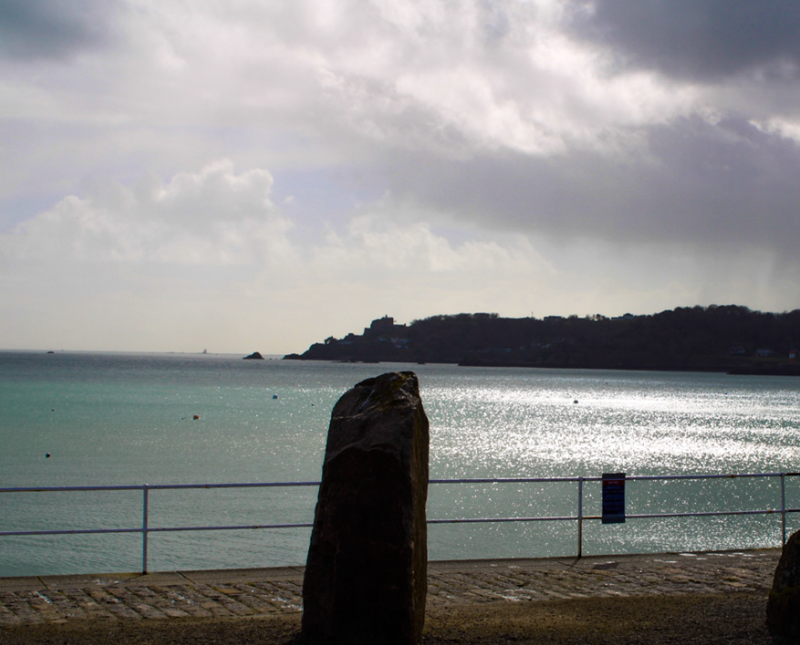
For my third image, by the angle and lighting in which I originally took it, it already had quite dull tones and shades due to the clouds covering the sky. Therefore I did not want this image to be black and white because I thought it would take away more life from the photo. Instead, I decreased exposure and increased contrast in order for the image to have some of its colours emphasised, while also increasing the highlights and shadows. By doing this, certain shades in the clouds were then made darker, which makes the overall photograph look much more interesting and less dull. By using this technique, I was able to create a similar look to some of the sublime and romanticism images we have looked at, as the image has some dull colours, but it contrasts well with the brighter tones. This also allowed the photograph to have more profundity, without looking too artificial.
My final image:

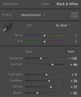
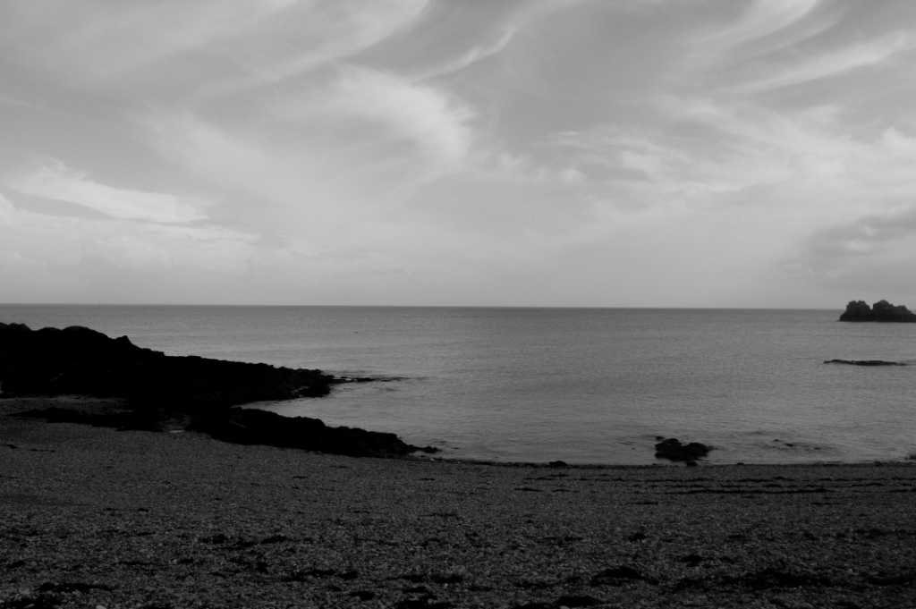
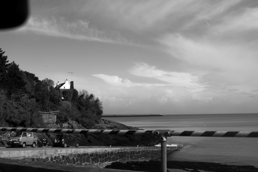
Although this image naturally has a range of colours and tones within it, I wanted to make it black and white as I believe it brings out lots of the details to the sea and sky. By decreasing the exposure I was then able to bring out the contrast in colours between the blue sky and white clouds, and then adding to this by increasing the highlights, shadows and whites. This then prevented the photo from looking monotonous, by also decreasing the blacks to emphasise the sky.
My final image:

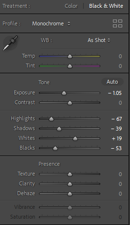

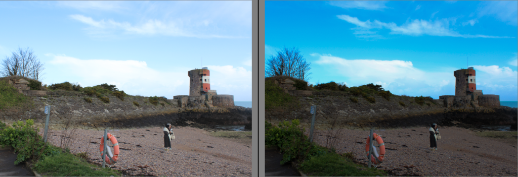
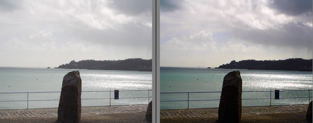
For my final edit, I experimented with whether it looks better in black and white or in colour. This photo has a high exposure which can drain some of the other tones throughout the image, so I think it looks more effective in black and white. By decreasing the exposure it helps add interest as the viewer is able to focus on detail within the photograph and see the range of shades. However I also think this image looks successful in colour because I was able to exaggerate some of the colours in the sky and make them appear brighter. I also increased the contrast because it adds prosperity and depth.
My final images:
