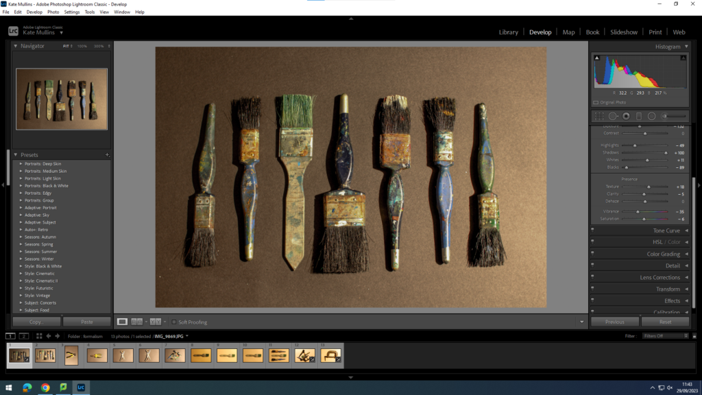
For my Formalism work I wanted to interpret what I saw in Walker Evan’s work where he used tools and almost ‘handy’ objects. I took a variety of photos and moved them to light-room to edit them slightly, just to change how the lighting effected the photo in certain ones.
Here are some examples :
before :
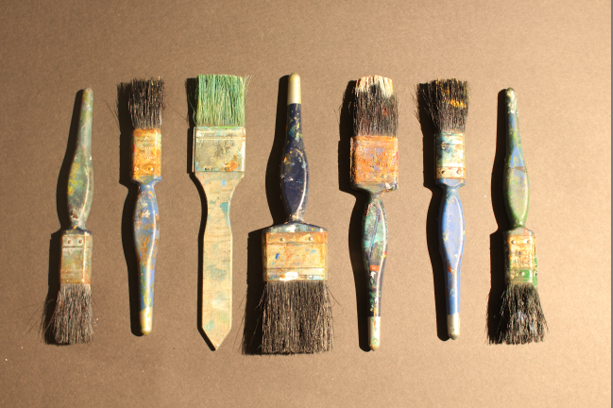
after editing :
before :
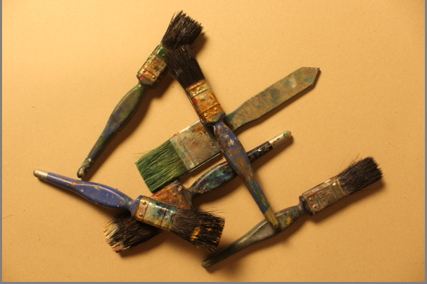
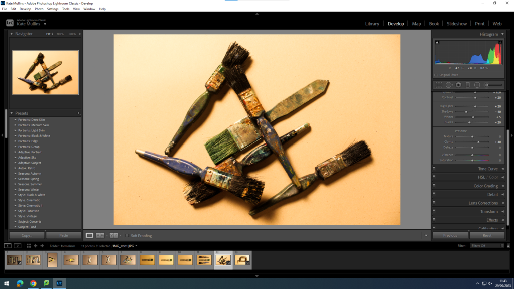
after editing :
before :
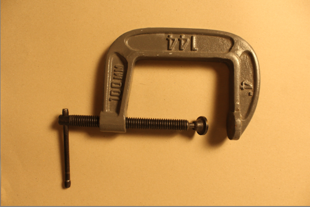
after editing :
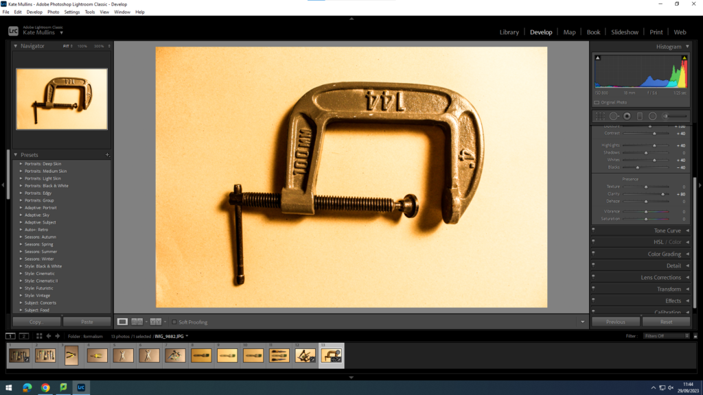
I edited the last two slightly differently adding more saturation to make the photos bright and more contrasting, while on the other one, I lowered the saturation to almost make the photos look more gloomy and dark.
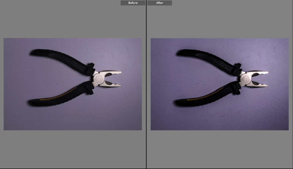
For this photo, the original photo was slightly unclear so while I was editing, I increased the exposure and clarity on the photo to make it more clear while also adding highlights and shadows to give the photo more dimension making the photo looking almost more ‘clean’ and clear.
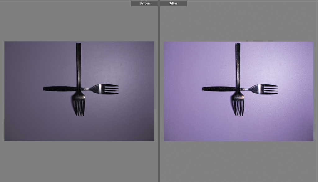
This photo was very dark before editing so I wanted to add better lighting that wasn’t produced in the studio. I also increased the saturation on the picture to give more clarity and to make the background colour ( purple ) more intense.
The use of brightening the photo was to make it more appealing to the viewer and more aesthetically pleasing as well. As you can see the shadows in the corner of the photo show depth and still give the kind of ominous feeling to the photo which I want to include in the photos I take as my own personal touch to them.
Overall :
overall, with help from teachers, I managed to improve the way I edited. At the beginning, I wanted to intentionally make the photos darker and less contrasting but towards the end I manged to keep the almost shadowy darkness but still adding highlights and keeping the picture bright and clear.
