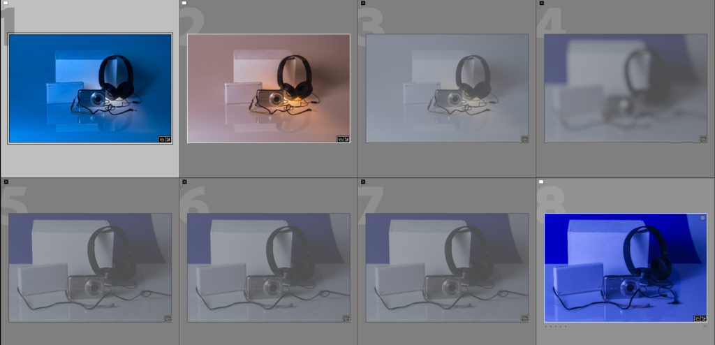
In this image above I have picked out my best three images from my photoshoot and edited them.
Below are the before and afters of my best images from when they were edited in lightroom.
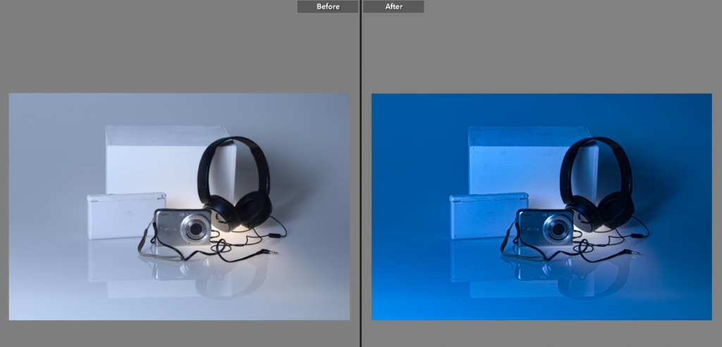
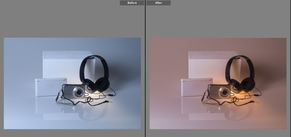
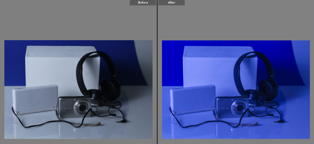
I’ve attempted to experiment with different temperatures to see which one would suit the images best, I preferably like the warmer toned image in the middle instead of the colder toned one as it is much nicer to look at. My worst image is probably the last one because of the blue card background and how it has been positioned.
Best Image
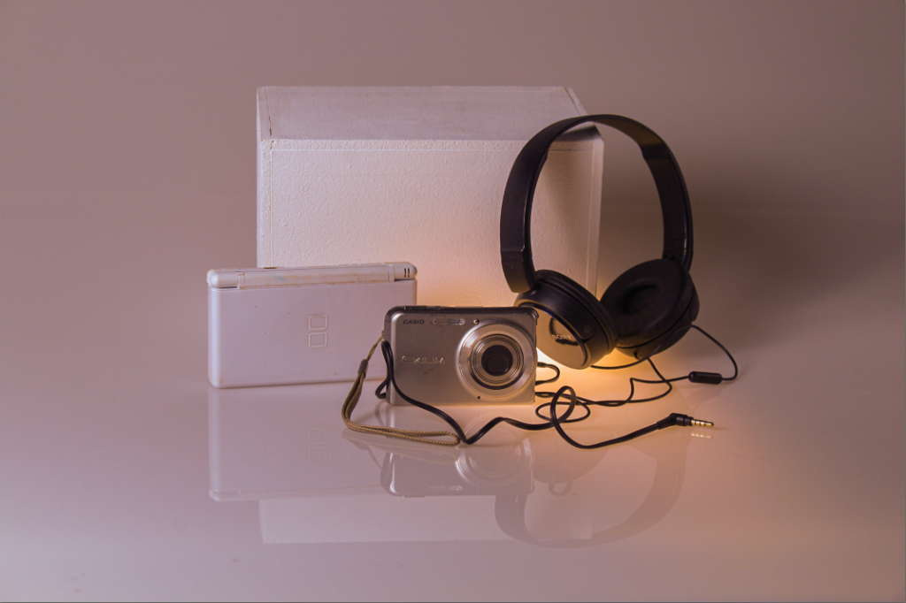
I have used a range of different artificial lights, this includes a tungsten light that was placed under the objects to give a warm glowing affect to the objects.
I thought carefully about the arrangement of my objects so that the image turned out looking interesting. I’ve placed some objects behind and in front of each other to try and create depth, I have also placed a block behind the objects to seclude the objects in that one spot and make them the main focus point.
I have experimented with the different tones in lightroom to add more warmth to the image and give it a more nostalgic, soft feeling, I had also done this to make the image more appealing to the eyes.

Some great still-life images illustrating good understanding of form, shape, colour and light.
Choose your best image and analyse your photo matrix
https://www.photopedagogy.com/photo-literacy.html