Cindy Sherman Inspired Edit
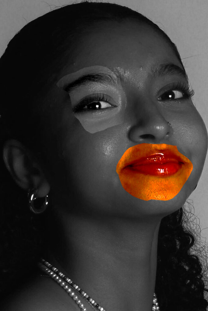
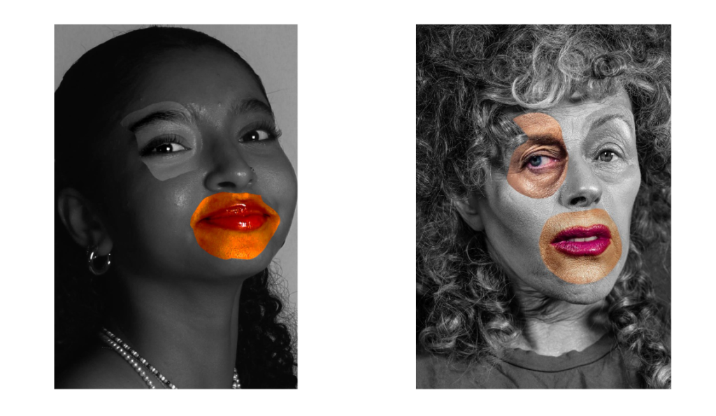
For this image I increased the saturation and added a filter over it in Lightroom. When I was happy how the original image looked I opened the edited version in photoshop, I then duplicated the layer so that I could have one layer in monochrome and one in colour. On the monochrome layer I used the lasso tool to cut out certain sections of the models face. This edit was inspired by Cindy Sherman’s photoshoot where she would distort her face to create a more unique image and question beauty. Overall I think that this photo turned out pretty good and is similar to what I was aiming for, however I think this could have been a better outcome if I had taken more close ups of the model and some with her showing no emotion as Cindy Sherman does. Below is a comparison of my image and Cindy Sherman`s Image.
Edit 2 – masculinity
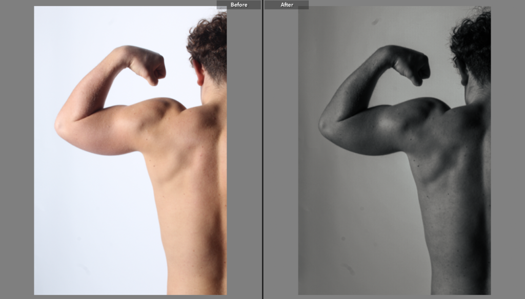
This is a before and after of the four images I used in this second edit.
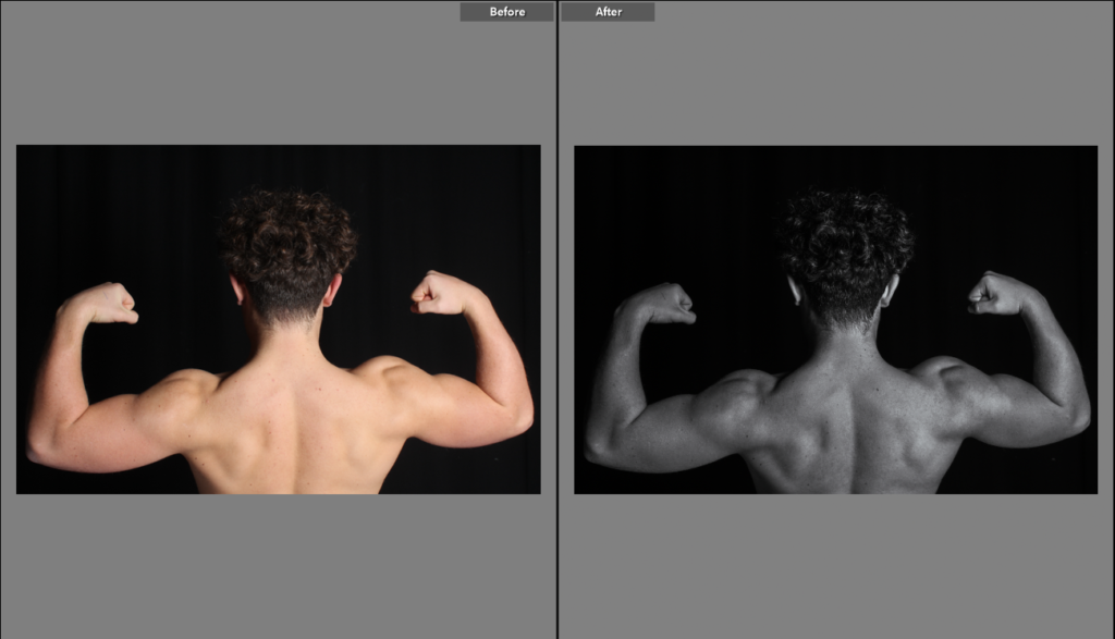
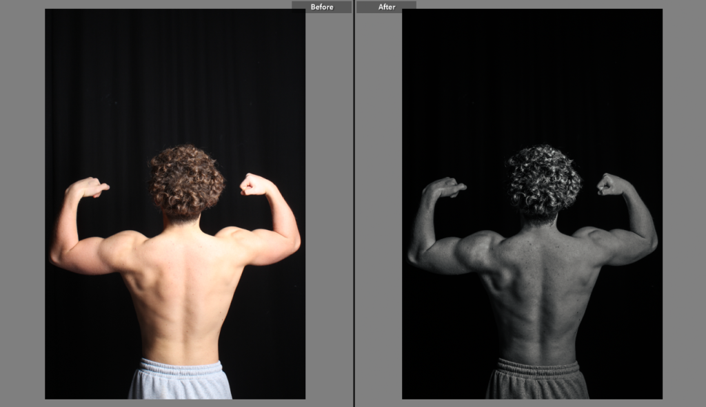
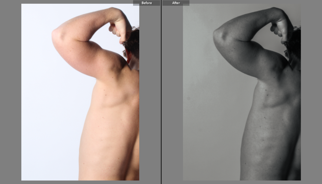
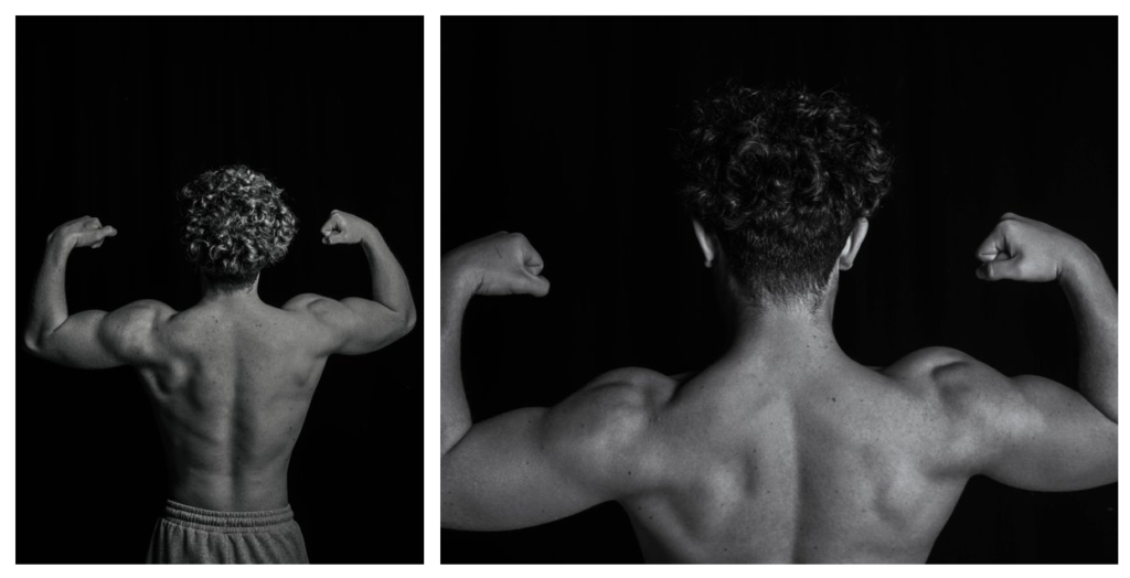
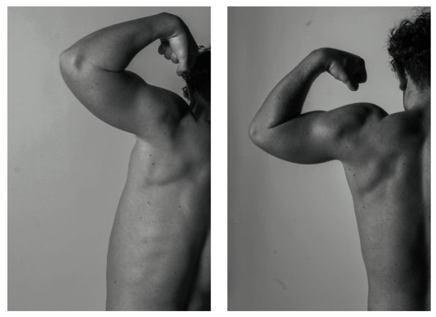
These are the final four images once I had edited them in Lightroom, I put all the images in monochrome to refer back to the artist Sam Contis, Sam Contis also focused on the male body like I did with my photoshoot and his images are in black and white so I took inspiration and did the same. With these final four images I put them into an A3 canvas/document in photoshop in which I created this:
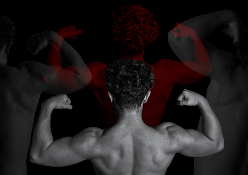
I really like how this edit came out, this edit really portrays the theme of masculinity. I used a technique I have used in the past , multi exposure so for this image I took inspiration of Sam Contis and Muhammed Faread who gave me stylistic inspiration for this image. Here is a few pictures taken by Muhammed Faread which inspired me :
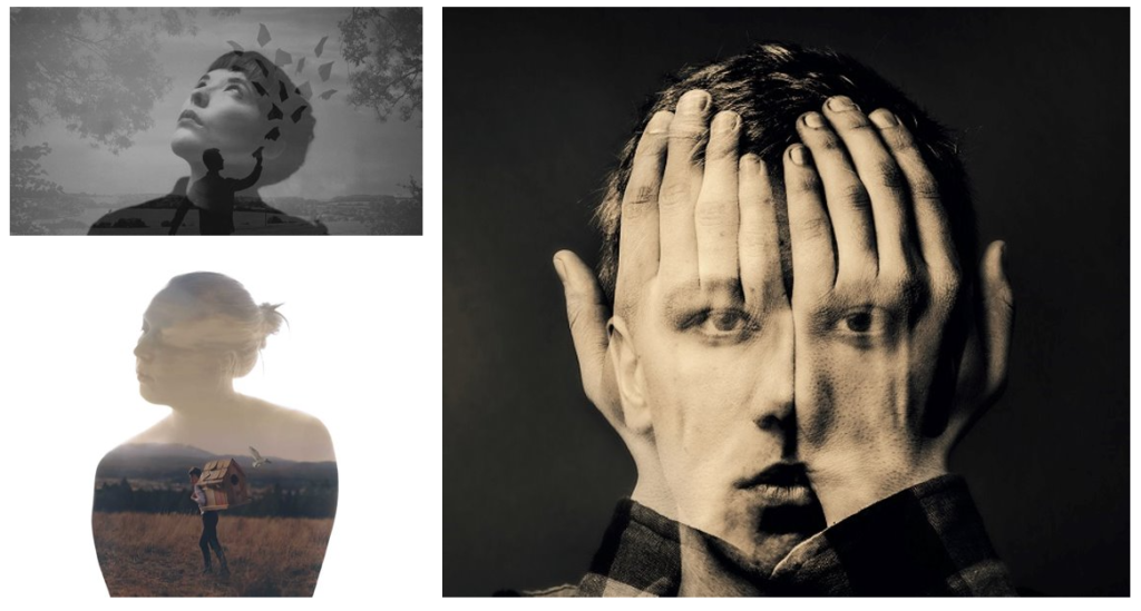
Muhammed Faread is a talented Egyptian photographer who is recognised for his multi exposure/ double exposure work. Muhammed Faread said that he sees double exposure as a form of poetry. I like the concept of Fareed’s images and i really like how they turn out therefore I took style inspiration from him.
Edit 3– femininity
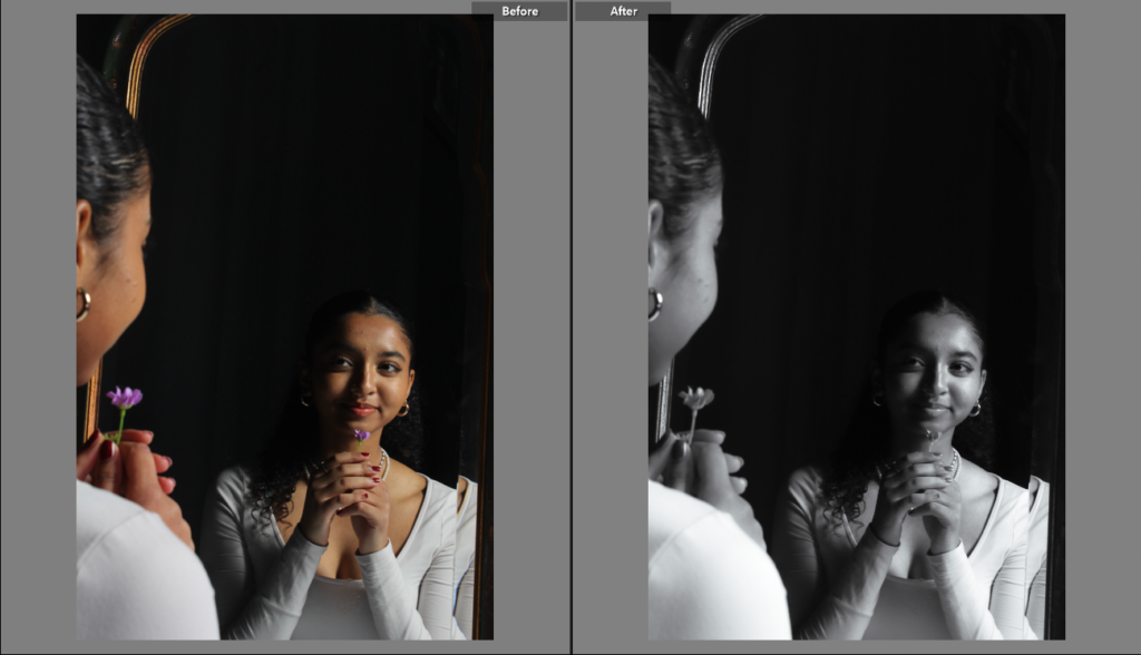
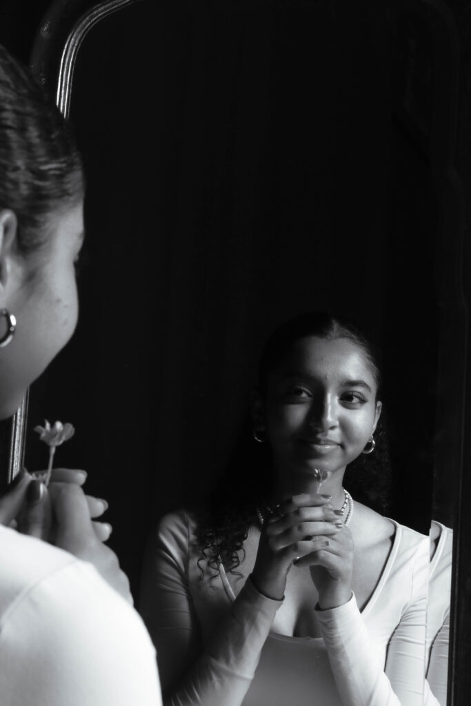
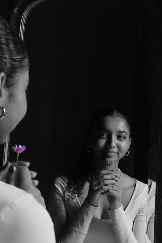
For this edit I used this photo of the model holding a flower in the mirror and I put the image into black and white changing the temp and exposure until I got the right tone I wanted on the image. Then once I had edited it in Lightroom I thought that making the flower in the image the only thing in colour was a great idea as it changes the focal point. So then I put the image into photoshop, duplicated the layer, made it monochrome and then selected the flower to keep the colour.
Edit 4 – femininity
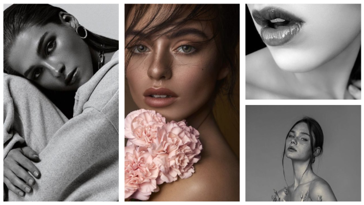
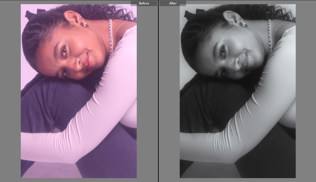
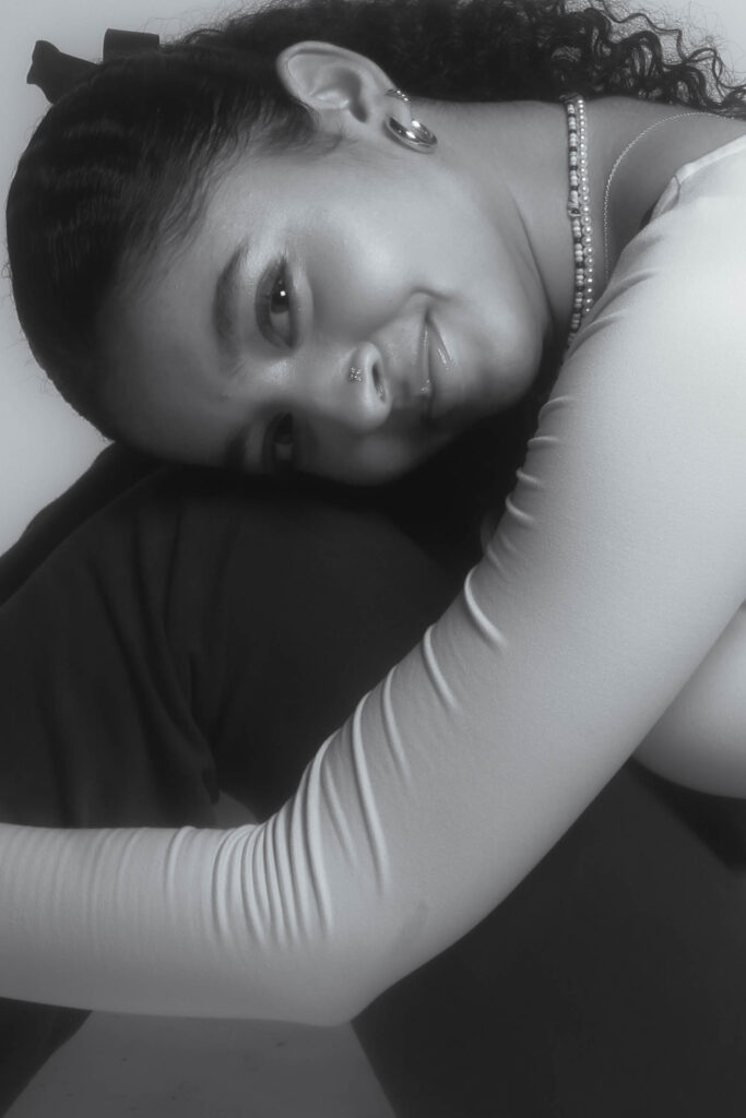
For this image I did a simple edit in Lightroom, I turned the image into black and white and I played around with the exposure, highlights, temp and etc until I was happy with how the photo looked. This photo was inspired by a photo on my femininity mood board which is the image on the left of the mood board.
edit 5 – Femininity
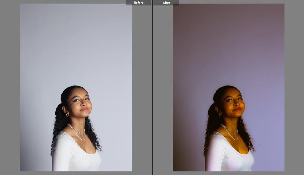
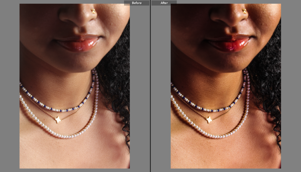
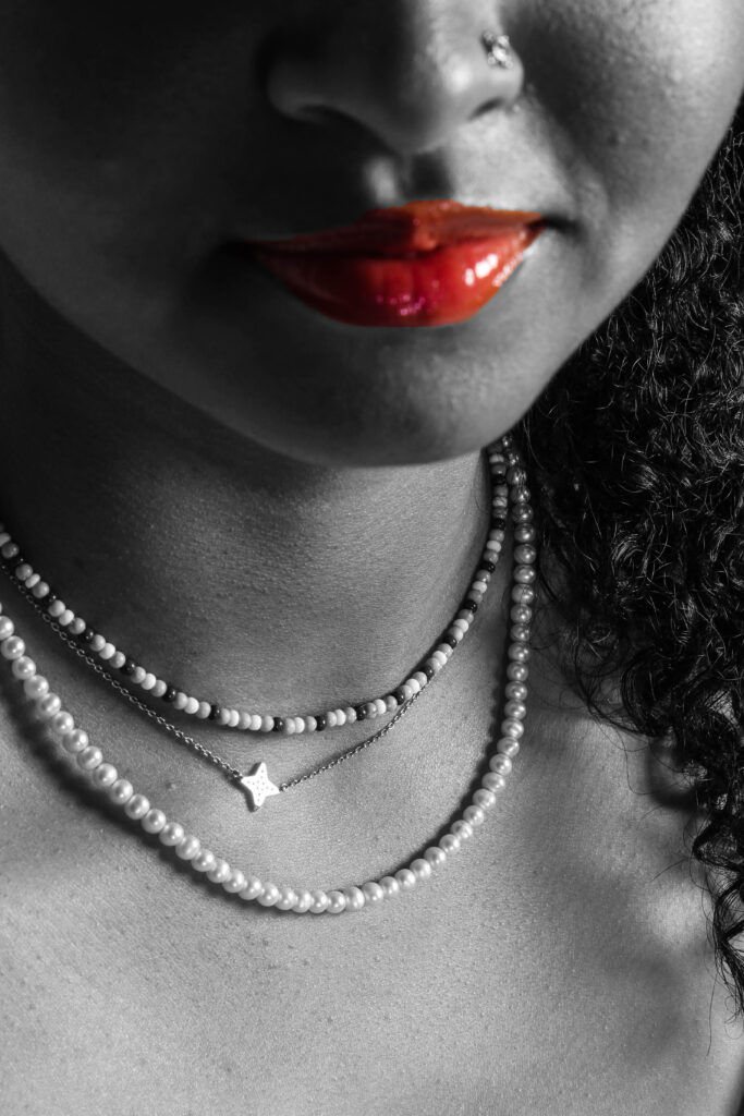
For this edit I put a filter over the natural image and adjusted exposure and shadows on Lightroom, Once that was done and I was happy with the overall photo I then opened the photo in photoshop ,duplicated the layer, made the new layer monochrome and selected her lips as it is associated with femininity and removed it so that the lips would be in their normal colour.
edit 6 – Masculinity
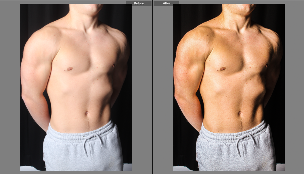
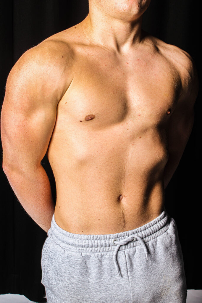
For this edit I thought that this image was too overexposed and that the body was too white so in Lightroom I played around with the exposure and added filters to it until his body was clearer.
