Before the controlled conditions I want to make sure that I have tested editing techniques and worked out what exactly I want to do.
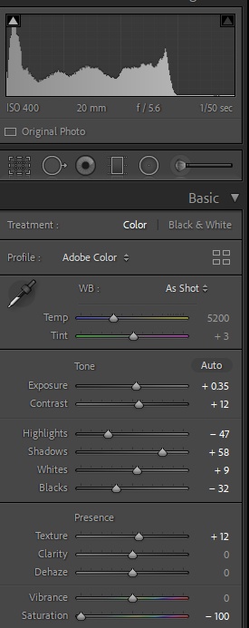
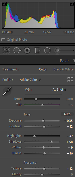
I started by adjusting the settings in Lightroom to create a better balanced well rounded image. This included adding texture and reducing the highlights before reducing the saturation to make the image black and white.
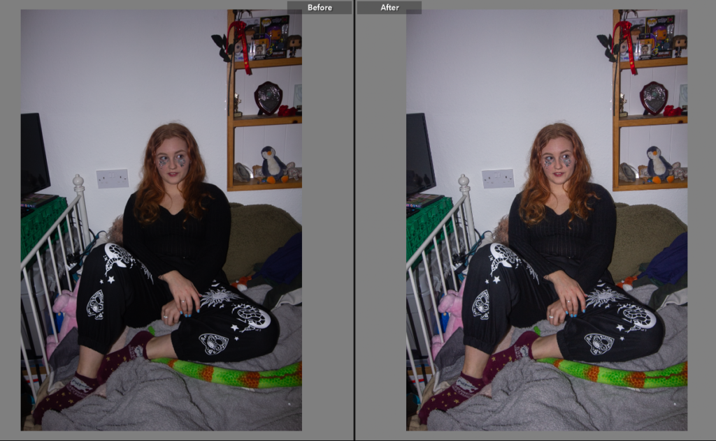
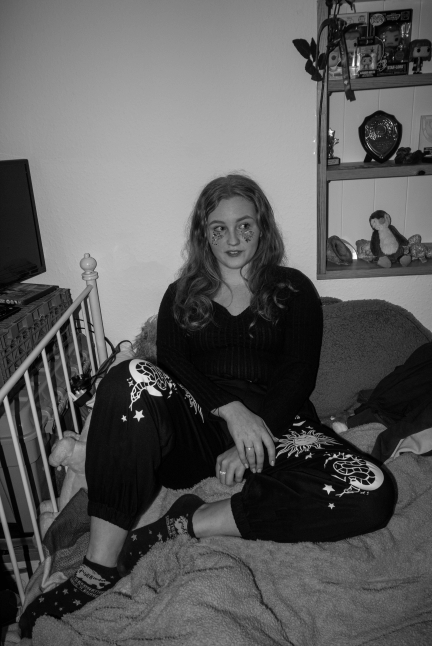
By then taking the image onto photoshop I could manipulate the busyness of the plug socket and the teddies tail that I felt didn’t add to the image and ended up making it seem messy and unfinished.
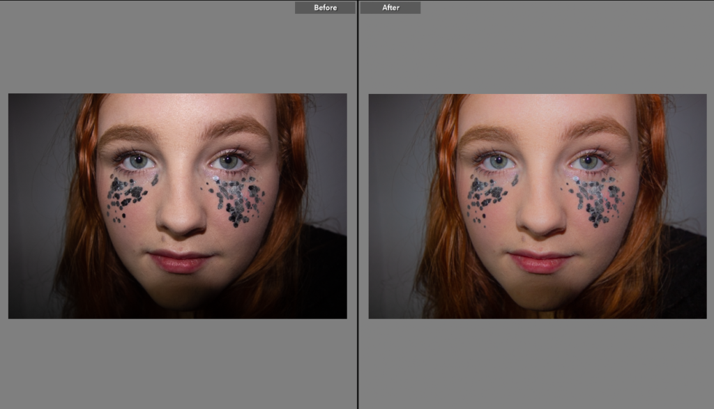
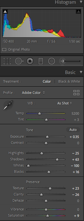
For the next shot I wanted to try and use some of the close up detail photos. These were inspired by Kayla Varley’s work with unusual angles and bold makeup, I have edited them by turning parts black and white and bright colours have been left in colour.
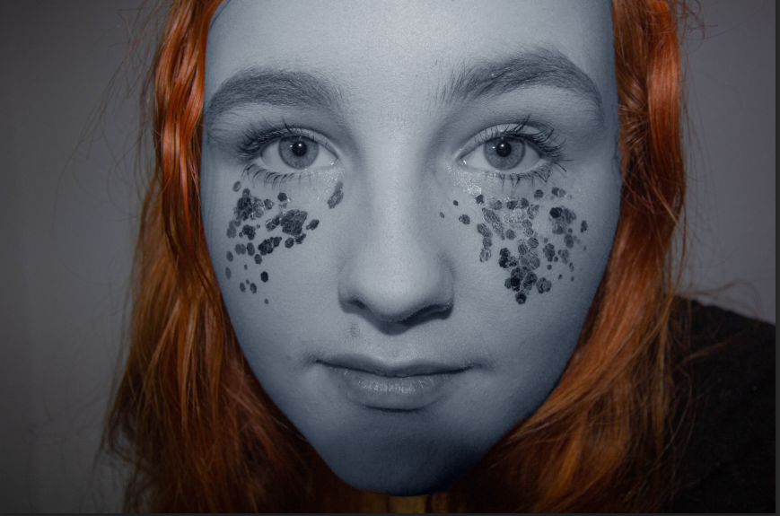
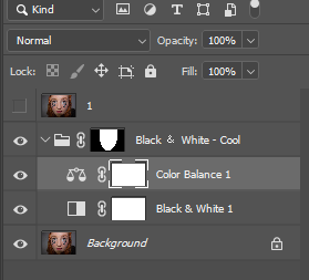
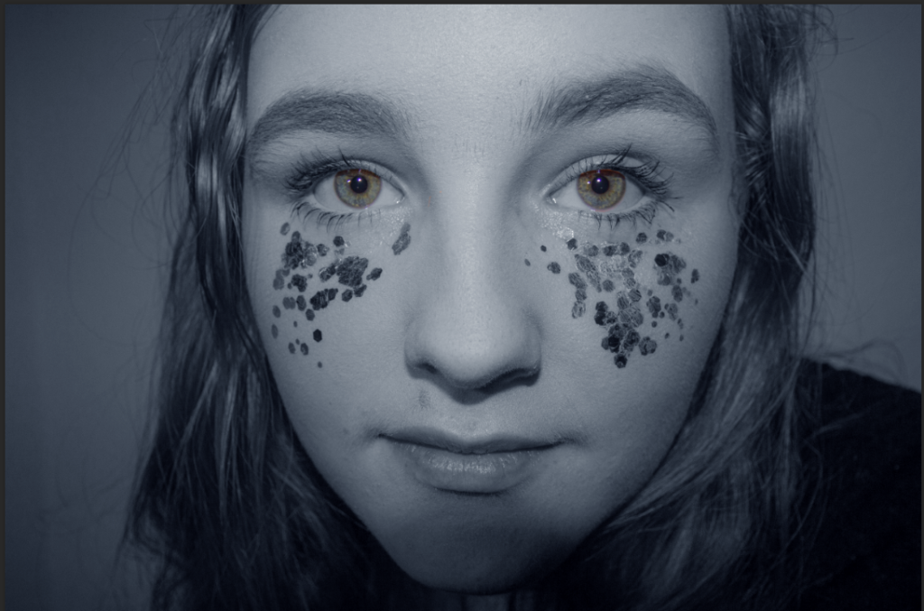
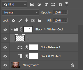
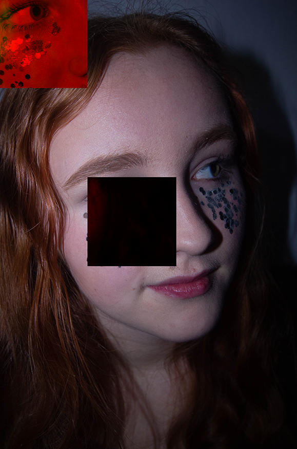
For my final test I tried a style heavily inspired by Cindy Sherman’s editing work and Varley’s photography style. I did this as I didn’t love my previous edits as I don’t think they show the theme well. So to do this I made sure I had a high quality image and then put it on photoshop to allow me to use the lasso tool to cut parts of the image out and move them. By then using -image-adjustments-colouring on the moved layer it allowed me to change the colour of the ,moved square to make it more noticeable. I love the outcome of this photo and it blends my inspiration together very well taking Varley’s photography style, Sherman’s editing style and Altman’s model presentation. I also think this shows the message I was trying to get across with the theme of femininity and masculinity, as I was heavily inspired by the absurdism idea and showing typical female stereotypes of beauty and being uncomfortable in who you are or simply not knowing who you are which is are all common things as a teenage girl.
