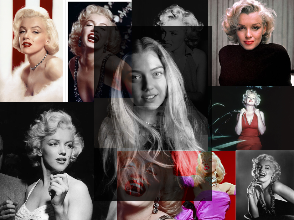
Overall, this final outcome is my favourite because I included prominent hints of my inspiration for my own image, which shows the viewer where I got some ideas from. I like how the background is all different photos of Monroe, yet I added my own image on top, to ensure it is the subject of the overall outcome. I chose to do the collage of different phots of Marilyn Monroe because I think it adds a unique effect and gives the overall outcome some life. I also like how I added coloured photos of Monroe in the background, not just black and white. This added a more appealing look. To achieve this, I adjusted the opacity of my own layer on top, which allowed the entire outcome to blend more, and have a seamless look. I like how I managed to combine my own image with my inspirations to show the similarities and differences between them, but they blend well and compliment each other due to the similar approach we did.
However, I do think I could have changed some things within this outcome. One of the main problems I faced was time management, in which I had to rush my editing process. I don’t like how prominent my image is on top of the background ones. I think it would look more successful if I had blended out the edges of my image into the background, so it creates more of a fade. I also think it could’ve looked better if I kept my own photo in colour, rather than in black and white. I think this approach would’ve made my outcome look more unique.

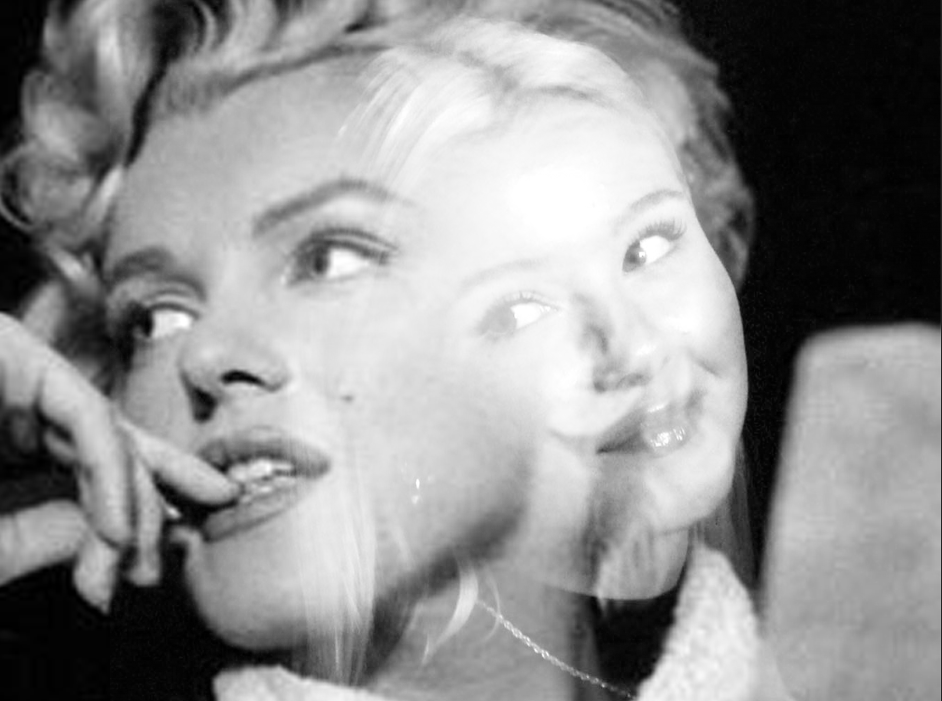
Within this outcome, I personally believe the editing on Lightroom went smoothly. The use of overlapping the two similar images of me and Marilyn Monroe portrays my aims and objectives to achieve. I like the lighting of my image as it is bright and luminous, which ultimately gives the4 image a happy mood. I chose to execute this technique as it shows how Marilyn was illustrated to the world as “perfect” with no flaws, which is a big part of femininity. However this contrasts with the cold tones in the image, as I made it black and white, which is similar to Claude Cahun’s photos. I overlapped these two photos smoothly so the outcome didn’t look too harsh. I did this because I think it looks more gentle, which is essentially what women are stereotyped to be. I like how the viewer can still see my entire image and also Marilyn. In addition to this, I used this photo of Marilyn because I knew it would compliment my image because of the gaze we are both doing, this is a common thing that girls do because we are stereotyped as “self conscious”.

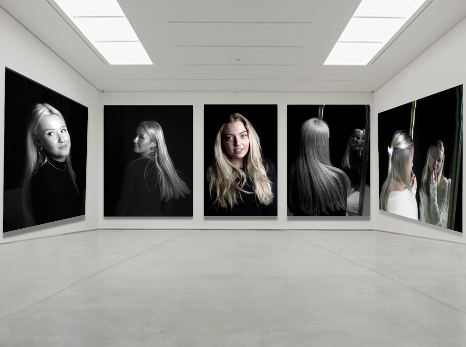
I chose to do a virtual gallery as a final outcome, because it portrays all my best images into one. I put my most successful image in the middle, so it draws the viewers attention straight away. I think this adds to the outcome because there are many resemblances to Monroe and our inspiration photos of her. It looks good because my model is doing the “female gaze”, which is very fitting for the topic of masculinity and femininity, and is also something Monroe does in a lot of her photos. Also, I like the middle image because it has different tones to the others; the other images are completely black and white, whereas the middle one has hints of colour which is intriguing and creates a contrast. I ensured the background was black in all my images so it gives a classy effect, while also allowing the black and white to stand out more and add a mysterious effect. I like how all of my images have a clear main subject, which is mainly the hair, as again it ties in with the femininity aspect perfectly.
