I chose to take photos in response to Cole Ndelu’s project ‘a study on femininity’. To respond to this I will take my photos in a home environment using a white curtain for the background as Ndelu also uses plain simple backgrounds in her photos. I chose to take photos of my family members holding things such as flowers and leaves in a similar way to Ndelu.
Photoshoot 1:
In this first photoshoot I took 43 photos using a mix of fake a real flowers as a prop. I chose to use similar poses to the ones used in Ndelu’s collection of photos.
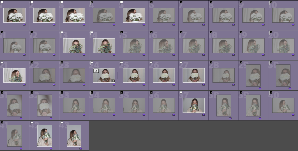
I went through my photos and flagged them with either a white flag, meaning the photo was good, or a black flag, meaning the photo wasn’t.
Best photos:
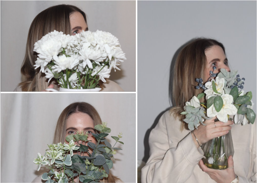
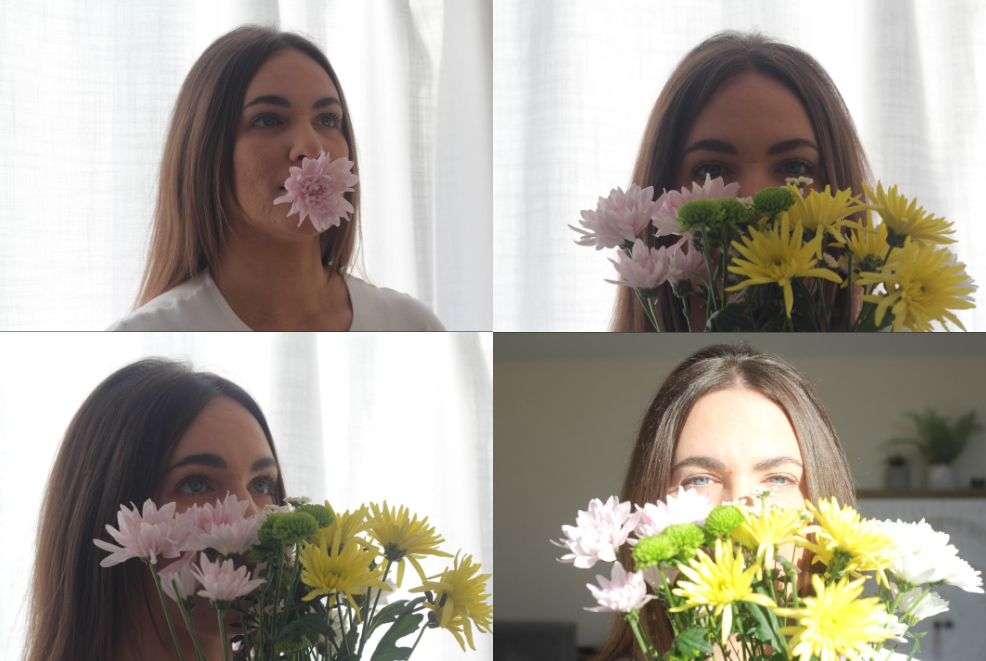
These are my best photos as they are clear and most similar the Ndelu’s work.
Editing photos:
First edit:
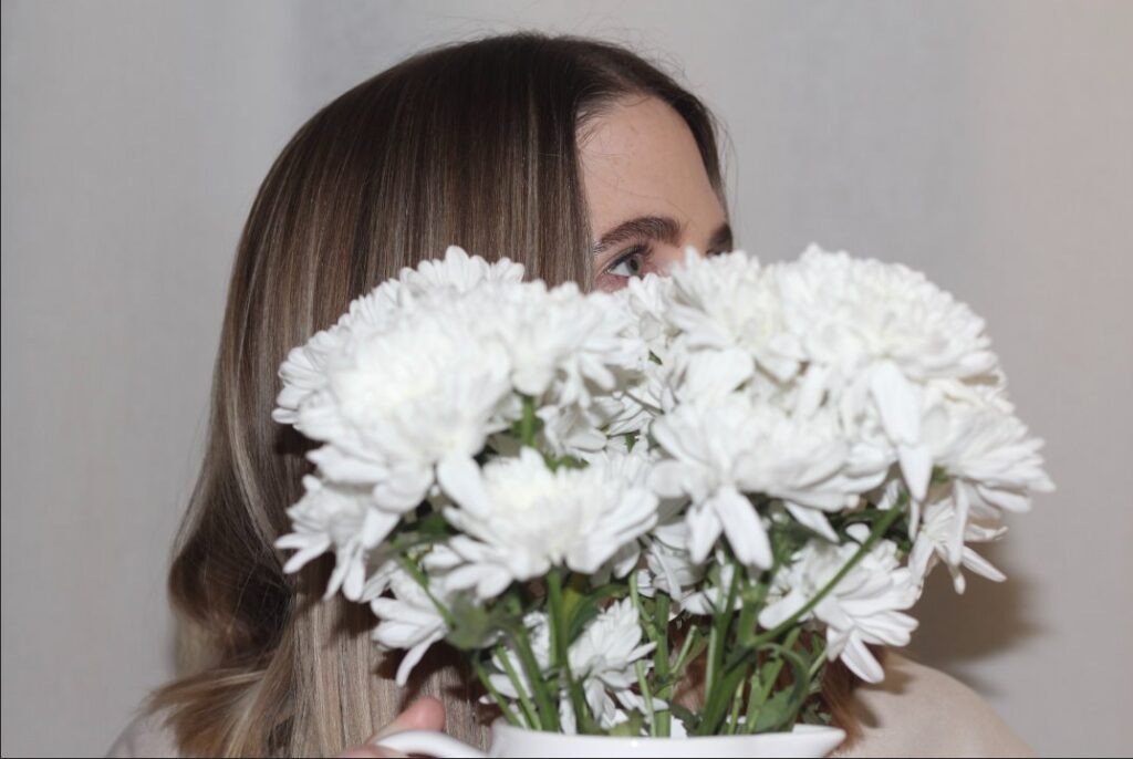
Original photo before editing:
I found that the photo before editing was slightly too dull and I didn’t like the stray hairs as they showed up clearly against the white background and made the photo look less sharp. In this shoot artificial lighting was used.
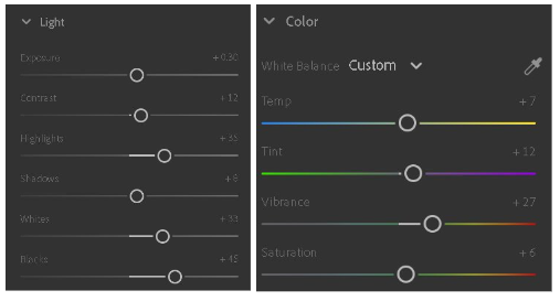
To edit this photo I began by adjusting the exposure as I found the light was quite dull. I also increased some of the other lighting settings. Next I adjusted the colour settings as i wanted a more saturated warm photo similar to the photographers photos.
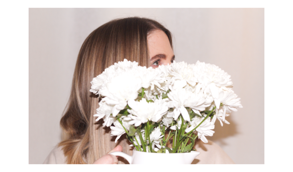
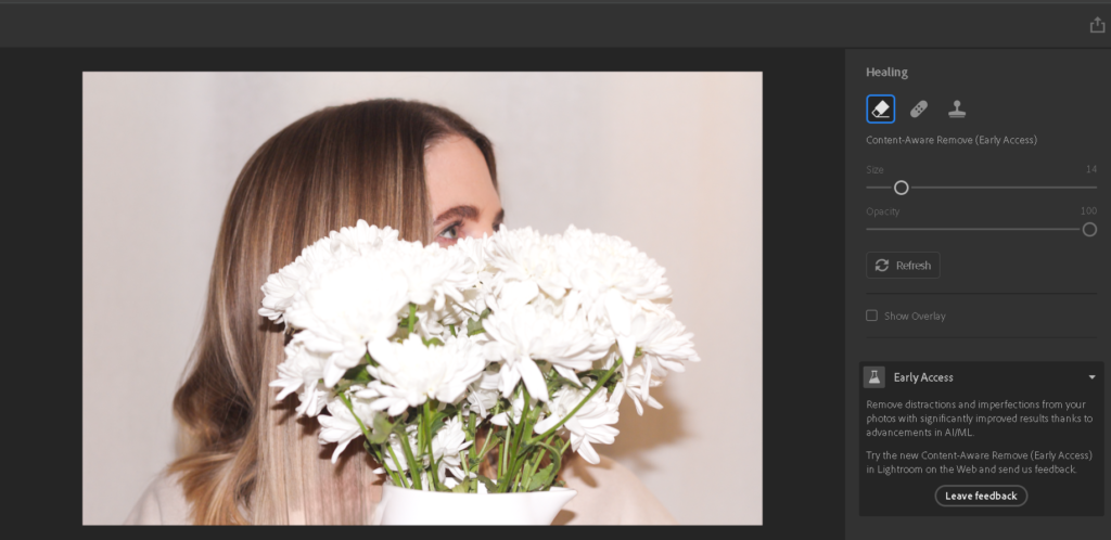
To improve the photo I removed some of the stray hairs from the top of the head as well as the hand using the healing tool in adobe Lightroom. This made the photo look sharper and cleaner.
Final outcome:
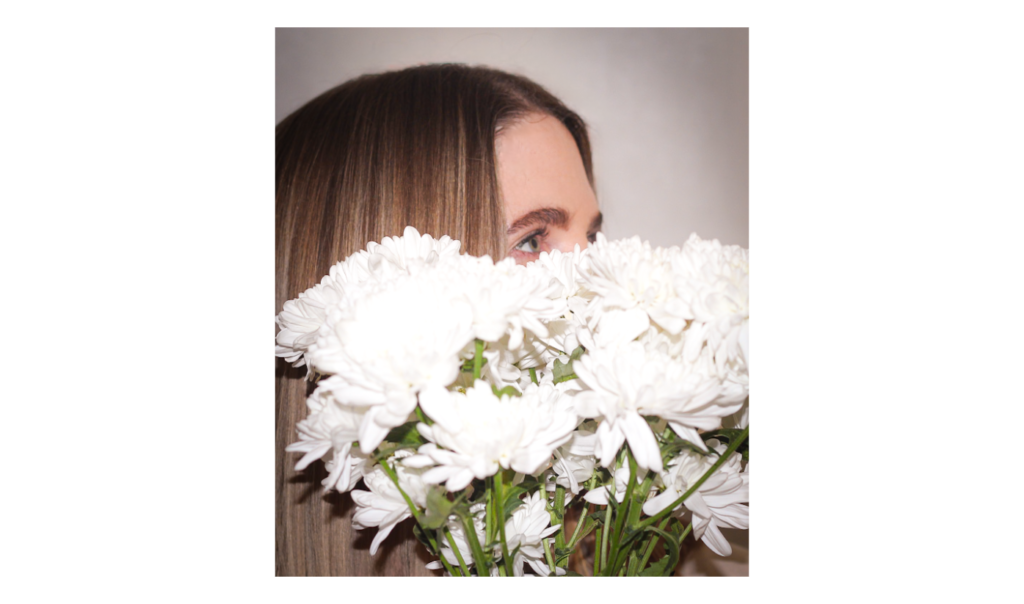
For my final edit I decided to use the vignette tool in order to draw the views eyes towards the centre of the photo where the models eye is. I also cropped the photo to remove the extra space around the model and the flowers. The flowers add a feminine aspect to the photo as they are widely associated with women due to their beauty. The flowers also add in an aspect of nature to the photo which is also associated with women and the stereotypical idea that they are meant to have a nurturing personality. The photo has more of a warm tone in comparison to the original version of it.
Edit 2
Original photo before editing:
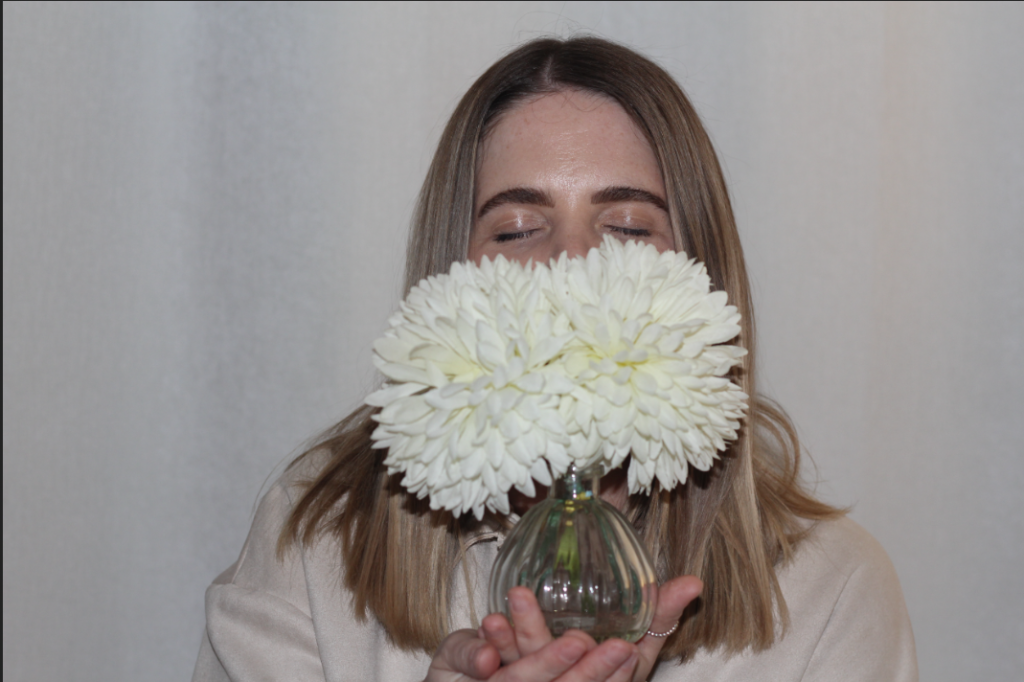
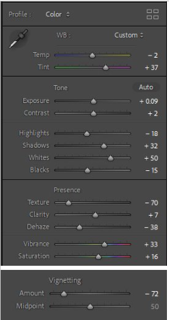
I decided to experiment with this edit by adding a pink tint to it. I used the auto generated tone settings to see whether or not they improved the photo and they did. I also decreased the texture as I wanted this photo to have a smooth look. I added a light vignette to the photo so that the focus is brought to the centre of the photo where the flowers and model are.
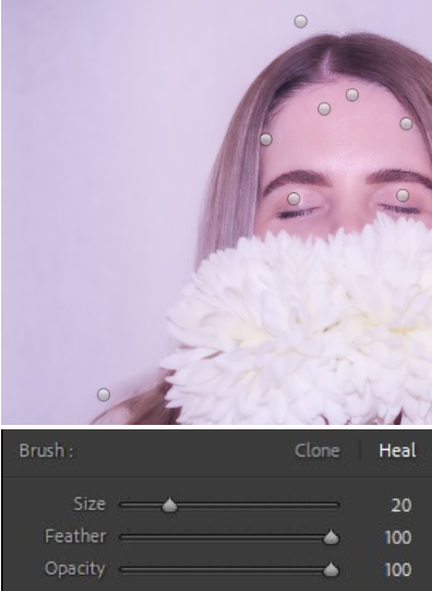
To remove strands of hair and the creases in the eye I used the spot removal tool. This makes the photo look much neater than the original one.
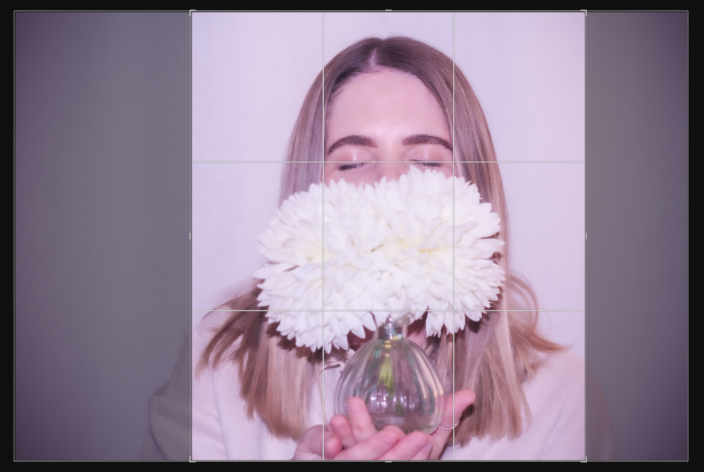
Finally, I cropped the photo to get rid of the extra unneeded space from both sides of the photo.
Final outcome:
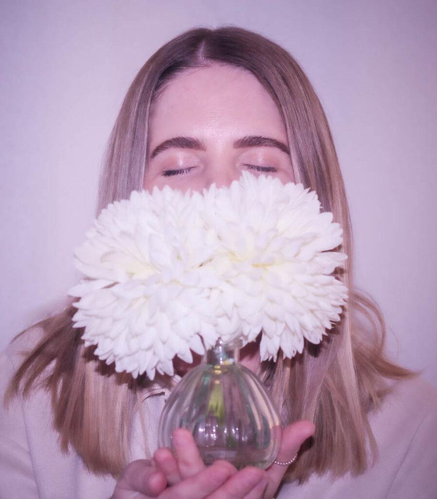
In this photo the model is holding a glass jar of white flowers, whilst editing I chose to leave the models hands in the photo as I think it gives a nurturing look to the photo which is a stereotypical aspect of a woman. I created a soft look to the photo by reducing the texture, I did this to enhance the nurturing sense of the photo as it makes the model look gentle and kind, which are stereotypical traits of women, rather than adding a sharp texture which wouldn’t give the same look. The pink tone to the photo shows colour stereotypes, women are associated with the colour pink whereas men as associated with blue. The composition of this photo has the model and the flowers in the centre causing them to be the only focus of the photo, there is also little background space which makes sure the viewers attention isn’t taken away from the main focus.
Photoshoot 2
In this shoot I used a different model in a different environment, I also used different flowers. I experimented with different poses in a similar way to Cole Ndelu. In this shoot natural lighting was used.
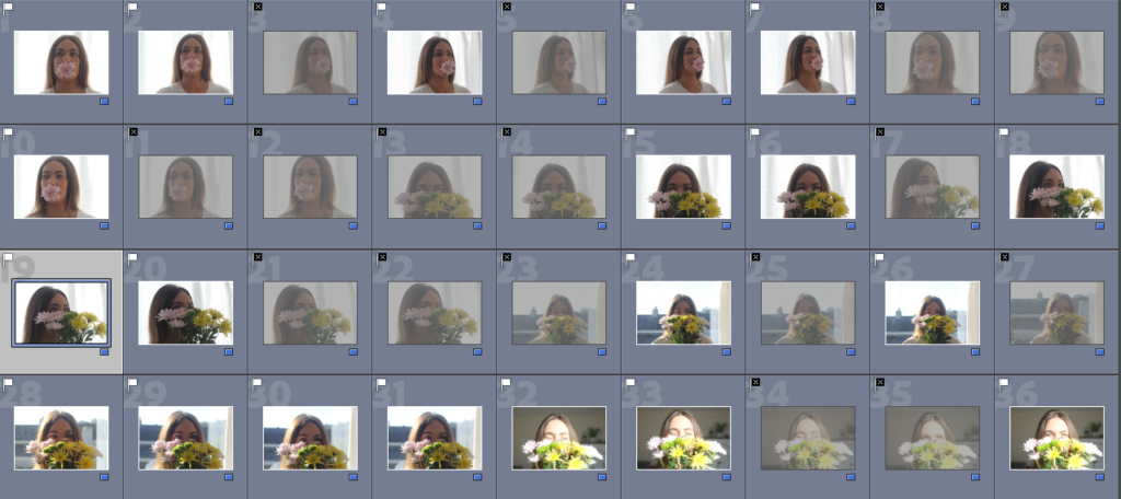
I again labelled my best shoots using either a white (good) or a black (bad) flag so that editing and selecting my final photos would be easier.
Best photos
Editing:
Original photo before editing:
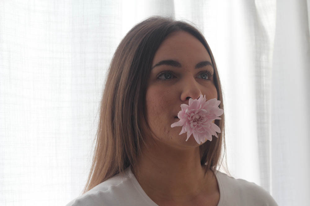
Due to taking photos against the light the photo has a dull look to it so using adobe Lightroom I will improve this.
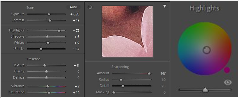
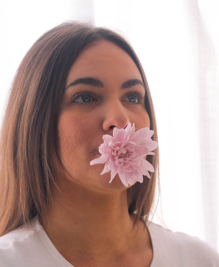
I made the photo sharper so that the details would stand out more. I also moved the highlights point towards a more pink tone so that the flower would stand out. By adjusting the saturation and vibrancy the photo appeared brighter and less dull. I also cropped it so that the attention was on the model rather than the background of the photo.
Final outcome:
Comparing my work to the photographers work:
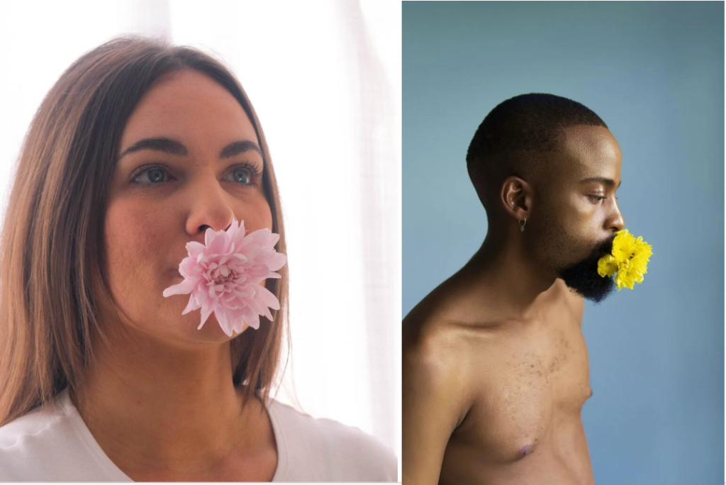
My photo is similar to Ndelu’s photo as they both have brightly coloured flowers in the model’s mouths. The models are posed in the same way in both mine and Ndelu’s photograph however in her photo the model is turned more towards the side, showing their side profile. Both photos support Ndelu’s aim of her photography which is to represent that both women and men can be as equally as beautiful.
