Formalism is when a photographer prioritises lighting, composition, photography techniques and overall design of the image over the subject whilst eliminating all factors in the image other than the subject.
There are 7 fundamentals in formalism; line, shape, form, texture, colour, size, depth.
Examples:
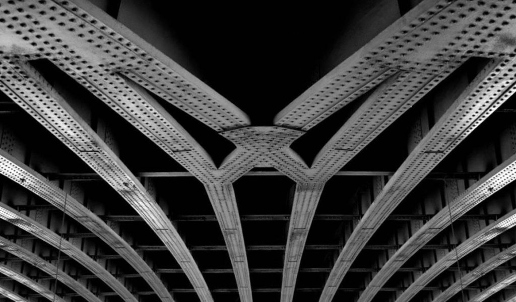
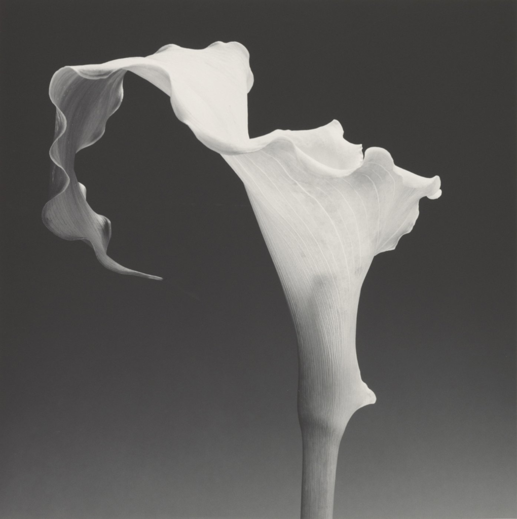
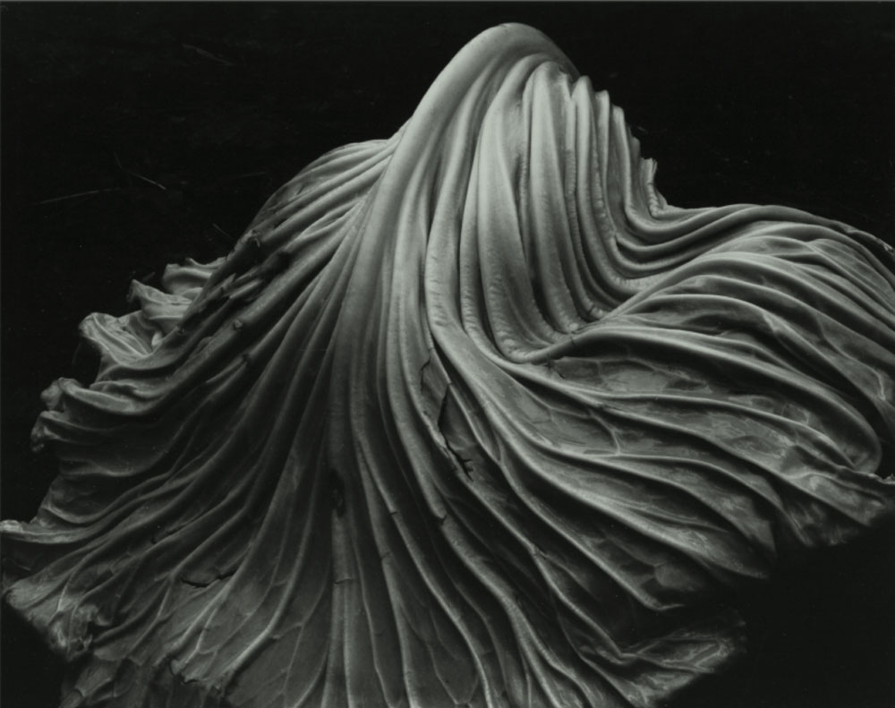
Lines
Lines – A straight or curved element that is made between two points on an image
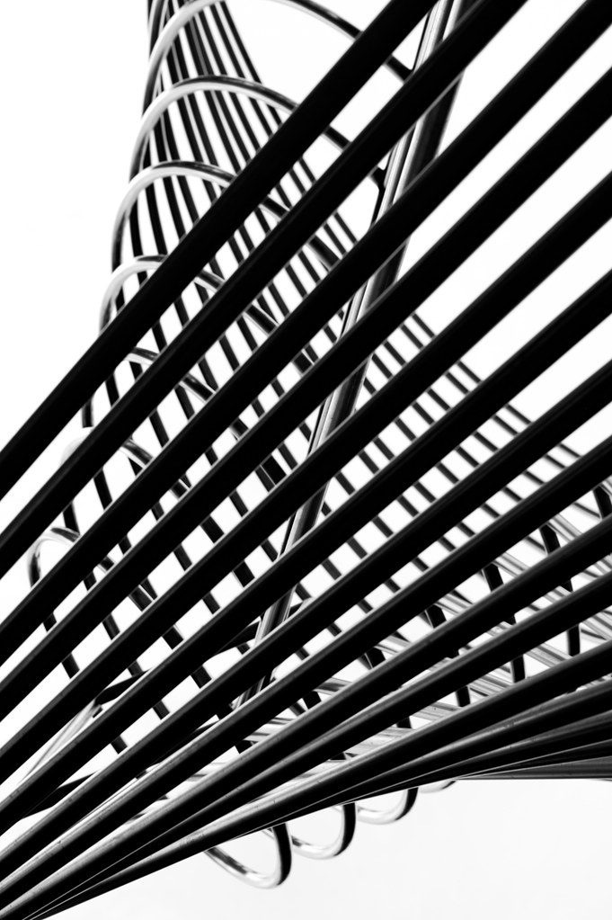
These bars of warped metal have created lines across the image.
Shape
Shape – Shapes are formed when one or more lines connects. These shapes are usually familiar shapes and 2D.
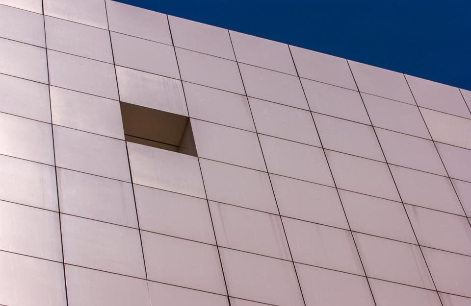
The lines in this image have connected to make a grid of parallelograms.
Form
Form – Unlike shape, form takes 2D shapes and brings them into 3 dimensions. Form takes the shape and structure of something and distinguishes it from its material.
In form there are geometric shapes which are familiar like cones, spheres and cubes whereas organic shapes are infinitely simple or complex like the shape of a plane.
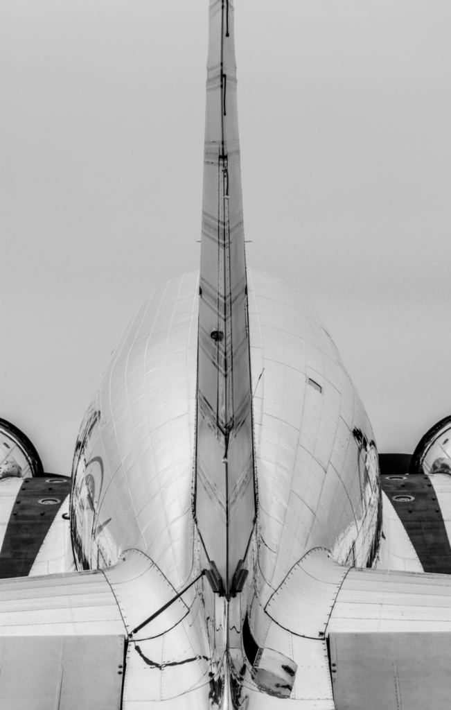
The texture of the plane creates lines with come to form shapes which are then given form by shadows, reflections and value.
Texture
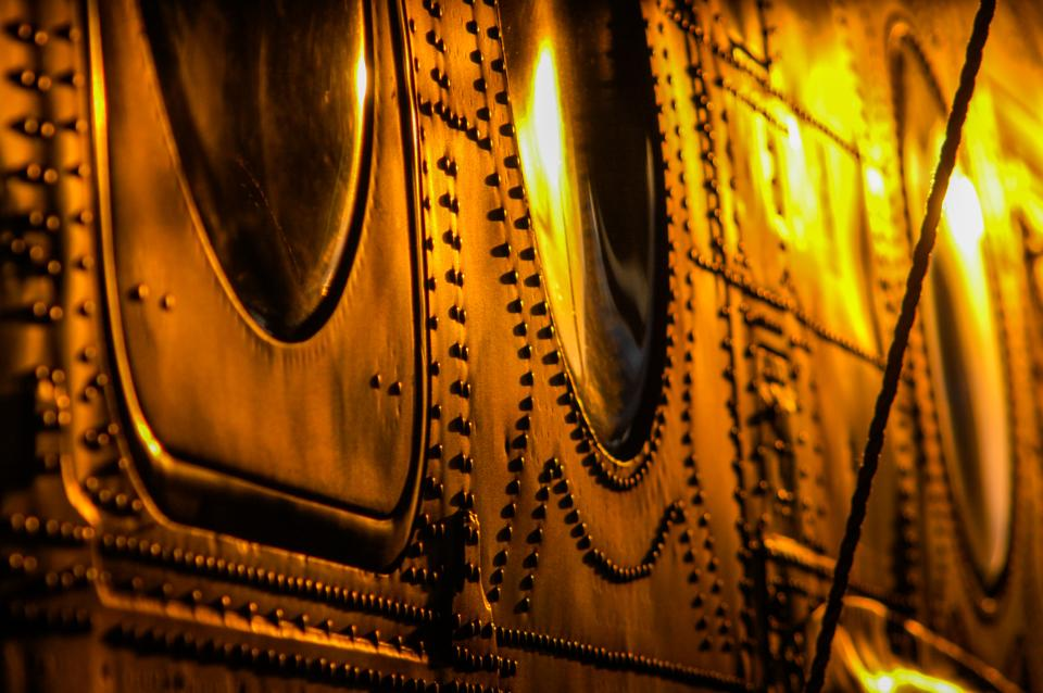
The characteristics of the surfaces and appearance of objects. Textures can be felt virtually/visually or by touch (when the image has been printed)
Texture can be effected by lighting, the subject, forms or other fundamentals of formalism.
Colour
Colour has three properties; the hue, saturation, brightness of the objects and their contrast with their surroundings.
Colour can describe the mood of an image and is present in most photographs unless they are using a greyscale colour scheme.
Hue is the description of a colour. for example; red, blue, green or purple.
Saturation is the harshness or softness of a colour. Pastel colours like a light pink, baby blue or lavender could be described as a lowly saturated colours and are soft. Neon colours like electric orange, “UFO” green and “proton” purple are an example of a highly saturated colours and are harsher.
Value or brightness is how dark or light a colour is. Navy blue is an example of having a low value.
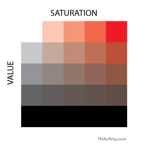
Here you can see how combinations of saturation and value can affect a hue.
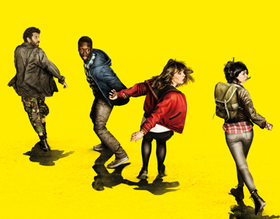
The highly saturated, bright yellow colour conveys a feelings of an unsettling nature and also works as the base structure for the composition of the subjects as it helps infer that the subjects are panicked and distraught. Furthermore, the contrast between low and high values (the shadows verses the bright yellow) create a disjointed sense in the image.

The dark values and lowly saturated colour scheme are being used to describe the eerie atmosphere of a graveyard.
Size
Size is the magnitude of objects in an image and gives the image most of its sense of scale. Our sense of scale can be made different by introducing familiar or unfamiliar objects into the scene and altering the way the image is composed.
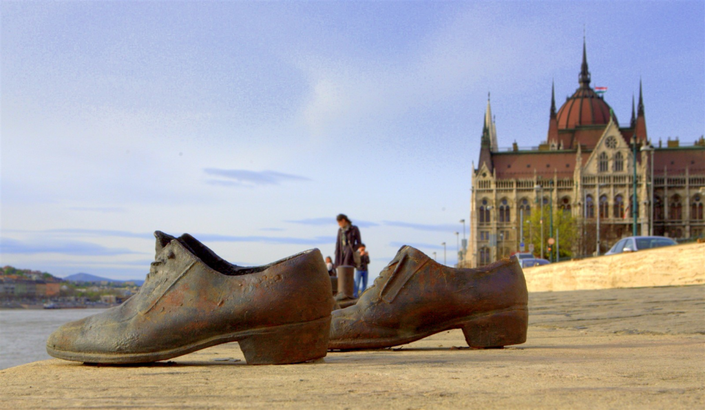
Here the shoes, a small pair of objects, have been positioned in the foreground and all the typically large components of the image, the people, building and cars, have been positioned in the background presenting the shoes as if they have a larger magnitude.
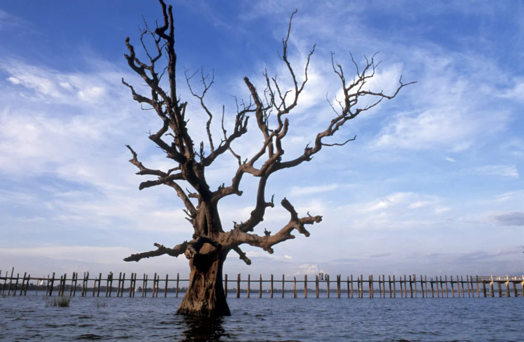
The size of objects in this image is highly ambiguous because the photo lacks a strong sense of depth and comparable objects to gather an idea of the size of the subjects in the image.
Depth
Depth is distance from the front to the back of an image. It can give the image a sense of size, shape and form.
The stronger the distinguishability between the foreground, midground and background in an image is determines how large or small its depth can be. Depth can be enhanced with diagonal lines and vanishing points.
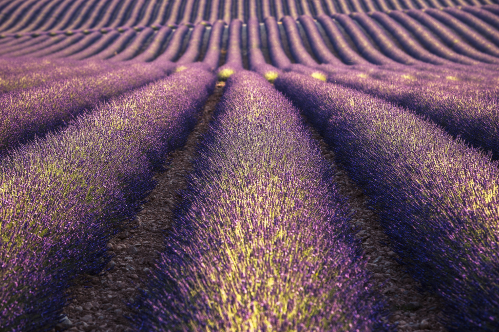
There is a strong sense of depth in this image because the foreground, middle ground and background are all distinguishable by lines and blurs. The lines converging also enhance the depth of field.
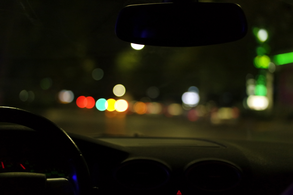
Here there is a weaker depth of field. The foreground and middle ground are easily distinguishable but the background is entirely blurred and is harder to tell where things like the road end. There is less of a sense of a vanishing point and overall feels more flat.
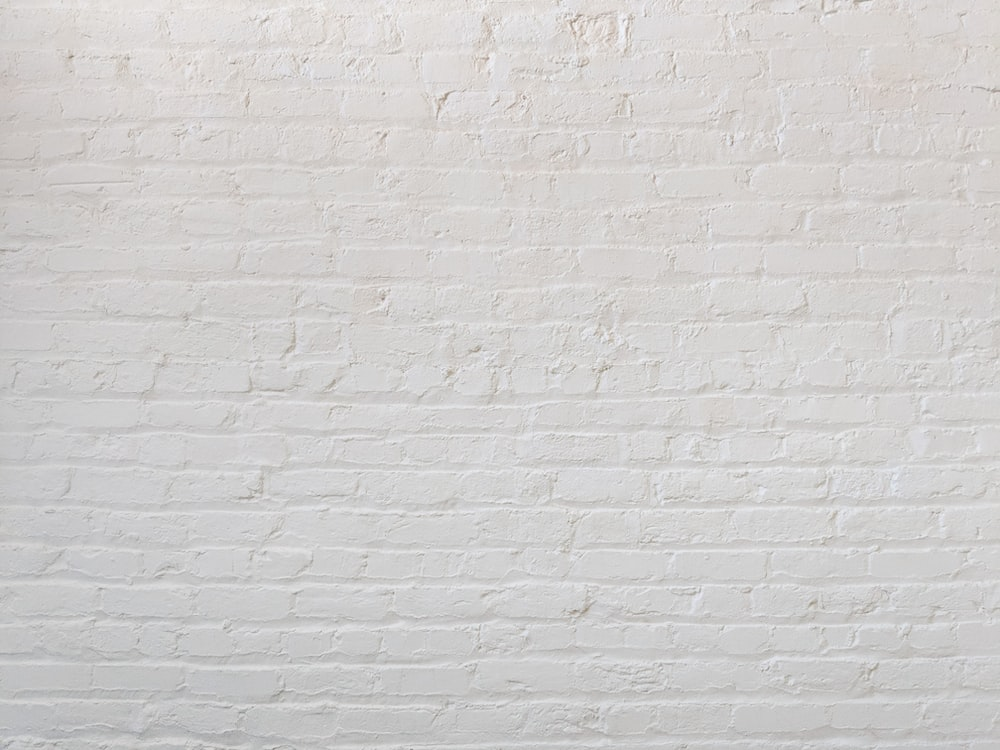
There is no depth of field in this image because it lacks layers, only consisting of a foreground and a single texture.
